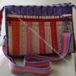
Rose Petrillo bag – I found the pieces for this bag cut out, but not sewn.
Still UFOs
I still have UFOs. Who doesn’t, after all? A project in the ‘UFO’ category means I am stalled, it hasn’t been worked on in awhile or it is waiting its turn to be worked on. The list is a lot shorter and the projects are newer, for the most part.
I am annoyed that some of these are still UFOs. I have to give myself credit for completing some of them last year.
Handbag Sampler – I found the blocks! I found them in a bin I thought I had thoroughly searched! I also found the fabrics carefully stored together. Hooray!!
As you probably know from my frequent mentions of Sue and Carrie, my excellent students, I teach a quiltmaking class. You can find notes and tutorials here on the blog for the class, but no video. If you want personalized teaching there is a fee. Recently, I have added notes and links from the design class that I also teach. For the design class, I will give lectures on one topic to groups. Contact me if you want to discuss those lectures.
I saw this tutorial a long time ago, but found it again when I reviewed my guild’s old blog. If you like the Japanese cute animal style, this is for you. It is useful also.
Kylie and the Machine have a free pattern called Snippy Pouch. The instruction booklet tells you how to measure your scissors for a perfect fit.
I found a new bag pattern designer: Love You Sews. I really like the Leah Travel Bag. It has a nice shape and good pockets. I love the way she has used, what looks like some webbing, as a pen holder. I wonder if that would be better than foldover / doublefold elastic**?
Struggling with wavy borders? Check out this comparison of two methods of adding borders.
If you need a tutorial on how to use and refill your Sewline pencil, the tutorial on the Sewline site tells everything you need quickly. 4-6 leads only to refill was the key to getting my pencil back up and running.
My mom is thinking of finishing her Scrapitude quilt. She sewed hers at the same time I sewed mine, but never had the quilting done. This forced me to go look at Charlotte Hawkes’ site again. She has some interesting patterns in her shop and a new mystery quilt just started. You might want to join to see if you like her patterns.
MessyGoat (Elaine P) showed a picture of her Kraken quilt, which is really amazing! Her quilt led me to LegitKits and the various patterns and kits they sell. They have really interesting designs!
I am looking at needlepoint again. I am working on the Ehrman design I bought, but am not finished yet. That means I really shouldn’t buy anymore. In all the QuiltCon hullaballoo, Anna Maria has been showing off her new website and fabrics. I took a look at the site and found some needlepoint kits. I like them, but I think I like the Ehrman designs better. They have some Kaffe designs I might try next if I continue with a needlepoint project.
I really like the pineapple (fruit) blocks. I have a lot to do, but might make one. I found some directions and noticed when I was searching that people made them from all sorts of different units.
This isn’t intended to be a photo post, but I do like to throw one in every now and again. A group of fabric seems like a good idea.
I like the colors in this group, but not all of the prints. The prints with the dots are the best. I may actually buy the pink and turquoise dot fabrics. Too bad the one with the dots on cream is not on white. I want to take a look at that large motif design in person. It is hard to see the entire motif.
Jammin’ Threads has a label that warns people about donation a quilt you made to thrift store that I find really funny.
Did you know you can download fabric image files from the FreeSpirit site? Click on a collection and then choose download files.
I really dislike taping patterns together, which is why I usually buy, if possible, the printed pattern. On Sunday February 2, 2025, Sara Lawson presented her Sewcial Sunday show and talked about PDF Plotting. PDF Plotting prints your patterns out on AO paper (very large) and mails them rolled not folded. I haven’t tried it yet, but you can bet I will. Our guild challenge this year is to use a pattern we’ve had laying around. I’ll have to check through my PDF patterns and see what I can use to try out the service.
Judy Martin is updating her Encyclopedia of Judy Martin Blocks & Quilts. It is only an e-book. I with it were in print. “The 588-page Encyclopedia features 957 original block designs shown in drawings and 1029 original quilt designs shown in 247 quilt photos, 197 quilt drawings, and 585 setting variations. It also has 16 original, full-size quilting patterns with sketches showing how to arrange them for blocks and borders. I have added photos for every design that was presented with a photo.” The price is really good for so many patterns and designs.
I am giving up on my main Oliso iron. It stopped working and is no longer under warranty despite receiving a replacement just about a year ago. I LOVE the up and down feature. I also love that it sits on the base, so is lower to the ironing board. I am, however, sick of it giving out on me. I have a backup iron, which is subpar, but works. Either I am going back to buying cheap irons and replacing them when they die or I might get a Reliable iron**. Stay tuned.
Check out the video where Tula Pink introduces her new TTrue Colors for 2025. The variety of prints – the size of the motif on the print – is GREAT. Variety of the size of the motif in the fabrics you choose for your quilt adds a lot of interest.
Parents magazine has an article about “Grandma Hobbies.” Seriously? Grandma Hobbies? I knew many of my grandmothers and all except one I loved dearly. Most of them did some kind of needlework and did it very well. I also have a lot of friends who are mostly not yet grandmas who enjoy quilting, crochet, knitting, needlepoint, and scrapbooking. I currently have a number of quiltmaking projects and a needlepoint cushion on the go. WTH, Parents mag? I am glad teens are delving into pastimes such as these, but why are they called grandma hobbies? Do they know about the thriving knitting community? Crocheters who knit many hats, etc for all different types of communities in need?
Joann Fabric filed for bankruptcy again! An article in BHG talks about it, but it is mostly anecdotal. There isn’t a lot of meaty information. In my opinion, having sales all the time is the big problem. Macy’s has the same problem. Sales bring in shoppers, but too many sales sets the expectation that shoppers can just wait until the next sale. I hope the new owners settle into a routine that includes plenty of help and less mess in stores.
Exhibits and Organizations
Join our guild. We’d love to share sewing projects with you.
NQR
**N. B. : Obviously, you should shop at local quilt shops and small businesses. However, if you are too busy or can’t find what you need there, I use Amazon affiliate links and may be paid for your purchase of an item when you click on an item’s link in my post. There is no additional cost to you for clicking or purchasing items I recommend. I appreciate your clicks and purchases as it helps support this blog.
After turning in a batch of 16 patches, I switched back to making my white strip donation blocks. I should have done it ages ago as the strip blocks lead directly to quilts whereas the 16 patches lead to someone having to store them until someone takes them to make into a quilt.
I started another Day Trip Cell Phone Wallet almost immediately.
This one, as you can clearly see, is for my mom. I want her to be able to carry her cell phone while leaving her one free hand. Now that she is moving around more and using her cane more, she might need a free hand to hold a banister. I tried something new with the strap, which I’ll talk about later and am in the process of working through the first steps.
The one thing I am trying on this one is to cut the foam a little smaller in order to reduce the bulk in the seams.
I am so excited about finishing this bag! I am not sure that is the right way to say it, but it has been a long time in coming. As mentioned, I bought Minikins Season 2 for the express reason of making this bag. Then, I was intimidated and didn’t feel up to making it.
A few years have gone by, and I have made several bags. This bag seemed right for a gift. I guess I was ready.
The bag was a challenge, but only because of the many layers, not because of the directions. The process is actually very easy. With the pattern and the video, it wasn’t hard.
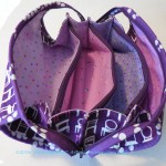
Finished: Day Trip Wallet – interior
This bag is, basically, a small wallet that fits your cell phone. You could put this into a larger bag, but then take it out when you don’t need the whole bag.
This would be great for doing that since the strap is detachable. You could store the strap elsewhere or in one of the inside zipper pockets and take it out as needed.
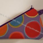
Finished: Day Trip Wallet – exterior pocket
This is the first one that I have made, but I hope to make more. I wonder about the size of the flap for the cell phone pocket. I wonder why it is so small. It might interfere with stitching the zipper. I have asked in the Sew Sweetness group to see what others say.
I was a little worried that the pattern was designed when cell phones were smaller and a modern phone wouldn’t fit. I tried my large-ish Samsung phone in the pocket and it fits just fine. Whew! This is good as the bag is not that large and I wouldn’t want it to be enlarged so much that it wouldn’t fit in the larger bag mentioned above.
Finished: Day Trip Wallet – interior detail
The inside has two sides, both with a zipper pocket and several card slots. Behind the top card slot could be a spot for cash.
I added the optional D-ring on the spine so there would be a place to clip keys.
I also used two different colors of zippers in order to give the recipient a visual cue as to where she stashed something.
Hindsight Day Trip Cell Phone Wallet
I think I could probably have put another cell phone pocket on the other side of the bag exterior. I am not sure how useful that would be, though more pockets are always better.
I am pleased with how this came out and am cutting out a second one. This one will be for my mom who needs something for her phone so her hands are free to maneuver her walker.
I sewed the first few seams of the million HSTs I need for Old Town a few weeks ago. I used the tutorial for making 8-at-a-time, thus the added cuts, and then the stack languished.
Old Town HSTs
Finally, the other night I used scissors to cut the 8 HSTs apart. I wasn’t sure it would work, but it did. I cut the original squares generously, so I have enough wiggle room to trim to the exact size. I have a small, 2.5 inch ruler** tucked into my handwork bag that is kept in the living room. It worked really well for confirming that I had enough extra to ensure the HSTs were the right size. I haven’t really used that ruler much. It came with a set and I find it too small to use with a rotary cutter. For measuring, however, it worked really well!
It sounds stupid, but it was great to realize I could cut these with scissors! I made sure I used my sharpest pair of scissors, the ones I bought this summer with the titanium (or something) blades. I, also, was really careful to cut straight.
Now I have to press and trim all of those HSTs, but I am a bit closer to putting the blocks together.
**N. B. : Obviously, you should shop at local quilt shops and small businesses. However, if you are too busy or can’t find what you need there, I use Amazon affiliate links and may be paid for your purchase of an item when you click on an item’s link in my post. There is no additional cost to you for clicking or purchasing items I recommend. I appreciate your clicks and purchases as it helps support this blog.
Your first design choice is to choose your own colors. If you buy a pattern and use the fabrics you enjoy (not the fabrics in the pattern) you have made the first step in designing your own quilts.
Munsell color system: An artist and an educator, Munsell developed his color theory to bring clarity to color communication by establishing an orderly system for accurately identifying every color that exists. Munsell based his system on what he defined as “perceived equidistance” — the human visual system’s perception of color. (Munsell color, http://munsell.com/about-munsell-color/)
“Professor Albert H. Munsell, an artist and art teacher, developed the basic principles of his color order system mainly for the purpose of bringing order to the study of color. Munsell wanted the study of color to be similar to the study of music, which had order so that one could “hear” how a composition would sound by reading the notes. Likewise, Munsell wanted one to “see” color based on its three-dimensional attributes of hue, value and chroma.” (Development of the Munsell Color order System http://munsell.com/about-munsell-color/development-of-the-munsell-color-order-system/)
Munsell color order system is based on a three-dimensional model depicted in the Munsell color tree. Each color has three qualities or attributes:
Hue – color such as red, orange, yellow, etc.
Value – the lightness or darkness of a color
Chroma – the saturation or brilliance of a color
Hue, value and chroma are also referred to as (HVC)
Munsell Color Theory is based on a three-dimensional model in which each color is comprised of three attributes of hue (color itself), value (lightness/darkness) and chroma (color saturation or brilliance)
“The Munsell color-order system has gained international acceptance. It is described in unabridged dictionaries and encyclopedias as well as in specialized publications on art, design, color photography, television, printing, paint, textiles and plastics. It is recognized as a standard system of color specification in standard Z138.2 of the American National Standards Institute, Japanese Industrial Standard for Color JIS Z 8721, the German Standard Color System, DIN 6164 and several British national standards.” (Development of Munsell Color Order System http://munsell.com/about-munsell-color/development-of-the-munsell-color-order-system/)
“Up until the mid-19th century, bright colors were the preserve of the wealthy, the only people who could afford them. Yet the dyes used in even the most expensive items were so unstable that they often faded or discolored. The development of chemical dyes, like Perkin’s, enabled more shades to be created in brighter, longer lasting hues. People responded by choosing the vivid colors that had until then been denied them when clothing themselves and furnishing their homes, prompting the upper classes to choose subtler shades as a form of snobbish protest. ” (New York Times, 50 Shades of Color: How the Evolution of Palettes Changed the World, By ALICE RAWSTHORN, Published: September 23, 2012 http://nyti.ms/RZj53N)
In the TQS episode 313 with Jinny Beyer, she talks about her color system, which is way of picking colors different than the systems we have talked about above. Her idea is to shade from one set of colors to another in order to keep the transitions smooth. She uses her Portable Palette tool, which uses Beyer’s fabrics. This is a good system, but you might be unduly influenced by Beyer’s color palette, which has, in my opinion, an East Coast look to it. Try to create your own portable palette with colors you have in your stash.
“By the 1910s, the scientific approach to management advocated by theoreticians like Frederick Winslow Taylor was becoming increasingly popular, and color was identified as a problematic area, because of its unpredictability. If a manufacturer of furniture or dresses ordered fabric and trimmings, which were both described as “scarlet,” they often turned out to be different hues. The problem worsened with the development of new types of paints and dyes after World War I, and the U.S. government encouraged various industries to standardize colors in an attempt to reduce wastage.” (New York Times, 50 Shades of Color: How the Evolution of Palettes Changed the World, By ALICE RAWSTHORN, Published: September 23, 2012 http://nyti.ms/RZj53N)
Most of us love precuts, because, well, they are PRE cut, e.g. you don’t have to cut them. Keep in mind when you actually want to use them in a quilt, as opposed to using them for decoration, that pre-cuts (Jelly Rolls, Layer cakes, honey buns, etc., as well as Fat Quarter packs) are marketing tools. Pre-cuts are marketing tools. They are small, fun, look great on your shelves and are easy to purchase. They are all-in-one and don’t need much thinking when buying them.
When you are using these for a quilt you need to look at the colors/fabrics included in the selection. IF you need the contrast as part of the design of your quilt, make sure you have enough contrast. Many of the pre-cuts are heavy on medium colors, which we all love to buy, but can create a mushy looking quilt when you don’t want it to be mushy. Joanna Figueroa of Fig Tree Quilts has (or had) a publication called Fresh Vintage and in many of her issues, she says to take 20% of the pre selected pre-cuts out and replaces them with something else. Not only with this give you more control over your light and dark, but it will also make your quilt your own. You can see a good variety of sizes of prints in the 2025 video introducing the new Tula Pink True Colors.
A profile of Alicia Merret in Quilting Arts includes “Her appreciation for color theory greatly informs her work. ‘I have found that it is incredibly important to understand how colors interact with each, and how one color can look quite different depending on the colors that are next to it.’ ” (Quilting Arts Magazine, April/May 2012, Artist Profile: Alicia Merrett, pg. 33)
One way to figure out your own palette is to look at the world around you. Remember the glossy expensive fashion magazines we discussed before? Ms. Brackett, in Scrap Basket Sensations, writes “Be alert for color combinations that catch your eye in clothing, magazines, nature, and the quilts of others (pg.10).” This is a great way to learn about color. I keep an idea book where bits and pieces are pasted. Some are shapes I want to remember and others are color combinations that would make great quilts. Once you identify color groups you like, check the color wheel and try to identify the type of color scheme it is (primary, secondary, split complimentary, monochromatic, etc). This exercise will help you to become familiar with the different ways to use the color wheel to make successful quilts.
Homework:
Exercise #1: Create a palette
1. Choose a favorite photo.
2. Look carefully at the photo to try to identify the unique colors. You don’t need to isolate periwinkle, violet and lavender. Unless you are making a purple family quilt, just pick one from the purple family. Be sure to look at the very thin lines, if any, and include those colors.
3. Select fabrics (or paper or another craft supply) that match the colors you have selected.
4. Create a palette of 5-9 fabrics and take a photo. Share the photo.
5. Optional: make a quilt from your palette and give the group your thoughts.
–> I was inspired to create the above exercise by the Palette Chasing feature in Modern Quilts Illustrated.
Exercise #2
Please note that this not a weekend project and it will be easier the more fabrics you have to work with.
1. Cut a 2.5″ square from every fabric you have.
2. When you have a good number of squares sort them into color families, e.g. heap all blues together, all reds together.
3. Once you have the colors in color families, place them on the design wall in color order from dark (upper left hand corner) to light (lower right hand corner.
4. Work on rearranging the squares until there is a smooth transition between the color families.
Questions to answer:
What do you notice about prints and colors?
How does the ratio of one color to another in a print affect how the color ‘reads’?
What colors are most prevalent in your stash? What do you think about that? What did you expect the answer to be?
I am pleased to say that the Day Trip is progressing much better than I expected.
As mentioned, I was anxious about the difficulty of this project. I am carefully following all the directions and watching the video accompaniment when I have even a sliver of doubt. I am not having any problems! I am so excited.
In some ways, this is a meditative process for me. There are a reasonable number of pieces and I was able to cut them out relatively quickly. I decided that I wasn’t going to skip steps to get to the sewing faster. That attitude made the sewing, once I finished all the prep, go much faster.
Day Trip: Magnetic snaps
It has been awhile since I installed magnet closure. I added some Decovil Heavy scraps behind both pieces to reinforce the snaps. I hope they will hold.
Sara has a really good tip in this pattern about using the round template/reinforcement thingy that comes with the magnet closure for placement. It is so obvious yet I never thought of it.
Day Trip zipper installation
The cell phone pocket (above) is complete. I am working on installing the zipper that closes the whole bag. I had to cut the zipper to the right size. I really need to make some of those Center Street Quilts heart pouches in order to use up some of my leftover zipper pieces. This is a difficult part as the zipper really doesn’t like going around corners, but I went slowly and persevered. It’s the same challenge all the time. Am I getting better? Maybe. I should be after all those Hackney pouches.
I am really jealous of that skinny quarter inch foot Sara uses. I think it would make going around those corners easier.
At Bag Club on Saturday we talked about installing an interior zipper pocket. I did sort of a theoretical tutorial using the Sotak Handmade Purse Organizer as an example. Since it was already made, there was a lot of imagination required.
Day Trip: one interior zipper pocket
Funnily enough, I had to make two of these types of pockets on Sunday! They are a little fiddly, but really easy. I use Sara’s zipper pocket ruler for the measuring and drawing the box. She is not restocking her acrylic templates, so get them while they are still available. I checked other places and can’t find one like Sara’s. I found one from Arc Expressions (no affiliation) that I think would work, though you would have to use another ruler to measure pockets on larger bags.
Anyway, talking through the pocket installation on Saturday was really helpful on Sunday when I went to make the pockets. I had an idea in my mind about what I was doing. I made one (or more??) on the most recent Superbloom, so I was in good shape. I like having the process firmly in my mind.
One of the best things about these pockets is you can pull the bag right side out through this pocket. I love it when designers use that technique. You can add these pockets to almost any bag with a lining.
I am well on my way. Get this pattern and make one!
I selected some new fabrics for the rest of the pillowcases. I bought more than I normally would have. There was such a great selection that I couldn’t decide.
I went looking first at Boersma’s, because they sent me a coupon. I bought some of the fabrics from them, though I couldn’t use the coupon. All the fabrics I selected were on sale.
I bought Minikins Season 2 specifically for this pattern in March of 2020. At that time, I was a little scared of this pattern. Recently, I realized I wanted to make one as a gift. Since I had the recipient in mind, I dove in to make it. This will match the Superbloom tote I finished a few weeks ago.
Day Trip for Diana start
I was still anxious that I wasn’t up to the task, so I carefully worked my way through the cutting and interfacing. I only forgot one piece! I am about to start working on the pockets, straps and tabs.
I am pretty excited that I am getting going on this project after almost 5 years!
I was scrolling IG the other evening and found yet another Color of the Year announced.
Pantone Color of the Year 2025: Mocha Mousse
Kona Color of the Year 2025
We have Mocha Mousse from Pantone and Nocturne from Kona, both of which I talked about the other week. Could these two colors be more different?
KitchenAid Color of the Year 2025 – Butter
Now, we have KitchenAid’s Color of the Year, Butter, joining the party.
If you are thinking, enough is enough, wait there are more! Better Homes and Gardens has a whole article about Colors of the Year as does House Beautiful. A lot of these companies are paint companies. Sherwin-Williams was not satisfied with one color, but chose nine, yes NINE, in their “first ever color capsules of the year.” Most of the colors are brown and purple tones.
N.B. Kona and KitchenAid were not included in the article, which was written in December.
Separately, Diamond Vogel, a paint company I have never heard of, announced their color of the year: Rediscover 0408. It could be just 0408. It is a green color.
I think a lot of these colors are depressing and dark. Perhaps it reflects the times?
Young House Love provides a recap of all the paint colors of the year for 2025. This is a nice post, even without Kona and KitchenAid, as it provides the new CotY next to the previous several years for each company. You could use these for quilt color palettes assuming you like darker colors.
What is your color of the year? I am struggling to choose between turquoise and pink.
These are the notes for one of the modules in my quilt and design classes. They are posted on the blog so my students have easy access. You will get something out of them, but you would get more by taking one of my classes. Check the link for more information.
Size and Scale are an element of design
Size and Scale are related terms
Definitions:
-> N.B. Definitions overlap. I have tried to organize them, so keep an open mind.
Size
“Size and scale are words used to describe the physical size that a shape or form has in comparison other shapes or lines within the design field.” (A Fiber Artist’s Guide, pg.98)
“Proportion relates to how shapes interact with each other within a design.” (Adventures in Design, pg. 74)
“Proportion refers to relative size, size measure against other elements or against some mental norm or standard.” (Pentak & Lauer, pg.60)
the comparative relation between things or magnitudes; a proper or significant relation between things or parts; relative size or extent (Random House College Dictionary).
Proportion (Random House College Dictionary): the comparative relation between things or magnitudes; a proper or significant relation between things or parts; relative size or extent
Example: “Proportion refers to relative size, size measure against other elements or against some mental norm or standard.” (Pentak & Lauer, pg.60)
Scale
“‘Scale and ‘proportion’ are related terms that both basically refer to size. Scale is essentially another word for size.” (Pentak & Lauer, pg.60)
“Big is meaningless unless we have some standard of reference. A big dog means nothing if we do not know the size of most dogs. This is what separates the two terms,” size and scale. (Pentak & Lauer, pg.60)
“…the scale of the pattern, that is, its size in relationship to the size of the pieces that are cut, will determine the impact of the pattern on the overall design of the quilt.” (Quilter’s Book of Design, 2d, pg. 80)”‘Large scale’ is a way of saying big and ‘small scale’ means small.” (Pentak & Lauer, pg.60)
a succession or progression of steps or degrees; a graduated series; an arrangement of things in order of importance (Random House College Dictionary).
Scale (Random House College Dictionary): a succession or progression of steps or degrees; a graduated series; an arrangement of things in order of importance
Ratio
the relation between two similar magnitudes in respect to the number of times the first contains the second (Random House College Dictionary).
Ratio (Random House College Dictionary): the relation between two similar magnitudes in respect to the number of times the first contains the second
Example: “…the scale of the pattern, that is, its size in relationship to the size of the pieces that are cut, will determine the impact of the pattern on the overall design of the quilt.” (Quilter’s Book of Design, 2d, pg. 80)
Using these Tools:
Using Size:
“The principle of scale in a work of art is all about the volume of the message you wish to send to your viewer.” (Art+Quilt, pg.64)
“The scale of a work of art in relation to the viewer, its human scale, is often” one of the first considerations an artist makes.” (Art+Quilt, pg.64)
where will it be displayed? the atrium of a large office building or the foyer of a private home? (Art+Quilt, pg.64)
Elements in a design that are larger seem close. (Pentak & Lauer, pg.176)
Elements of a design that are smaller seem farther away. (Pentak & Lauer, pg.176)
Elements of a design that are larger seem more important, conversely elements of a design that are smaller seem less important. (Pentak & Lauer, pg.176)
I don’t want you to get the idea that small is unimportant. A small amount of yellow in a purple quilt can make all the difference to the overall design.
“Scale and proportion are closely tied to emphasis and focal point. Large scale, especially large scale in proportion to other elements makes for an obvious visual emphasis.” (Pentak & Lauer, pg.60)
“Unusual or unexpected scale is arresting and attention getting. Sheer size does impress us.” (Pentak & Lauer, pg.61) Magnifying something that is usually quite small can capture your attention through sheer surprise. A butterfly wing that fills the entire frame gains significance as you see extraordinary details seldom noticed in everyday life.” (Art+Quilt, pg.65)
Georgia O’Keefe is an example of an artist that uses this technique. (Art+Quilt, pg.65)
“An unnatural contrast of scale in your quilts can also be used to achieve interesting effects. Surrealists such as Salvador Dali used wildly confused internal proportions to intentionally create uneasiness in the viewer. One element that is purposefully out of scale with other elements within the quilt will attract the viewer’s attention and become a focal point.” (Art+Quilt, pg.65)
if you want to exaggerate a shape, “have some visual continuity between the shapes.”(Adventures in Design, pg. 75)
Think about the relative sizes of pieces in a quilt. It is important to vary sizes to add interest. (Fearless Design, pg. 32)
think about piecing the same blocks in different sizes in order to add interest to your quilt.
Using Ratio
Using ratios really has to do with proportion. The Fibonacci sequence has to do with ratios of objects to one another on the design field. “One powerful way to help your design evolve to its highest potential is to select the width and height dimensions that promote the natural movement of your design….select your dimensions based on a ratio that best suits your design. Observing your design’s directional flow and focus gives you a starting point to sort through your options.” (Adventures in Design, pg. 77)
“1:1 ratio is a perfect ratio for designs that radiate symmetrically from a center point….if your design is 24″ high in this ratio, it will also be 24″ wide.” (Adventures in Design, pg. 77)
“A 1:2 ratio provides added width to a horizontal design or it extends height to a vertical design. In this ratio, the longer dimension is twice as long as the shorter dimension. If you want one dimension to be 24″ wide, the other dimension would be double that – 48″ high.” An example of this ratio is Poulnabrone Dolmen (Adventures in Design, pg. 77)
The 1:3 ratio provides more lengthwise extension than 1:2 ratio. “In this ratio, one dimension is three times greater than the other dimension. This gives more room for the design to expand in one direction. Thus if you want one dimension of your design to be 24″, the other dimension would be 72″.” An example is a quilt called Acid Rain by Gloria Loughman. This ratio has allowed a “dynamic sky to evolve in her quilt.” (Adventures in Design, pg. 77)
“A 1:4 ratio greatly exaggerates the length of a design. One dimension is four times greater than the other dimension. If you want your 24″ high design to have an extreme horizontal extension, the 1:4 ratio would give you a width of 96″.” An example is Rhododendrons over Water by Amanda Richardson of Cornwall England (Adventures in Design, pg. 77)
” The 3:4 ratio is best used when a design has only slightly more movement in one direction than the other. In a 3:4 ratio, a design that is 24″ in one direction would be 32″ high in the other direction”…. Joen Wolfrom says that “the 3:4 ratio should be saved for such occasions when your design does not need much expansion in one direction or the other.” Example is Ticondrroga Star by Larisa Key, Willimatic, CT. (Adventures in Design, pg. 77) I use this ratio quite a bit, especially for block quilts, because I think it adds interest to the layout.
“A 2:3 ratio allows for more extended directional movement than a 3:4 ratio does. It doesn’t exaggerate the length as much as the 1:2, 1:3, and 1:4 ratios do. ” (Adventures in Design, pg. 77) If you have 24″ high quilt, your quilt’s width would be 36″. (Adventures in Design, pg. 78) Example is Fishermen’s Widows by Anna Faustino
The Golden Mean or 8:13 ratio is considered to be “the most beautiful, pleasing dimension for art and architecture…It provides beautifully balanced dimensions”, because of the subtle dimensional change. “The Golden Mean is a component of the Fibonacci sequence.” (Adventures in Design, pg. 81) If you have 24″ high quilt, your quilt’s width using the 8:13 ratio would be 39″. (Adventures in Design, pg. 78) You can find a calculator for Golden Mean ratios at: http://goldenratiocalculator.com/ and there is a chart in Adventures in Design pg.81. An example of a quilt using the Golden Mean Ratio is Pamela Mostek’s Five Apples.
Notes:
A designer can use relative sizes to give a feeling of space or depth. Artists have taken this basic idea and exaggerated it by increasing the size differences. It is very common to many periods and styles of art to use different scales. (Pentak & Lauer, pg.176)
“In past centuries visual scale was often related to thematic importance. The size of the figures was based on their symbolic importance in the subject being presented… This is called hieratic scaling.” (Pentak & Lauer, pg.60)
“Private spaces are perfect for small, intricately stitched works and allow for a more intimate experience with the art.” (Art+Quilt, pg.64)
“The most renowned proportional number sequence is the Fibonacci sequence“…”The Fibonacci sequence begins as 0, 1, 1, 2, 3, 5, 8, 13, 21, 34, 55, 89, 144, and so on. Each successive number in this sequence is the sum of the previous two numbers. You can use small or large sections of this sequence to determine the dimensions of elements within a design.”… “The Fibonacci sequence highlights the strong relationship between mathematics, nature and art. (Adventures in Design, pg. 76)
The images denoting the Fibonacci sequence are fairly common. I imagine you will say “oh, of course! I have seen this!” when you see the spiral. Nautilus shells are also used as examples of the Fibonacci sequence. As we mentioned in the podcast, nature uses the Fibonacci sequence in its design field frequently. By doing a search on the term and looking at images, you will be amazed at the trees, flowers and other natural phenomena that include the Fibonacci sequence.
Resources:
Art + Quilt: Design Principles and Creativity Exercises by Lyric Kinard**.
Design Basics**, 5th, c.1999, David A. Lauer, Stephen Pentak
Painting by Numbers: the Fibonacci sequence in art by Curtis Belmonte and Conor Pappas
**N. B. : Obviously, you should shop at local quilt shops and small businesses. However, if you are too busy or can’t find what you need there, I use Amazon affiliate links and may be paid for your purchase of an item when you click on an item’s link in my post. There is no additional cost to you for clicking or purchasing items I recommend. I appreciate your clicks and purchases as it helps support this blog.
In this case, some of the books I use are out of print, so visit your local independent used book store for copies.
I decided to revisit other gifts I have made. This time it is Friend Julie’s turn.
Julie’s Birthday Gifts
Julie’s Journal Cover – front
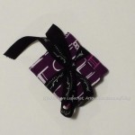
Julie’s Purple Pincushion Gift
Kaffe Pillowcase Gift for Julie
Halloween House #3
Halloween House #2
Halloween House #1
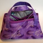
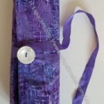
Walker Bag
Purple Chair Sew Together Bag for Julie – open
Scissor Cozy for Julie
Julie’s Iron Caddy
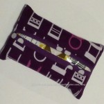
Julie’s Pencil Roll
Mega- Pinnie for Julie
Tissue Holder
Purple Chair Needlecase
Purple Chair Bag – closed
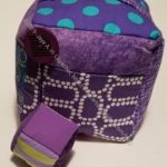
Julie’s Mini Maker Case
Large Retreat pouch -aerial view
Julie’s Project Bag
Julie’s Take a Stand Bag
Julie’s UCAB
Lined Drawstring Bag for Julie
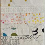
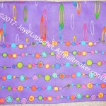
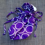
Lavender Dot Bluestem – top
I am pleased to see these bags and accessories show up when Julie and I meet to sew. I am still so glad that she is using them. She liked the Bluestem pouch I gave her for Christmas.
I am not sure what patterns are on my to make list for this year’s gifts. I’ll have to see!
I finally dug in last weekend and finished Ends n.21. Honestly, I needed the design wall space! LOL! Still, it is finished and ready to go to the meeting on Saturday.
This design is super easy, so there wasn’t really a lot to do. I just had to sit down and sew. Saturday was kind of a finishing up day as I didn’t have tons of time to sew, so I finished up projects that were already started and didn’t require a lot of thinking. I think this quilt looks fun. It is about 39 inches x 40 inches. Not huge, but a nice playmat size.
Ends n.21 back finished
I also grabbed a piece of fabric out of my backing fabric supply and made a quick back.


