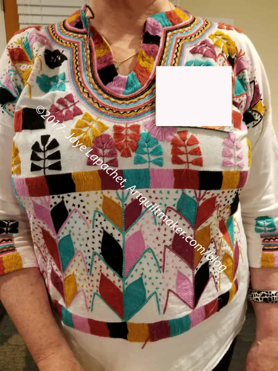
I went to the Retreat last weekend. While there, SIL suggested I do a ColorPlay post on G’s shirt. I thought it would be great because there were a lot of bright-ish colors.
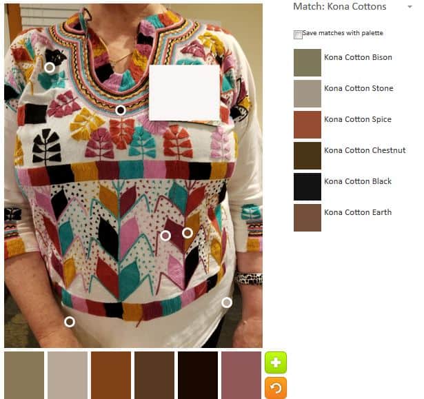
The default was …neutral, as usual. The Earth looks a little purple.
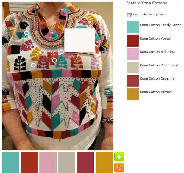
The first non-default palette is my favorite. I went to towards the turquoise. Ok, it isn’t really turquoise, it is Candy Green. I have never heard of Candy Green and that name kind of scares me.

Palette n.2 is an extension of palette n.1. I added a couple of neutrals. I am a fan of the gold, but it works well with the Ultramarine and the Deep Rose.
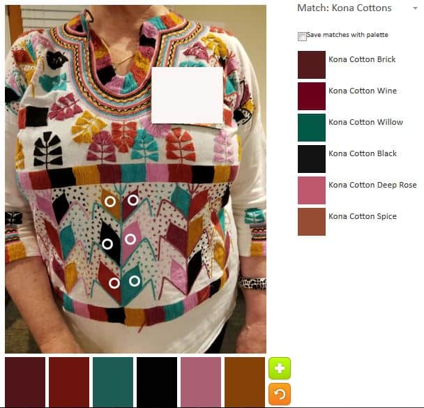
Palette n.3 is a combination of the neutral palette and my favorite, palette n.1. The Ultramarine stands out in this crowd. I also like the name of the Spice color.
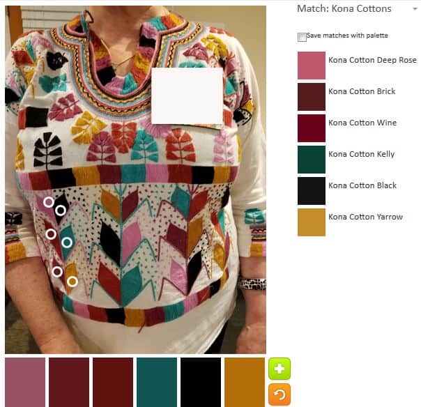
Palette n.4 has colors that show up in other palettes. Although I see this as a more colorful image, I also realized that the embroidery was all of the same colors.
Have you made any interesting palettes lately? Please share.