DebR over at RSR didn’t really ramble when she talked about creativity today. She really put together a classic post that should go into the BLOG OF CLASSIC POSTS. She explains her modus operandi in the creativity department and shows a great way of looking at creativity, which makes creativity accessible. Be creative and the art will come. RSR makes a good point about observing patterns and having them come together at some point through work on your own or by chance so that you have enough information to create. I think her discussion also shows that you can’t just sit down and create something. You have to gather the materials in one way or another. They may be ideas in your head, they may be mag pics in a folder or images in a folder on your desktop. At some point there is enough so you can get to work. I like this process as well, because it means that genius takes work and what I am doing is right.
APNQ has an exhibit up on their website of Postcard Quilts. The webmaster has a nice utility to zoom through all of them using ‘next’ and ‘previous’ buttons. One of my favorites reminds me of our 2005 trip to Hawaii. I love the turtle design.
A few years ago, I went to Lowell, Mass while on a business trip. I didn’t get to devote as much time as I would have liked to the experience. We didn’t have much time for sightseeing and I was pretty tired from taking a Red Eye. Still, it was great to get a flavor of the place. The quilts that I saw at the New England Quilt Museum were wonderful.
I was thrilled recently to see that the Lowell Textile Museum has put their online catalog in beta out on the web. While I am a sucker for online catalogs, I am more thrilled that more textile and quilt information is being put out as well. I would LOVE LOVE LOVE to see a quilt catalog that had hundreds and hundreds of quilts ranging from famous quilts to the neighbor next door quilts. The catalog could cover anyone that wants to upload a quilt and just be images and description-a virtual collection. I think it would be a great resource for historians, geneologists, people seeking patterns, artists, everyone, especially as it evolved. I think it would be fantastic. When I win the lottery, this will be my project.
In this catalog, I would like to see a general browse feature. Additionally, a photograph browse, a textile browse etc. would allow people browse through the collection if they just want to get an idea of what the museum owns.
I hope that some of the fabric companies look at these collections, because some of hte fabrics look really interesting. It would be great if The Electric Quilt could partner with the museum to reproduce their fabrics digitally for use with EQ5.
Still, I am thrilled that this new resource is available and I look forward to see more of their collection virtually.
I had a few hours in Baltimore on Thursday June 16, so I went up to the Mt. Vernon District and looked around. While I was there I visited the Walters. I like their tag line: experience 55 centuries of art. I can’t even conceive of 55 centuries. How wonderful it is that people have been making art for 55 centuries!
The Walters is in an interesting space. It is a blend of old and new. The old really appeals to me, but I also liked the new staircase that they have built recently (I understand). The sculpture courtyard, on the first floor, was modeled after an Italian palazzo. It was very light and airy and I enjoyed being in there. I would have liked to have sat there for awhile with some cappucino and written in my journal. Alas, it was not to be. An activity for another day. There were two elderly people sitting and seemed to be enjoying themselves. I will take their enjoyment as my own.
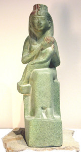
Isis Nursing Horus
Hands down, my favorite piece was in the Egypt gallery. It was a statute of Isis sitting with Horus on her lap. It was called Isis Nursing Horus. First, I liked the subject matter. It was very feminine, but also showed what a strong woman Isis was. She was a goddess in her own right as well as being the wife of Osiris and the mother of Horus, two other strong gods. Despite the fact that she was a goddess, she was also a mother, which, on some level, I find very profound. In terms of the actual piece, I like the simple lines, sort of Bufano-esque. There are other pieces that I saw while surfing which are much more detailed and painted. This version is my preference. It looks like I could buy a copy of this statue at The Virtual Khan el Khalili. I’ll have to consider it once the construction is finished.
I also liked a painting near the Impressionist Gallery called The Christian Martyrs’ Last Prayer by Jean-Leon Gerome. While I wasn’t thrilled with the subject matter, (Christians praying right before they were going to be killed for sport at the Circus) the thing I liked about it was the detail. The way the lion was painted, the beard of the man saying the prayer, the stone on the structure. The lion looked like it could have turned it’s head and roared. I was also quite taken with the pad on the lion’s paws. You can’t really see the paw and the pad very well in the ‘Net image, but it is amazing. I guess this is a good reason not to rely completely on the web for everything. We still need to go to art museums.
Another piece I loved was a sculpture of a little girl. It was so realistic that it was nearly impossible for me not to touch it. It was called First Disappointment by Erastus Dow Palmer. This piece is not available in image format on the web, nor was there a postcard of the piece. What a shame.
I really think that museums should make more of their works available either in postcard or image format. I think it would allow more access to their collections. I understand the concept of inventory, but inventory vs marketing…. Frankly, I just want access…
I only had a few minutes to look at the Treasury, which had all of the china, crystal and silver. It was one spot that I wish I had spent more time in, but I didn’t see that it was available until I wandered past it. I love china, crystal and silver. I spent a few minutes looking at a chocolate pot. I know it is a silly piece of dishware, but I love the way the handle is perpendicular to the spout.
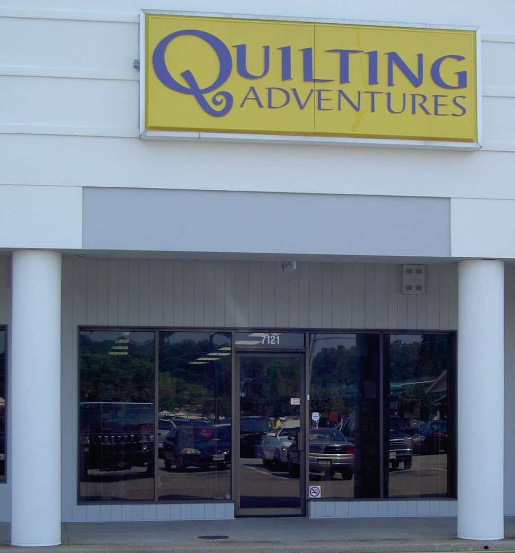
Pamelala is Pamela Allen, an artist who has come into her own in recent years using fabric and through quilts. Pamela came from a painting and assemblage/mixed media background. Her background includes classes that many quiltmakers never take: college level design classes. She brought this background and shared it with students at Quilting Adventures on Staples Mill Road in Richmond Virginia.
If you haven’t been to Quilting Adventures, make the trek. Joyce and her team have done a fantastic job selecting fabrics that speak to those of us who don’t do reproductions, small calicos or brown. You won’t see these varieties of fabrics at Quilting Adventures. If repros and brown are what you are looking for, Joyce and her staff will cheerfully direct you to other stores in the area that have the fabrics you need. There are lots of bright fabrics as well as many, many tone-on-tones. I could have bought the entire store. I did my best.;-) In addition to fabrics, Joyce also carries a nice selection of fabric alteration supplies: dyes, paints, fabric crayons. She carries the supplies, but also has samples of what happens to the fabric when you use the various supplies.
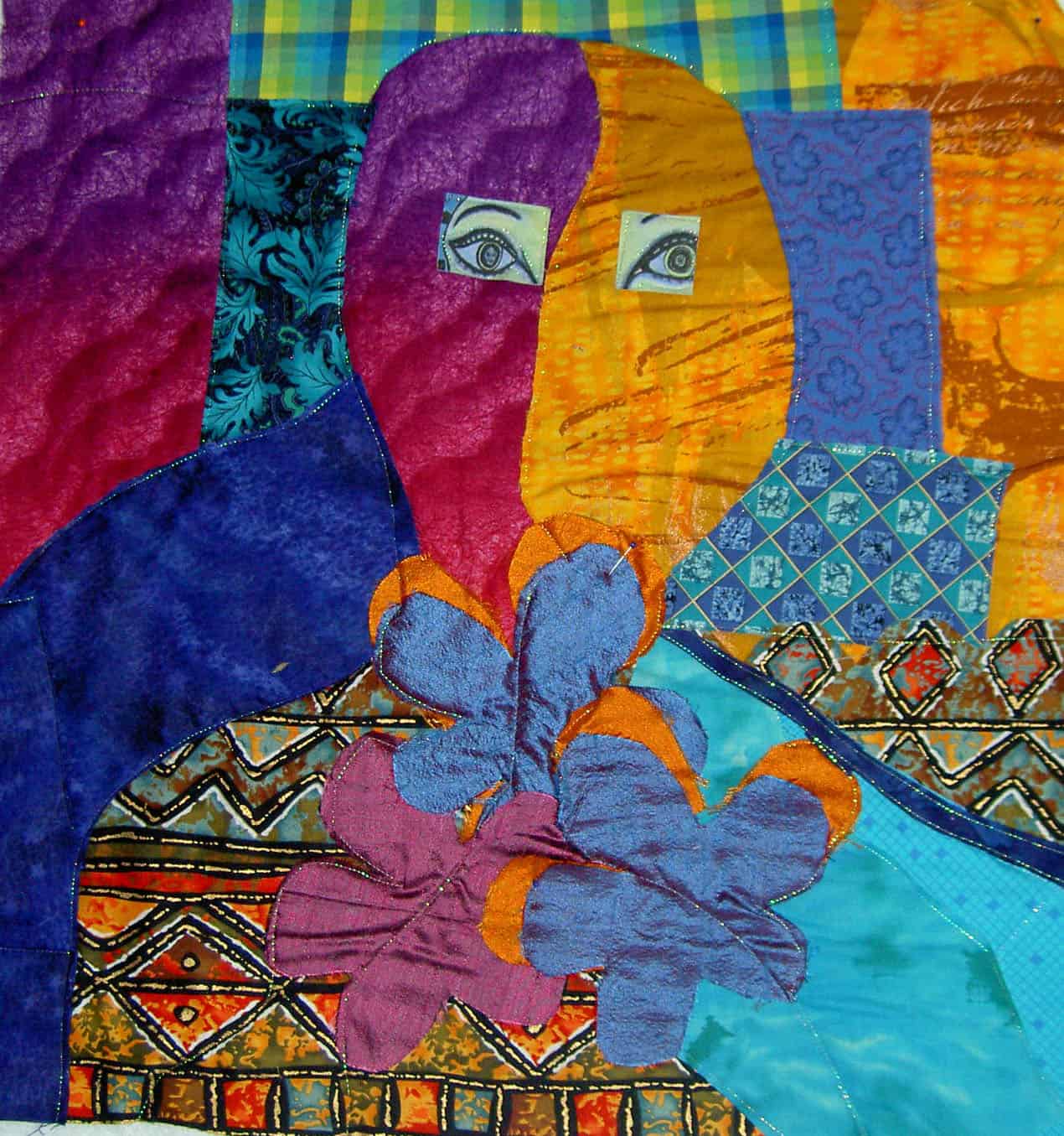
I took two classes from Pamela. The first, a fabric portrait class, was an exercise in negative space. The portrait I made is NOT a self portrait. We were given the assignment of working with the negative space first and later filling in the details. It was interesting to think about the fabric of the negative space defining the portrait. I have a hard time seeing the negative space, but I got some practice in during this class. I was able to use the Glitter thread from Superior on Joyce’s Babylock machine to appliquilt the pieces down. I have to figure out the hair (if any), the mouth and the nose (OH GOODNESS!!!). Pamela has a gentle manner in directing her students without being a doormat. She also has firm boundaries, which I appreciate and takes care of herself. I probably could have spent a week with her working on this piece. Of course, I didn’t finish, but am well on my way.
Self Portrait, in process
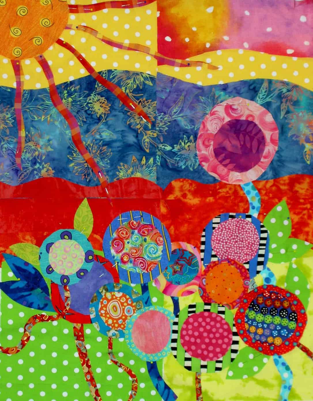
The second class was a class on composition. My piece is a garden and was limited by the distance I had to travel and the supplies I was able to bring. It also helps to remember to bring your supplies. 😉 Mrs. Kristen, a fellow Mavette, was quite generous in sharing her stash with me, so I was able to make a small piece.
Jaye’s Garden
First we assembled the background and then we laid our design on top of it. I used some of the leftover circles from the bullseye quilts and created a garden. This piece lends itself to hand stitching and I hope to be able to do some and complete this piece. During this time when the machine is better left under plastic, the timing is perfect. I’ll try to get to it. The piece is on its way to completion, but also not completed.
I would recommend classes with Pamela. She is a teacher who forces her students to think, is diplomatic about student work and gives the class the opportunity to work in a positive critique situation. She is an artist and also a teacher, not an artist who thinks s/he can teach. You can find more of Pamela’s work at her website.
Mark Lipinski is the editor and, presumably, creative genius, behind Quilter’s Home, a new quilt lifestyle magazine from Primedia. Lipinski is a fellow Quilt Maverick. In an effort at full disclosure I have to say that despite sharing cyberspace on this venerable list, I haven’t met Mark. I have also, unfortunately, only read a few of his posts.
Airplane rides are good magazine reading time so I picked up a copy of the premiere issue of his magazine at Joann’s after ordering one from my friends at Quilting Adventures. Yes, I know I will have two copies, but either I will cut one up or send one to St. JCN or both and really, I just couldn’t wait!
In general, I like the magazine. I think it gives a different twist to quilt magazines and brings quiltmaking out of the ‘hobby for quilters only’ area and into the mainstream decorating world. In addition to a few patterns, techniques and reviews, the magazine shows using quilts as decorative objects. The magazine is billed as being for quiltmakers, but I think it would appeal to non quiltmakers, especially home dec fans, as well.
One aspect that I especially appreciated was the writing. There is a cohesive voice in this first issue, but the writers also tied their styles together well. Perhaps this is what editors do?
The layout and colors were really well done as well. I liked the scrapbook like splashes of color across the pages. It draws your eye around and makes the layout interesting. I especially noticed this on the “Souvenir Hankies” article. The color of the title picks up the color in some of the hankies.
I thought there was a nice range of articles related to quiltmaking, if not completely about quiltmaking. The big YAYs were the fact that there was NO section on how to make a quilt. Thank goodness Mark resisted Primedia’s probable pressure to include two paragraphs on quilting your quilt. There are enough magazines and books out there telling beginners how to make a quilt in 3 paragraphs. I am in favor as much as the next girl of getting people into quiltmaking, but how often do we have to publish incomplete directions on how to make a quilt? [Come back and look at this post, because I know this is a soapbox that I will have to stand on one day. When I do, I will put the link HERE as well]
Of course, the mag doesn’t serve all of my “needs.” One thing I would like to see is a review of blogs. Mark and crew did have a list of quilt related podcasts, which is COOL. I can’t wait to see what they are about. Perhaps, Quilter’s Home will choose blogs as their next medium to review? I think there are way too many blogs to include in one issue. I hope that it would be a short regular piece of the magazine… at least for a as long as blogs are around.
While there was only one pattern (YAY again, go somewhere else for patterns!), I thought it was an interesting and unusual pattern. Not a difficult pattern, but also not a 9 patch or an Ohio Star. They tied the pattern into an article that covered the Great San Francisco Earthquake and Fire as well as genealogy. I thought this approach was very well done. I would like them to continu, if not expand this aspect. My ideal would be a column or regular feature on how to take a pattern you find in everyday life (Gradma’s quilt, a mosaic stoop or an ad in the newspaper) and make it your own. Another aspect could be how to take a block you like, change the size and turn it into a quilt or wallhanging. There are enough patterns in this world to choke a horse. I don’t need anymore.
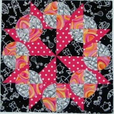
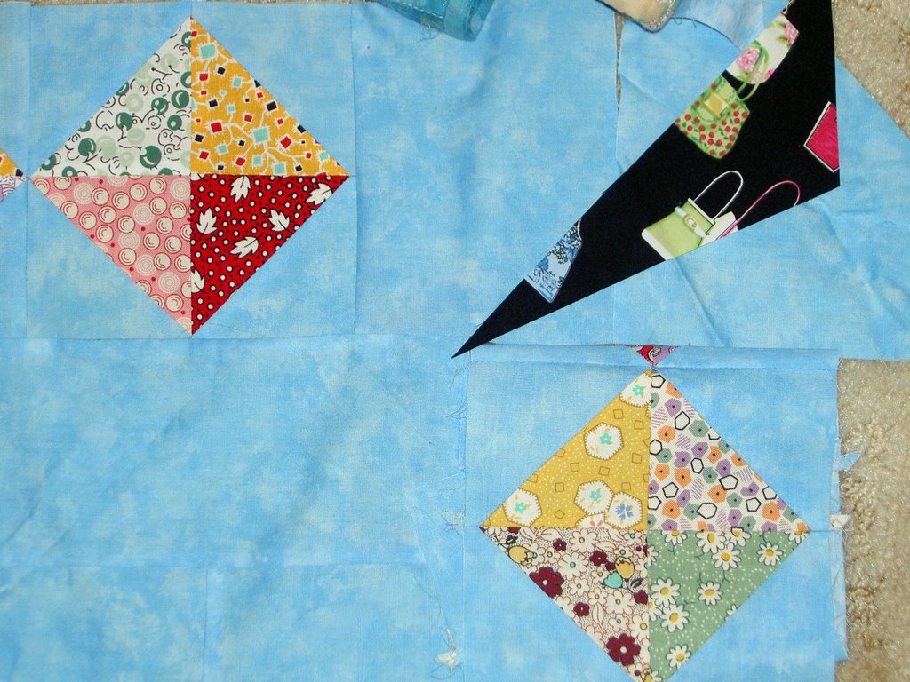
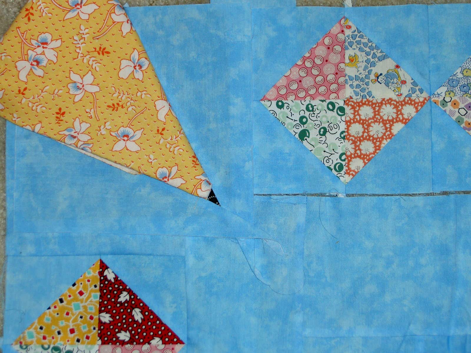
Additionally, I would like to see some of the more complex, unusual and interesting blocks highlighted in their historical context as well as, perhaps, a gallery of quilts or wallhangings or sample blocks made by readers in that pattern. I am thinking of the Laura Wheeler Snowball Wreath block I found on eBay. See a photo below of my rendition of this block pattern.
Snowball Wreath by Jaye
Mark did have an article on diet and exercise for quiltmakers, which I thought was a) an enlightened idea for an article; b) a great public service; and c) listed good ideas for keeping the weight off. I did, however, get the impression (and correct me if I am wrong) that it set an underlying tone of self deprecation for the entire issue. I don’t like self deprecation in anyone and don’t want to see it in a magazine. I believe that everyone is fabulous the way they are. If a person wants to improve themselves, more power to them, but nobody should be made to feel like a lesser person because someone else says they should be fatter, thinner, prettier, uglier, etc. I am sure that Mark is struggling with the difficult position of being a man in a predominantly female hobby and doesn’t want to come across as too arrogant. Mark, you ROCK the way you are!
I was pleased to see some sources of creativity and inspiration displayed, such as Vera Wang. It is great to think about how another media or designer can influence a quiltmaker or quiltmaking. Not enough attention is given to inspiration and creativity, so this was a great choice of article.
In that vein, the article entitled 111 Ways to Jumpstart your Creativity was excellent. As you have probably noticed from some entries here on Artquiltmaker, I am adamant that you have to look at everything in order to get inspiration. The Greek embroideries at the Textile Museum were very interesting. There is a turquoise, hot pink and seafoam green quilt in my future, I think, as a result of looking at them. Many of the sources listed in the article were sources already on my radar, but it is great to get a reminder. I would have liked to have seen more visual examples of the sources of creativity. Little squares to the right of the text showing examples of the editors’ entries would have added to the article. It may, however, have cluttered up the fine layout of the page. They mention holiday ornaments, why not have a picture of one? Mosaic-show an example of a piece of the mosaic and give a URL for the whole piece. The end part of the article discusses flea markets, which confused me a bit. Do the editors mean that we should be inspired by a flea market or what we find there? The latter, I assume, but one can never tell. One thing I didn’t see on the list was grillwork. Did I miss it?
I also liked the concept of the real room makeover. I would have liked to know to whom the room belonged. Was it a real room or a staged room? Was it the master bedroom of one of the editors? Was it Mark’s guest room? More info, please. Perhaps he could take readers rooms and have his designers make them over? After my construciton is finished, I would volunteer one of my rooms. Heck! They need redoing anyway!
I am not really sure what to think about the article about the medium talking with Jane Stickle. Was it for real? It was definitely different. If true, it is very interesting. I am inclined to lean towards true since the “discussion” with Jane Stickle was rather vague.I have no experience in that area, so I’ll let my faithful readers draw their own conclusions.
One ad displayed Martha Negley fabric and shows an interesting coffee print. I have o shortage of coffee prints that I am not using, so I will have to see if it comes in different colorways for curtains or napkins or something. I didn’t find any of the other ads particularly interesting. They are the same as in QNM and the AQS magazine. No big surprise there.
The book reviews are placed in interesting locations, which draw your eye around the different pages.
I couldn’t appreciate the cat in the studio article as I am petless and wouldn’t stand for the rummaging around that pets do. I don’t allow it for anyone else so why would I allow it for a pet? I have to say that the article was well written and had an interesting voice. I know there are many quiltmakers with pets and I refuse to judge the whole magazine by one article.
The rotary cutter comparison article was great. I had a hard time finding the detailed review descriptions, but once I did the information was really helpful. They make an important point upfront about people never testing rotary cutters themselves, because of the cost of rotary cutters. I especially liked the Mark’s Posse aspect. I think that idea epitomizes the way people learn about stuff: from their friends.
The Souvenir hankies article reminded me of a feature in the Mary Englebreit magazine. It was nice to see it, but it is not an aspect of the magazine that I think is critical. Could I use these hankies in a quilt? Should I use these hankies in a quilt?
I have to say that I am disconcerted by the fact that this mag is published by Primedia. Primedia has nearly ruined Quilter’s Newsletter Magazine. In all fairness, the decline started after Bonnie Leman left. Some freshening up of the layout has been good, but I fear that venerable lady will be dead soon. I hope that Primedia doesn’t have too much say in the direction of Quilter’s Home.
In any case I would buy another copy or the next issues. No subscription card for this mag was included in the issue. We’ll have to stay tuned. Thanks and NICE WORK to Mark and the gang.
I spent the day in a class at Quilting Adventures in Richmond, VA with quilt artist, Pamela Allen. Pamela is from Canada and you can see much of her work at her website.
If you haven’t been to Quilting Adventures, drop what you are doing and go. The shop is great: bright colors, fabulous samples of dolls, quilts and what paints and dyes look like on fabric as well as examples of what you can do with them. Joyce and her team have done an outstanding job with the shop. They are not all things to all quiltmakers, but I think everyone could find something there!
In the class, the topic was Mavericky portraits. Mine is not a self portrait, and is clearly not complete. I took the above photo before I started to quilt it. I “appli-quilted”, which is to say I appliqued the pieces down as I quilted them.
It was a rocky road to quilting as I wanted to use the Glitter thread, but had used very fat batting. I took my initial attempts at stitching out after several frustrating thread breaks. Joyce, the owner of QA, calmly and ably assisted me and replaced the batting with thinner batting and the quilting went much more smoothly. I was able to finish all I wanted to on one machine.
People may be afraid of Glitter, but it is wonderful thread. It gives the sparkle of metallic threads without the headaches. I have tried it, now, on three different machines with minimal issues. It does not like the fat batts, though.
I still want to do some work embellishing, the silk flowers especially need centers of some kind. I also need some kind of hair, but perhaps I will leave her hairless. She is very much still in progress and her personality is not developed, so we will see what comes next.
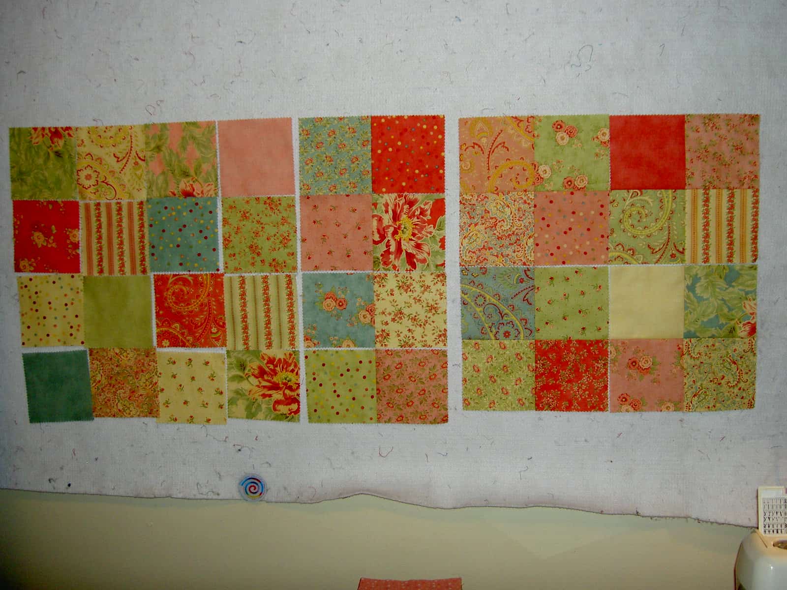
Also, during TFQ’s visit, I worked on the Moda squares I got from Hancock’s. I decided on the final arrangement and started sewing them together. More than 20 days later, they are still in the same state. I will get back to it in another month or so.
I decided to get more of the squares, after St.JCN suggested it, and make the piece a little bigger. I was thinking about how I would arrange the new batch of squares. My idea now is to arrange them the same way, but turn the whole arrangement upside down and then sew it to the original group. Since I have not made this decision visually yet, we will have to see once the squares arrive.
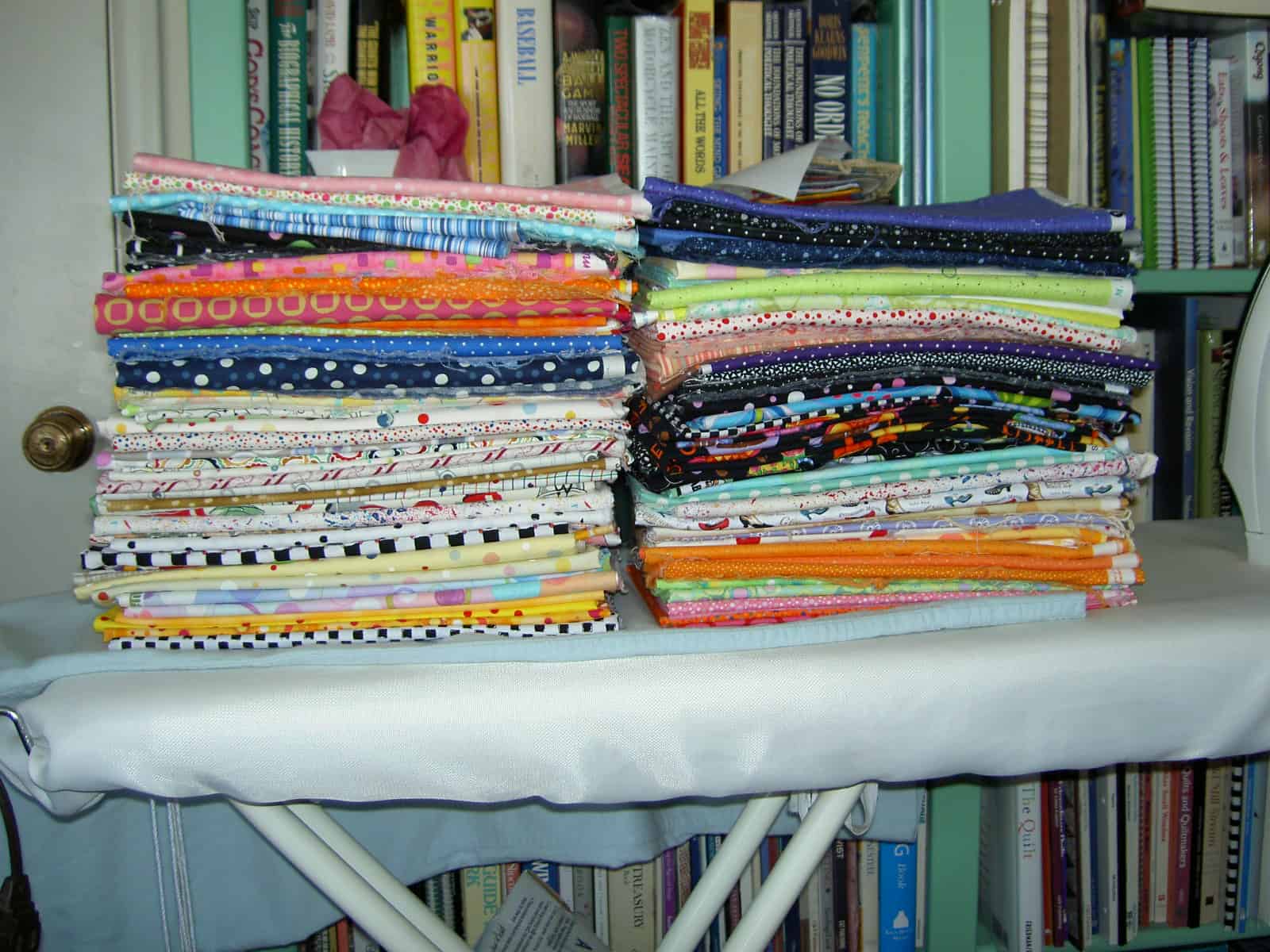
One of the benefits for me of my friendship with St.JCN is that she doesn’t mind ironing and pressing. Above is the great unwashed clean and pressed and ready for use! I had nothing to do with these neat piles of fabric. St.JCN pressed and folded it all.
She was quite disgusted that I had not washed all the fabric and packed it up and took it home with her to wash and press there. The fabric will also stay and play with its friends until the chaos here at home dies down.
Some time has gone by since I last wrote and I hope my faithful readers have not given up on this blog. Since I last wrote, I haven’t been doing much of anything creative. However, the top for the Nosegay is finished! St. JCN’s visit was the first weekend in May and extremely productive in a lot of ways. Although we did not get to do everything we wanted (we never do!), we did get to do a number of fun things on the list, one of which was finishing the Nosegay.
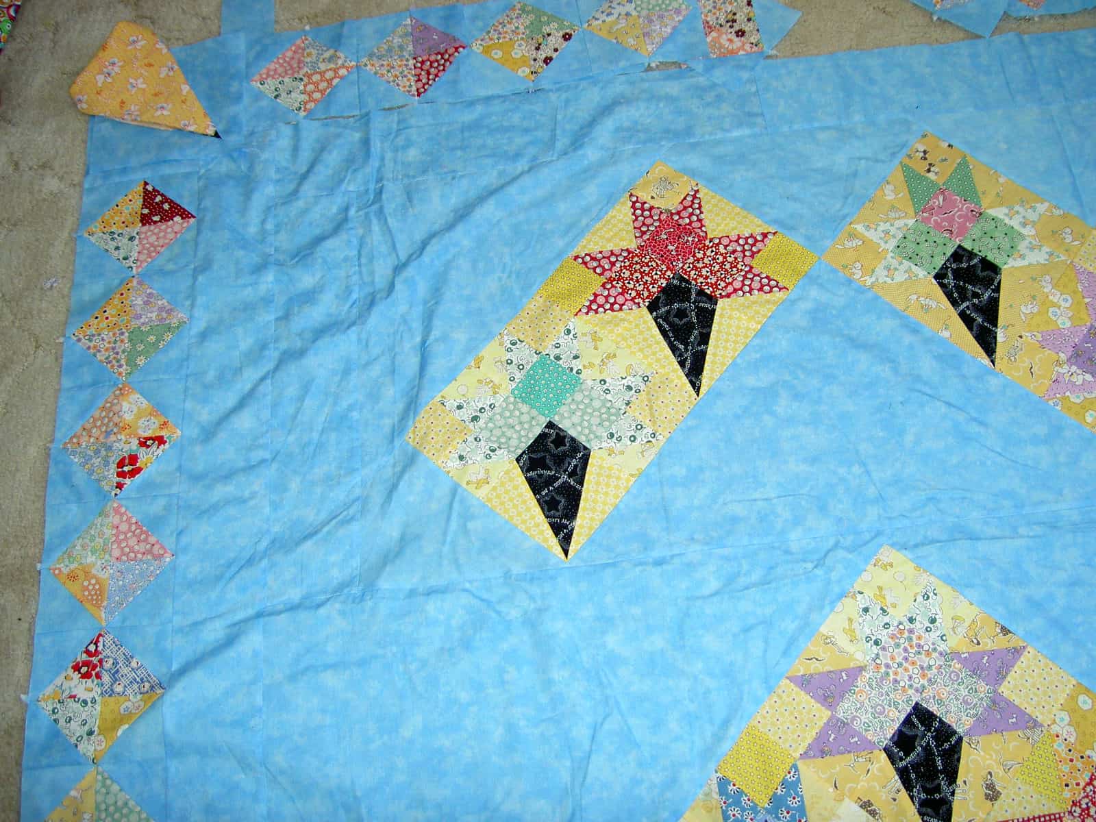
The Nosegay was started in a class with Doreen Speckman at Black Cat Quilts. It was the last class she taught at Black Cat before she died. This class was held in about 1997 or 1998. I worked on it on and off, but fairly steadily until I came to the border. The quilt is huge and, thus, unwieldy to work on alone. St. JCN has helped me on and off but other quilts took precendence since the 90s and the Nosegay was relegated to the closet. At some point a few years ago, in an attempt to move the project along, we made border blocks. St. JCN is very good at helping me work through problems. She is also generous with her time and excellent at keeping me on track. We (I?) decided that the time had come to deal with Nosegay. First we looked over all the notes I had from the past efforts (I keep a file on each quilt and stuff everything related to it in the file). One note had been on my bulletin board so long that the ink had faded to a point where we could no longer read it! We also measured the border blocks and the quilt itself. We discussed how to get the border blocks to fit and tried a couple of different options.
I did like the black, in theory, as it echoed the cone in each of the Nosegay blocks, but it really looked like a big blob of black in each corner. The other colors are very pastel-y, thus we thought it was important to watch how the black fit in. I also liked the idea of a different shape in each corner to take the viewers mind off of the fact that the border blocks didn’t fit perfectly.
The yellow looked nice in the corner and was pastel so it worked with the other colors. It also fit with my concept of the different shape to draw attention away from the spacing issue, but again we had the big blob problem. A big blob of fabric in the corner drew too much attention to the area we wanted to mask.
Finally, we selected the above arrangement of border blocks as the best option. Even though the spacing isn’t even when you get to the corners, the blocks being similar draws less attention to the problem area.
Lorraine Torrence is one of my favorite teachers. She is organized, not sentimental, friendly in a professional way and provides useful information. One of her precepts, which has proven very useful to me, is “make visual decisions visually.” This means that a quiltmaker needs to make design decisions by looking at how the design will look IRL before starting to sew and cut. I did this with the black and yellow options above. In the case of the black, I actually sewed a few blocks and we tried them out. In the case of the yellow, St. JCN and I folded the fabric in some semblance of how the block would look. This is a much better method than just thinking it would look good. If I hadn’t looked at the design visually, I would have probably gone with the black and ended up with blocks that drew attentio to an area, I really didn’t want anyone to notice.
There are some ugly and inaccurate words and generally accepted principles in quiltmaking. Here is my opinion about them
* Stash implies we are doing something sordid or illegal. I prefer palette or materials.
* The term ‘Quilting‘ does not acknowledge all the aspects that comprises making a quilt. Whenever I hear the word quilting, I think of the process of putting three layers together. I understand that the same terms are often used for different, but related concepts. Still, I don’t often do my own quilting; I prefer to be called a quiltmaker rather than a quilter.
* A lot of quiltmakers are nice people. I don’t assume that all are. I have been at shows where the police have been called and people are shocked when a quiltmaker is taken away for shoplifting. Quiltmakers are people like every other group.
*While I may have something in common with others who make quilts, I don’t automatically assume that every quiltmaker is my friend. Friendships are developed and nurtured.
* Design is given short shrift in quiltmaking. A good design is everything. If you have a beautifully executed quilt with poor design, it doesn’t matter how great the design is.
* Hand-dyed fabric is not always the be-all end all. People can make gorgeous quilts without hand-dyes. In your artist statement, please do not include how much hand-dyed fabric you used. We all know what hand-dyed fabrics look like and can tell. Do a great design and tell us your inspiration. We will admire your hand-dyed fabric along with the design.
Kathan Brown is a printmaker and author of a book called Magical Secrets about Thinking Creatively. She is also the founder of Crown Point Press. At the de Young, they had an exhibit of Crown Point Press prints. On the legends I noticed some of the magical secrets, which made some sense or were interesting to think about so I started to write them down. I stopped when I found a brochure. The Magical Secrets are listed at www.magical-secrets.com.
Seeing these ‘secrets’ made me think that creativity is a lifetime experience and that you have to work at your creative work.
I like the idea of Magical Secrets of Creativity. It makes me wonder if people have their own ideas about creativity and where people’s ideas intersect. I want to think about Brown’s ideas and see if they work for me.


