
Response: Glimmer - Response: Glimmer

Again, I was influenced by SherriD’s ‘glimmer’ response. I am working on adding lots of details.
Commentary about works in progress, design & creativity
I decided that I would write one big long post to catch up, because I seem to have bunches of photos yet to post. I don’t want to say “oh 3 weeks ago, I made this and that.”

Another idea for the curvy coffee pot embellishment. My mom told me that steam goes down first and I should put the hearts below the exit to the spout. I tried it, took a picture and above is the result. I prefer the other view, Fluttering Hearts, regardless of whether or not steamreally goes up or down. I think I am really getting sick of this obsessing about the Tarts. I got home from my week away, saw the Tarts on my design wall and just sighed. I thought to myself “oh brother, just make a decision about the &*(^%$ hearts and move on already!” Perhaps it is time to just applique’ the hearts on the curvy coffee pot and move on. Perhaps I will start on the back and that will give me renewed energy around this project?

TFQ has these wonderful mirrors at her house. They are made by an artist named Kathe. I love the glass beads and blobs and shards she uses to create her designs.

I like the sun at the top of the one above. Notice the two different color schemes?

Above are the most recent FOTY blocks. I made them before I left on my travels. I have a month and a half to wash, press and cut pieces from my new fabrics. As I have mentioned, I want to be ready to make the FOTY 2009 at the CQFA retreat in January. I had better not buy anymore fabric. 😉

Here is another Sorbet block. I made it in between trips. I call it 3 Columns, for obvious reasons. It may have another name. I don’t think it is really that easy to make up new blocks, but I also haven’t looked it up in Barbara Brackman’s block book. I will sometime. Let me know if you know the real name. I still have not looked at the fabrics again to see what other colors I need to add. I am limping along with this project.

I have been cutting green strips since about July as I press fabric. I have also been saving shards in order to make ornaments. I usually make a few every year, but don’t seem to have taken any photos to show you. I’ll have to put that on my list of things to do.
See the Creative Prompt page if you have questions about this project.
Post the direct URL where your drawing, doodle, artwork is posted (e.g. your blog, Flickr) in the comments area of this post. It will keep all the artwork together.
The Creative Prompt Project, also, now, has a Flickr group, which you can join and where you can post your responses.
Core strength.
Apple core.
The Earth’s core.
Intel Core 2 Duo.
Andromeda’s core.
Core curriculum.
Getting at the core.
Core compentancies.
Core knowledge.
Core values.
Core data.
There is more information on the recently updated Creative Prompt Page.
I found a new blog recently, after listening to a recent CraftSanity podcast. The interview is with Liesl, the owner and designer of the pattern company Oliver + S. They produce patterns for children’s clothing in a “contemporary classic style.” After listening to the podcast, I decided to wander over to her blog and found that it might be one to visit regularly.
I loved the photos in this post about one of the subway stations in New York. I adore mosaics, so this lighthearted art was right up my alley.
In another post, she has a funny exchange with her daughter about a blue silk winter coat. Liesl’s blog is worth a look.
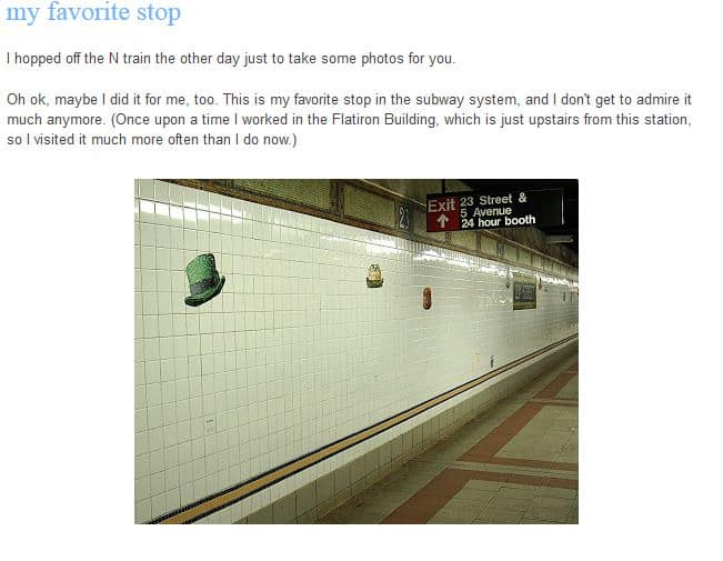
Take a look at the post that discusses the photo above.
Liesl + Co is the parent company of Oliver + S. The former is the company that put out The Day in the Park Backpack tote that I bought last year at PIQF.

I have to admit that I looked at Quilt Rat’s response for one of the other prompts and it did influence me. I was thinking a lot about the Genie and receiving 3 wishes.

An oldie, but a goodie: feather. I am trying to get back on track and get my responses posted.
|
This is a really short review that I may beef up later. Pat Sloan’s book on color is easy to read, though it will take more time if you go through the exercises.
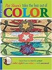 Pat Sloan’s Take the Fear Out of Color by Pat Sloan
My rating: 4 of 5 stars
I liked this book, because:
1. she had the same quilt pattern made in different fabrics. This is a great technique, because it is easy to dismiss a pattern when a quiltmaker doesn’t like the fabrics. By showing different fabrics, the reader can overlook one of the colorways that may not appeal.
2. she didn’t talk much about value. It isn’t that I don’t think value is important, but I think that people can get bogged down by value if they are just starting out with color. Pat really gives the reader confidence to make color choices.
3. she didn’t bad mouth other ways of choosing color. All ways are valid and Pat shows her way and doesn’t bill it as anything different.
4. she encouraged the reader to start with colors that s/he likes
5. she uses an inspiration notebook to start.
It is bright and cheerful book as well.
There are projects included which I just used to expand my view of what the author was saying.
Today is another travel day for me. I am heading home after a week away. I have sewn and relaxed and been allowed to just be. All of my normal stuff is on hold until tonight or tomorrow or whenever it calls loud enough for me to pay attention.
This is my last trip of the year and my last trip for awhile. Now I get to settle in at home and try to enjoy the holidays.

TFQ is working on two hexagon projects. The one above looks like sorbet or sherbet. It is so wonderful to look at. She is also working on a 1930s hexagon project, which is her main focus right now.
She works in a similar manner to me in that she explores the process and technique thoroughly as she works on it.

Above is some additional fabric I bought at the Quilting Loft in Ballard and at the new shop in Magnolia called Fabric Crush. The dot fabric is an oilcloth and I plan to make a Multi-tasker tote in the original size whether or not I decide to abandon that pattern completely. In carrying around the Julie tote in the rain, I found that something with a waterproof bottom would be very nice. I am missing my clear tote bag.
Fabric Crush had a fresh look and feel. They are still stocking their store, but everything was fresh and new and wonderfully displayed. It is worth a look. I went into a bookstore as well and saw some restaurants nearby also.
I bought the black and white print for some other bag, but am thinking it would make a nice skirt as well. My SIL once explained to our husbands that we didn’t see masses of fabric in the quilt store, but finished projects and possibilities. So true. Now I just need to make some of those dreams a reality.
One of the fabulous things about visiting TFQ is the plethora of books and magazines in which I can indulge and explore. This trip is no exception. She had a bunch of magazines and books for me toperuse. I already talked about some of the books and look for a review of Pat Sloan‘s color book, which was new to me. By the way, Pat has some Aurifil thread boxes shown on one of her recent blog posts. Really cool looking.
I tried to resist reviewing the magazines, but was unsuccessful. I am so disappointed in the recent quilts and projects and COLORS shown in fall and winter issues of some magazines.
One thing is the colors that dominant the issues. Grim. Grim. Grim. I love Fall. When I was out and about yesterday and the day before I noticed the GORGEOUS colors of the leaves on the ground.

Does this look grim to you? Not to me. Look at all that yellow! Look at those dashes of red. Yes, there is black moldy yuck on the bottom, but imagine a cool black and white print for that bit of a quilt.
The first magazine I looked at was the Quilt Sampler. This magazine has an interesting concept, because they introduce readers to quilt shops all over the country. You probably knew that. Using this magazine, I found a great shop in Virginia I could visit while I was back east last year.
This issue, however, is grim… lots of brown, taupe, beige, olive green. Bleah. Not what I need as the sky turns grey and the days get shorter. Yes, there is a pink project and a cool blue quilt pattern as well as color options with lime and yellow. The overall feeling of the issue is brown.
The cover of the new Fons and Porter magazine has a very interesting block. The center block below is rich and complex.

The color option on the inside is even better: black setting triangles with a combination of white, lime and pink.
The rest of the magazine, barring two redeeming articles, has grim colors and uninspiring projects. TFQ made some good points when we were discussing the issue of ‘grim’:
1. There are people who find these projects inspiring (if you are out there, I want you to let me know why you love these colors and projects, because I want to learn!)
2. If a magazine publishes a simple project, they cannot add a more complex variation without giving the impression that the simpler option is lesser. If they suggest that a reader is not up to the challenge of the harder version, they will lose readers. Another excellent point.
3. There are lots of projects for beginning quiltmakers and not much in the magazine arena for more advanced people. We are a hard lot to pin down, because of our experience. The magazines are in the business of selling magazines, fabric, tools and kits. They are not in the business of making me happy.
4. It is hard for some people, and I have to catch myself at this, to imagine a quilt pattern in different color ways.
The two articles in the Nov/Dec issue of Fons and Porter that I liked were Gerald Roy’s column discussing antique quilts. This issue has a discussion of a few 9patches. One of them is yellow and blue with neon oranges centers and background set in a Streak of Lightning type set. FABULOUS! I would buy a book of his columns from this magazine. I think they are great!
There is also a column called Art of Quilting by Kirsten Rohrs Schmitt called Vintage Vehicles. No patterns, just a discussion of a variety of different quilts depicting vintage cars and motor cycles. One quilt, by Tracey Pereira called the Mini Job (click on the link and see it on her website). It is done on a longarm with thread and then colored with Derwent Inktense coloring pencils. I was really interested to read about that process!
There is a pattern in this issue for an 8 pointed star quilt in Coral Gables Christmas colors (aqua and pink). Not grim.
Reader question: what quilt magazines do you like and why?
Finally, TFQ had the Fall 2009 issue of Quilts & More. The first time I saw this magazine, a few years ago, I found the colors fresh and cheerful. Since that first experience I have picked it up at the store to make the bags pictured and to be inspired by the quilts and colors. This particular issue: grim.
Granted, Q&M is less grim than the others and it has some interesting things to look at such as the yo-yo pillow and the Triple Play pillow article, but, again, the colors are just not me. TFQ bought it because of the Daisy Dazzler tote bag pattern, which I also like.
Reader question #2: OK, readers, I, obviously, need an attitude adjustment about the lumpy colors, so tell me what you enjoy about browns and their cousins, beige, taupe, olive, natural, tan, etc. Do these colors make you feel cheerful and if so, why?

When I was at SFO last Sunday my flight was in the international terminal which I am not in very often. That is a new terminal and really light and airy. Before I got on the plane and was confined to my seat for an hour, I took a tour around the area, looking at the shops and the people.
I also saw this piece of art. I was attracted by the dimensionality. Then I saw the white part in the background and it reminded me of cutting paper using scrapbook punches, so I took a closer look.
I was thinking that it would look very cool to do some kind of fabric cutting like that and layer it on top of a background. I could follow up with some more work on top. Not sure what, though. I am a big proponent, in case you haven’t noticed, of looking at the world around you and being inspired.


|
See the Creative Prompt page if you have questions about this project.
Post the direct URL where your drawing, doodle, artwork is posted (e.g. your blog, Flickr) in the comments area of this post. It will keep all the artwork together.
The Creative Prompt Project, also, now, has a Flickr group, which you can join and where you can post your responses.
There is more information on the recently updated Creative Prompt Page.
Make a wish
Make-A-Wish Foundation
A hope or desire for something.
If you rub the lamp, a genie will give you three wishes
WISH – a TV station in Indianapolis
Nine Inch Nails performs Wish
Wish you were here (song by Pink Floyd of the same name)
Wish bone
Wish-bone salad dressing
What is on your wish list?
I wish I had thought of that!
Wish upon a star
Wishing well
Wish you well
I realized that one of the reasons I like making the same tote bag pattern over and over is that I am trying to understand it. I want to understand it so I can change the pattern to suit my needs and also incorporate the techniques into my own design bag of tricks.

The Anna Maria Horner Multi-tasker tote is no exception. As I mentioned in a previous post, I love the way this tote goes together. Above is my completed Multi-tasker tote #2. This will be a gift for a friend of mine. I used Lonni Rossi’s new fabric line in the black and white colorway. You can buy them at Back Porch if you want some.
I used a FQ pack and had to piece some of the fabrics together to make them large enough to fit the pattern pieces. The pattern calls for more yardage than an FQ pack, however I only had a FQ pack of the fabrics and am always up for a challenge.


I always enjoy using TFQ’s Bernina 1230. It is a tough little machine that has never really given me any problems. Now I know how to wind the bobbin and rethread. TFQ better watch out or I’ll just take it over! 😉
It doesn’t have the bells and whistles that mine does (I miss the auto needle up button!), but it does bags very well. I also like the button holer.
I always have a tough time maneuvering the fabric through the sewing machine as the layers increase. Towards the end of the process I was sewing through about 8 layers of fabric or seams or interfacing. I found that TFQ’s machine was powered right through with no grunts, groans or complaints.

The pattern doesn’t call for as much interfacing as I put in, but I like my bags to have some body, so I put interfacing on the exterior and lining pieces. I omitted it from the pocket panels.
I am pretty pleased with how it came out and hope my friend is as well. I am going to size this pattern down so it fits me better. If it doesn’t work, then I probably won’t make anymore of these totes, despite the great way they go together.
I am also working on a Chubby Charmer tote. Stay tuned!


