This is a really short review that I may beef up later. Pat Sloan’s book on color is easy to read, though it will take more time if you go through the exercises.
My rating: 4 of 5 stars
I liked this book, because:
1. she had the same quilt pattern made in different fabrics. This is a great technique, because it is easy to dismiss a pattern when a quiltmaker doesn’t like the fabrics. By showing different fabrics, the reader can overlook one of the colorways that may not appeal.
2. she didn’t talk much about value. It isn’t that I don’t think value is important, but I think that people can get bogged down by value if they are just starting out with color. Pat really gives the reader confidence to make color choices.
3. she didn’t bad mouth other ways of choosing color. All ways are valid and Pat shows her way and doesn’t bill it as anything different.
4. she encouraged the reader to start with colors that s/he likes
5. she uses an inspiration notebook to start.
It is bright and cheerful book as well.
There are projects included which I just used to expand my view of what the author was saying.
Today is another travel day for me. I am heading home after a week away. I have sewn and relaxed and been allowed to just be. All of my normal stuff is on hold until tonight or tomorrow or whenever it calls loud enough for me to pay attention.
This is my last trip of the year and my last trip for awhile. Now I get to settle in at home and try to enjoy the holidays.
TFQ's Hexagons
TFQ is working on two hexagon projects. The one above looks like sorbet or sherbet. It is so wonderful to look at. She is also working on a 1930s hexagon project, which is her main focus right now.
She works in a similar manner to me in that she explores the process and technique thoroughly as she works on it.
QL Fabric, Nov. 2009
Above is some additional fabric I bought at the Quilting Loft in Ballard and at the new shop in Magnolia called Fabric Crush. The dot fabric is an oilcloth and I plan to make a Multi-tasker tote in the original size whether or not I decide to abandon that pattern completely. In carrying around the Julie tote in the rain, I found that something with a waterproof bottom would be very nice. I am missing my clear tote bag.
Fabric Crush had a fresh look and feel. They are still stocking their store, but everything was fresh and new and wonderfully displayed. It is worth a look. I went into a bookstore as well and saw some restaurants nearby also.
I bought the black and white print for some other bag, but am thinking it would make a nice skirt as well. My SIL once explained to our husbands that we didn’t see masses of fabric in the quilt store, but finished projects and possibilities. So true. Now I just need to make some of those dreams a reality.
One of the fabulous things about visiting TFQ is the plethora of books and magazines in which I can indulge and explore. This trip is no exception. She had a bunch of magazines and books for me toperuse. I already talked about some of the books and look for a review of Pat Sloan‘s color book, which was new to me. By the way, Pat has some Aurifil thread boxes shown on one of her recent blog posts. Really cool looking.
I tried to resist reviewing the magazines, but was unsuccessful. I am so disappointed in the recent quilts and projects and COLORS shown in fall and winter issues of some magazines.
One thing is the colors that dominant the issues. Grim. Grim. Grim. I love Fall. When I was out and about yesterday and the day before I noticed the GORGEOUS colors of the leaves on the ground.
Leaves with Flash
Does this look grim to you? Not to me. Look at all that yellow! Look at those dashes of red. Yes, there is black moldy yuck on the bottom, but imagine a cool black and white print for that bit of a quilt.
The first magazine I looked at was the Quilt Sampler. This magazine has an interesting concept, because they introduce readers to quilt shops all over the country. You probably knew that. Using this magazine, I found a great shop in Virginia I could visit while I was back east last year.
This issue, however, is grim… lots of brown, taupe, beige, olive green. Bleah. Not what I need as the sky turns grey and the days get shorter. Yes, there is a pink project and a cool blue quilt pattern as well as color options with lime and yellow. The overall feeling of the issue is brown.
The cover of the new Fons and Porter magazine has a very interesting block. The center block below is rich and complex.
Fons &Porter Dec. 2009
The color option on the inside is even better: black setting triangles with a combination of white, lime and pink.
The rest of the magazine, barring two redeeming articles, has grim colors and uninspiring projects. TFQ made some good points when we were discussing the issue of ‘grim’:
1. There are people who find these projects inspiring (if you are out there, I want you to let me know why you love these colors and projects, because I want to learn!)
2. If a magazine publishes a simple project, they cannot add a more complex variation without giving the impression that the simpler option is lesser. If they suggest that a reader is not up to the challenge of the harder version, they will lose readers. Another excellent point.
3. There are lots of projects for beginning quiltmakers and not much in the magazine arena for more advanced people. We are a hard lot to pin down, because of our experience. The magazines are in the business of selling magazines, fabric, tools and kits. They are not in the business of making me happy.
4. It is hard for some people, and I have to catch myself at this, to imagine a quilt pattern in different color ways.
The two articles in the Nov/Dec issue of Fons and Porter that I liked were Gerald Roy’s column discussing antique quilts. This issue has a discussion of a few 9patches. One of them is yellow and blue with neon oranges centers and background set in a Streak of Lightning type set. FABULOUS! I would buy a book of his columns from this magazine. I think they are great!
There is also a column called Art of Quilting by Kirsten Rohrs Schmitt called Vintage Vehicles. No patterns, just a discussion of a variety of different quilts depicting vintage cars and motor cycles. One quilt, by Tracey Pereira called the Mini Job (click on the link and see it on her website). It is done on a longarm with thread and then colored with Derwent Inktense coloring pencils. I was really interested to read about that process!
There is a pattern in this issue for an 8 pointed star quilt in Coral Gables Christmas colors (aqua and pink). Not grim.
Reader question: what quilt magazines do you like and why?
Finally, TFQ had the Fall 2009 issue of Quilts & More. The first time I saw this magazine, a few years ago, I found the colors fresh and cheerful. Since that first experience I have picked it up at the store to make the bags pictured and to be inspired by the quilts and colors. This particular issue: grim.
Granted, Q&M is less grim than the others and it has some interesting things to look at such as the yo-yo pillow and the Triple Play pillow article, but, again, the colors are just not me. TFQ bought it because of the Daisy Dazzler tote bag pattern, which I also like.
Reader question #2: OK, readers, I, obviously, need an attitude adjustment about the lumpy colors, so tell me what you enjoy about browns and their cousins, beige, taupe, olive, natural, tan, etc. Do these colors make you feel cheerful and if so, why?
When I was at SFO last Sunday my flight was in the international terminal which I am not in very often. That is a new terminal and really light and airy. Before I got on the plane and was confined to my seat for an hour, I took a tour around the area, looking at the shops and the people.
I also saw this piece of art. I was attracted by the dimensionality. Then I saw the white part in the background and it reminded me of cutting paper using scrapbook punches, so I took a closer look.
I was thinking that it would look very cool to do some kind of fabric cutting like that and layer it on top of a background. I could follow up with some more work on top. Not sure what, though. I am a big proponent, in case you haven’t noticed, of looking at the world around you and being inspired.
Quilt Rat Jill has been doing some wonderful CPP work. Recently, I was over at Finishing Lines, Kathy Perino’s blog, and saw what Jill had done with some of her Prompt Responses. What a wonderful way to extend the creativity!
Really. Just for admiring the Quilt Rat’s talents she sent me a package full of treasures. She is our friendly neighbor from Canada and if you haven’t already – I hope you go visit her page. She is multi talented and always has tid bits to share about her fiber art and quilting. Recently, she had a great recipe for treating fabric before printing. So go check her out here…..
Quilt Rat has been participating in the CPP and has turned some of her doodles into post cards.
See the Creative Prompt page if you have questions about this project.
Post the direct URL where your drawing, doodle, artwork is posted (e.g. your blog, Flickr) in the comments area of this post. It will keep all the artwork together.
The Creative Prompt Project, also, now, has a Flickr group, which you can join and where you can post your responses.
I realized that one of the reasons I like making the same tote bag pattern over and over is that I am trying to understand it. I want to understand it so I can change the pattern to suit my needs and also incorporate the techniques into my own design bag of tricks.
Completed Bag, Nov. 2009
The Anna Maria Horner Multi-tasker tote is no exception. As I mentioned in a previous post, I love the way this tote goes together. Above is my completed Multi-tasker tote #2. This will be a gift for a friend of mine. I used Lonni Rossi’s new fabric line in the black and white colorway. You can buy them at Back Porch if you want some.
I used a FQ pack and had to piece some of the fabrics together to make them large enough to fit the pattern pieces. The pattern calls for more yardage than an FQ pack, however I only had a FQ pack of the fabrics and am always up for a challenge.
Nov. AMMTT in progressBernina Bliss
I always enjoy using TFQ’s Bernina 1230. It is a tough little machine that has never really given me any problems. Now I know how to wind the bobbin and rethread. TFQ better watch out or I’ll just take it over! 😉
It doesn’t have the bells and whistles that mine does (I miss the auto needle up button!), but it does bags very well. I also like the button holer.
I always have a tough time maneuvering the fabric through the sewing machine as the layers increase. Towards the end of the process I was sewing through about 8 layers of fabric or seams or interfacing. I found that TFQ’s machine was powered right through with no grunts, groans or complaints.
Nov. Tote, detail
The pattern doesn’t call for as much interfacing as I put in, but I like my bags to have some body, so I put interfacing on the exterior and lining pieces. I omitted it from the pocket panels.
I am pretty pleased with how it came out and hope my friend is as well. I am going to size this pattern down so it fits me better. If it doesn’t work, then I probably won’t make anymore of these totes, despite the great way they go together.
While in Monterey last week, I stopped in at the Back Porch quilt shop. They don’t allow photos inside, so no photos of the shop, the light filled space, the huge amount of books or the exhibit of Gwen Marston and Freddy Moran quilts that were on display.
I have written about this shop before. Each time I go is a different experience. I always find something that I like and this time was no exception. There were a lot of books I wanted to snap up, new and fresh fabrics to fondle and different tools to consider.
Collaborate Again
Back Porch usually has an exhibit up in the back of their shop. This time I was fortunate to hit the quilts from Freddy Moran and Gwen Marston from their new-ish book, Collaborate Again. The quilts I saw were bright, cheerful, full of checkerboards and dots. They look like Freddy and Gwen really had a good time making them. The exhibit brightened up an already airy and light space. The quilts which were shown had elements of Gwen Marston’s liberated quiltmaking techniques incorporated in them. They also include chickens, flowers, baskets and houses. The thing about the quilts which were on display is that the elements aren’t difficult. Any quiltmaker can make a house block or a basket block. The key to what made this exhibit special (and the book as well) is the combinations of fabrics and the fabric choices.
Late October 2009
Yes, more fabrics. The dots (3rd from left, top row) are destined to be a bag, perhaps even this week. The pink and green leafy floral (5th from the left, top row) will also be a bag. The blacks and whites in the second and third rows towards the left are already mostly a bag. I worked on another Multi-tasker tote yesterday for a friend from those fabrics. One thing I learned was that you can almost make a Multi-tasker tote from a fat quarter pack. I did it, but needed to piece some of the fabrics together in order to have a large enough enough piece to cut out the pattern piece. I also brought a Jane Sassaman half yard with me and cut the straps from that fabric. Anna Maria Horner never claims you can make the tote from an FQ pack. A friend admired them and her birthday is coming so I thought I would make her a tote. Pictures to follow.
The two bottom rows of fabric are all from Lonni Rossi’s new collection. I really like a lot of them. I have the ones I have, because they were in FQ packs and I was too lazy to have my friend, Jean, who works there, cut half yards. Now I wish I had bought some half yards. Perhaps I’ll see the ones I really like somewhere else.
The shop had some Philip Jacobs fabrics. His fabrics, by Westminster, are bright and cheerful florals. TFQ was madly choosing fabrics to make Jane Market totes last night and it occured to me that the Philip Jacobs fabrics would make fabulous Market totes. The tote pattern is by Alicia Paulson and reasonably priced at $6. She also provides instant gratification with an instant download! TFQ is going to make sets of these totes as Christmas gifts. I imagine a day when everyone in the grocery store is carrying around a tote made from gorgeous quiltmaking fabric!
Finally, the book selection at Back Porch is fabulous! They have tons of books, many of which I had never seen at a quilt shop. First, there was the New Handmade by Cassie Barden. This book reminds me of the Lexis Barnes book, Sew What bags that I wrote about. Really great bags to make, including one that is similar to my handbag. I also found a new book by Sandra Meech, Connecting Art to Stitch.
Art to Stitch, Meech
I have always liked Sandra Meech’s books. They are not just about a step by step technique process. She talks about design and inspiration and all the things that take quiltmaking to the next level. I like her writing style as well. I don’t yet have this book, but will put it on my Amazon list.
I didn’t think there were great books out there, but recently I have found a number that I can’t wait to add to my collection.
I was shocked to find that Back Porch is offering a class in the Flowering Snowball pattern! They had a sample on the wall done exactly the way mine will be finished – using the self bordering technique. Sigh. I guess I am not so unique, after all.
Last time I went to Back Porch, I left with a bad taste in my mouth. I went back anyway, because I had heard a podcast interview with the owner, Gail Abeloe and they have a nice shop with great fabric. One thing I admired about Gail was her firm grasp that a quilt shop is a business. Her philosophy is that you have to keep your stock fresh and your customers interested and that you have to sell fabric. As a former small business owner, I can appreciate that attitude.
Lydia Hirt, of Penguin Group, asked me to read this book and write about it on my blog. I was really flattered even if I am one of the legions offering free labor to write about this book, released today.
My rating: 4 of 5 stars Lydia Hirt, of Penguin Group, asked me to read this book and write about it on my blog, Artquiltmaker.com. I was really flattered even if I am one of the legions offering free labor to write about this book, released today.
Kate Jacobs picks up the story of the Friday Night Knitting Club after James and Dakota have worked out some of their messy family issues, such as Dakota switching colleges. Dakota is older and more adult and that makes for a more interesting story line. One line in the book conveys one of the underlying themes of the book quite well, “Convincing everyone she was all grown up led to a hard-won realization: She had to act like an adult. She had to handle new responsibilities.”
The author focuses on Dakota and does a good job showing her trying to juggle school, her business, her dreams for changing and expanding her business, her family and all the things that adults have to do.
I think Jacobs has found her stride with this book. I found Knit Two hard to read, because so much was going on. I think Ms. Jacobs was trying to do get through too much of the story in that book. In Knit the Season, she has relaxed. I also have to thank her for not rehashing the entire previous two books in this book. This book stands on its own and Jacobs had the confidence to write it as such.
I also thought this book didn’t try to give all the characters equal time. Again, Jacobs shows confidence in her writing of this book. She doesn’t exclude Darwin and Lucy, but they receded into the background a bit to give space for Dakota, Gran, Bess and others. I think this was a good choice. Too many storylines can be confusing.
The backstory is also being developed. Jacobs employs a flashback technique to provide context and give Georgia a voice. Flashback writing can be dangerous in the wrong hands, but Kate Jacobs does a GREAT job. She uses restraint and the flashbacks she offers provide insight into the club, into Dakota and the other characters. Learning about the characters’ pasts as well as interactions between the different characters gave added dimension to the book. I also liked the flashbacks, because they gave voice to Georgia again. Georgia was a strong and important character in the Friday Night Knitting Club and she now has a new opportunity to say more.
Jacobs does use sentence fragments in some cases, which I really don’t think worked well. While they got the message across, I would have liked to have seen them punctuated differently. That being said, I was reading an uncorrected proof and those tidbits may have been changed in the version you have in your hands now.
This book has a lot of dialog. I think that it could have used a bit more description. One of the sections I thought needed some extra description was the part where Dakota brought groceries over to Peri’s apartment so she could cook Thanksgiving dinner for Peri. Peri has nothing, NOTHING, in her cupboards, and only root beer and nail polish in her fridge. I would have liked to know more about this phenomenon. Don’t New Yorkers want coffee or tea when they get up in the morning? It didn’t impact the story and I learned to love descriptions reading Rosamunde Pilcher‘s novels, so I may have a skewed view of the writing world in terms of descriptions.
I like books with take-aways. Take-aways are often quotes I can write in my quote book and read later. In one of the flashbacks, Georgia is giving advice to a much younger Dakota, “Don’t give up something you love jut because there’s an obstacle. Find a way to work around it. Be open to something unexpected. Make changes.” This is a great line and I hope it made it into the final version. I think it is one of those quotes that I could put on my wall and be inspired by forever.
Ms. Jacobs tidied up the ends of the story in such a way that if she decides to write another installment, there are enough interesting storylines for her to pick up and weave them in. If she moves on to something else, this book ends in a satisfying manner so the reader, at least this reader, doesn’t feel cheated.
Yesterday was a travel day for me as I jetted off to the Pacific Northwest for a week of sewing, writing, relaxation, and, yes, some work as well. I arrived in Seattle under clear blue skies and crisp fall temperatures. The pilot announced the temperature and I immediately thought of my cozy Polartec scarf languishing in the scarf/hat/gloves basket at home.
After a minor car confusion, we headed off to begin my vacation. When we arrived at TFQ’s house, I was confronted with a lovely pile of books in which she had gathered together for me to review, peruse, read and flick through.
Seattle Books
I have seen a number of these books here and there, but some were new to me, such as A Year of Mornings by Maria Alexandra Vettese. She and her co-author, Stephanie Congdon Barnes have also written A Year of Evenings.
My rating: 3 of 5 stars
My good friend is a great source of new books.
This book is the culmination of a year long joint blog project in which the authors posted a morning picture each day. I liked the idea of this book. It was mostly pictures and could be a source of inspiration. I can imagine putting a piece of tracing paper over one of the photos and tracing an outline of the shapes to get me started on a quilt.
The photos have a certain color and ‘Shabby Chic’ aesthetic, which I think demonstrates the authors’ style as well as their surroundings.
One thing about this book is that it is a celebration of the every day. There are rumpled beds, half eaten bowls of oatmeal, braids and small children reading Calvin and Hobbes at the breakfast table. I like that about this book, because I, sometimes, think that we look for the special and extraordinary outside of our lives and try to draw it in without looking at the specialness of the every day IN our lives.
TFQ pointed out, in the Gwen Marston book, Abstract Quilts in Solids, that the first line is something like “This is a quilt book for grownups.” I love that line, because she goes on to explain that the book does not have patterns, that it is for inspiration and that most people have simple quilt directions in a myriad of other books. Thank you, Gwen Marston!
I don’t want to give anyone the impression that there is something wrong with patterns, because there isn’t. I don’t, however, want to make a quilt just like someone else’s. Also, I am not capable of it. Did you read the wine bag post? Typical of me to change the pattern out of the gate! I know this is an issue that I go on about often. I am still trying to find the right words to express my feelings about patterns, which seem to be complicated!
My rating: 4 of 5 stars
To say that I read this book would be just a bit of stretching the truth. I read parts of this book and scanned others.
Letter to the publisher and author: To Whom it May Concern: please write and publish other books like this. I love the lush colors and descriptions of the processes that the artists go through to produce their quilts. Thank you for not including patterns by each of the artists as I do not want to reproduce to their work. You have provided spectacular inspiration for me and I greatly appreciate it. I look forward to perusing this book further and frequently. Sincerely, JL.
Each artist is pictured, along with her quilts and, in some cases, her studio, her sketchbook or her surroundings. Details of the pieces are in abundance. The processes of the artists are described as well. The artists talk about how they get their ideas, how they got to where they are and, additionally, where they are going.The reader gleans some hints about the personal lives of the artists as manifested in the work. One of Lisa Call’s pieces, Structures #10 is colloquially referred to as her divorce quilt. There is a definitely a story there.
The detail shots are great. In some cases you can see the stitching up close and personal, which I love.
I saw this quilt by the Upland, CA artist at PIQF. It has been on my mind, even though it wasn’t one I would consciously select as a favorite. I think it has been on my mind because of the colors. I might see leaves that color, however I mostly see leaves which are rust, orange or brown.
Also, the road and trees look very white. The road and trees could be covered by snow or the light could be different or strange. It could be very early in the morning or just at twilight on a snowy day.
The contrast in this quilt is really interesting,which is probably why it has been on my mind.
See the Creative Prompt page if you have questions about this project.
Post the direct URL where your drawing, doodle, artwork is posted (e.g. your blog, Flickr) in the comments area of this post. It will keep all the artwork together.
The Creative Prompt Project, also, now, has a Flickr group, which you can join and where you can post your responses.
I got the directions for making this little bag, just with folding an sewing from Maeda Trading Company at PIQF 2009.
They sold squares of fabric so you could make this little bag right away. Of course, a person could also use their own fabric with no problem.
Mine looks a little weird, because I didn’t have enough of the right ribbon to make this work. I thought about using these types of bags as another kind fo gift bag.
Friday was a busy day, of which the crowning glory was a trip to buy wine as a gift. I bought the wine and laid the bags (small paper wine bags inside a doubled plastic grocery bag) in the trunk for the trip home. I don’t know why I didn’t bring my own bags into the store, especially since two of which were right there in the trunk. If I had, we may not be having this conversation right now.
Just before I closed the trunk I thought what a hideous wrapping that collection of bags was. Please note that I do not wrap gifts with paper. I avoid it at all costs. Once in a blue moon, if there is some good reason why I must, I will struggle through the process. Imagine a small person who has rumpled gift wrap all over the room, tape covering her hands, face and legs, a sore back and who is fuming with rage. That is me. I sincerely dislike wrapping gifts with paper. I remembered a pattern I had copied from the Bag Bazaar: 25 Stylish Bags to Sew in an Afternoon by Megan Avery for a wine bag and thought I would make a couple for the bottles.
I dutifully read through the directions, which made no sense, as per usual. I started in on following the directions. I find that if I go slowly, I will get through the pattern. Except for this one. There were two directions that were on pages that I had not made notes from. The first one was for the handle, which said ‘make handle according to directions on page 18.” I didn’t have notes from page 18 so I made the handle like I would for the Eco-Market Tote.
After I got to the instruction for the main body of the bag, which said, something like, trace pattern from next page on cardstock or a manila folder. Since I didn’t have that page either, I went online and found a pattern for gift and wine bags so I could just get the measurement. This was an okay tactic and I used some of the directions from the online pattern. I ended up, however, essentially taking my own measurements – 12″x15″ for the outside and 11.5″x14.5″ for the lining, if you are interested. I read and sort of followed the basic overall directions in both patterns, dealing with the details myself.
Wine Bag, test mode
One of the first issues was fabric. I have no shortage of fabric, but I wanted to use something that wouldn’t kill me with boredom and would fit the decor of my friends. They have a gorgeous house that uses lots of earth tones with some forest and tree kind of accents. I have been trying to think of ways to use my beiges and this seemed like a perfect opportunity. Still, I didn’t want to hate the project.
I found a great mottled pinky-beige with gold leaves, tastefully, screenprinted over the background. Perfect! I also had a lot of it. I picked out a marbled beige and brown for the lining.
Wine Bag, detail
The directions above say to cut a piece 6″x34″. These measurements did not make sense to me. I knew that wine bottles were neither 6″ around nor 34″ tall, thus there was no way I was cutting a piece with those measurements. I got the measurements, in the end, by measuring a bottle of wine.
NOTE to designers: please give some explanation up front when you want someone to cut a piece that seems way bigger, or more oddly shaped, than needed. I am sure you have a good reason, so please let me know.
The red wine in the bag above was my test bottle. Yes, people will be mad at me for messing up their sediment process. Oh well. I was surprised to find that a wine bottle is about 11″ inches around.
I could have used the leave-a-hole-and-turn-the-bag-and-lining-right-side-out, but I didn’t feel like figuring out where the handles were supposed to go in that process. I put the whole thing together and folded the top hem down, inserted the straps and top-stitched around. It was a tight fit in my machine, but worked in the end.
I also neatly sank my knots and threads. 😉
Wine, wrapped and ready
Above are my wine bags with the actual gift wines in them and ready to go. I have to admit that I thought about the height a bit. I wondered if I should make the bag shorter so the neck of the bottle was slightly visible. In the end, I decided the gift would be more of a surprise if the height covered the entire bottle. There would also be no interference between the neck and the handle.
I realize that some of you don’t drink wine. This pattern could be easily adapted to another gift drink such as Martinelli’s Sparkling Cider, or even a bottle of soda. It might be a nice way to wrap a gift bottle during the upcoming holidays.
Last week (or so), I posted about some embellishing that I wanted to do. La, one of my FB readers and a friend, said that she needed to see the whole piece not just the details. Here is my initial attempts at embellishing. Check out the previous post if you want to see details.
Tarts with Embellishing, #1Chocolate Pot with Embellishing
After looking at this audition for a few days, I decided that there was too much going on in the Chocolate pot area (upper left), so no embellishing. At the same time I noticed that the tea kettle (lower left) was looking a little lonely.
Tea Kettle, 3 stars
I have some star buttons that I bought to make The Child some fun garment when he was tiny. It never got made and I have been looking for something to do with the buttons. Perhaps embellishing the Tarts will be their ultimate home?
Tea Kettle, 5 stars
I kind of like the 5 stars. I am liking having some of the embellishments cross the block boundaries.
Grey Tea Pot, with circles
I have tried a couple of different things with the grey tea pot. One is red circles. They are okay, but I think I like the hearts better. Still, as Lorraine Torrence says “make visual decisions visually.”
Grey Tea Pot, with stars
Since I had the stars out anyway, I thought I would try them. I thought they might work since the yellow could spark up the purple. Yellow is also opposite purple on the color wheel. No dice. There is something about that purple that the yellow could not help. I like that purple, but I am finding it hard to work with…today.
Tarts Embellishing, #3
I took a picture of the whole thing with the red circles. The circles don’t work for me.
Fluttering Hearts
I like the hearts best. TFQ pointed out that they would be very difficult to applique’. I think I am up for the challenge. It would be better if I found some heart buttons, but I need some that aren’t too cutesy. I’ll look around.
Tarts with Embellishing, #2
Here is a full view with the 5 stars and the hearts back on the grey curvy tea pot (upper right).
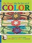 Pat Sloan’s Take the Fear Out of Color by Pat Sloan