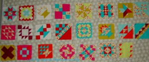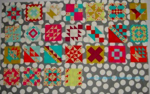
This is a fabric I bought at Quiltology. I didn’t have the blocks with me, but I thought it might work. In the end, a person has make visually decisions visually. Looking at it with the blocks on the design wall, I am not so sure. I think the grey has too much beige or brown in it, but it isn’t terrible.

I have to make a few more blocks, but the more important thing I need to figure out is this sashing thing.
I thought the grey Half Moon Dot would work, but looking at in the photo makes me think that the dots are too large and it makes the piece look too busy. It’s too bad. I do like those dots, but not for this piece. I do have to think of something to do with the Half Moon Street Collection, though. Soon.

The dots were a good idea, though, so I looked at some other dots I had. No shortage of dots, of course.
I have to use a fabric of which I have enough (one of the bad things about stashing fabric is that you might have the perfect fabric, but not have enough of it: design challenge, I think, yes.)
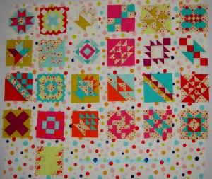
I like the large dot a lot. I like it because it looks cheerful. I also like it because it showcases the blocks better than the grey does. I do worry that the white will run into the white of some of the backgrounds I used. I also worry about the colors of the dots not being the same, but I think the colors of the dots are similar enough, so that is not so much of a worry. I don’t think the Zoe Pearns Sweet Nothings dots don’t conflict too much with these large dots.

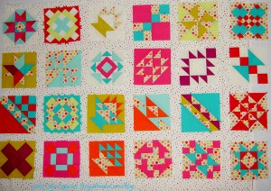
This small dot works, I think, but the dot might be too small.
Click to make the last photo larger to see how the small dots look against the blocks. The small dot works well with the Zoe Pearns Sweet Nothings in the blocks. It is also bright enough, but the white doesn’t seem to suck the life out of this piece.
What do you think?
I like the smallest dot fabric. I looked at all of the photos larger and the last fabric is the most pleasing to my eye. The large grey w/white polka dot fights your blocks in my opinion – taking away rather than adding. The large multi color dots is better, but still stands out against your blocks. I don’t see a connection between the first sashing fabric and your blocks.
I look forward to seeing your decision!
I look forward to seeing my decision as well! I have to keep looking.
I like the large colored dots (#3)
That is my favorite, too, but not universally loved. I’ll try a few more solids and see what happens.
The only one that I did not like was the gray with the large dots. I liked different aspects of the other three.
Well, first I guess I need to know where this quilt will go…I like the large colorful dots if I were looking at this from a distance. If up close, I like the small dots. The small dots get sort of lost from a distance, just from the pics. Very pretty either way!
HAHAHA!!! My quilts are everywhere! You will have to come over sometime and see them heaped all over the place. The small dots do reward the viewer if they come up close.
Keep looking. The first one doesn’t do anything to showcase your bright colors. The second grey is a great color but the big dots make it too busy. The last two suck your white backgrounds into the sashing and while that adds movement, it destroys the regularity. I think a tone on tone or a solid grey in the blue grey family like the second one would be very pleasing.
Sigh. I thought 4 fabrics would be plenty of choices, but I guess not. I have a dark purple and a chocolate that are both new colors in the Pure Elements solids line. I wonder if one of them will work?
I agree with CW. I think you need something a little darker to help make the squares “pop” and stand out on their own. I think the white with dots makes everything kinda fade into itself, and while I like the grey in the big white dots, the big white dots are too big, IMHO. A solid could work well, I think. Or what about a medium to dark stripe? That might give the movement, yet definition, these squares seem to be looking for…..
Nobody said picking fabric was easy, so back to the drawing board for me! Thanks for all of your input. Keep it coming!
The third option with the smallest dots pleases my eye the best. I like how the smaller dots are not busy but as you said, reward the viewer when you get up close.
If I go with any of the above, I think this one will be it. I am concerned about the white backgrounds of the blocks bleeding into the white of the sashing.
Another way to look at this maybe is that certain prints make the individual blocks look like they are floating separately from the sashing and other prints have the blocks fade/mesh into the whole quilt more. Know what I mean?
Not really. Do you mean using several different prints for sashing?
I meant that for example, in the photo using the small dot sashing, the blocks are floating, like they are in a pond. In the one with the large dot sashing, some of the blocks blend into the background more. Those blocks have less definition on their outlines. It might not make any difference to you. It was just something I noticed. There was/is something about the small dot sashing that makes the blocks look like they are floating in air…disjointed? I can’t find the words to express what my eye and mind are trying to convey!!!!!!
It is so hard to tell from photos and looking at the options unsewn. Sigh!