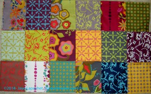
For some reason I became enamored with the Field Day print fabrics by Alison Glass. These are not my colors, they are somewhat muddy and have a flair, or feel, of the turn of the 20th Century. This ‘feel’ makes it so odd that I actually want to work with them. There is something about them that appeals to me.
My favorite print is the dark blue with the turquoise kelp-like print on top.
Shortly after receiving the fabrics, I came across a pattern I will use with these fabrics. It came from the Missouri Star Quilt Company and I found it in their Block! magazine (watch for a review soon). It isn’t a hard pattern, but there is something about it and the fabric that went together in my mind.
I washed the Field Day fabric last Friday, then started cutting 2.5″ strips on Saturday. I have about 10 strips cut. I need to cut them into 2.5″x5″ rectangles, but have only done that for one strip so far, because I still haven’t decided what to use as a background. Also, I still have about 10 FQs to cut strips from.
I thought about looking at the coordinating solids that various online shops suggest. I did that, but did not want to chose gold, chartreuse or deep garnety red-purple for the background. I want something lighter, brighter so the quilt doesn’t seem depressing.
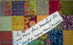
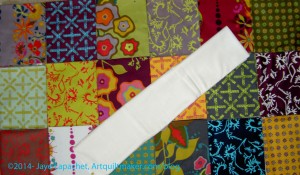
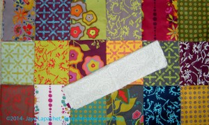
I have the following background options:

I love this print, but think that the large letters will get lost.

This is my favorite, because it brightens up the muddiness of some of the fabrics.
I also have a lot of grey.

I would probably have to use a few different greys as I only have a yard of this one and I think I will need more. I don’t mind using different greys as it will add interest.
The funny thing is that after I started cutting the Field Day, I came across a friend who I think needs a quilt and this one might be perfect.