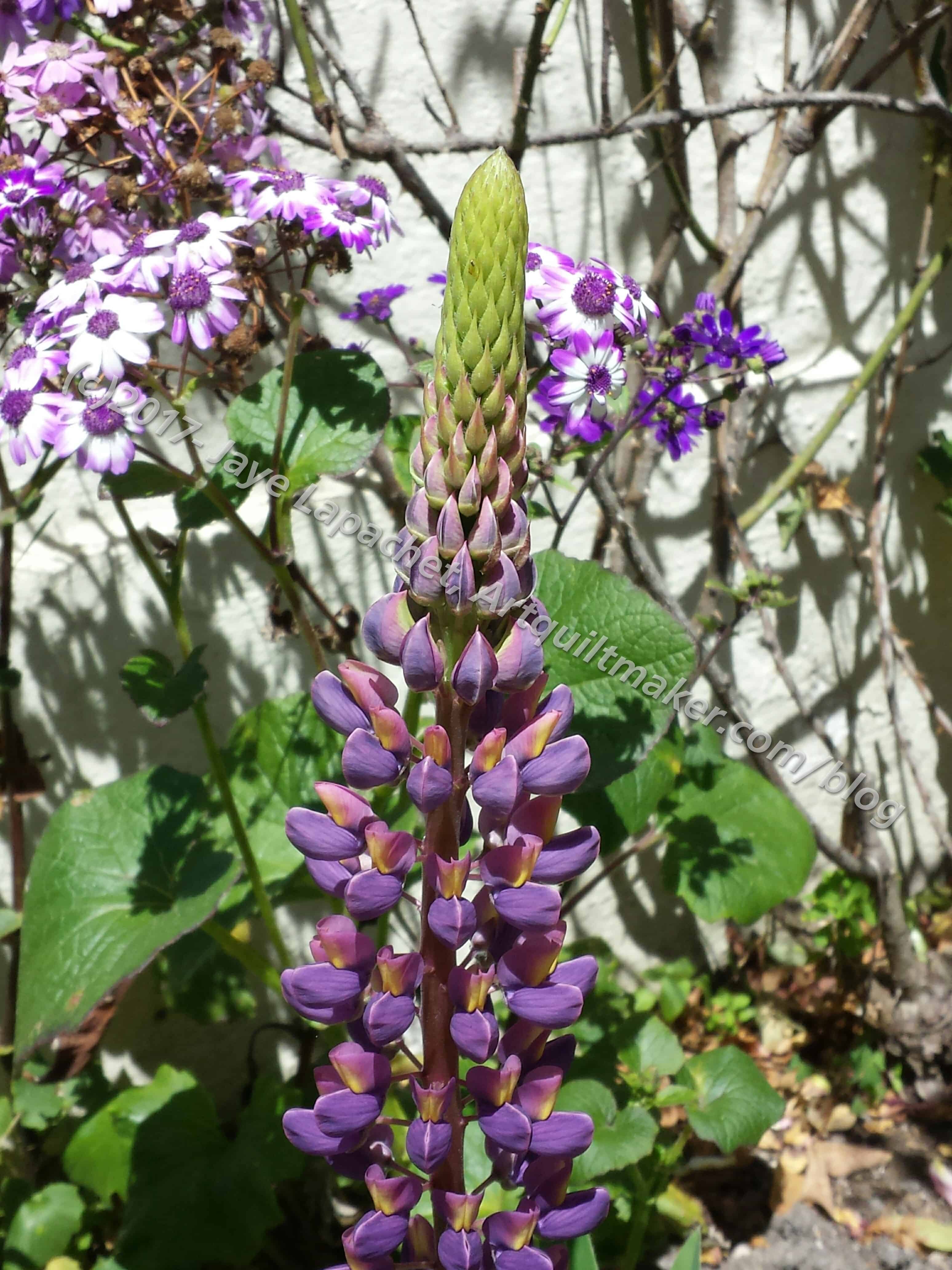
I spent a BBQ in a walled garden last week at Grand Parlor. In addition to the walls keeping the wind out and the cozy nature of the gathering, it was so gorgeous I could have stayed there all day.
There was a whole slew of different flowers. They were all different. I chose this one because of the cropping, to be honest. As I went through the Palette Builder options, I found that this picture came up with a lot of different color options.
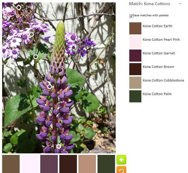
The default again was very neutral with reddish overtones. I am sort of interested in the top color, Kona Cotton Earth. It reminds me more of chocolate than earth.
Again, there are lots of browns and other darks. The Kona Cotton Earth and the Kona Cotton Cobblestone are the two significantly beige-y ones.
Two interesting color options came up while I was playing, neither of them having much to do with purple: dark and light.
I continually find it interesting and entertaining that such differences can be made in the same photograph. To make it even more entertaining, the color palettes above have very little to do with purple, which I see as the dominate color.
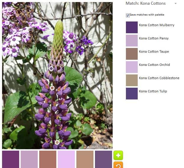
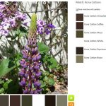
The first palette that I made after the default was more purple, but still reddish and some neutrals.
It is interesting to me how Orchid and Pansy look so similar. Even I can tell they are not exact duplicates, but I like it that Kona feels that two so similar colors are worth making. It warms my heart.
Again, Kona Cotton Cobblestone and Kona Cotton Taupe are more towards the brown and beige tones. I don’t know why they show up so much.
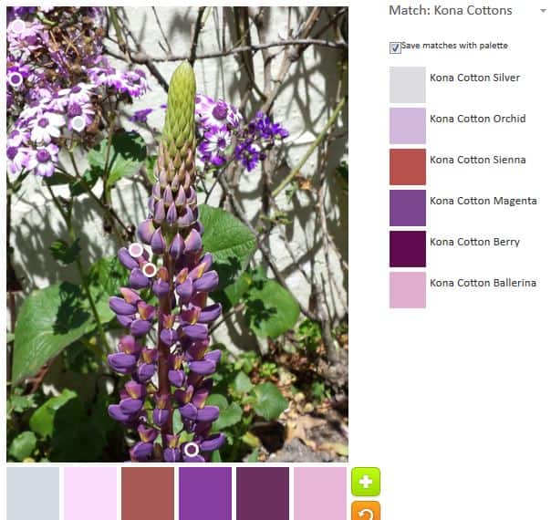
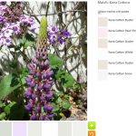
I tried to get more of the purples in a palette and I pretty much succeeded. Kona Cotton Sienna is the only one that looks out of place in this palette. If I were using this palette for a quilt, I would remove the Sienna, maybe replace it with something else and maybe not.
The light colors are interesting. On the bottom, the second one looks like a blush pink, but it is actually Orchid.
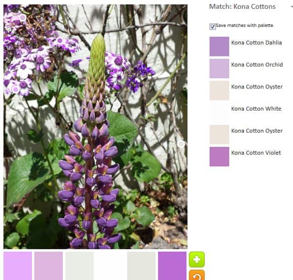
I tried again to find a purple palette that excluded that Sienna. I went a little lighter (working my way to the very light one above), but got mostly purple tones.
I thought the Violet and Dahlia were very similar and I like the gradations between those and the Orchid.
I screwed up, though and Oyster is in there twice. Oops. I tried to avoid that .
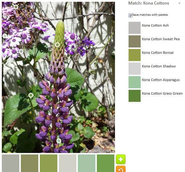
I did a green palette as well just to do it. I thought the greens were a nice variety. I don’t know if Kona Ash is a green or not, though it looks green with the other greens.
So, go out and play with the Palette Builder. See if you can make something awesome.
This is interesting.
Many colors rhyme with purple, more than you realize. I think it is the most versatile crayon in the box.
I never thought of it that way. I’ll have to think more about purple next time I am looking for a color to mix in.
Just a suggestion … The sienna is the surprise ‘pop’ of color that completes the palette. It’s in the middle of the blossoms and in tiny, tiny places as a reddish brown that compliments the cobblestone and sienna color that shows up in nature. You might reconsider and only put sienna in a tiny unexpected spot here or there to fire up your design. Whatever you do will be beautiful!
Thanks for chiming in! You are absolutely right and make a point I didn’t think about. I have considered this before and it just didn’t come to mind this time. Thanks for the reminder.