The CQFA Meeting was last Saturday and it was great. As you know, I haven’t been in awhile and I was so glad to see my art quilt pals.
Julie, Dolores and Maureen did a presentation on color. The presentation was called “Why Your Stash Needs to Be Bigger.” 😉 I am not going to rant today about the low cost of fabric compared to other stress reducing activities.
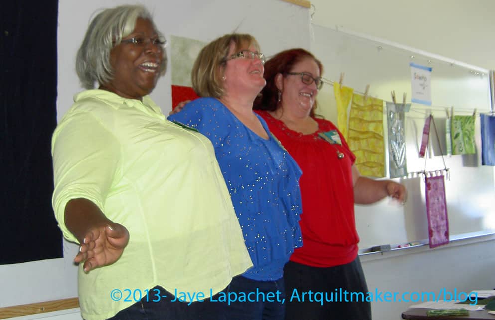
They covered the science of color, color in culture and some color exercises. I am trying to get Dolores to do a guest blog post, but I will post some of my notes for your edification. I was too fascinated by what she was saying to take really good notes.
Science of Color
Color is the reflection of ambient light on to an object. Dolores referred to the Archimedes Lab’s information on color. I just Googled and found some pages that I would like to explore later.
gamut is a term used for the range of color that can be reproduced.
Your monitor is set to use RGB colors and your printer is set to use CMYK colors, which why we sometimes have problems printing what is on our screen
No device can reproduce as many colors as our eyes can see.
simultaneous contrast – our eye evaluates the color in relation to what is next what we are looking at. This affects the sense of what color we see. It isn’t a function of the color, but of the perception of the color. Dolores told us that Van Gogh used this technique (?) a lot in his work. Our other senses experience this also. If you are in the hot tub, then jump into a pool, the pool seems colder than it really is. If you drink orange juice with your pancakes and maple syrup, the acidity of the juice in enhanced as is the sweetness of the syrup. Fabrics next to each other talk to each other.
Culture of Color
Maureen present culture to us and it was an eye opener how much color is involved in our culture in ways not related to actually using color such as writing with a purple pen or playing with fabric.
Language uses color in metaphors and for metaphors. This is called cognitive metaphor. Part of it is associating colors with emotions (not a comprehensive list; just some examples):
- red- passion, anger, danger
- green – nature, recycling
- blue – calm
- etc.
We have been trained to have associations with certain colors. Colors telegraph a certain message. I think this might have to do with my comments about cheerful quilts. I see certain quilts as cheerful when they have warm colors, usually. [I haven’t thought of this before, so it isn’t a fully formed thought. The idea just came together as I was writing this.]
Having emotional associations with certain colors means that we might want to look at the colors we are using in our work and ask ourselves if we are trying to telegraph a certain message through our work via color?
We also use color a lot in our language:
- silver lining
- feeling blue
- green with envy
etc.
Victoria Finlay wrote a book on color called Color: A Natural History of the Palette. It is a dense book, but has a lot of interesting information.
There is also an iPad app you might want to try out called Josef Albers.
Exercise your Color Muscle
Julie reminded us that we all have our own color palette that is defined by our lives, experiences, art to which we have been exposed, etc. Julie showed us some exercises that started in a book called Playing with Color by Richard Mehl.
She used some of what Dolores and Maureen said for the exercises, such as picking a color from two that was in the center of another color.
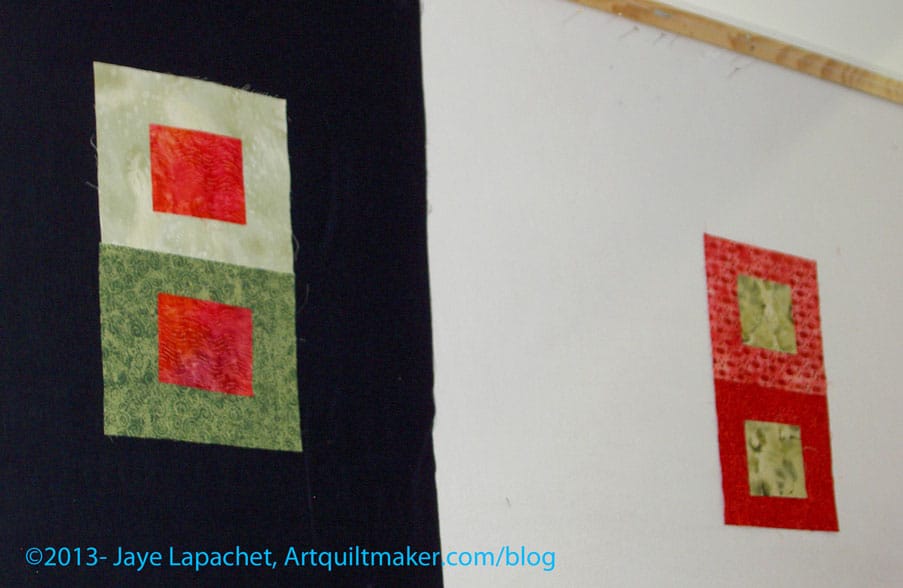
One exercise (green on red) was an effort to find a color that looked the same when laid on two different fabrics in the same color family.
You’d think that this was easy, but it isn’t. There were a couple of issues to work with. 1) we are working with fabric. With paint, you can mix a bit of white in or a bit of grey. In fabric, it doesn’t work that way. 2) we were working with pattern. Julie set up the exercise and she doesn’t have many solids (remember the title of the presentation?), so she has to work with patterned fabric. Because of the contrast that often exists in a patterned fabric, it made the exercise harder. Yes, she found as many tone-on-tones as she could, but it was still a challenge. a good challenge, but a challenge. 3) we have a very limited amount of fabric handy, but even with your own stash, this would be a challenging exercise, because of the nature of fabric – it already has color. Yes, you can dye it or discharge it, but you still may not get what you expected out of the dye/discharge bath.
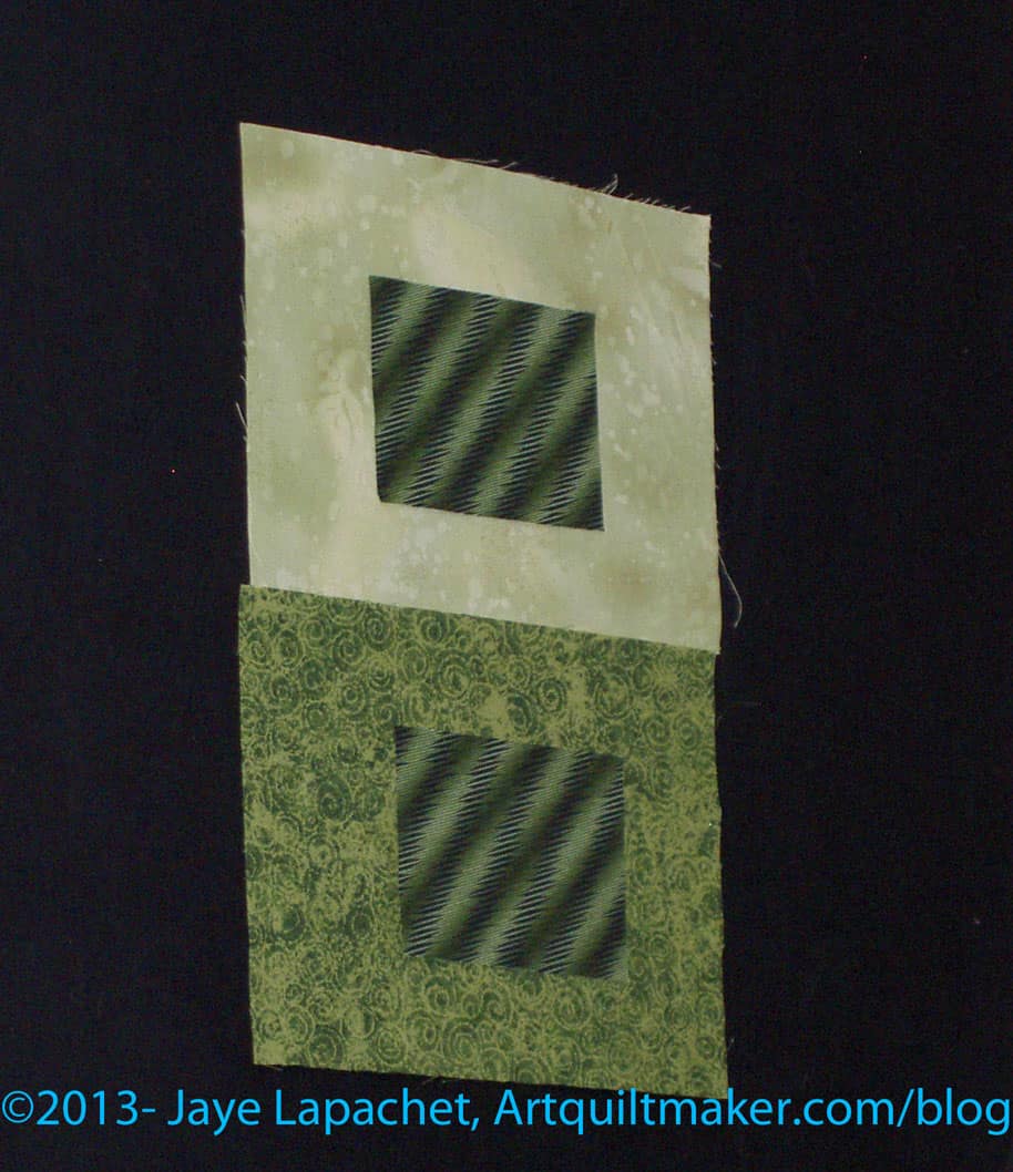
This was a great example for me of “fabrics talking to each other.” It was really, really interesting and amazing to see the same fabric paired with two different fabrics and how different they can look. The green on green examples show this really well. One makes my eyes vibrate a little. The top combination has the center square looking much darker than the bottom center square even though they are the same fabric.
It was very interesting and fun to work with the whole group. I enjoyed hearing others’ thoughts and how they saw the fabric.
Business
The group is working on a second show at SF Public Library. The organizing group is new, though I have offered to still act as the liaison with the library. The piece I am thinking of making is too big and will take too long. I also don’t think I have thought through the making of the whole piece yet. Not sure. I think I will consider entering Beach Town. More info about the first show can be found in earlier posts.
The Retreat was discussed. It will be at the end of January as per usual.

I was glad I didn’t do the color challenge. My idea was LAME compared to the gorgeousness that others brought. I am so lucky to be in this group. The CQFA people do fantastic work. I need to up my art quilt game. I might be a little discouraged, but the pieces were inspiring and made me think of my color strip in a different way. I am not out of the game. Late, yes, out: NO! The collage above was created using Ribbet.com.
We are having another challenge with shapes. Everyone cut shapes, our personal symbols or what we have been doodling, out of black paper and trade them. Now we have to take the symbols and do something with them.
Show and Tell
Show and Tell always make me want to work harder and more to get better.
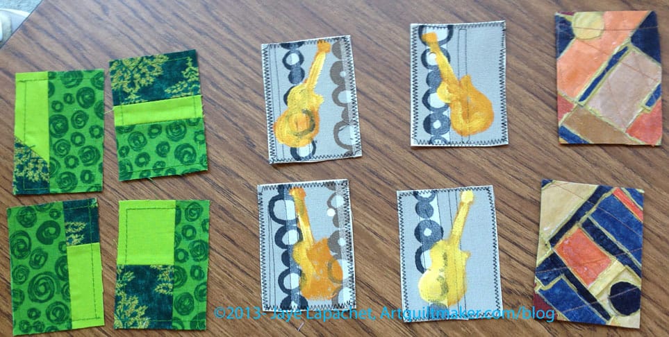
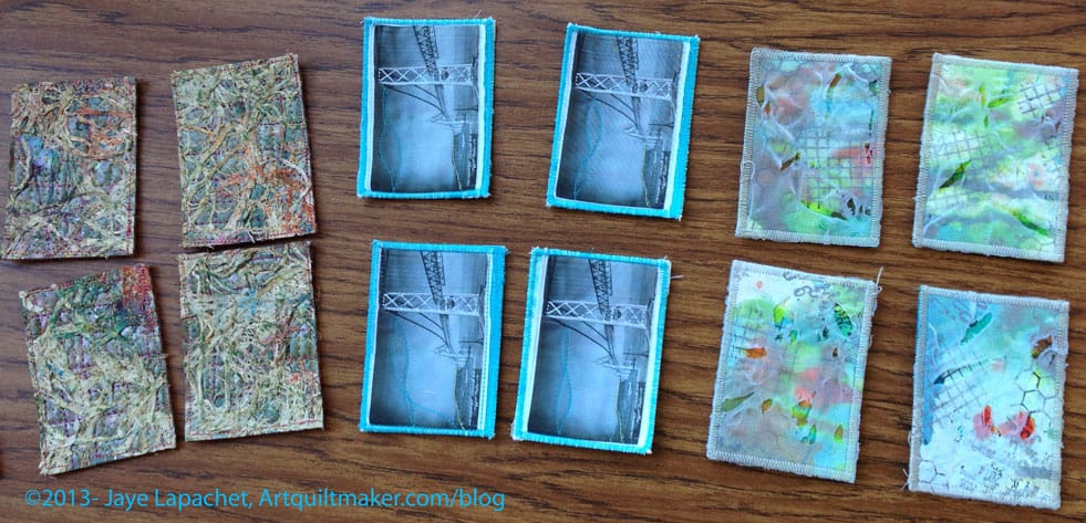
ATCs
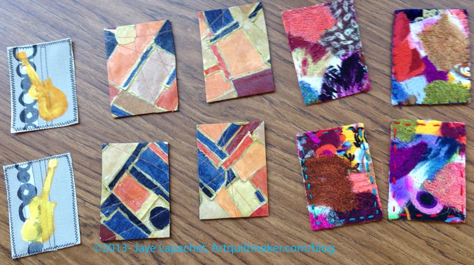
We swapped ATCs (photos sprinkled throughout this post) and there were a lot of swappers this time, which was nice. My bridge ATCs (Artists Trading Cards) were very popular, which was nice. I took some photos as I crossed the new bridge last Sunday and may use those as the basis for my November set. It is hard to take good photos from a moving car, so we will see.
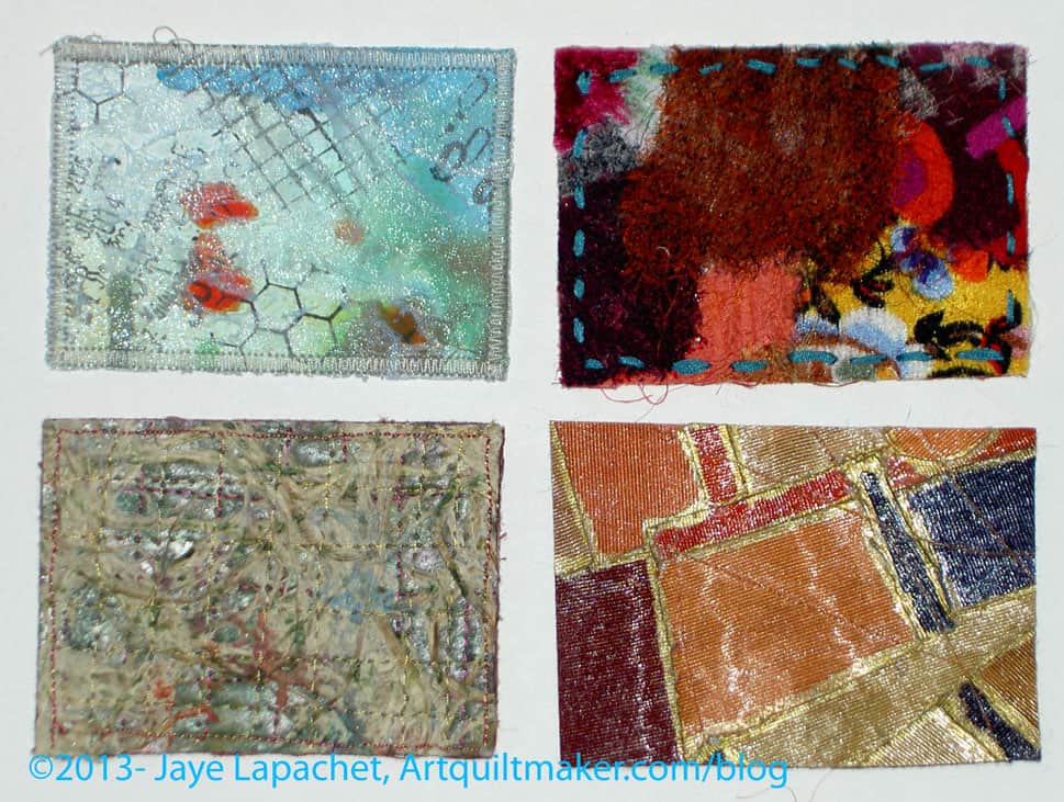
I picked a nice range of ATCs. I didn’t get one of each, because of all the swappers, but that is the nature of the beast. A couple people asked me for Bridge ATCs, so I might make some more of the historic bridge. We will see. I didn’t really enjoy the stitching I did on the photo. I felt like I had to do something in addition to just print a photo on fabric and edging it to the back to keep it together, but I wasn’t happy with the way the stitching came out. Not sure what to do.
Regardless, I need to get started on my ATCs for the next meeting. Not waiting until the last minute was fantastic.
Some of us stayed after and chatted and sewed. I started cutting out the next Petrillo Bag. Yes, I am making it with the changes I described in my previous post.
Thanks to Angela for the use of her photos of the ATCs.