I don’t know if this set is a trilogy, but if you were waiting for the bracelet version of the Bead & Wire series, here it is. There are a wide variety of bracelets to entice different kinds of jewelry makers. Not only are the styles different, but the beads and materials all give the projects a variety of looks.
Some of my favorite pieces are Wire Links (pg.122), which, in a variety of blues combined with silver, has great colors. Paris is lovely memory bracelet, like a charm bracelet (pg.116), but made as a memory. The crystals make it a bit different and interesting.
The book starts out with lists and definitions of tools, including photos, a Key to Wire Gauges and depictions of clasps, bead caps, spacers and chain. Different techniques and skills are discussed and illustrated. The projects and patterns start immediately after these sections.
Many of the patterns have a “Designer’s Tip” which gives just a little bit of extra information, not just on the pattern, but to improve the reader’s skills. The lists of tools needed for each project are clearly spelled out and photos and diagrams are very clear.
The patterns come from a variety of designers, whose bios are all included in the back of the book. There is a very brief table of contents and no index.
The imagery provides great inspiration for everyone.
Nathalie Mornu has come up with this new take on beads and wire after previously sharing A Bounty of Bead & Wire Earrings. This is another book I received from Lark Crafts as a review copy in the last week or two.
When I read “bead & wire” I don’t think of the elegance that is included in this book. Many of these pieces could be worn to elegant events.
As in the previous work, there are a lot of great photos in this follow-up. The lighting especially enhances the photos. There are photos of the projects, such as Odyssey (pg.127), inspiration photos, clear photos of tools and processes as well as multiple, large images of each project. The reader is also able to clearly see the details of each piece, such as claps, the facets of beads and the patina of the metal. The photos really make this book.
Many of the projects are delicate and lovely and are enhanced by the models wearing them.
Jewelry makers would get something out of this book; other artists would enjoy the forms and shapes. Buy it at your bookstore or check it out at your local library.
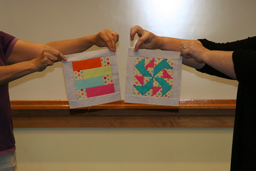
Sometimes I paint myself, no pun intended, into a corner when I create these prompts and this was just such a prompt. After I posted it, I asked myself what I was thinking, because how could I recreate a painting that viewers would recognize. I still had nothing when i sat down to draw, but after creating a response to prompt #169, I flashed on this response.
CPP Response #170: Painting
The painting part could be better, but I was so relieved that I just put something down on paper.
This was a good lesson for me, because I often tell you to just take 5 minutes and I often spend more time on my responses.
The original prompt has some interesting words and terms. Take some time to create your own response in the media of your choice.
Make your response simple. It doesn’t need to be a masterpiece. Take 5 minutes. Just respond and create a creative habit.
Please post the direct URL (link) where your drawing, doodle, artwork is posted (e.g. your blog, Flickr) in the comments area of this post. I would really like to keep all the artwork together and provide a way for others to see your work and/or your blog, and how your work relates to the other responses.
The Creative Prompt Project has a Flickr group, which you can join to post your responses. Are you already a member? I created that spot so those of you without blogs or websites would have a place to post your responses. Please join and look at all of the great artwork that people have posted.
If you are wondering WTF? then you are with me, because I keep looking at this quilt thinking “what was I thinking?”
This is NOT a horrible quilt. I am not embarrassed to give it to charity. It is not ugly. The workmanship is excellent. Not trying to be arrogant, but I do my best to make well made quilts. One of my biggest pet peeves, in case I didn’t mention it before, is bad workmanship. I could write a whole dissertation on THAT subject, but will spare you at the moment.
I have to admit, though, that it is not my best design work. The problem was I couldn’t figure out completely what was going on. I knew:
I should have been more selective about the shades and tones of the pinks and greens I picked.
I should have picked a 3rd color for the sashing and a 4th color for the cornerstones.
I knew something was wrong so I just put borders on with fabric that was large enough. I stopped worrying about the top being a great design. I actually like the batik border fabric a lot better after I cut it up.
Other than that, I was stumped. Then I listened to Sandy’s podcast on space with her guesthost: ME and think I figured out the problem.
An aside: I listen to all of the podcasts that Sandy and I record. I am cringing less and less. I want to hear what you hear. This episode on Space was a mind bender, even for me and I had been living and breathing the content for months.
Listening to the episode clarified the concept and I was able to figure out the problem with this quilt. In the episode I said that definition of space is “the area the design occupies”(for purposes of the design series) of space. I used the example of a 4’x3′ piece of fabric as space for a quilt. On that background or Picture plane or Space, the maker places his/her objects.
In the case of the donation quilt, the space, which is supposed to surround the objects (shapes in a piece), is confusing. If I had chosen all the same pink fabric, it would be clear that the pink was the background/space in the quilt. Same with the green. I didn’t do either. I just put a bunch of pink and green squares together and sewed for broke.
The donation quilts, such as the pink or the blue or the yellow, where I used the black on white background work a lot better, because it is clear to the viewer what fabric constitutes the space. Even though the black on white fabrics are different prints, it is still clear that those fabrics are the background/space.
I am ok with the quilt, especially now that I think I know the problem. The quilt will still keep a little missy warm. Live and learn.
My favorite image in this book is called Venice 2 by Tom Leighton of the UK. It shows St. Mark’s Square with a carousel in the middle of the plaza and famous buildings such as Notre Dame ringing the plaza. I love the juxtaposition and “wrongness” of the image even though it looks wonderful and perfect and as though it cannot possibly be wrong. Everything fits and it seems normal. There are tons of other images, as well as pieces of images, that I really REALLY like. Losing T.E.M.P.E.R.(detail, pg.34) satisfies that urge for gears that seems to manifest itself periodically in me. Dreamboat(pg.166) has really great waves. The curves are so symmetrical and perfect. I also like America the Beautiful(pg.169), a woodblock print that shows the topography of the United States in a cartoon kind of style. It makes the cities seem unimportant, which is a relief since they seem to dominate everything.
The last book I reviewed in this series was PUSH Jewelry. I still love this series, especially the edginess of the art that is included and the joy that is no patterns!
You’d think that all of the pieces in this book would be digitally manipulated, but there are pieces described as “woodblock, linoleum cut, hand-typeset lead and wood typography,” so something for everyone!
The types of images range from drawings to photographic imagery. Images are sparse and very complicated. There are dense drawings as well as lithographs, monoprints and silkscreens. The 30 (again!) artists in this book really push the boundaries of printmaking.
Yes, there are some images that I don’t like at all. They just aren’t my style, but I can see the line weight and the shading in them and appreciate those aspects.
There are brief bios at the back of the book either of the artists or their studio. The bios provide links to websites and information on whether the artist teaches, sells works or can be hired for other services. Artists come from all over the world and it makes me think of the differences in styles between countries and whether a similar book of artists from all one country would have the variety?
Saturday was the October meeting of the Bay Area Modern Quilt Guild. I know I am late getting this up, but I had to juggle posts around as I was sewing on Sunday instead of writing.
The meeting was fun as usual! The sad part is that I forgot my camera, so I don’t have any of my own photos. I could have taken them with my phone, but just didn’t. Adrianne, the current photographer got the photos up on Flickr pretty quickly, so you may see some.
There are a lot of upcoming events. If you are a member, you can participate in the FQ swap and the pincushion swap. I haven’t decided if I am going to participate in either. I am leaning towards the FQ swap. I want to look at patterns for pincushions as I haven’t made one and I don’t want to commit to something that will come out crappy.
It is also time for new officers. I don’t think anyone signed up, so I am nervous about what will happen. Adrianne will not continue as president. I can’t really blame her. After 2 years, she needs a break and guild needs some new blood. Adrianne has great ideas, but groups, organizations need new leaders to shake things up a bit periodically. I am not really presidential material, so didn’t sign up either. I am still doing the blog (would love to hear your comments over there, BTW!!!), but if you only have time for one comment, comment here at Artquiltmaker. 😉
Someone emailed me and wants to help out with the blog, so I am excited about that! I hope I am not taking candidates away from the leadership of the guild.
A-B-C Challenge
It was the end of the A-B-C Challenge block-making portion of the challenge. We asked people to finish their tops by December and the whole quilt by the beginning of May. Our goal is to enter them into the county fair as a group.
Rhonda was the only other one who showed blocks, the other participants were absent.
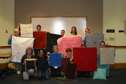
Whole Cloth Challenge
Here is the big reveal of all of the quilts. I wrote about my quilt earlier this week. I do have a detail that Adrianne took with her nice, fancy camera.
Charity
I was sad not to see the Charity Girls, Jennifer and Deborah at the meeting. They were both off having lives. I turned in the Froggy Cat Bed, but there weren’t any new cat bed kits to take, so I took some of the Patchwork Wheel block kits and am having some fun with them. I only took two kits, which seem to make a total of 4 blocks. The kits have pretty crazy fabric combinations! Perhaps I will move on from the checkerboard blocks I have been churning out and make some more of these blocks?
Checkerboard Charity Quilt
At the last possible moment, I also took a quilt that someone quilted to bind. I put the binding on it on Sunday by machine and am trying to decide if I will test sewing the back to the quilt by machine or if I will hand sew it. It is in the hand sewing area now (down by the couch), but I can always bring it up. I have some Aurifil monofilament to try out and this might be the perfect opportunity to try something new.
I do like the things in my drawings to look odd, incomplete from your angle or out of place. I like when the viewer is looking at the scene from an odd location.
I am still trying to fill in the whole street scene like a puzzle. This is a closer view of the sign for the shop.
Take a look at the original prompt and create your own response in any media that makes you happy.
In honor of my mom, whose birthday is this week, I decided to post a Creative Prompt Response.
Finally!
I know.
CPP Response #166: Growth
It took me a long time to finish Growth, because the green stalk took forever to color in.
I wanted to make the stalk look like it was growing out of the sidewalk, but I think I ended up with a kind of space alien, scary looking response rather than something fun, if odd. Oh, well. Immerhin.
I have decided to do the prompts in order even when I get behind. It is getting too hard to figure out which prompts I have and haven’t done.
You can see the original prompt and create your own response! Please do. I would love to have you join in.
No other name really occurred to me as I was working on this quilt. It is kind of sad, because most of my other quilts have much better names. Still, it is better than “The No Name Quilt” and it is descriptive.
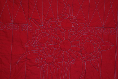
I finished the binding in time to show the quilt at BAMQG. I was excited to see the other pieces in the challenge. I wasn’t the only one who used a colored background, but mine was the only red and aqua quilt. It received a good response.
I will put a sleeve on this quilt, but I want to have the back photographed before I do that, thus it is not in the back photo I am showing today and I don’t know when/if I will show a picture of the sleeve.
Whole Cloth Quilt: back
I have to say that the binding went on to this quilt really fast.
Did I tell you? I’d like to use this design again for another rendition of this quilt. I wouldn’t do it as a whole cloth quilt again, but perhaps fusible applique’.
Definition: verb (used without object) 1. to move along a surface by revolving or turning over and over, as a ball or a wheel. 2. to move or be moved on wheels, as a vehicle or its occupants. 3. to flow or advance in a stream or with an undulating motion, as water, waves, or smoke. 4. to extend in undulations, as land. 5. to elapse, pass, or move, as time (often followed by on, away, or by ).
Rolling Stone (magazine)
rollcall
Rock ‘n Roll
roll the dice
The Rock and Roll Hall of Fame
Congressional Roll Call votes
Let’s Roll!
Cinnamon roll
Easter Egg Roll
Tootsie Roll (candy)
take roll
drum roll
Rolls Royce
Rolling Stones
Make your response simple. It doesn’t need to be a masterpiece. Take 5 minutes. Just respond and create a creative habit.
Please post the direct URL (link) where your drawing, doodle, artwork is posted (e.g. your blog, Flickr) in the comments area of this post. I would really like to keep all the artwork together and provide a way for others to see your work and/or your blog, and how your work relates to the other responses.
The Creative Prompt Project has a Flickr group, which you can join to post your responses. Are you already a member? I created that spot so those of you without blogs or websites would have a place to post your responses. Please join and look at all of the great artwork that people have posted.
This is a new book I got from Lark Crafts to review Tuesday and I have to say that I love this series. The last one I reviewed was PUSH Stitchery. I like the size, shape and feel of the books. I also like the edgy nature of the pieces they include. I probably wouldn’t make any of these pieces (not that there are patterns, because there aren’t), but I can definitely get inspired from looking at them. They are really different from things that I normally look at and looking at new stuff always fires my brain.
I have to admit that the linear part of my brain was in charge when I started looking at this book. I thought that many of the pieces were quite ridiculous, but then I started look at them in terms of creativity, shape, form and some of the other design elements and principles we have been exploring in the Design Series. I kicked the linear part of my brain to the curb and started thinking about them in terms of originality and WOW factor.
The books in the PUSH series highlight several artists and give a few pages to each artist, so the reader can see more than one work by each contributor. This part of the series includes 30 artists. Each section includes a picture of the artist and a selection of their work as well as an artist statement in Q&A format.
This book has really interesting forms. Many of the pieces are quite sculptural.
Some of the pieces I really like:
Li-Chu Wu, of the UK, has a piece that looks like a sea urchin.
Allyson Bone, of the US, shows some necklaces that look like cat eye glasses or masks.
Joe Wood’s pieces, also of the US, are quite sculptural and would be appropriate 50 times larger and installed at the SFMOMA.
Dr. Tina De Ruysser, UK, has some very interesting folded paper necklaces.
Mirjam Hiller, Germany. She has feathery, layered pieces. Some of my recent CPP responses have had feathers and I see myself gravitating to those shapes and layers.
These pieces really push all sorts of the boundaries and even the display photographs are provocative. Many of the pieces are large. There are a number of the pieces that do not fit my definition of delicate or pretty. The artists use interesting and unusual materials as well: acrylic, dollars and Euros, fur, rubber, and porcelain, to name a few. The processes used to create the works are equally as interesting: folding stainless steel, adding powder coats, a process like origami, if it isn’t origami along with normal jewelry techniques such as stone setting and metalsmithing.
I think that you would get a lot of inspiration from this book and wouldn’t be sorry if you took a look.
Julie posted about her Windmills/our joint Windmill project and it occurred to me that I hadn’t post anything about this potential quilt.
I am still very much in the Hunting and Gathering stage at this point and I don’t know how large it will be, what the background color will be or anything about it yet. It is not yet up on my radar, which it why it never occurred to me to post about it.
Julie and I went to lunch last week and she gave a bunch of windmills she had cut for me. The photo shows some of them. Lots of lovely and luscious batiks!
We are cutting windmills for each other and we are using a Come Quilt With Me rotary cutting template/ruler. It is a piece of Lucite thick enough to use with a rotary cutter. It was very slick, so I put True Grips on the bottom to keep it still while I cut. True Grips are expensive, so I use the background as well as the dots. I think they work better than the sheet of plastic that can be adhered to rulers. True Grips are easier to put on as well.
I cut Windmills whenever I am cutting into a new piece of fabric or pull out a piece of fabric from the fabric closet, so there is quite a variety. Lots of dots, pinks and turquoises. 😉
For the moment, I am just going to continue cutting. I have other projects on my plate that are higher up on the list.
I have to say that I find it very frustrating not to be able to show every little detail of the progress of this piece. I couldn’t stand it any longer and wanted to give you a little peek.
I worked on it on and off all weekend last week. I also put in a few hours during the week, especially on Tuesday, when I was off, and in the evenings last week as well. Yes, I was on a mission to finish this piece by the deadline.
Whole Cloth – Mostly Vase
That was my plan again this past weekend since it is due next Saturday. When I started stitching on Saturday, I had all of the spirals done, and had, mostly, straight stitching to finish.
There is a lot of starting and stopping and thread sinking required, but I am enjoying this project for some reason.
I was able to finish the top on Saturday after working on it all day. I spent Sunday trimming it, making the binding, machine stitching the binding. After I folded the laundry, I started to hand stitch the binding down. I was pleased that it going very quickly. In an hour or two, I had more than half of the binding stitched. I was too tired to work on it last night, but, perhaps, tomorrow.
I have a slim hope of making the sleeve this week as well. We will see. I can’t forget to prepare the Renewed Jelly Roll Race for the show. It is due on Friday.
In two dimensional art forms, such as quilts, an illusion of space is created using different techniques such as size, overlapping, vertical location, aerial perspective, linear perspective, one-point perspective, two-point perspective, multipoint perspective, etc. (Pentak & Lauer, pg.171)
“…the space around the object can distract, focus, or alter our impression. A cluttered background tends to diminish the importance of the object, while a plain background draws attention to it.” (Art Design & Visual Thinking http://char.txa.cornell.edu/language/element/form/form.htm)
“Two-dimensional design is concerned with the flat space” on which the design takes place “and the illusion of three-dimensional space. The major methods of controlling the illusion of space are:”
Overlap
objects in front of one another
Shading
modeling with light and dark
Linear perspective
the relationship between apparent size and space
Atmospheric perspective
how the atmosphere affects the appearance of objects in space
“Each composition is filled with positive and negative space. Design elements usually occupy positive space and are surrounded by negative space. The amount of negative space within a design field can greatly impact a composition.” (A Fiber Artist’s Guide to Color and Design, pg.130)
White Space (https://tomrobb.files.wordpress.com/2011/04/whitespace.png)
With three dimensional art, such as a sculpture, one can see how the object occupies space by walking around it, looking from above, below or from the side. Three dimensional objects have height, width and depth. With two dimensional art [like a quilt], the arrangement of objects on the design field can be crowded with lots of objects or nearly empty with very few objects. These design elements have height and width, but no depth. (A Fiber Artist’s Guide to Color and Design, pg.130)
“Forms and shapes can be thought of as positive or negative. In a two dimensional composition, the objects constitute the positive forms, while the background is the negative space. For beginning art and design students, effective use of negative space is often an especially important concept to be mastered. [An] exercise in cut paper require[s students] to work with the same composition in black on white and white on black simultaneously. This makes it difficult to ignore the background and treat it as merely empty space. The effective placement of objects in relation to the surrounding negative space is essential for success in composition.
Some artists play with the reversal of positive and negative space to create complex illusions. The prints of M. C. Escher … often feature interlocking images that play with our perception of what is foreground and what is background. Other artists take these illusions of positive and negative images to even greater lengths, hiding images within images. Perception of form and shape are conditioned by our ingrained “instinct” to impute meaning and order to visual data. When we look at an image and initially form an impression, there is a tendency to latch on to that conclusion about its meaning, and then ignore other possible solutions. This may make it hard to see the other images. Training the eye to keep on looking beyond first impressions is a crucial step in developing true visual literacy.”(Art Design & Visual Thinking http://char.txa.cornell.edu/language/element/form/form.htm)
Other:
“PICTURE PLANE Two-dimensional design takes place on a surface called the picture plane. The picture planes” you use your quilt. We have also been calling this the design field”For a painter it is the canvas, for a muralist the wall.The significance of the picture plane becomes apparent when you think of the image on picture plane as being like what you would see if you were looking through a window. A flat image, like one of your figure/ground projects, appears to be pasted to the window (picture plane) with no space extending beyond it. A photograph or any image that shows the illusion of space appears to extend beyond the picture plane. In rare instances it is possible to make the image project in front of the picture plane.”
 A Bounty of Bead & Wire Bracelets: 50 Fun, Fast Jewelry Projects by Nathalie Mornu


