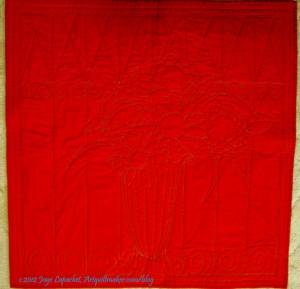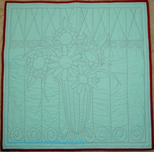
No other name really occurred to me as I was working on this quilt. It is kind of sad, because most of my other quilts have much better names. Still, it is better than “The No Name Quilt” and it is descriptive.
I finished the binding in time to show the quilt at BAMQG. I was excited to see the other pieces in the challenge. I wasn’t the only one who used a colored background, but mine was the only red and aqua quilt. It received a good response.
I will put a sleeve on this quilt, but I want to have the back photographed before I do that, thus it is not in the back photo I am showing today and I don’t know when/if I will show a picture of the sleeve.

I have to say that the binding went on to this quilt really fast.
Did I tell you? I’d like to use this design again for another rendition of this quilt. I wouldn’t do it as a whole cloth quilt again, but perhaps fusible applique’.
until the last picture, I didn’t see any aqua and was wondering about your description. I think it is a lovely quilt. Love the still life design.
how big did it turn out to be?
It is about 30″x30″.
Yes, I was wondering about the size. This is lovely. I like the back as well as the front.
I love it, and I agree that it would make a charming appliqué. And I’d name it “Posey Milkshake” because the vase reminds me of a milkshake glass. Just being weird today! Sorry!
You are right! The vase does look like a milkshake glass. 😉
Very nice. The back photo really shows off the quilting.
Jackie
Thanks!
Check out the detail at: http://www.flickr.com/photos/79863382@N04/8065632539/in/photostream/
That’s really pretty, Jaye! I also like the checkerboard charity quilt on today’s post – so many great colors!
Thanks for commenting, Sandi! I meant to tell you that I reviewed the Master’s quilt books and enjoyed your discussion of them on your podcast.