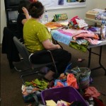
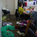
The A Work of Heart Spontaneous Scraps Journal class really caught me unawares. I feel like everything is sneaking up on me lately. My head is definitely not in its normal spot.
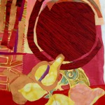
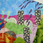
The idea of the class was the a few people were invited (or that was my impression) and would bring scraps to make a journal with a fabric cover. As I was thinking about getting ready for the class on Friday and Saturday, I decided to bring the red mosaic pieces to use to make the cover. I also brought the Malka Dubrawsky piece that TFQ gave me for my birthday and used that for the inside.
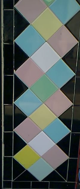
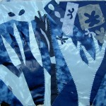
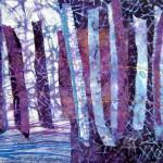
I used the mosaic quilting piece to make the journal cover. I had gotten away from it, but am now in love with that process again. I was feeling like I would never use that fabric, because it was too precious. I also couldn’t think of what project would be appropriate. Anything too fiddly wouldn’t work, because there are so many seam allowances right next to each other. The pressing was a bit of a challenge, but I think the journal cover came out very well.

The class called for a nice ribbon for a closure. I brought it, but I didn’t attach it yet. I am thinking that I want to put a button (or a Mah Jong tile with a hole drilled in it – something out of the ordinary/interesting) and some elastic to wrap around it. I need to get that settled before I do much else. I don’t have any of that thin elastic nor do I know how to attach it after the piece has been made.
")
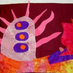
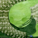
That bit of mosaic quilting is a pocket on the inside. I guess I can use it for pens. Andrea suggested that putting a pocket in the piece was an option, so I did it. I am pleased with how it came out.
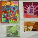
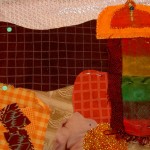
The red dotted page on the left is one of the journal pages. The embellishment (the paper with the white dots) is paper clipped to the page, because it has not been attached to the page yet. I did complete the sewing on some of the pages, but not all. I want to work on that before the concluding class.

I brought some strips that were piling up as well, so I was also able to add bits and pieces to make the piece big enough. Above is what I have left and I am back in the mindset of making this type of fabric. I used the bits and pieces as leaders and enders as I was sewing the journal cover together.
I am thinking that I would like to make at least one more as a gift. We will see how making the pages goes.


")


")

")


")


")
")