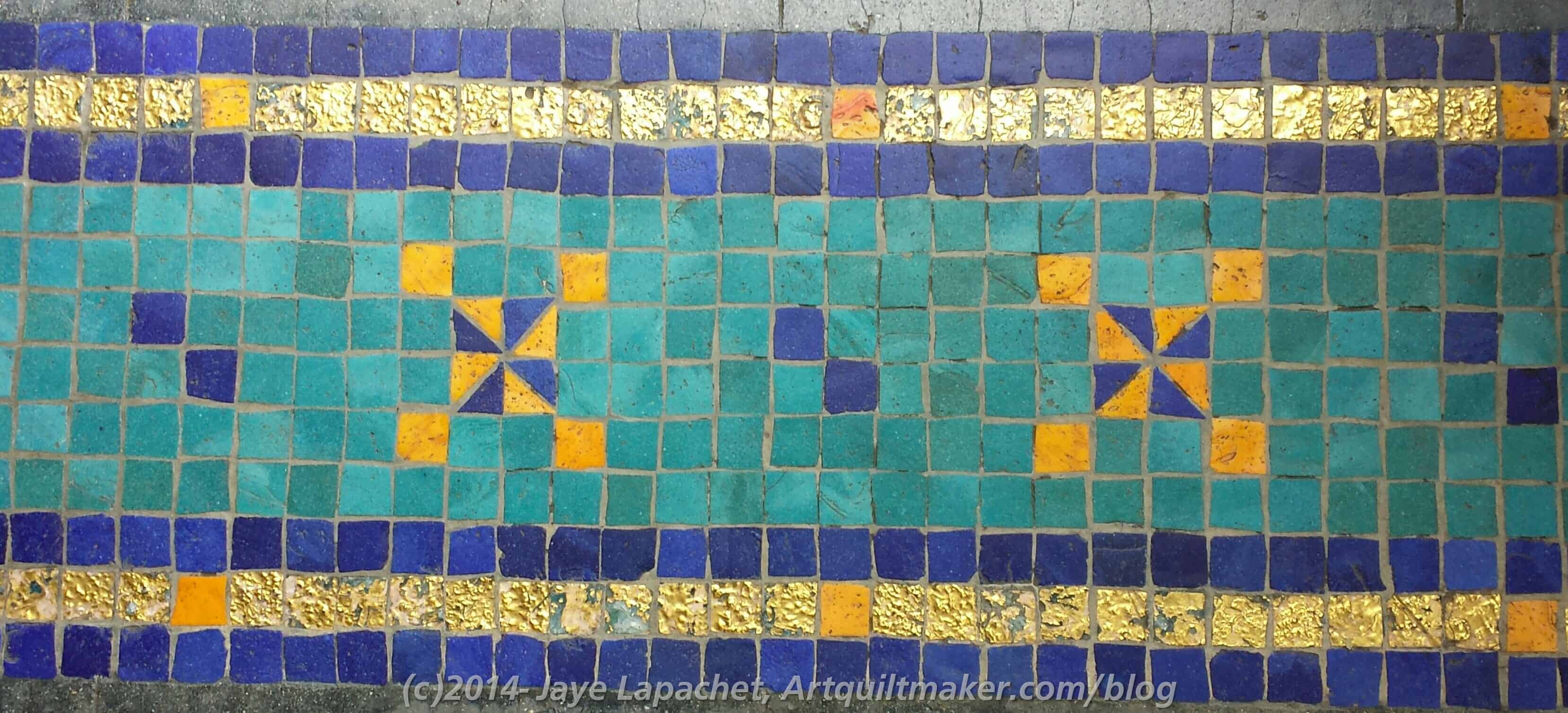
I saw this color study in my most recent issue of House Beautiful. One reason I like that magazine is the color. They report on a lot of great color combinations in interior design. I follow them on Instagram so I can get a quick dose of color when I need it.
They often have very energetic color combinations similar to Anna Maria Horner, Jennifer Paganelli and some Amy Butler, but in furniture, wallpaper and dishes. I really love the over the top combinations and would do soemthing similar in my vacation house, if I had a vacation house, 😉 and were starting from scratch with decorating.
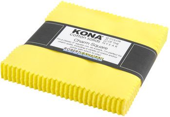
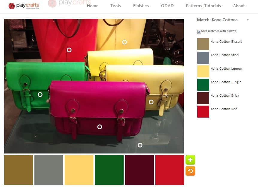
Kona Color of the Year 2016
This caught my eye because of QuiltCon. Remember Highlight? The Robert Kaufman Color of the Year? I don’t think the values are quite the same, but the sentiment is definitely the same!
I am really intrigued with the circumstance that brings these two companies to the same color. Actually, there are more companies and House Beautiful saw the similarities and brought them together. I am sure somehow there is some overlap. Furnishings companies need fabric, right? Still I am intrigued by why this particular color?
I have heard many people profess to dislike yellow, even easy to use sunshiney and golden yellows. This neon would be difficult to use if it weren’t the main color in a quilt. The quilts made for the challenge and displayed at the QuiltCon booth were great. (QuiltingMod displayed some in her blog post about Quilt Market). Still, I like yellow in a quilt as it helps the eye move around the surface.
What are your theories about highlight cropping up?
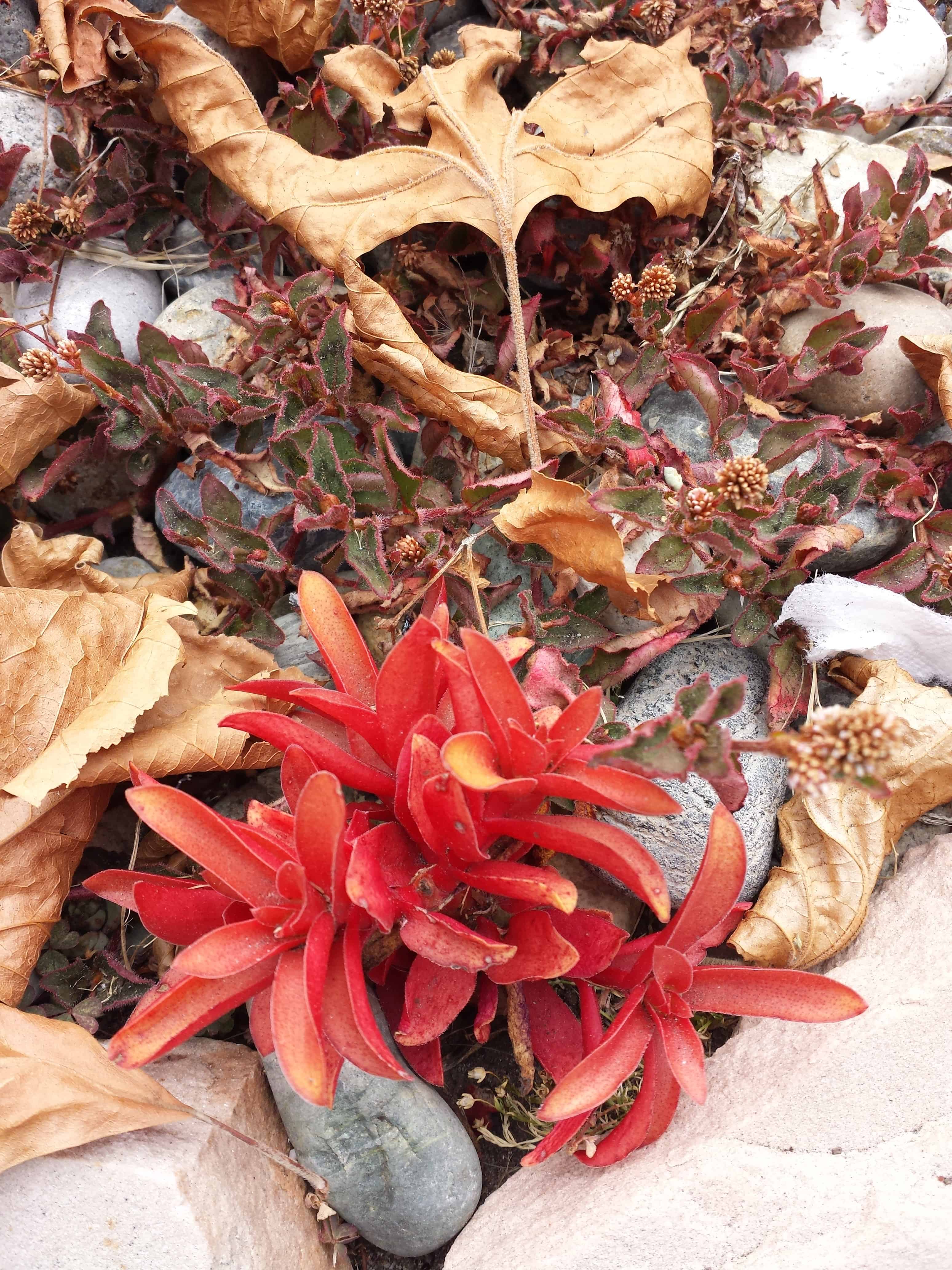
On another of my daily walks, a bit of red caught my eye. I saw this small bit of succulent and liked the arrangement.
I tried both palettes.
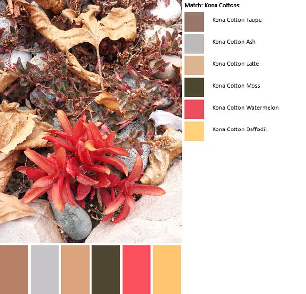
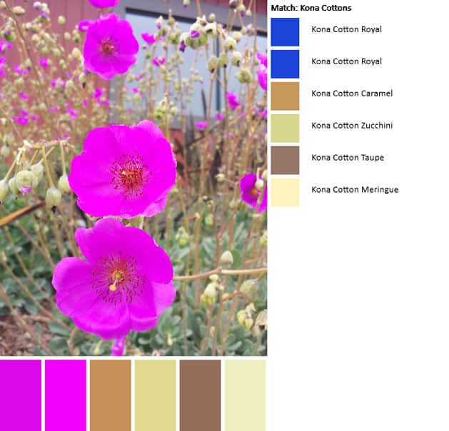
Kona Palette
Left is the Kona palette. The red and sunshine yellow (gold??) are really nice colors.
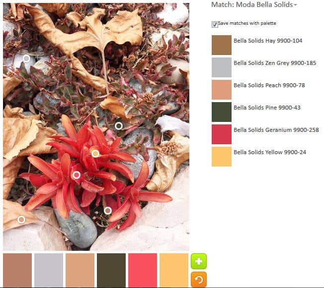
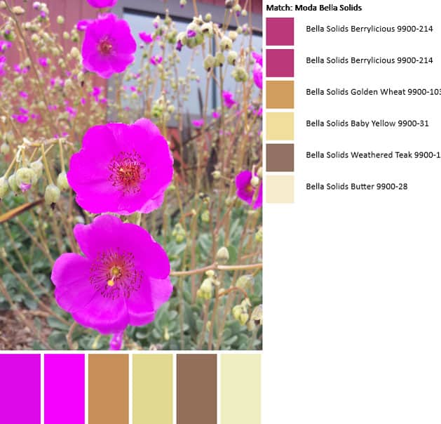
Bella Palette
Because I liked comparing the two palettes last week, I also tried the Bella solids palette. It seems similar, even though we know that the fabrics have different names.
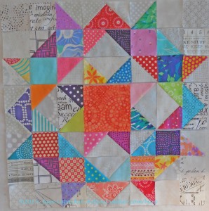
I took this picture on one of my daily walks. This plant, which has become very popular as people convert to more water friendly gardens, is more and more prevalent.
The bottom of the plant is quite ugly, but the flowers are really gorgeous. This particular photo was taken outside of a restaurant where they have recently redone the landscaping. A large-ish area of these plants are in bloom and make the area look like a field of magenta.
Unlike previous palettes, I was disappointed in the outcome of this one. the neutrals seem ok, but the beautiful fuschia/magentas are not represented at all correctly.
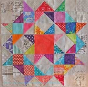
Color palette #2-July 1
I redid the palette, switching my option to Moda Bella Solids. This palette is better in that the fuschia/magenta tones are represented. However, the line must not have enough in that value range to accommodate the slight variations in color.
Finally, I pulled out my Kona color card and checked with my eyes. Indeed, the colors in the flowers are not adequately represented. Cerise (#1066) is close to the darker tones, but that lighter shade of purply fuschia is not included.
I find that playing with the PlayCrafts Palette Builder to be a fun and useful exercise. It really makes me look at the colors in a picture and analyze them.
I don’t know when I took this photo or where I was, but it is an interesting view.
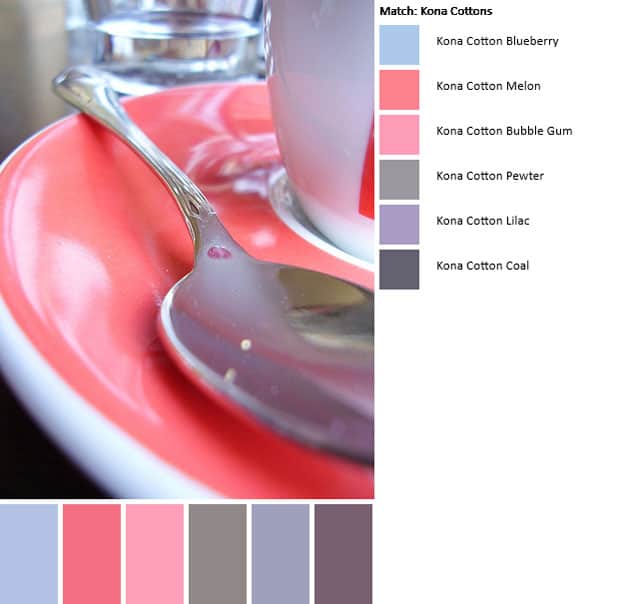
Red Cup
The palette I built has many more cool colors than I expected. I can see the reasoning when I look very closely.
Red Cup palette
If you generate a palette put a link in the comments of this post, so I can see it. Post the direct URL (link) where your drawing, doodle, artwork is posted (e.g. your blog, Flickr) in the comments area of this post. I would really like to keep all the work together and provide a way for others to see your work and get familiar with your blog or website.
The Creative Prompt Project, which we will continue to use for other creative activities, has a Flickr group. You can join to post your creative endeavors. I created this spot so those of you without blogs and websites would have a place to post your responses. Thanks for reading.
One of the things I want to do is inspire your creativity with color palettes.
June 10 Palette
The circles indicate the areas of the photo that determine the palette. The tool put all the circles ont he background, so my first palette had no brights.
June 10 Palette #3
I moved the circles a little to see the difference. I think the palette tool might tend to darker or muddier prints. It could be that I chose Kona as well.
Regardless, this tool is a great place to start, if you have a photo and want to use it as a color palette for your artwork. I used the Playcrafts tool and selected Kona Cottons to generate this palette.
If you generate a palette put a link in the comments of this post, so I can see it. Post the direct URL (link) where your drawing, doodle, artwork is posted (e.g. your blog, Flickr) in the comments area of this post. I would really like to keep all the work together and provide a way for others to see your work and get familiar with your blog or website.
The Creative Prompt Project, which we will continue to use for other creative activities, has a Flickr group. You can join to post your creative endeavors. I created this spot so those of you without blogs and websites would have a place to post your responses. Thanks for reading.
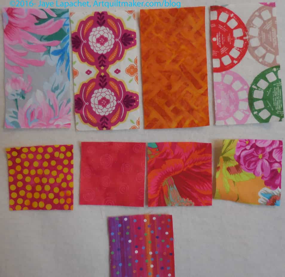
In every version of the Fabric of the Year concept, there are problem fabrics. Every year I have crammed them into some place, usually a place that didn’t quite work. This year might be different.
FOTY 2015 – Problem Children
The problem children this year have varying degrees of problems. all of them should get into the quilt, to be faithful to my rulers. Some of them will get in to the quilt, perhaps all. I am not making myself any crazier than I already am this year.
You might look at these fabrics and think I am a wimp. In some cases, I might be. The Philip Jacobs print (2d row, 2d from right) will probably fit nicely between the reds and pinks. The pinky red next to it should, too, but it is just off enough to have no compatriots in either pink or red.
The top row’s fabrics are the real demons. What color is that gold (top row, 2d from right)? Yes it is gold, but is it more brown than yellow? ERGH!
The big prints and modern prints like the Cotton & Steel Viewmaster fabric are real problems. They do not lend themselves to being blended in with any other fabrics. I constantly move them from white to color and back.
I will put as many of them on the front as I can, but the rest will go on the back. I just cannot make myself crazy.
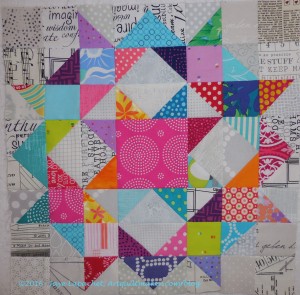
I was finally able to finish this pink (the center is pink so I think of it as the Pink Carpenter’s Wheel) Carpenter’s Wheel block. While I was working on the Sew Together Bags, I didn’t have a quarter inch foot on the machine, so I did barely any quilt work piecing. Very sad as that means very little gets done.
But the Sew Together Bags are done for the moment and I got quite a lot done over the weekend.
This one has more HSTs. I put some in the center, outside the Sawtooth Star, to try and get the look of a ring going. Not sure if I succeeded, thought I do like the look and the opportunity for additional color more HSTs provides.
I am still interested in the low volume background and am adding more of my own fabrics to the mini-charm packs I bought in Corvallis.
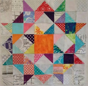
I cut and laid out another Carpenter’s Wheel block. I didn’t do it because I wanted an even number. I did it because I had another idea for a variation.
The Carpenter’s Wheel blocks were off visiting Kathleen in Reno when I started laying out the 5th version. Yes, I had another idea for a variation and decided to try it out. I was challenged by the center square. I got it in my head to use orange (forgetting that I had already made one with an orange center), thus had some fun trying out different oranges.
Carpenter’s Wheel with orange
I really thought that the tone-on-tone orange would be the perfect center for the 5th block. Somehow it didn’t work for me. I think the bold patterning of the other fabrics made the tone-on-tone look flat.
Carpenter’s Wheel with batik orange
I didn’t want a fabric that screamed because it is such a large piece compared to the other patches, so I tried this great orange batik. I thought it was probably the best of the lot, but there was something about it that didn’t quite work.
Carpenter’s Wheel with salmon-y orange
I picked out a more salmon-y orange, thinking more pink might work better. The pattern was better, but the pattern wasn’t bold enough to compete with all that was going on in the block and didn’t work.
Carpenter’s Wheel with stripey pink-orange fabric
I did think more pink was good, though, so I looked through my ‘oranges tending towards pink’ fabric to see if I could find anything. This was better. I almost went with it, but though it was a little light. You can see the block evolving as I move some of the other pieces or change them out as well.
Carpenter’s Wheel with pink stitch
I finally decided on a pink stitch design. I think it competes well with the other fabrics, but doesn’t overwhelm them.
I am working on stitching it down. As you might recall, these blocks have a lot of pieces, so it takes time. I also laid out another block and will need to pick out another center. Stay tuned.
The end of July has come and gone, which means that I didn’t make my original deadline. Still, I got back to the design wall over the weekend and worked on this piece. I decided to move all of the reds down towards the bottom, which meant touching almost every piece as I shifted the rectangles clockwise.
The biggest problem I have now is that I have a stack of blues that don’t fit on the design wall. I need to add them to the 9 o’clock position and there are many more than the 10 or so that look like they will fit. I need all of the pieces on the design wall so I can work with them all at once.
I may do some overlapping, but I definitely have to count the patches I have and figure out the size of quilt I need to make. Then I can figure out what I need to add to my design wall to design this quilt.
There are things I like about pillowcases, but more things I don’t like about making pillowcases. The other day I got into a zone with making them and the whole process wasn’t so bad. Making pillowcases in batches is definitely the way to go.
One thing about making pillowcases is the different colors and fabrics required. The sizes required are so weird that I am left with weird pieces of fabric left over. This really shouldn’t matter that much since there is really no shortage of fabric in my workroom, but the bad part is figuring out where to store these weird sizes.
All this background is to say that there is more to choosing colors for pillowcases than actually just choosing the colors. Do I want this particular fabric leftover in a weird size is a consideration also.
One thing I have done is to eliminate the trim unless I have a piece laying around that will work. Next I decide on a color I want as an accent for the cuff and go rummaging around in the particular bin where that color is stored. I might have the perfect color, but I might want to keep the fabric for something else. Lately, I have been trying not to consider certain fabrics precious. I am much happier if I can see a fabric I love in a project I use frequently.
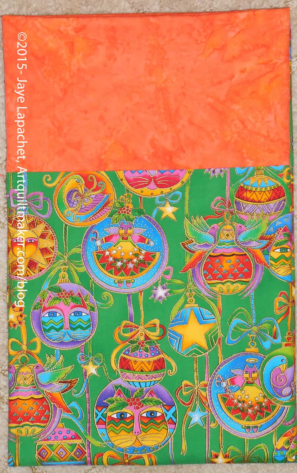
Laurel Burch Pillowcase
Some of the Christmas fabrics I had were hard to match with accent colors. I really wonder why I bought this Laurel Burch fabric, but I did and it was about to become a pillowcase. It was probably on sale.
Orange isn’t really a Christmas color, but it is different and orange makes the pillowcase even more bright and cheerful than the Laurel Burch cats already are. It is a different look, but one that will suit one of the nephews or neieces.
Purple, Green & Gold Pillowcase
The purple with gold was a challenge. it is definitely more of a winter themed fabric that Christmas per se. I would have chosen gold for the cuff, but don’t have any gold fabric. I decided to use the color wheel as my friend and picked a batik green with purple highlights. It isn’t a stellar choice because of the motifs, but it is bold and unique.
These two are the most unusual. The others I made were much m ore conventional.
I don’t know when I first saw the term “color stories.” In one way, the phrase sounds a little bit like keeping up with the Joneses – everyone is saying it, so you might as well say it, too. But after sitting with the words and rolling them around on my tongue and through my head for awhile, I decided that I like what they imply. I like the two words together. I like the pictures they create in my head.
In thinking about the words in our society, it seems to me that there are ‘standard color’ stories that we all understand*. Red and Green generally implies Christmas. Pink and blue denote girls and boys. Red, white and blue usually means patriotic in the US. The French, UK and Australia flags are red, white and blue as well, but I don’t know how they feel about the color combo. Red, orange, brown, when combined, tell us Autumn is upon us. Avocado green, gold and orange [shag carpeting] tell us the story of 1970s remodels. Black represents death here and white represents death in China. Barbie’s color story is pink even with Barbie showing up in stores dressed as a doctor, astronaut and other professionals to counterbalance all drama about her bust size and high heel shoe feet. Apparently, wedding planning includes developing a color story rather than just picking your colors. Seems like a lot of extra pressure. There are other standard color stories that we understand in our society. Which come to mind for you?
To me, color stories mean a group of colors that are saying something (ahem, telling a story). I have always made up stories, so if I let my mind go, what colors say becomes a story. In my head, the story may have characters, plot, the whole 9 yards. If I don’t take the time I just get an impression of a story that can become more later.
I wonder what happens when standard color stories are disrupted? For example, I have seen Christmas change to turquoise, silver and pink in some circles. Does that mean those still using the standard red and green are old fuddy-duddies or will they be laughing when the turquoise, silver and pink color scheme goes out of fashion and looks dated?
If you look around there are color stories everywhere. That is one of the reasons I like Instagram. Joyce and Phoebe posted a picture of bowls that I saved, because of the sunshiny-ness of those yellow-orange bowls. They say happy, sunshiny weather to me.
One of the easiest color stories is the rainbow, like the Confetti Dots that Quilting Adventures posted the other day. Rainbows are, basically, easy to use as a color scheme. Perhaps they are not as challenging, because we can get gradations of fabrics, like the Confetti Dots, and we don’t have to put a color story together ourselves
I also think that we have vague color stories to which we default. Bright or reproduction, for example. You know me, I am always encouraging you to make cheerful quilts. What kind of color story is ‘cheerful’? The word makes me think of bright and happy. I never really set down on paper what I thought about making cheerful quilts, beyond no brown and not depressing. I can see that it might be time to move on to more of a story because of some of the questions running through my mind.
House Beautiful Nov 2014
House Beautiful, yes the magazine, has a small feature called “This Month’s Paint Index”. It is a thin visual list of the colors used in the month’s issue. Looking at that tells the color story of the issue. The November 2014 issue has bright lime yellow-green upholstered chairs set on a bold Blue-Green-Teal cover. It is eye-catching to say the least, but these colors are meant to attract a potential reader’s attention. The colors in “This Month’s Paint Index” seem to be much more subtle, more realistic for use in a real person’s house.
When I see blue and gold, I think of my alma mater, UC Berkeley. When I see red, green and yellow, I think of summer and picnics. When I see pink and white, I immediately think of the colors of my sorority.
In the end, for us quiltmakers, I think that ‘color stories’ are no different than color schemes or a color palette or anything that denotes the interplay of colors in our quilts. The phrase does go a bit farther, though, if we want to add plot, characters and scenery.
*Nota bene: ‘understanding’ is different than agreeing with. Also, color stories may be understood by many people, but not universally. Also, color combinations vary by culture.
Remember this quilt? I haven’t worked on it in a while, thought it has been on the list for awhile. Working on it what I did on the weekend when I wasn’t at the races (wearing a big hat like I was at Ascot or something), doing laundry or answering one of the 1000 questions I get asked when I am at home.
The project has been on my mind. I got a bug in my ear to quilt it myself and that was sitting in the back of my mind taunting me. I wasn’t sure how long it would take me. I wanted to get it done during these two weeks (last week and this week), because I was off work and I could devote some serious time to quilting.
Wonky 9 Patch – quilting
Because this quilt didn’t have a border and I didn’t think the design called for one, I put on what I call a ‘quilting border’. A quilting border gives me something to cut off when I am squaring up the quilt and don’t want to chop of points or parts of the design for a piece that didn’t end up quite square. I learned to do this after chopping off points and designs on the Punk Rock Quilt. the only tricky part is to make sure you cut off enough so that the edge will be completely covered by the binding.
Orange blocks quilted
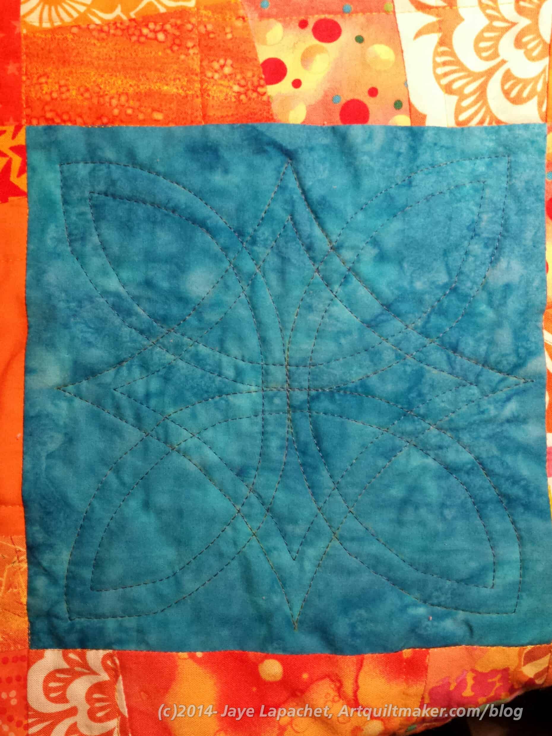
First, I quilted straight-ish lines in all of the orange wonky 9 patches. I used Aurifil #2145 for the orange blocks. I didn’t intentionally follow any lines or do any in the ditch quilting, except when I was trying to get from one part of the block to another. I did try and keep the three lines in each block about the same distance away from each other. However, sometimes I veered off track a little to make sure that there was a relatively even amount of quilting in each area. I also wanted the quilt to drape so that was another reason not to quilt too densely. That went pretty well and I didn’t see any puckers on the back. I quilted all of the orange blocks in a few hours on one afternoon.
Plain block quilting
After the orange blocks, came the hard part. Shockingly, I had an idea for the plain block quilting as well. I found a vaguely Celtic design that would work for my idea. I wanted it to be round, but all of the round designs I found were too complicated. I used Paint to enlarge the design.
I also didn’t want the design to scream out at viewers, so I used a companion color to the blue fabric (FYI: Aurifil #2740). I also used a walking foot on all of the quilting. I don’t usually do that, but it worked pretty well in keeping the puckers down.
I used Saral paper and a Sewline pencil to transfer the design. I really use the Saral paper. I don’t think there is much of the yellow left. I used the Sewline to fill in when the Saral rubbed off and I wasn’t finished quilting.
I quilted a couple of the plain blocks and figured out how to stop and start only once, assuming all went well. Not all of the blocks are perfect but, as Frances says, the Muggles won’t know. I think the overall impact is pretty striking.
One thing I wish I had done was use orange in the bobbin on the plain blocks. As it stands the blue quilting really stands out on the back.
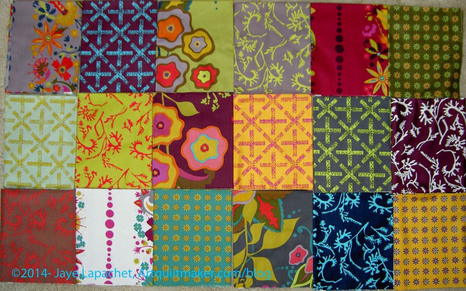
For some reason I became enamored with the Field Day print fabrics by Alison Glass. These are not my colors, they are somewhat muddy and have a flair, or feel, of the turn of the 20th Century. This ‘feel’ makes it so odd that I actually want to work with them. There is something about them that appeals to me.
My favorite print is the dark blue with the turquoise kelp-like print on top.
Shortly after receiving the fabrics, I came across a pattern I will use with these fabrics. It came from the Missouri Star Quilt Company and I found it in their Block! magazine (watch for a review soon). It isn’t a hard pattern, but there is something about it and the fabric that went together in my mind.
I washed the Field Day fabric last Friday, then started cutting 2.5″ strips on Saturday. I have about 10 strips cut. I need to cut them into 2.5″x5″ rectangles, but have only done that for one strip so far, because I still haven’t decided what to use as a background. Also, I still have about 10 FQs to cut strips from.
I thought about looking at the coordinating solids that various online shops suggest. I did that, but did not want to chose gold, chartreuse or deep garnety red-purple for the background. I want something lighter, brighter so the quilt doesn’t seem depressing.
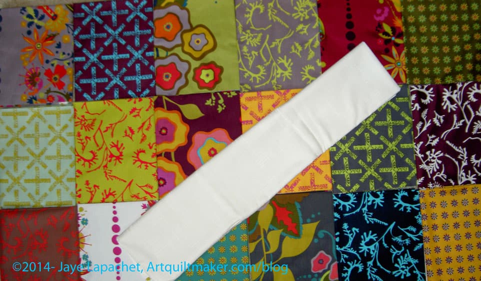
I have the following background options:
IKEA large text print
I love this print, but think that the large letters will get lost.
Painter’s Canvas in Vanilla
This is my favorite, because it brightens up the muddiness of some of the fabrics.
I also have a lot of grey.
Grey print from search
I would probably have to use a few different greys as I only have a yard of this one and I think I will need more. I don’t mind using different greys as it will add interest.
The funny thing is that after I started cutting the Field Day, I came across a friend who I think needs a quilt and this one might be perfect.