I know many of you liked the progress I was making on FOTY 2013. I didn’t like it, so I talked to Maureen and her son and started over.
This project is killing me and I have to get it done. I have to get it done for my own piece of mind. I also want to get it done, but the other layout was not achieving the goal I wanted to achieve. I was having a hard time gradating the colors horizontally and thought that I would need too much background.
I also didn’t want to do the same thing as FOTY 2012 despite the success of that quilt. I don’t want to do the same thing over and over.
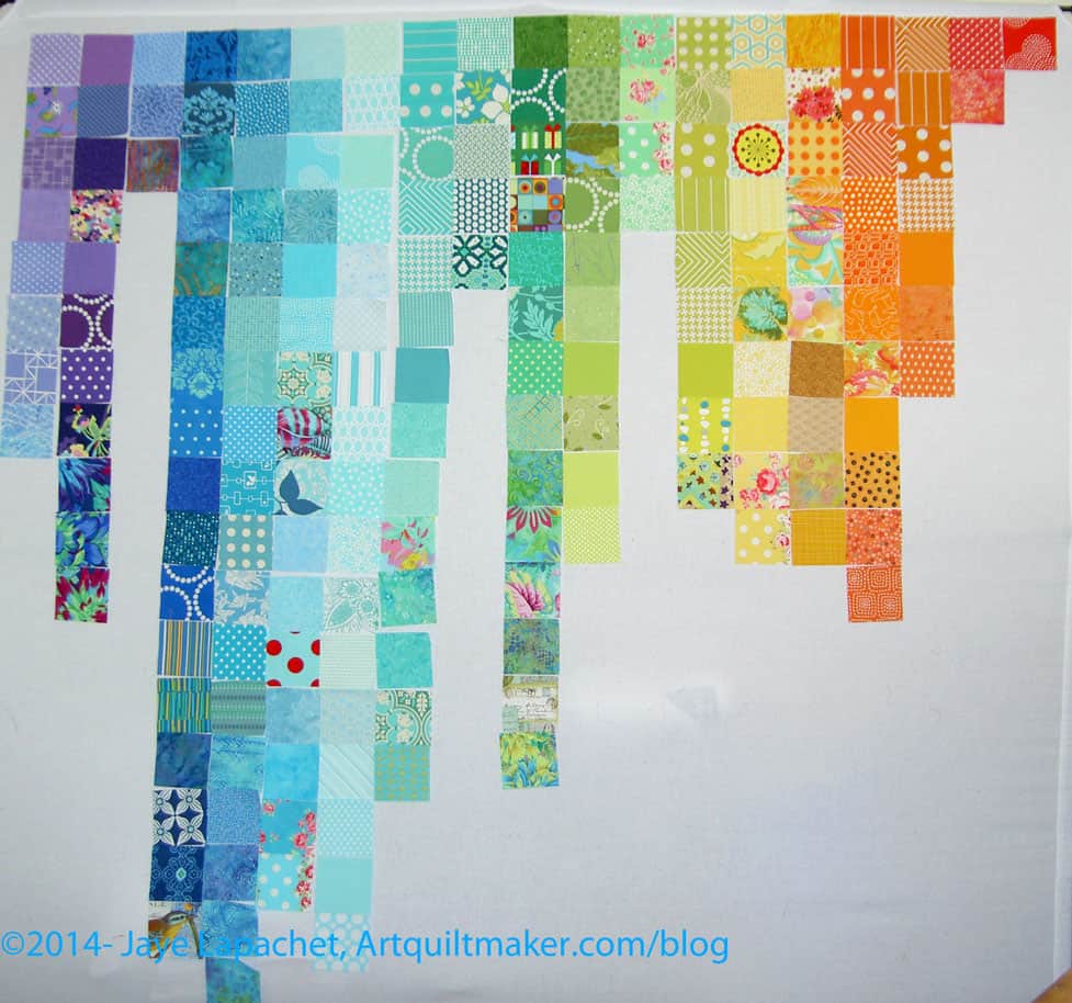
Maureen and Andy suggested starting in the middle. I went home and started, which is what you see in the picture, and I feel like the process is going a lot better.
Some theatre we visit occasionally has a “First Look” feature. It is one of the half hour’s worth of ads that plays before the movie actually starts! This is your first look at Fabric of the Year 2013.
I want to stress FIRST look. I have a long way to go to get this quilt top pieced. There is a lot of rearranging that needs to happen.
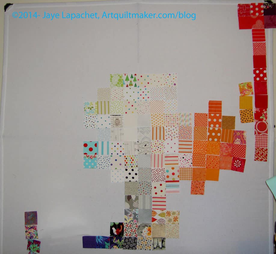
The first step to get to the first look was that I had to get the squares out of the Fabric Closet. That was pretty easy, so I sorted them into rough color piles, e.g. ROYGBIV plus grey, black and white.
Pink Chalk Fabrics sends a post card with an order. It has some gorgeous piece on the front and sizes of quilts on the back. I saw the lifestyle shot on a post card I received from them. After getting FOTY 2012 back, I knew I needed to do something a little different. How could I compete with that quilt? At some point in the FOTY 2013 cutting process, I put the squares and the image on this postcard together in my head and decided to arrange the piece in a similar fashion.
Then I got out the post card that is inspiring this piece and started putting them up on the design wall. I just slapped them up, only further sorting roughly into light, medium and dark.
First observations:
The picture above may not even begin to resemble the finished quilt.
I couldn’t fit the pinks on the design wall
Even though the Basic Textures by Patty Young (used on Fresh Fruit) are all the same value, they can’t all be next to each other.
This project has been on my mind since December when Friend Julie suggested it. I am finally making a wobbly start. The start is that I have started to choose the colors.
Julie bought me the book as a gift and after some discussions with her, I decided I would be inspired by the city around me. This, in my mind, fits into the ‘City Sampler” theme that Tula Pink encourages also.
In the winter, the sky is very blue here and, though cold, I enjoy the strong light and clear colors. It should be no surprise that turquoise factors into my choices. I just can’t help myself.
Another appeal of this project is the block element. I miss making blocks on a regular basis like I did for the A-B-C Challenge and the Star Sampler. This project will help me satisfy that craving and, hopefully, will not annoy me.
Finally, shortly after Julie and I talked about the project, Kelly brought it up as a BAMQG small group project. This means I can have fun with Julie and participate more in BAMQG.
I was having trouble getting started. I have been distracted by life and picking a few fabrics (I am sure I will need more) really helps me to get the process out of my head and started.
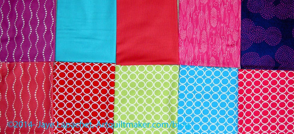
Some confluence of events made the planets come into alignment over the weekend. I picked out the rest of the fabrics (plus a few extras) for the Russian Rubix, photographed them and put them up on the wall. I think I might be ready to sew. I think so.
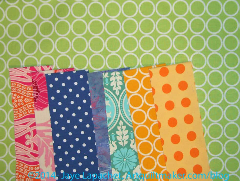
The above fabrics are the fabrics I picked. I didn’t pick them after comparing color cards and color wheels to what I already had. I wish I could say that I did a lot of work to find these fabrics, but I would be a liar. I received a coupon from Pink Chalk Fabric and, despite my vow to tone down the fabric buying, I went and looked.
Then I bought some fabrics. In fairness, I had deleted a previous coupon.
Yes, I couldn’t help myself. Something about these fabrics called my name and when I received them, I thought “yes, these are the fabrics for the Russian Rubix.”No, there aren’t a ton of cool colors like I thought I needed, but some and I think the whole group, mostly, works.
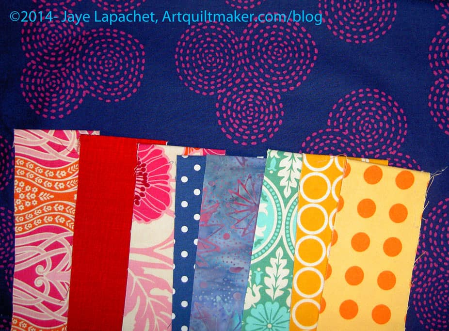
Michael Miller Fabrics Midnite Gems Stitch Circle Passion
I also thought of the dark blue/purple Stitch Circle fabric (upper right hand corner) quite a bit after I bought it. I couldn’t get it out of my head and I was really pleased when it arrived. It shimmers in a way. You should get some and look at it.
Alison Glass Sun Print Bike Path Fuchsia
One thing I liked about this fabric is stripey effect.I didn’t want, necessarily a stripe, though I auditioned some, but this has a stripe effect without the stripe being straight. I also thought the color was one that I was missing from the group.
Free Spirit Designer Solids Parrot Blue
I am becoming enamored, again, with solids.When I first started to make quilts, I thought I would do all of my quilts in solids. The only thing that tempted me into the print arena was a very expensive piece of a border print. I bought an 1/8th of a yard and used it very judiciously in my Sampler quilt. Now look at me! Barely a solid in sight. 😉
Free Spirit Designer Solids Cranberry
The solid above is definitely NOT cranberry. That is the official name, but it is not like any cranberry I have ever seen, especially if you go off cranberry juice. It is very similar in color to the Alison Glass Sun Print Bike Path Peony below. I think it works and I didn’t have many solids in the warm colors.
Sarah Jane Wee Wander Nature Walk Magenta
I like this print very much, but I don’t like the name. If I had seen the name before the print, I probably would not have looked at it. It turns out that I really like the feathers. It is a good intermediate print between the solids and some of the bold prints I have included.
Alison Glass Sun Print Bike Path Peony
I like the idea of the stripe as I mentioned above, but I also like having multiples of the same print in different colors. Again, there is some continuity without being boring.
Metro Living Circles Red
If I had to throw out one of the prints, it would be this Metro Living Circles Red. I am not 100% sold on it as part of the group. It might be the one in the quilt that is a little off and, thus, it works. Or it just might not work at all and I need to not use it.
I realized after auditioning the prints that I had a number of these Metro Living Circles, even one already in the group of fabrics I will use. Hhmm. Who knew I would like these circles so much? They are prints that I might not use if I did not have this Russian Rubix project even though I would buy them.
Metro Living Circles Chartreuse
This chartreuse is definitely in. It really lightens up the other prints. That sounds odd since the ones I chose are mostly light, but it reminds me of a ray of sunshine streaming in on the fabrics.
Metro Living Circles Turquoise
The circles above are a fabulous color and go really well with the Free Spirit Designer Solids Parrot Blue. I like the way it looks with the Notting Hill pink prints as well.
Metro Living Circles Fuchsia
I can never get enough pink, though this is called fushsia. These circles make me think of bags. Perhaps I should save some so I can make a bag, or accent a bag, with them.
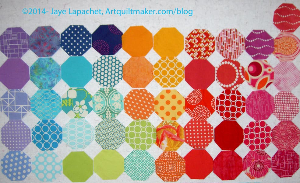
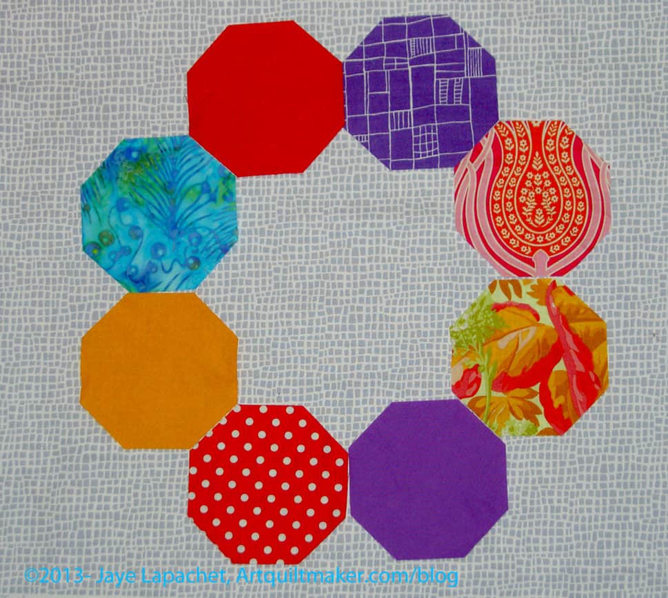
Colorful Octagons
I really like the way they look together. I feel like I have made a successful stack, like Anna Maria Horner and some of the other modern designers put together. Yes, I have one extra and these are way more fabrics than a Jelly Roll. My quilt, my rules? I guess I have enough to toss some if I don’t like them. I am pretty sure I want to make a couple of the blocks with just these fabrics. Let’s see if I remember to do it.
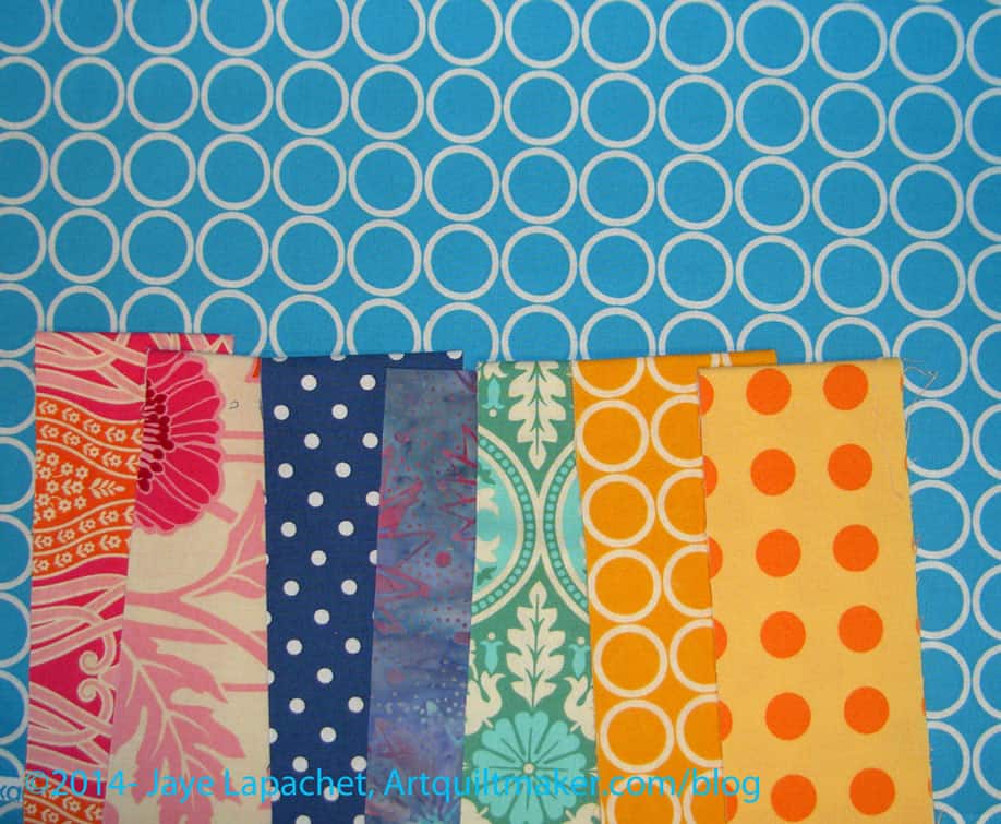
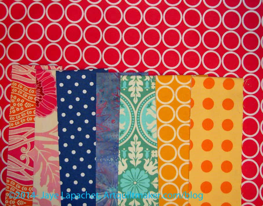
You might think it is odd that I used the same strips to review each of the fabrics, but I thought I needed a constant.
I picked out more colors for the Russian Rubix last week.I’m nearly there. I seem to be inspired to make progress all of a sudden. Perhaps my mind is freeing up from the rigors of other projects. I am not sure why that would be true since I seem to have three projects actively going all at once.
I can’t remember, offhand, where I bought that dark blue. It isn’t quite navy, but it definitely tends towards navy. It is darker and more primary than the other colors I have selected so far, but somehow I like it. I think it goes well with the selection of colors already in the pool.
I had to buck up and get on with choosing extra colors for the Russian Rubix and my Super Secret Project #4.
I came across this light blue (tending towards aqua) dot and thought it would be good for the project. It does have the same qualities as the aqua ring print – it looks like it will blend in with the background. Still, I like it.
The fabrics shown on top of the blue are fabrics I have already chosen. The oranges look more gold in the photo than they are in real life.
I am still thinking that a Joel Dewberry Notting Hill print in cool colors would be a good addition. I haven’t put it up with the other fabrics to take a look. Stay tuned for that.
As you know, the machine is in the shop. It is still in the shop. While I have the Jem on which to sew, it isn’t the same.
I have been looking at the Russian Rubix pieces A LOT. I finally decided that some of the Joel Dewberry fabrics might be wrong. I really wanted to keep them in , because they were nice darks. Sadly, they just seemed wrong. Also, I couldn’t get a comment about the large stylized flowers looking like eyes out of my mind. I think that this quilt needs some darks. These weren’t them, though, so I thought they had to go.
One fabric removed
I decided that I would take them out in stages and try to make, at least, some of these dark fabrics work.
I took out the one Notting Hill fabric that had the stylized flowers. I left in the fabric with the same colors (upper left hand corner). I am on the fence about it. I think that the piece, as I said, needs some darks.
One of the things I don’t like about the Moda Jelly Rolls is that the collections of fabrics often do not have enough darks or lights. Remember how I said I was trying to make my own Jelly Roll? I am understanding how hard it is to make a Jelly Roll with the right mix of lights, darks and mediums.
All dark Joel Dewberry removed
With the two dark Joel Dewberrys removed, it was clear I had too many warm colors
OR
I needed more cool colors.
The piece stayed like this for a week or two until today when it occurred to me that I might be able to add some DARKS and that might make the piece.
As I see it, at the moment, there are two reds that are the only darks. Perhaps I will some dark purple Pearl Bracelets. I have to look at it with the dark purple.
Once again, I am working on the background for the Russian Rubix. I know this seems like more drama than it is worth, but there are a couple of reasons, I am being picky:
White seems like an easy choice
Solid grey seems too boring and I don’t want to be depressed making it
I have to sew octagons together. I don’t want to sincerely dislike the background of a quilt that is difficult to piece
I don’t want the white in the foreground fabrics to bleed in the background and distort the look of the wreaths made up by the octagons.
I finally washed some greys and here are the choices I am contemplating:
Grey on White Batik
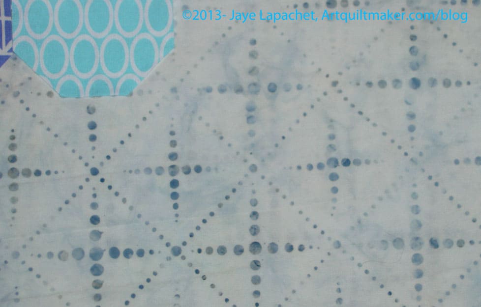
In no particular order, I am posting examples of the backgrounds I am considering. I like the movement of the grey on white batik. It does interfere with the light blue (bottom, center right).
Grey on White Batik detail
Above is the detail of the Grey on White Batik with only a little bit of other fabric for reference.
Painter’s Canvas from Magnolia Lane Collection by Laura Gunn for Michael Miller
This is my second favorite. It adds interest. It doesn’t interfere with the foreground fabrics. It isn’t boring.
Painter’s Canvas detail
I wish it weren’t so directional, though I think the directionality wouldn’t interfere with the design of the piecing. I could be wrong.
P&B Happy Go Lucky Grey
This my favorite. I love this grey. I have gone on and on about this grey and I am kind of angry that I didn’t realize I loved it when I had the chance to buy 1,000 yards. It is nowhere. I may call P&B and see if they have a bolt they will sell me.
I am worried I am just on the grey bandwagon and will sincerely dislike all of these quilts made with grey in 2 years.
Why Should you Care: you should care because of process. My thought process in the making of a quilt will give you some ideas of what to think about when you are making your next quilt. Maybe.
As I mentioned in a previous (ok, really old) post, I talked about
my new/old cutting table. Normally, the table is in the middle of the room and working piles are scattered around. Not this week. The cutting table has been in the closet for over a week and the room looks strangely clean. I hope to change that this weekend by sewing.
Yes, I am able to sew today, because the machine is back. I picked it up on my way from Grama’s. The boys are gone at a band review (I really should go to one of those sometime) so the laundry and I will have the house to ourselves.
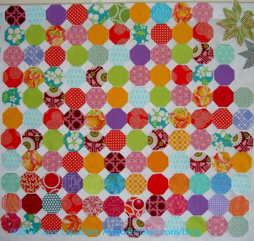
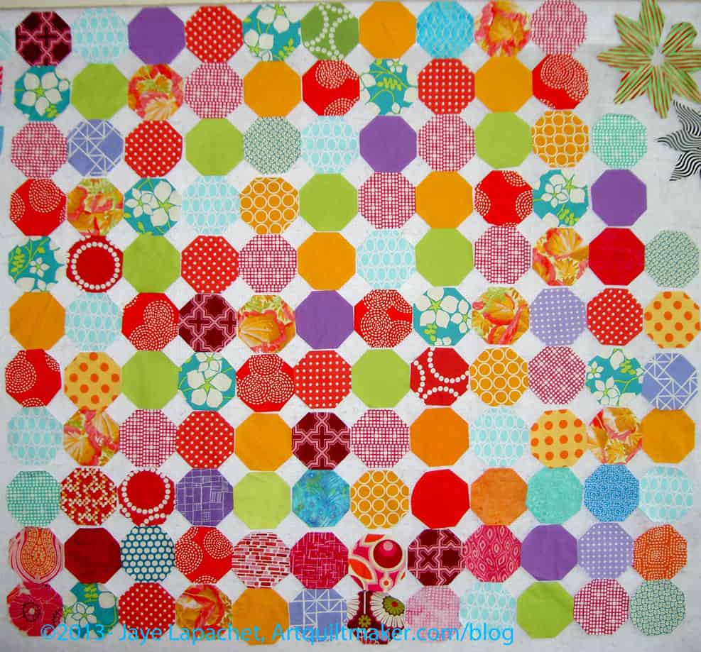
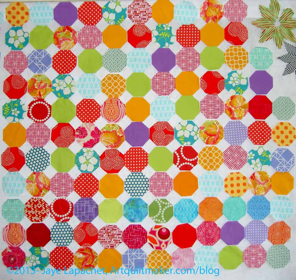
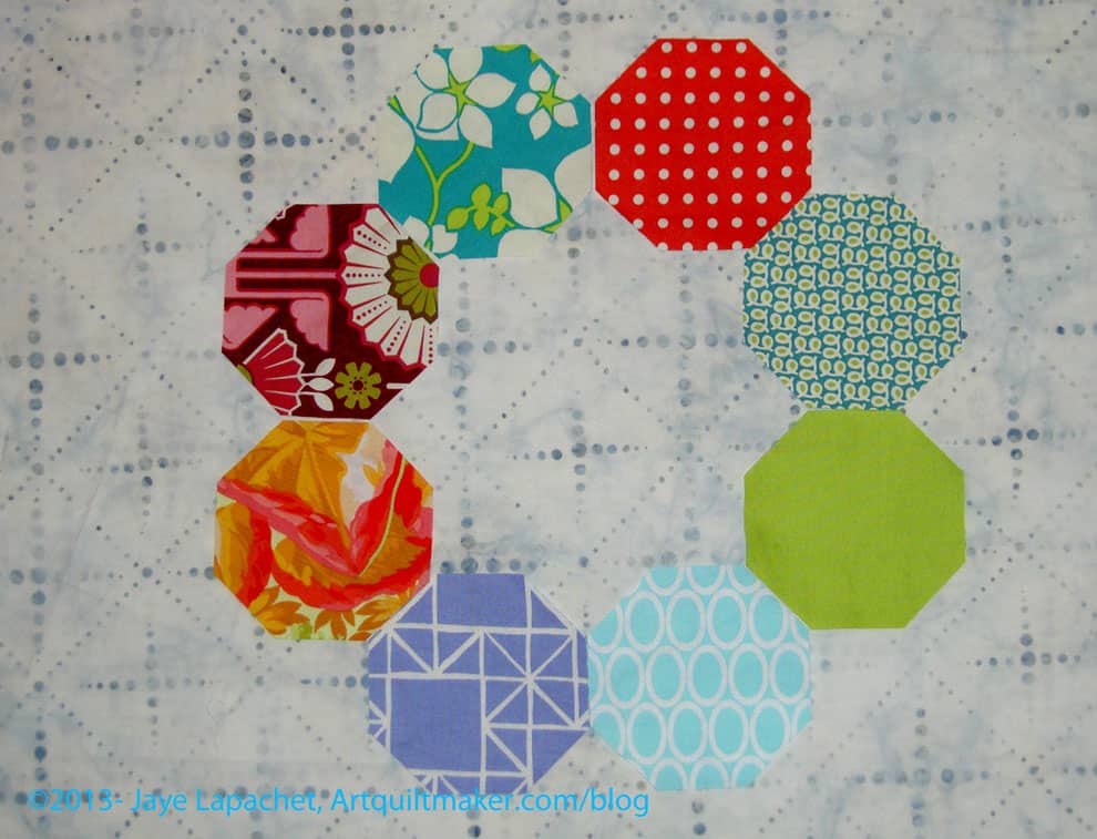
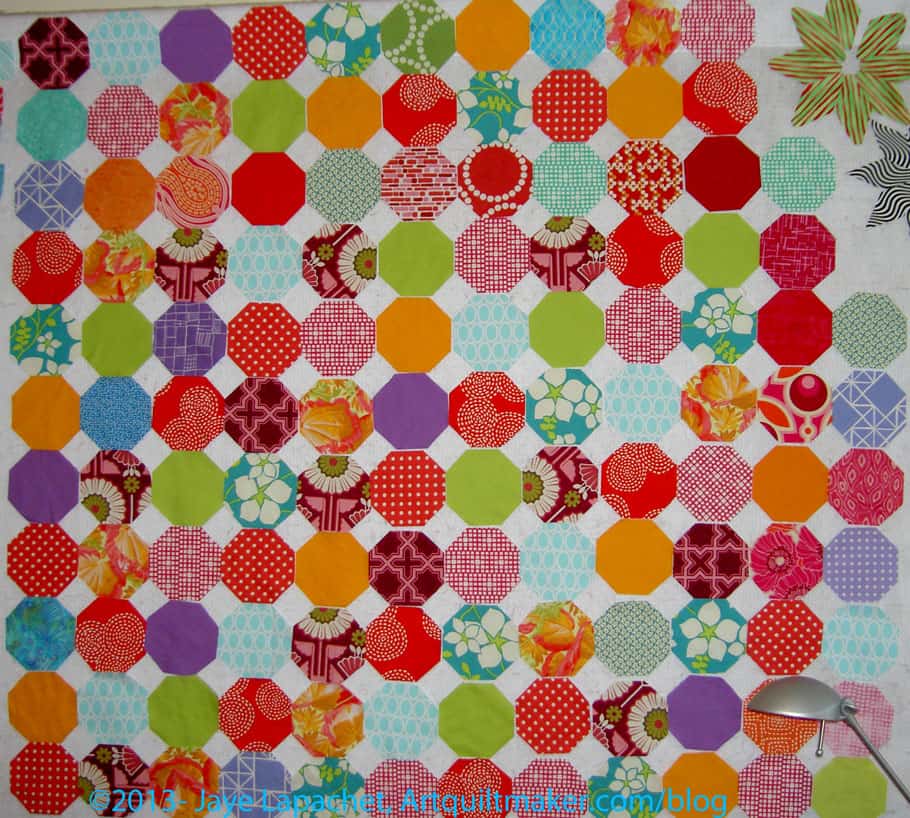
Russian Rubix Octagons
The Russian Rubix is on one of the design walls – all the little octagons crammed together jockeying for space. On the other design wall is the Attack of the Hexies.
Russian Rubix with Grey
One plan is to pick a background for the Attack of the Hexies. I received the grey i ordered and it is the wrong grey. It is the darker version of the grey I used in the A-B-C Challenge (HAP 207 S not HAP 207 LS). I hope the company will let me return it, otherwise I’ll be calling Candy’s Quiltworks to see if they still have the one I want. I am not hopeful, so I have to plow through some of my other fabrics and see what will work with what grey I have.
Scrumptious Green
My other idea is from the new Scrumptious line. It is a green stripe and there are a couple of things that concern me.
One, it is a stripe. What if all the stripes going in different directions drives me crazy?
It is a Moda fabric. I love the Moda designs, often, but I don’t love the way the fabric ravels. I am not sure I could stand working with it again on such a large project.
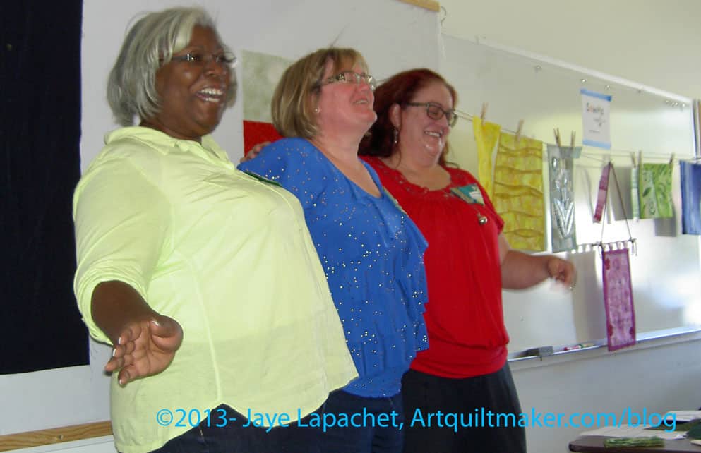
The CQFA Meeting was last Saturday and it was great. As you know, I haven’t been in awhile and I was so glad to see my art quilt pals.
Julie, Dolores and Maureen did a presentation on color. The presentation was called “Why Your Stash Needs to Be Bigger.” 😉 I am not going to rant today about the low cost of fabric compared to other stress reducing activities.
Dolores, Maureen & Julie
They covered the science of color, color in culture and some color exercises. I am trying to get Dolores to do a guest blog post, but I will post some of my notes for your edification. I was too fascinated by what she was saying to take really good notes.
Science of Color
Color is the reflection of ambient light on to an object. Dolores referred to the Archimedes Lab’s information on color. I just Googled and found some pages that I would like to explore later.
gamut is a term used for the range of color that can be reproduced.
Your monitor is set to use RGB colors and your printer is set to use CMYK colors, which why we sometimes have problems printing what is on our screen
No device can reproduce as many colors as our eyes can see.
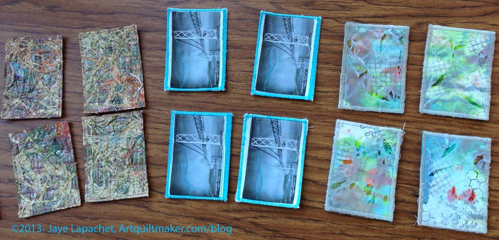
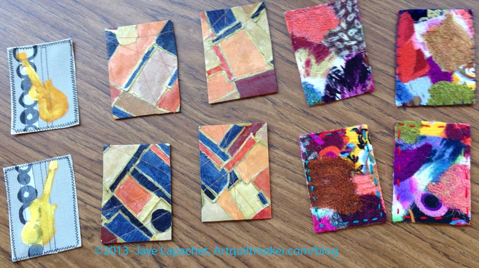
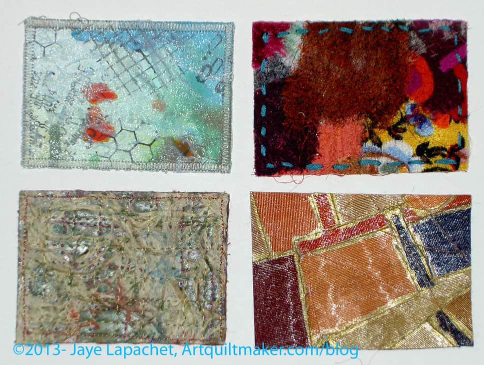
ATCs
simultaneous contrast – our eye evaluates the color in relation to what is next what we are looking at. This affects the sense of what color we see. It isn’t a function of the color, but of the perception of the color. Dolores told us that Van Gogh used this technique (?) a lot in his work. Our other senses experience this also. If you are in the hot tub, then jump into a pool, the pool seems colder than it really is. If you drink orange juice with your pancakes and maple syrup, the acidity of the juice in enhanced as is the sweetness of the syrup. Fabrics next to each other talk to each other.
Culture of Color
Maureen present culture to us and it was an eye opener how much color is involved in our culture in ways not related to actually using color such as writing with a purple pen or playing with fabric.
Language uses color in metaphors and for metaphors. This is called cognitive metaphor. Part of it is associating colors with emotions (not a comprehensive list; just some examples):
red- passion, anger, danger
green – nature, recycling
blue – calm
etc.
We have been trained to have associations with certain colors. Colors telegraph a certain message. I think this might have to do with my comments about cheerful quilts. I see certain quilts as cheerful when they have warm colors, usually. [I haven’t thought of this before, so it isn’t a fully formed thought. The idea just came together as I was writing this.]
Having emotional associations with certain colors means that we might want to look at the colors we are using in our work and ask ourselves if we are trying to telegraph a certain message through our work via color?
There is also an iPad app you might want to try out called Josef Albers.
Exercise your Color Muscle
Julie reminded us that we all have our own color palette that is defined by our lives, experiences, art to which we have been exposed, etc. Julie showed us some exercises that started in a book called Playing with Color by Richard Mehl.
She used some of what Dolores and Maureen said for the exercises, such as picking a color from two that was in the center of another color.
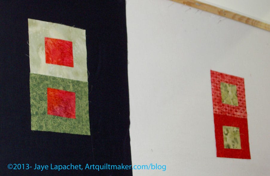
Color Exercises
One exercise (green on red) was an effort to find a color that looked the same when laid on two different fabrics in the same color family.
You’d think that this was easy, but it isn’t. There were a couple of issues to work with. 1) we are working with fabric. With paint, you can mix a bit of white in or a bit of grey. In fabric, it doesn’t work that way. 2) we were working with pattern. Julie set up the exercise and she doesn’t have many solids (remember the title of the presentation?), so she has to work with patterned fabric. Because of the contrast that often exists in a patterned fabric, it made the exercise harder. Yes, she found as many tone-on-tones as she could, but it was still a challenge. a good challenge, but a challenge. 3) we have a very limited amount of fabric handy, but even with your own stash, this would be a challenging exercise, because of the nature of fabric – it already has color. Yes, you can dye it or discharge it, but you still may not get what you expected out of the dye/discharge bath.
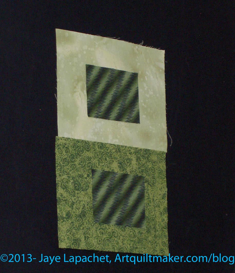
Color Exercises
This was a great example for me of “fabrics talking to each other.” It was really, really interesting and amazing to see the same fabric paired with two different fabrics and how different they can look. The green on green examples show this really well. One makes my eyes vibrate a little. The top combination has the center square looking much darker than the bottom center square even though they are the same fabric.
It was very interesting and fun to work with the whole group. I enjoyed hearing others’ thoughts and how they saw the fabric.
Business
The group is working on a second show at SF Public Library. The organizing group is new, though I have offered to still act as the liaison with the library. The piece I am thinking of making is too big and will take too long. I also don’t think I have thought through the making of the whole piece yet. Not sure. I think I will consider entering Beach Town. More info about the first show can be found in earlier posts.
The Retreat was discussed. It will be at the end of January as per usual.
CQFA Color Challenge
I was glad I didn’t do the color challenge. My idea was LAME compared to the gorgeousness that others brought. I am so lucky to be in this group. The CQFA people do fantastic work. I need to up my art quilt game. I might be a little discouraged, but the pieces were inspiring and made me think of my color strip in a different way. I am not out of the game. Late, yes, out: NO! The collage above was created using Ribbet.com.
We are having another challenge with shapes. Everyone cut shapes, our personal symbols or what we have been doodling, out of black paper and trade them. Now we have to take the symbols and do something with them.
Show and Tell
Show and Tell always make me want to work harder and more to get better.
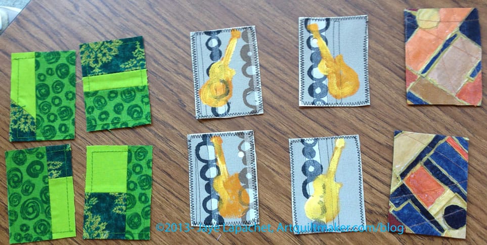
ATCs
CQFA ATCs September
We swapped ATCs (photos sprinkled throughout this post) and there were a lot of swappers this time, which was nice. My bridge ATCs (Artists Trading Cards) were very popular, which was nice. I took some photos as I crossed the new bridge last Sunday and may use those as the basis for my November set. It is hard to take good photos from a moving car, so we will see.
ATCs: The Chosen Ones
I picked a nice range of ATCs. I didn’t get one of each, because of all the swappers, but that is the nature of the beast. A couple people asked me for Bridge ATCs, so I might make some more of the historic bridge. We will see. I didn’t really enjoy the stitching I did on the photo. I felt like I had to do something in addition to just print a photo on fabric and edging it to the back to keep it together, but I wasn’t happy with the way the stitching came out. Not sure what to do.
Regardless, I need to get started on my ATCs for the next meeting. Not waiting until the last minute was fantastic.
Some of us stayed after and chatted and sewed. I started cutting out the next Petrillo Bag. Yes, I am making it with the changes I described in my previous post.
Thanks to Angela for the use of her photos of the ATCs.
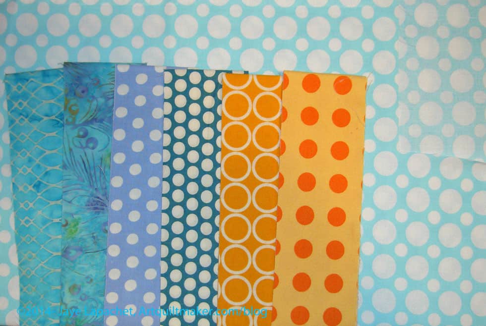
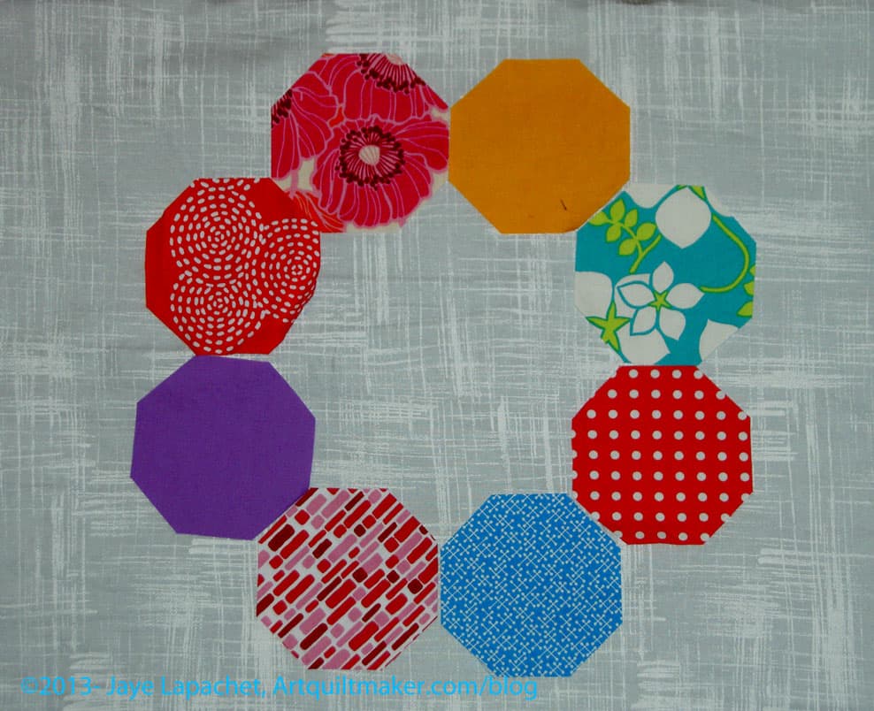
Over the weekend, I really had only a couple of hours to sew. Since I was behind Susan a bit on the Russian Rubix project, I decided to cut octagons from the fabrics I had selected for the 2.5″ strip project.
I know you must be thinking “what is she thinking!?!” Well, I was thinking that I really only needed 1-2 (at the most) strips for the 2.5″ strip project and that I could test out the color combination by using the same fabrics for the Russian Rubix project.
I may be wrong and may may have just cut up a bunch of fabric that I will need for something else. I may have cut up a bunch of fabric that I will be sick of using for projects by the time I have made two projects with it. I may hate the fabrics together, and have just cut up a bunch of fabrics in weird shapes that I won’t be able to use.
I really just needed something on the design wall.
Perhaps, for now, I am testing.
I cut a 2.5″ strip for the Jaye-roll project and a 3.75″ inch strip for the Russian Rubix and proceeded to use the RR templates to cut the octagons. I got about half way through cutting strips and octagons from the stack of fabrics I had selected and am pleased with the variety, the cohesiveness and the cheerfulness of the group.
I also cut enough so I could see how different fabrics interact with each other and on that level, I think this group is working.
Right now my biggest problem is background. It will be easier to audition backgrounds with smaller pieces available. The pattern has a white or Kona Snow background. I don’t know if I want to go that route, though I do think it would showcase-provide a nice backdrop? – for the colors of the fabric. I have been thinking grey. I wish P&B still made the Happy Go Lucky (?) grey I used in the A-B-C Challenge. I have some, but I don’t know if I have enough.
All of the above is speculation in my head. I have to get fabric out and look at it before I can decide for certain. Yes, I need to make visual decisions visually (thanks, Lorraine Torrence).
You might remember a couple of posts I wrote about choosing colors. I am still choosing colors for the Super Secret Project #3. As I said, I want to create my own roll of 2.5″ strips.
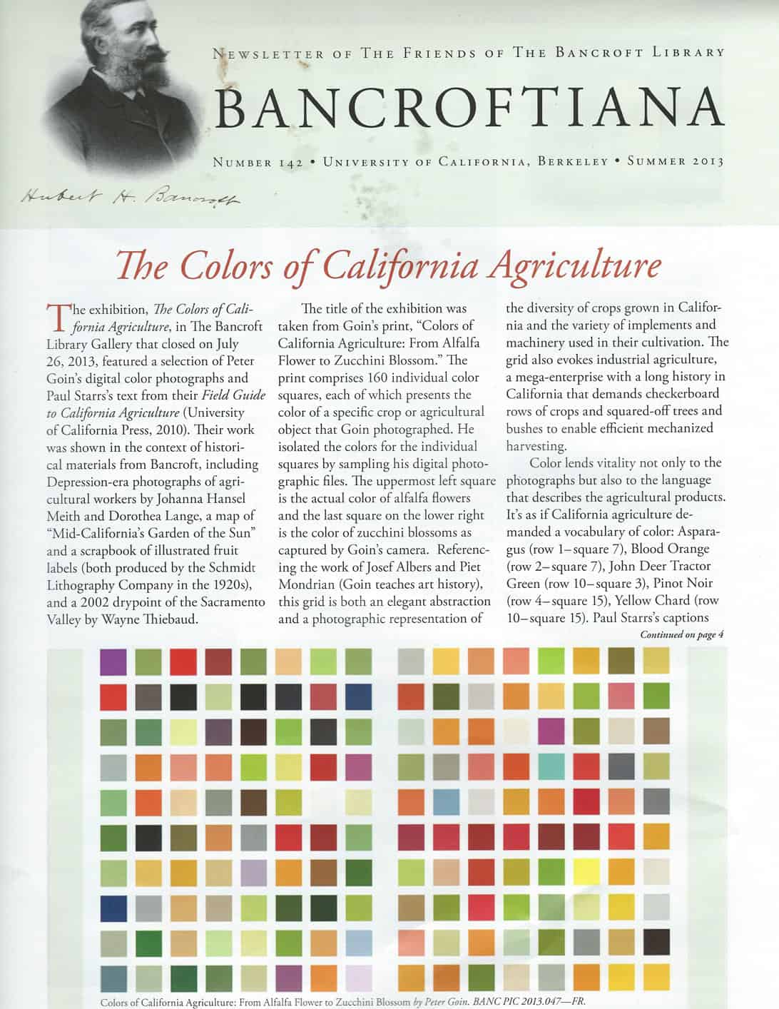
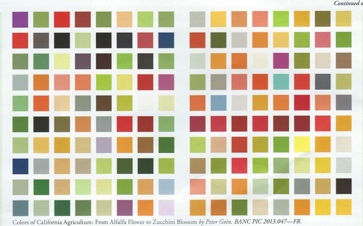
After I wrote the last post, I got a recent issue, (Summer 2013) of Bancroftiana, the Newsletter of the Friends of the Bancroft Library. The Bancroft Library is the “primary special collections library at the University of California, Berkeley. One of the largest and most heavily used libraries of manuscripts, rare books, and unique materials in the United States, Bancroft supports major research and instructional activities and plays a leading role in the development of the University’s research collections”. Periodically I give money and, periodically, they send me an issue.
It is amazing that this came right when I was working on color choices. The article discusses an exhibit that recently closed that “featured a selection of Peter Goin’s digital color photographs and Paul Starr’s text from their Field Guide to California Agriculture (University of California Press, 2010).” The color grid “comprises 160 individual color squares, each of which presents the color of a specific crop or agricultural object that Goin photographed. He isolated the colors for the individual squares by sampling his digital photographic files. The upper most left square is the actual color of alfalfa flowers and the last square on the lower right is the color of zucchini blossoms as captured by Goin’s camera. Referencing the work of Josef Albers and Piet Mondrian (Goin teaches art history), this grid is both an elegant abstraction and a photographic representation of the diversity of the crops grown in California…” I looked at the cover and that color grid and thought how much the colors resembled the color choices I was working with. Some of the colors are very similar to the colors I started to choose in the previous two posts. It also made me wonder if I am simply reflecting the colors I see in my every day life spanning all the years I have been alive?
Also, the reason the article was written was about California agriculture. Could that be my color story? I don’t know much about California agriculture and California agriculture wasn’t my intention, but it isn’t a bad color story. It is kind of an interesting story.
Choosing Colors
I was kind of shocked at how I was on the same page as the magazine. The photo really helps me figure out what colors I am missing. From the photo, for example, I can see that I need some lighter yellows – like butter yellow, but a little lighter. According to the photo I could add beiges, some blacks and very dark blues as well as a variety of different greens. Thinking about the hues and the fabrics I have already chosen, make me think about what fruits and vegetables and implements are the color of each of those squares. There are 160 different hues in the magazine photo. I don’t need, nor will I choose 160 different fabrics, but the grid gives me a lot of options.
Color Grid Bancroftiana n.142, Summer 2013
The way they named the colors in the exhibit is interesting. They named them after the colors of the plants they photographed. Asparagus (row 1-square 7), Blood Orange (row 2-square 7), John Deer Tractor Green (row 10- square 3), Pinot Noir (row 4-square 15), and Yellow Chard (row 10-square 15).
It kind of makes me warm and fuzzy to think that someone saw the beauty in something that we put on our plates and eat for dinner.
I was thinking that I was off base with the violet, but according to the color grid and this color story, the purples work. The blues in the color grid are a little more grey than I was thinking I would like to add (turquoise, of course). I will look at the color grid and see what I need to add. I still need about 15 more fabrics.
The thing I wonder about is whether I would be cheating.
Cheating?
Yes, cheating on the Bill Kerr system of choosing colors. Would I be cheating if I took some hints from the photo in the magazine? I don’t know. I’ll have to think about that, but I don’t think a little help is a bad thing.
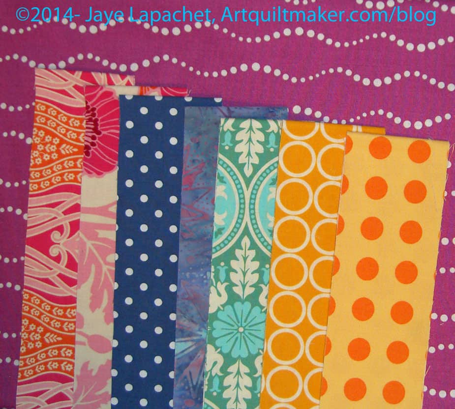
I wrote about choosing colors a few weeks ago. If you recall I am looking to make my own Jelly Roll (Jaye Roll??) to make another sample for the Super Secret Project. Since I wrote about that I took the Bill Kerr class and that class helped to inform my additional choices.
Philip Jacobs Print
Since I took the class I tried to apply the principles Kerr taught to my attempts at selecting the 40+ fabrics. I have to say that it is difficult to apply the principles we learned at the Fabric Smackdown, because I didn’t start with two completely unrelated fabrics. I started with one Philip Jacobs. You saw it in the previous post as well.
Remember I also had a lime and a couple of orange solids?
What I did NOT want to do was think of the PJ fabric as a focus fabric and just pick matchy-matchy fabrics to go with it. This fabric was to be the jumping off point, but not the full color spectrum for the quilt.
Choosing Colors
I still had the essence of the class on my mind, so I grabbed some additional fabrics….
I was going to say “that I thought would work”, but that isn’t quite right.
The fabrics I chose do work together, but I don’t think they would be typically considered “a group.”
Keep in mind, not all of these fabrics will definitely stay in the group. They might, but they might not. I think the group is interesting and it makes my eyes move around. The ones that bug me are the dark pinks from the Notting Hill group (upper left, second column). I don’t hate them. My eyes are drawn to them. I don’t think they are quite right.
I also need some more medium scale prints. Dots? Ta Dots?
I am moving forward and making progress. I need at least 12 more fabrics, if not 15. I think I am going in the right direction. I am not there yet, so I’ll keep working at it.
I want to make up my own Jelly Roll-like group of fabrics for another Super Secret Project #3.
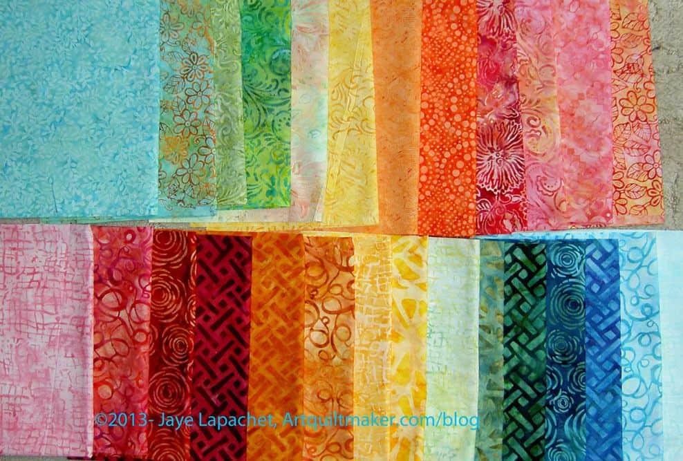
I remembered seeing these fabrics together after I bought them so I pulled them out and started trying to find some mates. I need about 45 strips, which means 45 different fabrics. That is not a MUST, but that is what I am thinking.
KQ Batiks
I pulled out some batiks and they were fine (pinks and oranges only-photo is of all of the FQs), but not perfect. I think what I saw was too much of a range of color. I need a range for some contrast, but think my mind doesn’t want too much of a range.
I really thought it would be no problem to pick 40 fabrics, but suddenly, I am not so sure. Should I add some red? Some pink? What do you think a Jelly Roll would have in it?
I know you are all sick of not seeing the finished pieces, but I promise that after I make this piece, I will be MUCH closer to showing you what I am working on.
I got sucked into Anna Maria Horner’s blog the other day as I do when the VIMH#1 wants to come out to play. I was reading about the death of her mother, then her latest pregnancy and found a post about composing a quilt for one of her daughters. She writes
“That particular Kokka piece on the right above not only captured almost the entire palette of the quilt, but the print itself feels like a patchwork so I left it in large whole blocks. I considered the direction I would orient the piece for a while though, in other words, what colored edge of the piece would be adjacent to what other piece of the quilt. When you have a single piece that varies so much within the print, this becomes pretty important, and that decision can really take the whole composition in various directions.“
I am especially interested in the line where she writes “I considered the direction I would orient the piece for a while though, in other words, what colored edge of the piece would be adjacent to what other piece of the quilt. ” I agree that this is important and she says it so well. This concept or idea has been on my mind since I began working on those tiny 4″ Sawtooth Star blocks. I wrote about it in an early Star Sampler blog post. I wrote “I want the stars to be crisp and I don’t want the colors of the fabric in the stars to bleed into the background.” It is the same idea, though AMH takes it a bit farther in that she is using larger pieces and going with the way the fabric is colored in informing her composition.
While this may be a small thing, I find it often important to think about whether fabrics are bleeding into the background and whether I want that look. If your composition wants the fabrics to merge, you can get a soft, smudgy look. It is easier to blend fabrics into each other when they are already merging into one another.
If you want a crisp look, it is important to make the background very different from the foreground pieces. The forethought will make the piece look crisp and defined.