Post the direct URL (link) where your drawing, doodle, artwork is posted (e.g. your blog, Flickr) in the comments area of this post. I would really like to keep all the artwork together and provide a way for others to see your work and/or your blog.
We are also talking about this on Twitter. Use the hashtag #CPP
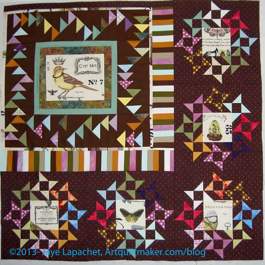
The Creative Prompt Project, also, has a Flickr group, which you can join to post your responses. I created this spot so those of you without blogs and websites would have a place to post your responses.
Tap Plastics
tap dance
tapping of a heel
tapping of a cane
beer tap
water tap
Mechanical and electrical
- Tap (valve), a device for controlling the release of a liquid or gas
- Tap (transformer), part of an electrical device
- A cutting tool, part of a tap and die set
Entertainment
- Tap dance
- Tap!, a magazine for owners of Apple’s iOS devices
- Tap (film)
- Tap: Book of Angels Volume 20, a 2013 album by guitarist Pat Metheny composed by John Zorn
- TAP (novelette), by Greg Egan
- Tapping, a playing technique for stringed instruments
- The Amazing Pudding, a magazine about Pink Floyd
- Topfield Application Program, a software application extending functionality of Topfield TV products
- Tap, a Magic: The Gathering keyword
- Lagging, a method of cheating in online games
- Tapped (film), 2009 documentary about the impact of bottled water on human health and the environment
- The Also People, a Doctor Who novel
- Spinal Tap, a parody band
Computing and telecommunications
- Network tap, a device that monitors data on a computer network
- Telephone tap, a device that monitors phone conversations
- Tap (signal processing)
- test access port (TAP) in JTAG
- TAP (network driver)
- Telelocator Alphanumeric Protocol, a protocol for sending messages to a cellular or pager service
- Test Anything Protocol, a protocol for communication of software unit testing results
- Time-sharing Assembly Program, an application for the SDS 940 computer
- Test Access Port, part of the Joint Test Action Group boundary scan architecture
- TAP, a phreaking magazine published by the Youth International Party
- Transferred Account Procedure, a GSMA Data Record Format
- .TAP files from original C64, VIC-20 and C16 tapes using the Commodore Datasette.
Transportation
- TAP Portugal, Portugal’s flagship airline
- Transit Access Pass, a Los Angeles fare card
- Tai Po Market Station, a rail station, MTR code TAP
- Tapachula International Airport, IATA code TAP
Pipelines
- Trans Adriatic Pipeline, a proposed pipeline from Greece to Italy via Albania
- Trans-Afghanistan Pipeline, a proposed pipeline from Turkmenistan to India
- Trans-Alaska Pipeline System
- Trans-Arabian Pipeline, a 1947-1990 pipeline from Saudi Arabia to Lebanon
Other uses
- Tap, Azerbaijan
- Táp, Hungary
- TAP Boyz (The Arabian Posse), a street gang
- Tap code, a cipher used by prisoners to communicate
- Tap consonant, a term in phonetics
- TAP Pharmaceutical Products
- Tajna Armia Polska, a WWII Resistance movement
- Tandem Affinity Purification, a technique for studying protein interactions
- Transitions and Access Program at University of Cincinnati
- Transporter associated with antigen processing, a protein
- Molson Coors Brewing Company, NYSE symbol TAP
- Tasmanians Against the Pulpmill, a group opposing the Bell Bay Pulp Mill
- Tunis Afrique Presse, a Tunisian news agency
- Tuition Assistance Program, New York State (Wikipedia)
tap water
Gmail tap
1989 movie
Definition: “tap 1 (t?p)
v. tapped, tap·ping, taps
v.tr.
1. To strike gently with a light blow or blows: I tapped you on the shoulder to get your attention.
2. To give a light rap with: tap a pencil.
3. To produce with a succession of light blows: tap out a rhythm.
4. To select, as for membership in an organization; designate. See Synonyms at appoint.
5.
a. To repair (shoe heels or toes) by applying a thin layer of leather or a substitute material.
b. To attach metal plates to (shoe toes or heels).
v.intr.
1. To deliver a gentle, light blow or blows.
2. To walk making light clicks.
n.
1.
a. A gentle blow.
b. The sound made by such a blow.
2.
a. A thin layer of leather or a substitute applied to a worn-down shoe heel or toe.
b. A metal plate attached to the toe or heel of a shoe, as for tap-dancing.” (Free Online Dictionary)