The first picture in this recent post by Camille Roskelley (I just can’t stay away from her blog! If she posted 10 times a day I would be reading all the time and not going to work, cooking for my family or washing my hair) made my eyes pop out of my head. I know you have gone to look at the photo and are thinking “well, yeah, it is a polka dot, you love polka dots, Jaye, big whoop.” Why my eyes popped out of my head when I saw Camille’s work is because of sashing.
Huh? you think.
 Yes, dear readers, sashing. Remember that I was puzzling over sashing options for the A-B-C Challenge earlier this week? The whole time I have been making these blocks I have been lamenting that Pat Bravo did not include a really good red in the line. I gnashed my teeth further because the Zoe Pearns dot has a wonderful red in it. I have lots of red and white dots. My idea may not work (make visual decisions visually!!!), but right at the moment I feel brilliant.
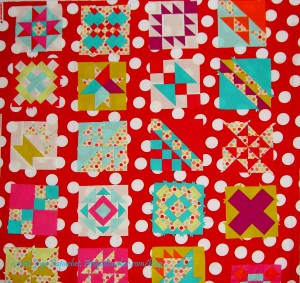
I love this big dot, but I don’t think it works with the A-B-C Challenge blocks.
The color is ok, though. It is hard to say, though, because the large dots interfere with the blocks. I think it might be from the Half Moon Street collection, but am not sure.
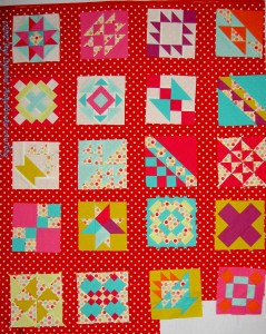
I think the smaller dots are better. This fabric is from the Sevenberry (?) collection. I am not sure, though. Not quite right. Why? I don’t know. I do have a large enough piece, though, so perhaps I will go with it just because of that. Bad reason to choose a sashing, though, I know.
Still, I liked the smaller dots, so I looked for another. A mini fabric avalanche (fabri-lanche?) gave me another idea.
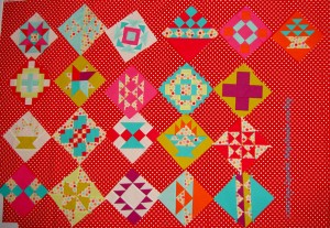
I thought, perhaps, the problem was that I was trying out the fabrics with a straight set, so i got out a different red and tried the blocks on point. Some of the blocks, like the baskets, look ok, but most of the blocks just look weird. It is probably just that I have been looking at them in a straight set, but I don’t like the on point set.
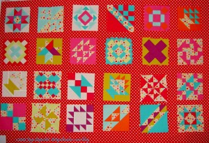
Here is the same fabric, but in a straight set. I like it, but the red is very strong.
A lot of what I like is the idea of the red. I like using a strong color for sashing and background. I also like the idea of bringing out that little red in the Zoe Pearns dots I mentioned above. It might be a dumb idea, because you can even tell. I can’t tell even when I standing with my nose next to the design wall.
More quilt drama. I am glad I am working on this now, because if I had 5 minutes one weekend to sew these blocks together and I was trying to do this, I know I would make a bad choice and have to live with it.
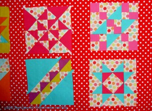
I thought you might like to see a close up of this fabric with the blocks on it. Of course, there are a lot of other factors that will affect the final outcome of this quilt: width of sashing, width of binding, arrangement of blocks (beyond straight or on point set), etc.
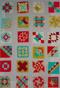
As much as I hate to say it, after all of the drama and hand wringing over red above, I think this grey is the winner. The blocks look really good. The grey is not too brown. The blocks stand out and do not blend into the background. All the colors look good. The grey is not as stark as a white.
The problem is that I have to get more. I found some on Quiltshops.com and PayPal wouldn’t let me pay. Even if I decide to go with the red, I can use this grey for something else.
Famous last words.
I have to say, I’m loving those *big dots*! In considering sashings for a project, I’d be following your own sashing thoughts, but if I went to a quilt show, it would be the *big dots* version that would grab me. I know. no help here. 🙂
(The gray dots do work well with those blocks…)
I agree w you about the gray. I love the idea of the big red dots, and maybe they could work, dpending on the width of sashing, but they are awfully busy. Everything looks so good on gray! The colors pop, and it is restful to look at. It is so widely used right now that I resist it, but I just bought 5 more yards of Kona Ash because I love it so and need it to set off some string blocks.
the grey is restful. some might say boring. The red really makes the blue pop. the problem with the big red dots isn’t that they are red, or that they are big, but that they are random. that makes the sashing pattern compete with the block patterns. The role of sashing is to frame and complement the blocks. is there another reason you are using sashing?
I want some breathing room between the blocks, so that they can each have some space to shine.
Now I am thinking grey frames around the blocks with red dots in between. Will try and take a photo.
What an awesome idea!!!
Glad there is some traction on this idea. I never know when my ideas are really stupid.
You never have a stupid idea….just sometimes you have less than perfect ones! 😀
😉
To my eye, the gray makes all the colors pop, and especially brings out the blocks with white backgrounds. Some of the blocks get a bit lost on the red dots — the ones with pink or red backgrounds (e.g. block 5 in row one, and blocks 3 in row 2 of “Small Dot #2 Straight Set.”
I also think that the gray calms things down, maybe too much for such cheerful blocks. I love the idea of gray frames with red-dot sashing in between.
I am definitely putting the grey around the blocks to highlight them. Then I will see if the red still works. I think the red is great as sashing, but I don’t want to lose any part of the blocks.