Design Series: Shape

Sandy and I were doing so well while she was on sabbatical getting the Design series podcasts to you regularly. The last one we recorded together was Texture. Then this summer, she and I have been like two virtual ships passing in the virtual night –all summer long. I was seriously thinking of recording something myself and sending her an audio file, but the technology aspects were significant enough for me to easily put it off. Finally, Sandy and I both had a spare minute at the same time, earlier this week, and were able to spend some time podcasting.

With Shape we are starting, what I think of as, some of the more advanced concepts. Will I ever learn not to leave the hard ones until last?

Probably not.

I have no doubt that you can all understand, especially with the fabulous foundation of design you have from the previous episodes and all the details we have discussed. 😉 Be sure to listen to the podcast, Episode 103. Below are the notes I used on the podcast.

Design tip: I just read somewhere that the Elements of Design are sometimes called the Sensory Properties, because the viewer can see and touch them with their senses. This is great for remembering which are the elements and which are the principles.

Shape is an Element of Design

 Definitions:

Understanding Shape

    • A shape is formed when a line encloses an area.
    • Shape is “defined by the lines forming its perimeter. Shapes are not three dimensional. They have no depth and cast no shadow. Shapes are two dimensional entities created by contrasts with their surroundings. They can contain color, value and texture as well as other elements of design.” (A Fiber Artist’s Guide to Color & Design, pg.85)
    • Shapes can also be defined by a color or value changes defining the outer edge.” (Pentak & Lauer, pg.136)
    • Shapes are used to convey meaning and organize information. (Design Element Shape: http://msfrankel.com/design_principles/elements/presentations/shape.pdf)
  • Shapes are flat and can express length and width. (Kidspace Art: http://new.4-hcurriculum.org/projects/kidspace/E-P.htm)
  • “Design, or composition, is basically the arrangement of shapes.” (Pentak & Lauer, pg.136)
  • Shapes define figure/ground relationships. (Visual Literacy: http://www.educ.kent.edu/community/vlo/design/elements/shape/index.html)  
  • There are various ways to categorize form and shape. Form and shape can be thought of as either two dimensional or three dimensional. Two dimensional shapes have width and height. Shapes can also create the illusion of three dimension objects. Three dimensional forms have depth as well as width and height. (Art Design & Visual Thinking http://char.txa.cornell.edu/language/element/form/form.htm)
  • Volume and Mass: Shape is considered to be a two-dimensional element, which has no volume or mass. Three-dimensional elements (form) have volume and/or mass. A painting has shapes, while a sculpture has volume and mass. (Skaalid, http://www.usask.ca/education/coursework/skaalid/theory/cgdt/shape.htm), (Pentak & Lauer, pg.138)   “Volume and mass refer to the three-dimensional shapes of sculpture and architecture. Even though quilts have dimension in the relief created by quilting and embellishment, they are usually considered two-dimensional because the angle of viewing doesn’t critically change the image.” (The Quilter’s Book of Design, 2d, pg.58)
    • Example: “paintings have shapes while sculptures have masses.” (Pentak & Lauer, pg.138) 

Types of Shapes

Some books say there are only three types of shapes. I found up to five in various sources. Therefore we will use the following types of shapes:

    • Geometric shapes
      • “…include, but are not limited to, circles, squares, rectangles, triangles, stars & diamonds. These types of shapes make up the bulk of the designs in traditional quilt making. They are used alone or together to create blocks and a repetition of design or patterned repeats on the surface of a quilt.” (A Fiber Artist’s Guide to Color & Design, pg.85)
      • “Geometric shapes are what most people think of when they think of shapes. ” (Design Element Shape: http://msfrankel.com/design_principles/elements/presentations/shape.pdf)Other common geometric shapes you see…are:
        • parallelogram
        • cube
        • pentagon
        • cylinder
    • Realistic shapes
      • “…replicate shapes found in [our lives] nature. These shapes actually exist and can be copied or recreated. Flowers, leaves, mountains, people, a pair of shoes and rocks in a riverbed are all realistic shapes.” These types of shapes are used quite often in applique’. (A Fiber Artist’s Guide to Color & Design, pg.85)
        • Check out Laura Kemshall’s DesignTV video where the main focus is the pair of red shoes. The shoes are a realistic shape. You can find the video in the Free Shows link on DesignTV. It is called Sketchbook Secrets – Using Photocopies Part 1. You will enjoy it.
    • Organic shapes (AKA Natural shapes)
      • “…are usually taken from nature but are less consistent than realistic shapes and offer more variation.” The following all have shapes that can be used as design elements.
        • clouds
        • flowing water
        • puddles
        • spills
      • Organic shapes call be linked to both the realistic and the abstract. (A Fiber Artist’s Guide to Color & Design, pg.85)
      • Abstract shapes
        • “Abstraction of shapes implies a simplification of natural shapes to their essential, basic character. Details are ignored as the shapes are reduced to their simplest terms.” (Pentak & Lauer, pg.144)
        • “Abstract shapes are those that have a recognizable form but are not “real” in the same way that natural shapes are. For example, a stick-figure drawing of a dog is an abstract dog shape, but another dog in a photo is a natural shape. Abstract shapes in Web designs are usually added through images. Some examples of abstract shapes are:
        • “Abstract shapes do not fall into the geometric category and are usually an exaggeration or simplification of natural shapes. With these shapes realism goes out the window and improvisation takes over.” (A Fiber Artist’s Guide to Color & Design, pg.85)
          • Example:  a landscape stitched together using blocks and strips of color to imply a landscape. “We know that landscapes are not filled with  squares, rectangles and strips, but when placed together in the right position with the right colors a landscape can be implied. Art” quiltmakers often rely heavily on abstract design and shape. (A Fiber Artist’s Guide to Color & Design, pg.85)
        • Abstract shapes are “simplified or transformed from the real object. The amount of abstraction can range from slight to extreme.” “A transformed shape can be used to provoke a response in the viewer and to emphasize elements in the subject.” (The Quilter’s Book of Design, 2d, pg.59)
          • Example: stick figure
          • An example of an abstract and a realistic shape side by side is the New Yorker magazine cover from November 23, 1992. (Note: click on the link, you will be asked for a username and password, but close the box and you can still see the cover without logging in or paying. If you want to read the article, you have to pay. You can also go to the Library and request to see the issue)
      • Non-objective shapes
        • “…shapes not found in geometry or nature.  These are non-realistic. They are similar to abstract shapes, but they lack any relation to a real idea or object. Free style piecing often features non-objective shapes.” (A Fiber Artist’s Guide to Color & Design, pg.85)
        • “Non-objective shapes are frequently used when the subject of a work is a concept, such as the relationship of colors or an emotion.” (The Quilter’s Book of Design, 2d, pg.59)
          • Example is a quilt called Two Trunks, by Ann Johnston, 2004.

      Properties of Shape

      • Size – “scale the shape you choose to enhance the meaning of your quilt design. Size alone can give emphasis to a shape in a design.” (The Quilter’s Book of Design, 2d, pg.60)
      • Proportion – “…the size of a shape in relationship to other shapes in the same design.”  Making shapes “much larger and out of proportion to other figures is unexpected and adds significance to their position in the design.” “If the scale of a shape is exaggerated by the artist, it may command attention.” (The Quilter’s Book of Design, 2d, pg.61)
        • Example: If you have a giant figure on your quilt and the houses, cars and animals are all much smaller, this use of proportion tells the viewer that the figure is the most important part.
        • Example: if you make a medallion quilt with a Mariner’s Compass or star (like Sandy’s Stonehenge piece) in the middle, the star becomes the most important part, because it is the largest. It doesn’t mean we shouldn’t look at the other parts of the quilt, but larger, generally,=more important.
      • Placement – “use placement of shapes for three-dimensional effects in a design.” (The Quilter’s Book of Design, 2d, pg.62) This does not mean you are making a 3D object, just that you are creating that effect using shapes.  For example, “[i]f shapes are overlapped, one appears to be in front of the other, giving a sense of depth.” (The Quilter’s Book of Design, 2d, pg.62).
        • …we automatically view the bottom of a composition as the foreground and the top of a composition as the background.” (The Quilter’s Book of Design, 2d, pg.62)
        • “The placement of shapes can direct and control where the viewer’s eye is first attracted, where it travels next , and where it ends. (Art + Quilt: Design Principles and Creativity Exercise, pg.28) 

      Psychology of shapes

      Use of Shapes in Design:

      Using Shape to achieve balance: (Pentak & Lauer, 5th, pg.88)

      • Shapes can be equal in size and density to achieve balance, but a larger more simple shape can also be balanced by smaller, more complex shape. Imagine a rectangle inside a rectangle on the left and splat or blob inside a rectangle on the right. The splat is more complex, thus, even though smaller, it can balance the simpler shape.
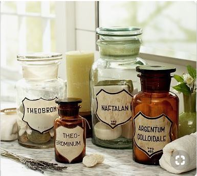
      Apothecary Jars by Pottery Barn
      Apothecary Jars by Pottery Barn

      The photo above shows four jars. The brown jars are smaller. They are also denser than than the larger jars which seems to achieve the balance. The candle helps with the balance by mimicking the shape of the jars and making an odd number of shapes .

      The Shape vs. Form Conundrum
      A shape is also sometimes “called a form. The two terms are generally synonymous and are often used interchangeably. ‘Shape’ is a more precise term because form has other meanings in art. For example, ‘form’ may be used in a broad sense to described the total visual organization of a work, including color, texture and composition. Thus, to avoid confusion,” and because we are going to use form in a different way for our purposes, “the term ‘shape’ is more specific.” (Pentak & Lauer, pg.136)

      Notes:

          • “Pictures certainly exist without color, without any significant textural interest, and even without line, but rarely do they exist without shape.”
            • Example:  modern paintings that are just splatters of paint. The splatters/droplets have a shape
          • “A flat work, such as a painting” or a quilt, “can be viewed satisfactorily from only a limited number of angles, and offers approximately the same image from each angle, but three dimensional works can be viewed from countless angles as [the viewer] moves around them.” (Pentak & Lauer, pg.138) 
          • Negative Space is the area that surrounds the shapes. (Artline Elements of Design: http://coolschool.k12.or.us/courses/115100/welcome/elements1.html)
          • The placement of one shape – a positive figure or foreground – creates another, a negative figure or background. The placement of a shape organizes the empty space around it into more shapes. (The Quilter’s Book of Design, 2d, pg.62)
          • Shapes can vary endlessly and can suggest physical form and direct eye movement.  (Visual Literacy: http://www.educ.kent.edu/community/vlo/design/elements/shape/index.html)
          • Simple shapes are remembered and understood more easily than complex shapes.  (Visual Literacy: http://www.educ.kent.edu/community/vlo/design/elements/shape/index.html)
          • Shapes serve many purposes in visual images. Value, texture, and color help us see different shapes.  (Visual Literacy: http://www.educ.kent.edu/community/vlo/design/elements/shape/index.html)
          • “Unless we are working whole-cloth, we textile artists must cut out shapes to create our work. The placement of shapes can direct and control where the viewer’s eye is first attracted, where it travels next , and where it ends. (Art + Quilt: Design Principles and Creativity Exercise, pg.28)

      Here is your mystery to ponder: “which came first line or shape?” Kind of like the chicken and the egg. (The Quilter’s Book of Design, 2d, pg.58)

      Resources:

Not Renewing

I received a ‘SERVICE INTERRUPTION PENDING’ notice from QNM yesterday. I received this notice despite the fact that I have sent back at least 2, if not 3 of their previous renewal notices letting them know I am not renewing.

I wonder what it takes for them to get the message?

Why am I not renewing? Many reasons.

Reason #1: My primary reason is that QNM is now part of a group that owns Love of Quilting, Keepsake quilting and other quiltmaking properties. This group has low standards for customer service.When I was looking for certain rotary cutting instructions that were not included in a pattern, but were mentioned on the Love of Quilting TV show, I kept getting fobbed off on someone else. Nobody would take responsibility for helping me, for finding the instructions.  I am not a moron. I know how to check the web, I have the CD of patterns, which I also looked at. They just don’t care.

Reason #2: I don’t usually use patterns, so the projects in the magazine are a waste of space for me and I don’t want to pay for them. This issue says “..patterns are ideas or guidelines not absolutes.” This is not the ‘vibe’ I have gotten from the quilt industry lately. They want you to use patterns, buy the printed pattern and the Jelly Roll and make what they tell you to make. The quote is quite ironic, I think.

Reason #3: They keep changing editors. Every issue seems to have a new editor.

Reason #4: My fabric doesn’t match the patterns anyway. When I did try and use a pattern (Stepping Stones by the Lintott girls) I found it to be very difficult, because they didn’t use terms such as light, medium and dark, large-scale print, small scale print or solid when describing the fabrics. They used pre-cuts and that was all the pattern was written for. There was no option for the future, when that pre-cut isn’t available or other color choices, because a person doesn’t like that mushy look.

Reason #5: I didn’t ask to subscribe to this magazine. I unsubscribed some time ago and was re-subscribed when they shut down Quilter’s Home.

Reason #6: I have enough to read. I am finding that reading in my life is going by the wayside. I have so many obligations and so much to do that reading is one of the things that is dropping away. If I didn’t have audiobooks, I would never ‘read’ anything. It was such a pleasure to read more than 2 pages in a real book this week while I was sick.

Reason #7: I have enough ideas. I really don’t need anymore new ideas. What I need is to figure out how to live longer (I already don’t smoke), so I can get through them.

Reason #8: There is a mini clothing catalog in the center. Not sure if the owners noticed, but QNM is quilt magazine, not a clothing magazine, why not put a fabric catalog in the center? I think this is one of the problems with QNM being owned by a private equity fund rather than by someone who knows something about quiltmaking. They lump women into a group with the idea that “if they like quilts, they must like clothing.”

Reason #9: I am really liking the Quilt Life magazine. Yes, they have patterns, but the patterns are not the focus. I also like the writing.

Reason #10: I can always change my mind

There are a lot of reasons to like QNM: the great quilt photos, variety of articles, variety of voices writing, the quilt world news and the interviews with designers. I don’t like some of the changes, but I can’t condemn the whole magazine. For now, it just isn’t for me.


Creative Prompt #174: Fire

Post the direct URL (link) where your drawing, doodle, artwork is posted (e.g. your blog, Flickr) in the comments area of this post. I would really like to keep all the artwork together and provide a way for others to see your work and/or your blog.

The Creative Prompt Project, also, has a Flickr group, which you can join to  post your responses. I created this spot so those of you without blogs and websites would have a place to post your responses.

Forest fire

camp fire

fireplace

Campfire Girls

light a fire

1906 San Francisco Earthquake and Fire

firepit

Definition: Fire is the rapid oxidation of a material in the exothermic chemical process of combustion, releasing heat, light, and various reaction products.[1] Slower oxidative processes like rusting or digestion are not included by this definition. At one time, fire was considered an element but no longer.

The flame is the visible portion of the fire. If hot enough, the gases may become ionized to produce plasma.[2] Depending on the substances alight, and any impurities outside, the color of the flame and the fire’s intensity will be different.

Fire in its most common form can result in conflagration, which has the potential to cause physical damage through burning. Fire is an important process that affects ecological systems across the globe. The positive effects of fire include stimulating growth and maintaining various ecological systems. Fire has been used by humans for cooking, generating heat, signaling, and propulsion purposes. The negative effects of fire include water contamination, soil erosion, atmospheric pollution and hazard to human and animal life.[3] (Wikipedia)

wildfire

CAL FIRE

The Foundation for Individual Rights in Education

SF Fire Credit Union

Firefighters

Chicago Fire

Firefox

fireplace tools

FDNY

element

I’m on Fire – Bruce Springsteen

firetruck

arson

Kindle Fire

Fire safety

Triangle Factory Fire

National Fire Protection Association

Fire Island

The Fire Museum of Maryland

Pokemon Fire type

Current Fire Danger


Brief Update

Target
Target

Am I on target?

Not by any stretch. Sewing is going very slowly and it is aggravating. I want to spend a stretch of time in front of the machine and it just isn’t happening. I hope to devote Saturday to sewing. Damn the bulbs I bought on Monday that need to be planted.

UGH! My stomach is killing me this morning and it is not my normal stomach issues. I can’t think. I hope I don’t have the stomach flu. If I do, at least I get to stay home, but no chance that I will be able to sew.

I want to work on the whole cloth quilt. I need to devote some time to it so that I can finish, at least the quilting, and have it ready for the BAMQG October meeting. Saturday.

I have also been thinking of making a bag. I bought some of the press on vinyl that Pam of Hip to be a Square mentioned recently in one of her podcasts. I found that my water bottle gets the Springy Bag‘s pockets a little wet from the condensation. I thought that ironing on this vinyl to the inside of the bag might help with that. I hope to try it; I just don’t know when. Have you tried the iron-on vinyl?

Short, but sweet. I am having a hard time keeping up with the blog, but, for YOU, am trying. Have a great day.


A-B-C Challenge Progress

A-B-C Challenge blocks sashed

I finished sashing all of the blocks over the weekend. I really only had a few hours to sew this weekend and that was one of the things I wanted to accomplish.

My next task is to figure out how big the blocks need to be and to trim them. I am not quite sure how to figure that out, though I am sure it will come to me. I am thinking they will end up about 8″.

I also want to try and put some red sashing in between the grey. TFQ wasn’t so sure about the red, but we didn’t put any up between the blocks and try it out.  she likes the effect of the blocks floating. I think there is too much grey, though that might change when I trim the blocks.

Various & Sundry #12

Other Artists

Recently we went to Disneyland for a vacation. It was a special birthday for DH so he got to pick the trip. I had a great time, because I love Disneyland, but it was very tiring. I don’t think a pair of shoes exist that would make walking on concrete for 14 hours a day 3 days in a row comfortable.

History Quilter Image

One of the highlights of the trip was meeting Susan of the History Quilter website and podcast. I have had some GREAT experiences meeting Internet people IRL and some experiences where the people should have just stayed in my computer. Meeting Susan was a great experience. I left the park in order to meet Susan. The boys rode all the rollercoasters, Tower of Terror and other stomach lurching rides while I was busy. We met at my hotel and then walked over and had smoothies at a cafe nearby.

Our boys are similar in age and have similar interests, so we had stuff to talk about on that subject. I was thrilled to hear about her new machine and that she lived in my area early in her life. Great visit!

PP Fabric from Pam
PP Fabric from Pam

Pam of Hip to Be a Square podcast recently had a major fabric giveaway (closed now, sorry). She was kind enough to send me the Pointillist Palette fabric. If you don’t know, Pointillist Palette fabric was designed by Debra Lunn and Michael Mrowka back in the dark ages of quiltmaking. This fabric cemented my friendship with TFQ, got me stashing fabric and started my Pointillist Palette series. It was one of the first lines I noticed that was so vibrant and bright. Some day I’ll write about one of my first meetings with TFQ.

Anyway. I still have PP fabric waiting to be made into the last 3 quilts of the PP series, but getting some more is never a bad idea. Thanks, Pam!

I clicked on a link to some new fabric by Daisy Janie and saw that she has something called the Lancaster Diamond Quiltalong. The design looks just like my Renewed Jelly Roll Race. There are some small differences, but essentially the designs are the same. As I often say: there is almost nothing new in quiltmaking.

Tutorials

Adrianne, Little Bluebell reminded me of another way to make half square triangles (triangle squares). If I think about it right, some of the edges are on the bias, but I know that won’t daunt you intrepid piecers!

Do you get inspiration from the Quilt Index? Here is a tutorial on how to use it to your best advantage.

Around the Web

I receive the Cloth Paper Scissors Daily newsletter, which provides their daily blog post in my email. I don’t always have time to read it, but I saved one called “Start a Letter Writing Campaign.” I put off reading it for a few days, because the title made me think of petitions and political campaigns and I want to stay as far away from that stuff as possible. Boy was I wrong. This was a homage to actual letter writing with pen and paper. I loved it. Perhaps you will, too.

I am embarrassed to say that I missed this homage to the quilts the Bay Area Modern quiltmakers entered in the county fair on Adrianne’s site.

Katie of Katie’s Quilting Corner does some interesting things. Over the weekend, she was tweeting about putting a zipper in using her embroidery machine. I could not visualize it and neither could landscape lady. Katie is great at posting videos and so we asked her to do so. She did! Check out this blog post including the video that shows a zipper being put into a little project.

Lazy Girl Blog has a round up of interfacing. I think there is never too much information about interfacing. This appears to be a new line of interfacing by Lazy Girl Quilting. I am not endorsing these products, as I haven’t tried them. Just letting you know what’s out there.

Lisa Call had a great post on clutter recently. I am guilty of the pen dilemma!

Ruth of Pippin Sequim (remember her from here?) was featured on the QuiltCon blog for her block for the QuiltCon challenge. She really shines in the blocks she made.

Mobile Quiltmaking

I am an inveterate journal writer. I write almost every morning and draw and doodle in my journals. They are not beautiful and are very text heavy. I have illusions of people studying them in awe after I am dead.

Now that you have stopped laughing, gotten up off the floor and are back to reading <insert stern look here>, I will continue. 😉

I have dabble in OneNote, Penultimate, SpringPad, MobileNoter and Evernote. My friend swears by Evernote and I miss the tactile feeling of the pen on the paper. The stylus on Penultimate just doesn’t work for me. So, when a friend sent me an article where Evernote has teamed up with Moleskine, I was very interested. The fact that I can put drawings into Evernote may make me move, at least partially, to online journaling. I’ll update my app and see what I think. The update may only be good for the pay per view version in which case I will only come back and tell you nothing happened. I am not buying a $50 app just to try out a mobile journal. Sorry kids.

Other

Tomspoolery Sad Day
Tomspoolery Sad Day

I got a notice from Tomspoolery that they are closing.

I have an account, but I didn’t use them that much. I tend to go towards SeamedUp for this kind of thing, but this blog is really my go to place for organizing my projects. I also have a file for each of my quilts and stuff gets stuck in those files as I work on a quilt.

Still, I am sorry to see them go as I think they made SeamedUp a better place.

I also liked their color scheme – very cheerful.

Then…I was going to continue…

If you haven’t been over to SeamedUp lately, go check it out. They did a major overhaul recently and the site is looking really good. I don’t think it has reached Ravelry proportions yet, but it will.

BUT, then this…

SeamedUp died this week. I really liked the new color scheme and recent changes. I thought things were looking up for them. First Tomspoolery, now SeamedUp. Sad. Many people are moving over to ThreadBias. I reserve my preferred login and I uploaded one project, but I don’t want to spend more time on another site that doesn’t have longevity.

Finished: Renewed Jelly Roll Race

Renewed Jelly Roll Race

Finally! A finish! It has been so long since I finished a quilt completely that I forgot how great it was.

Yes, I have finished a lot of tops and some smaller projects, but quilts are different. They feel more real.

Really, I still have to put the sleeve on, but I couldn’t wait to put up a Finish post.

Enjoy!

September BAMQG Meeting

Once again, BAMQG and CQFA were on the same day. I had a long week and couldn’t make both because of some unexpected tasks that fell on me. I was sorry to miss the CQFA meeting, but I am glad I was able to get in some quilty love today.

TFQ came with me again, as she is visiting, and we spent a lovely 45 minutes chatting on the way down. the meeting had just gotten started when we arrived and there were a ton of announcements. Now people are coming from other guilds to get us to be a part of their activities.

  • SFQG came to invite us to their show, which will be held in March 2013.
  • The SCVQA wants to give us a spot in their show to exhibit modern quilts.
  • Adrianne mentioned the Alden Lane Quilt Show, which will be held September 22-23 I Livermore, CA

We have such an active and fun group!

Charity

We are up to 72 or 73 finished quilts to give to charity this year. Some competitive types want to get us up to 100. I turned in the pink donation quilt this time, but didn’t get the green and pink top done yet, so that will be for next time.

Amanda asked that cat beds be filled full, rather than 3/4s full, but not overstuffed.
Show & Tell

Show and Tell was fairly amazing. Below is the list of quilts that Amanda (secretary) provided to me. I was stunned at the number of quilts and amount of work that were shown today and just had to share.

Amanda's quilt
Amanda’s quilt

1.      Amanda – 3 quilts:  Yellow & Dog/cat print coin quilt; Dark brown and blue/greens wildlife quilt; Cream and purple and muted color quilt. One of the things I like about Amanda’s quilt (right) is the cheddarish color around the edge. It isn’t as bright as cheddar, but is very effective. I think the cheddar is reacting with the browns to soften the quilt a little bit.

I also like the Chinese Coins pattern. This quilt was amazingly flat.

Deborah A's Quilt
Deborah A’s Quilt

2. Deborah A. – 3 quilts: 1) Vibrant multicolored houses on black background; 2) Kaffe Fasset quilt in pastels; 3) Vibrant batik quilt with the back of Kaffe Fasset fabrics. First of all, using the back of the Kaffe fabrics is a stroke of genius. Mostly what I thought of when I saw this quilt was that it would be a great showcase for my Philip Jacobs fabrics. The blocks are large enough to show a piece of the fabric, but the sashing and cornerstones keep it

3.      Cheryl S – 1) vibrant colored baby quilt in squares; 2) Yellow, orange and red and pink zig-zag quilt.

4.      Jen A (one of the Charity Girls) – 1)Yellow and blue Out To Sea Quilt; 2) Indie quilt in multi colors

5.      Chris C – 1) Handbag in brown and red, blue, yellow, green batiks; 2) Green and white and brown and blue/purple quilt, very modern blocks

6.      Claire F – Little bag for her daughter at college and for her roommates.

Peggy's Jelly Roll quilt
Peggy’s Jelly Roll quilt

7.      Peggy – Charity Quilt Blocks; 2) Jelly Roll Quilt – Amy Butler Fabrics and white; 3) Back of quilt (black and white); 3) Jelly Roll Race she tried on her own in rows with white borders; 4) back in green and yellow for jelly roll race; 5) Final jelly roll  quilt in strip blocks with white sashing; 6) Yellow & white & blue backing. Peggy has been quietly working through her stash. This quilt (right) is her Jelly Roll quilt. She also didn’t like the way it come out, so cut it up and set it differently. I think it looks very Hawaiian. I want to try another Jelly Roll Race quilt. Perhaps I will do it with the new Marmalade line from Bonnie and Camille? We’ll see. I am not sure I am ready to make another diamond quilt if it doesn’t look good.

8.      Heather K. – 1) 2 dolls – shy girl in blue and green, and then Zombenstein boy doll; 2) Out to Sea maps

9.      Kelly O – 1) Ice dyeing, scarf-sized, 6 pieces; 2) Cover for her tablet in Dr. Who fabric; 3) Doctor Who bag; 4) Dragonfly quilt back and front from Dan Rouse’s class

10.  Deborah A (the other Charity Girl) – Converging corners in blue and red and yellow and grey

11.  Joe – 1) Winter twister in black and white; 2)  Antique Japanese fabric and African fabrics “Patchwork Quilt” in yellows, oranges, blues and maroons; 3) 1871 (House with tree in front, all quilted, black on white).

12.  Joy-Lily – Placemats – 1) Pair of Olive Green and mint green; 2) Pair of Gingko leaf surrounding brights; 3) Pair of bright green and pink with gingko leaves

13.  Diana L – Pink & Brown roses with green leaves on white background 2) Blocks for the ABC Variable star, underground railroad, wagon tracks (Green, white and black)

14.  Lynette – 1) Charity quilt string strips (pieced, quilted and bound it!); 2) Stars in teal and red and white and grey; 3) Pinwheels in red and brown and blue and green on white background, did long arming herself; 4) Blue and purple and grey and bright green stars and hexes 5) ABC blocks Waterwheel, Xs and squares (grey, green and blue)

15.  Sara M – Joel Dewberry quilt in pinks and blues and purple

16.  Ruth B – 1) Made from patchwork squares that were her mom’s in blues and pinks and teals, 2) Quilt as old as the guild, pieces from the upholstery shop in greens, blues, yellows and browns

17.  Jaye – 1) Charity Quilt in pinks with backing in pinks; 2) Jelly roll race cut into diamond, got accepted into New Quilts of Northern California 3) ABC blocks – Rambler; xquartet; Japanese x block; variable star, wampum and underground railroad (in pinks, greens, teals and sashing

18.  Michelle – 1) Orange snowball pattern; 2) Green quilt with squares in blue and yellow 4) Placemats in  5) Blocks Union square, windblown square, xquartet, yankee puzzle (in blue and white)

19.  Colleen – Charity Quilt in tulips and butterflies – going to a group that gives quilts to kids in foster care

20.  Rhonda – two blocks Wyoming valley & X marks the spot (greys, blues and whites

21.  Kathleen – Windmill two and the X block (black and white and red)

22.  Mary – 1) Tulip charity quilt in retro fabrics 2) Oh Fransson clothesline quilt in oranges and grey; 3) Jelly Roll Race quilt in polka dots

23.  Erin – Whole Cloth challenge, hand-quilted, with several different colors of threads on taupe on one side, green on the other.

24.  Mallory – 1) Tula Pink birds and bees quilt in plus pattern 2) Zig Zag quilt with brown, pinks, white and maroons; 3) Plume quilt on white for a baby; 4)  Momo quilt on white; 5) Art Gallery picnic quilt in greys, teals, pinks and purples; 6) Plus blocks with wide mint-green expanse of solid with white circles on it

Book Review: Jelly Roll Quilt Magic

Jelly Roll Quilt MagicJelly Roll Quilt Magic by Kimberly Einmo

I bought this book after Katie, of Katie’s Quilting Corner blog and podcast, interviewed the author and enthusiastically endorsed the books. As you know, I have a love-hate relationship with Jelly Rolls, Layer Cakes, Turnovers, Honeybuns and the like. As cute as they are, I don’t have a stack of them decorating my workroom. Thus, this book is a bit of an odd duck for me to buy and review.
I really liked Katie’s interview with Kimberly Einmo. She sounds like such a nice person. She made Jelly Rolls and their cousins not seem like such a pain. The Introduction sets the tone of the book, which is friendly and fun, but not condescending. The book is written in the first person, so, perhaps, it seems like I am having a conversation with the author?
Einmo reminds us throughout the book that we can cut our own 2.5″ strips and use them for her designs as well.

She goes through the basics that you will need to make the experience successful. i was pleased to see her include “a place to sew” and “good lighting” and “a good chair.” Yes, we need fabric and rotary cutters, but as we get obsessed with quiltmaking good lighting and a good chair will help us keep at it. She refers back to a section in a previous book about quiltmaking basics, which I appreciate. I don’t need that section rehashed in every book. Thank you, Kimberly and AQS!

There is a brief history of pre-cuts, which includes a great chart detailing what each ‘baked good’ is. I didn’t know there were such a thing as Petit Fours (2.5″x2.5″ squares). The chart also includes the total yardage of the pre-cut bundle, which is handy.

The Get Set section includes tips for being successful with your pre-cut. Ms. Einmo shows how to make Flying Geese (you do need a special ruler). This is followed up by another chart on how to make and cut various common quiltmaking shapes and units. Yay! I love charts like this. There is also a discussion of grain, which is always helpful. I appreciated the tip on de-fuzzing the Jelly Rolls as that is one thing I detest about them.
Then, we are on to the ubiquitous projects required for each quilt book published these days. One of the things I like about the projects in this book is that they are not your normal quick piecing projects. They have interesting shapes and interesting overall looks. The colors she uses, which I know are variable depending on availability and year, are cheerful.

The first couple of projects use diamonds. I love diamonds and am glad to see them included as mastering diamonds really expand a quiltmaker’s horizons. A note in Summer Sparklers reminds the reader to refer to the picture frequently since color placement is important. The author does refer to colors as well as lights, mediums and darks in her cutting instructions, which is great if you don’t have the exact Jelly Roll or fabrics.

I am amazed at the quilts one can make from a Jelly Roll and think that this is a good book to work with.

View all my reviews

Creative Prompt #173: Water

Waterpark

Water for Elephants by Sara Gruen

water up your nose

watering the plants

Make your response simple. It doesn’t need to be a masterpiece. Take 5 minutes. Just respond and create a creative habit.

water under the bridge

in hot water

swallowing water

drink of water

water rights

saving water

Please post the direct URL (link) where your drawing, doodle, artwork is posted (e.g. your blog, Flickr) in the comments area of this post. I would really like to keep all the artwork together and provide a way for others to see your work and/or your blog, and how your work relates to the other responses.

water the lawn

water conservation

waterfall

water nymph

breakwater

life giving water

holy water

safe drinking water

Monet’s Waterlilies

water garden

water into wine

The Battle of Waterloo

Definition: Water is a chemical substance with the chemical formula H2O. A water molecule contains one oxygen and two hydrogen atoms connected by covalent bonds. Water is a liquid at ambient conditions, but it often co-exists on Earth with its solid state, ice, and gaseous state (water vapor or steam). Water also exists in a liquid crystal state near hydrophilic surfaces.[1][2]

Water covers 71% of the Earth‘s surface,[3] and is vital for all known forms of life.[4] On Earth, 96.5% of the planet’s water is found in oceans, 1.7% in groundwater, 1.7% in glaciers and the ice caps of Antarctica and Greenland, a small fraction in other large water bodies, and 0.001% in the air as vapor, clouds (formed of solid and liquid water particles suspended in air), and precipitation.[5][6] Only 2.5% of the Earth’s water is freshwater, and 98.8% of that water is in ice and groundwater. Less than 0.3% of all freshwater is in rivers, lakes, and the atmosphere, and an even smaller amount of the Earth’s freshwater (0.003%) is contained within biological bodies and manufactured products.[5]
(Wikipedia)

bodies of water

water skiing

boiling water

water taxi

bottled water

Waterloo, Iowa


The Creative Prompt Project has a Flickr group, which you can join to post your responses. Are you already a member? I created that spot so those of you without blogs or websites would have a place to post your responses. Please join and look at all of the great artwork that people have posted.

running water

drop of water

ground water

water cycle

waterslide

water sports

water dog

water pump

deluge of water

hot water heater

water fountain

My books are like water; those of the great geniuses are wine. (Fortunately) everybody drinks water.  Mark Twain (from BrainyQuotes.com)

By Ralph Waldo Emerson

The water understands
Civilization well;
It wets my foot, but prettily,
It chills my life, but wittily,
It is not disconcerted,
It is not broken-hearted:
Well used, it decketh joy,
Adorneth, doubleth joy:
Ill used, it will destroy,
In perfect time and measure
With a face of golden pleasure
Elegantly destroy.

My Block Featured on QuiltCon Blog

One of my blocks for the QuiltCon challenge made on to today’s blog post: http://themodernquiltguild.com/2012/09/06/quiltcon-block-challenge-graphic-squares-rectangles-boxes/

I wrote about my blocks a few weeks ago and how sad I felt that mine seemed boring compared to some of the others entered by BAMQGers. It makes me happy that one of my blocks was featured. I am also happy that this blog was linked. Perhaps people will stop by and stay awhile!

I knew and meant to tell you earlier, but was really busy. Thanks to Adrianne of Little Bluebell for the reminder!

Pointillist Palette Series

Pointillist Palette #1: Sun

Writing this post came about because I won some Pointillist Palette fabrics from Pam of Hip to Be a Square podcast. Sometimes it is good to revisit old projects.

These quilts are mostly about the fabric.

The fabric in these quilts cemented my friendship with TFQ, though we were well on our way already. 😉

The idea of the series is to play with ratios of color in such a way that subtle shifts in color or fabric changes the feeling of a quilt, though the designs are essentially the same for all the quilts in the series. These quilts started my experimentation with color, which I continue working at today. These quilts are the precursors, in a way to the Fabric of the Year quilts.

These quilts made me into an art quilt maker.

I bought the first batch of fabrics at a shop in Seattle called In the Beginning, which has since closed. At the time, I was in Seattle for a conference. I had been there briefly the month before on vacation, but didn’t get to do much quilty stuff. The day I purchased the fabric was a gorgeous, bright, sunny day and the sun was spilling into the shop lighting up these fabrics, which were arranged in rainbow order. I wanted them all. I was slightly horrified, but also excited at this visceral reaction, the strong desire to possess all of these fabrics. I think I even saw the series in my mind almost fully formed as I looked at the fabrics.

Pointillist Palette #2: Ice

I bought some of each. I cut thousands of squares (WAY before Accuquilt cutting systems) and began sewing them into blocks. Though, I didn’t know it at the time, I did some chunking on these pieces.

I also paid attention to the use of color, which I had never done before. ‘Sun’ is much warmer feeling than ‘Ice’. I think ‘Ice’ is whiter and has a feeling of ice crystals or snow …. or something.

I had sense enough to concentrate the larger patches on the outside of the quilts to give a sense of borders. Definitely a happy accident, though I could have planned it. I just don’t remember.

The fabrics, by Debra Lunn and Michael Mrowka, have multiple colors on each piece of yardage – the colors gradate from dark to light or medium to dark or medium to light. There are many more tones and values that can be used than is obvious when you see some of the fabric. I didn’t realize this until I had the fabric out of the store.

Pointillist Palette #3: Flower

In Pointillist Palette #3: Flower, I started to introduce other fabrics. The idea was that the last quilt (#6) would have barely any PP fabric in it.

The fabric I added was a group of larger scale reproduction flower fabrics. I think they were reproduced from a museum collection. I cut them up, sometimes fussy cutting, and included them with my Pointillist Palette fabrics.

I also started collecting other fabrics I thought I would use as the series went on.

Pointillist Palette #4: Night (WIP)

Pointillist Palette #4: Night is still in progress and has been for a long time. I took that back of #1 apart to get the black aboriginal looking fabric out of it, so I could use it for the top of #4. People, who shall remain nameless, thought I had lost my mind. I needed a certain fabric and when I made the back of #1, I didn’t know I would need the fabric for #4. I had to make the right decision for the design of the quilt.

I pieced a few squares together recently and feel much more interested in working on this piece. I wonder if I can continue what I started so long ago?

I don’t really remember my ideas for #5 or #6. I may have notes and drawings somewhere. If not, perhaps this 6 piece series will turn into a 4 piece series?

All of the pieces are machine pieced, machine quilted (I did it myself!) and made using commercial fabrics.

Book Review: Timeless

Timeless by Jo Morton, c2007

Timeless
Timeless

I first got interested in Jo Morton when I saw her do the Triangle Technique on Love of Quilting. As you may remember, I contacted her and asked if she had a technique sheet that gave directions for different sizes of half square triangles. She said no, that she was focusing on projects, which is what the market wants and my Triangle Technique post was born.

I bought Timeless in Minnesota after the email exchange, because I thought I would get an idea of her directions. The book was on the clearance table at Glad Creations, one of the shops I visited. This is a self published book, thus no ISBN and rather expensive ($16.00 for a 32 page pamphlet/booklet before clearance price). There are 3 projects, a section called ‘General Directions,’ a section on handpiecing, another on single thickness binding, some bio information and a pattern and book listing. There are lots of color photos as well.

The projects are quite classic. Jo does her projects in Civil War era reproduction colors and fabrics, but I think the projects would be stunning in more vibrant colors and more contemporary fabrics.

The heart method of making Flying Geese is well illustrated n in the Pickens Lane project. The directions are only for one size of Flying Geese. Deb Tucker’s Flying Geese Ruler comes with a chart of different sizes, which is one thing I was looking for from Jo Morton.

The Indigo Moment project gives specific instructions on cutting out patches for handpiecing, so the directions might be useful, if you have a car trip coming up and need a hand project. The other projects include directions saying how much to cut, but don’t say which method to use to cut. The directions are vague enough so one could rotary cut.

The Fabric Requirements have specific SKUs rather than saying 1 yard blues. This is definitely geared to people who are using her fabrics, which is difficult if you want to use different fabrics. I also think that tactic limits her market. I am not going to buy her fabric just because the directions include a SKU.

The feathers quilted on the Chestnut Hill project are very ….casual–, big and loopy, and I like their look very much.

She has general directions for making quilts including her “Clipping Trick” clearly shown and described in this book. This book is small enough to carry around without adding significant weight or bulk to your bag.


Labor Day Sew-in Day 3

Day 3 came and went and I am back to the drudgery of work.

Postage Stamp Star
Postage Stamp Star

While in sewing heaven, though, I design a block in EQ7 to use to make some Lovey blocks I promised. I saw the idea in a UK magazine called Fabrications. You can make this block as well as I am including the Postage Stamp Star Directions for your sewing pleasure! I was thinking of using these directions to set the donation blocks, but they might end up too big. I’ll see. I should probably plan the whole quilt using this setting from the start.

I made two of these for two different Lovey quilts.

4 Donation Blocks
4 Donation Blocks

I also finished all of the donation blocks. The blocks are ok looking, definitely cheerful, but I think, if I were to do this color scheme again, I would pay more attention to the tone of the color of the green.

Still I think these are interesting and cheerful and that some NICU baby will like the quilt.

1 Pink & Green donation block

I also started to sash these blocks. I decided to sash the blocks, but with 2″ unfinished strips rather than the 2.5″ strips I used last time. It means more cutting, but I think it will add interest to the quilt.

The Sew-in was fun. It was nice to sew at home and have others sew along at the same time.

Labor Day Sew-in Day 2

To find out how to participate in the Labor Day Sew-in, read the previous post.

I don’t feel like I got as much done on Day 2 as I did on Day 1, but I am still pretty pleased with the amount of work I got done.

4 Pink & Green Donation blocks

I worked on the donation blocks and think I have 9 more to go before I can start chunking.

I feel like I should have gotten all of these done, but I made a couple of journal covers, which required more than straight mindless sewing. Still 4 is good, right? Immerhin, right?

Journal Cover closed

Next up: Journal covers. Did I say somewhere that I started a new journal this past week and needed a journal cover? If not, I started a new journal this past week and need a journal cover. I didn’t believe my own directions, so that meant that I made one and it was just a tad too small. I was able to cut the covers of an old journal and use it, but I still needed a cover for my new journal. I followed my own directions this time and came up with one I could use. It is a tad too large, but works.

Journal Cover open (back cover)

I am not sure why I like using journal covers, but I do. I like seeing cheerful fabric. I liked the softness and a journal cover gives the impression of more privacy. Real privacy? I don’t know, but the impression is ok with me. My journal doesn’t often leave my sight.

I adjusted the sizes slightly and might try another cover tomorrow (LDSI3). I always need covers for new journals, so making another one would mean I get a bit ahead. I would like to go back and cover all of my journals, but I just don’t see that happening right now. Someday, perhaps.

A-B-C Challenge Blocks - more sashing
A-B-C Challenge Blocks – more sashing

I also worked on the A-B-C Challenge Blocks. I used the last bit of the half yard that TFQ returned from the Super Secret project. I was able to sash a lot of blocks with that half yard. I am fortunate I was able to find more of the grey, so I started pressing and cutting into that.

I expected to get more done, but am happy with how much I got done.

More tomorrow.