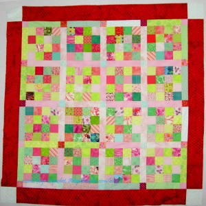
If you are wondering WTF? then you are with me, because I keep looking at this quilt thinking “what was I thinking?”
This is NOT a horrible quilt. I am not embarrassed to give it to charity. It is not ugly. The workmanship is excellent. Not trying to be arrogant, but I do my best to make well made quilts. One of my biggest pet peeves, in case I didn’t mention it before, is bad workmanship. I could write a whole dissertation on THAT subject, but will spare you at the moment.
I have to admit, though, that it is not my best design work. The problem was I couldn’t figure out completely what was going on. I knew:
- I should have been more selective about the shades and tones of the pinks and greens I picked.
- I should have picked a 3rd color for the sashing and a 4th color for the cornerstones.
- I knew something was wrong so I just put borders on with fabric that was large enough. I stopped worrying about the top being a great design. I actually like the batik border fabric a lot better after I cut it up.
Other than that, I was stumped. Then I listened to Sandy’s podcast on space with her guesthost: ME and think I figured out the problem.
An aside: I listen to all of the podcasts that Sandy and I record. I am cringing less and less. I want to hear what you hear. This episode on Space was a mind bender, even for me and I had been living and breathing the content for months.
Listening to the episode clarified the concept and I was able to figure out the problem with this quilt. In the episode I said that definition of space is “the area the design occupies”(for purposes of the design series) of space. I used the example of a 4’x3′ piece of fabric as space for a quilt. On that background or Picture plane or Space, the maker places his/her objects.
In the case of the donation quilt, the space, which is supposed to surround the objects (shapes in a piece), is confusing. If I had chosen all the same pink fabric, it would be clear that the pink was the background/space in the quilt. Same with the green. I didn’t do either. I just put a bunch of pink and green squares together and sewed for broke.
The donation quilts, such as the pink or the blue or the yellow, where I used the black on white background work a lot better, because it is clear to the viewer what fabric constitutes the space. Even though the black on white fabrics are different prints, it is still clear that those fabrics are the background/space.
I am ok with the quilt, especially now that I think I know the problem. The quilt will still keep a little missy warm. Live and learn.