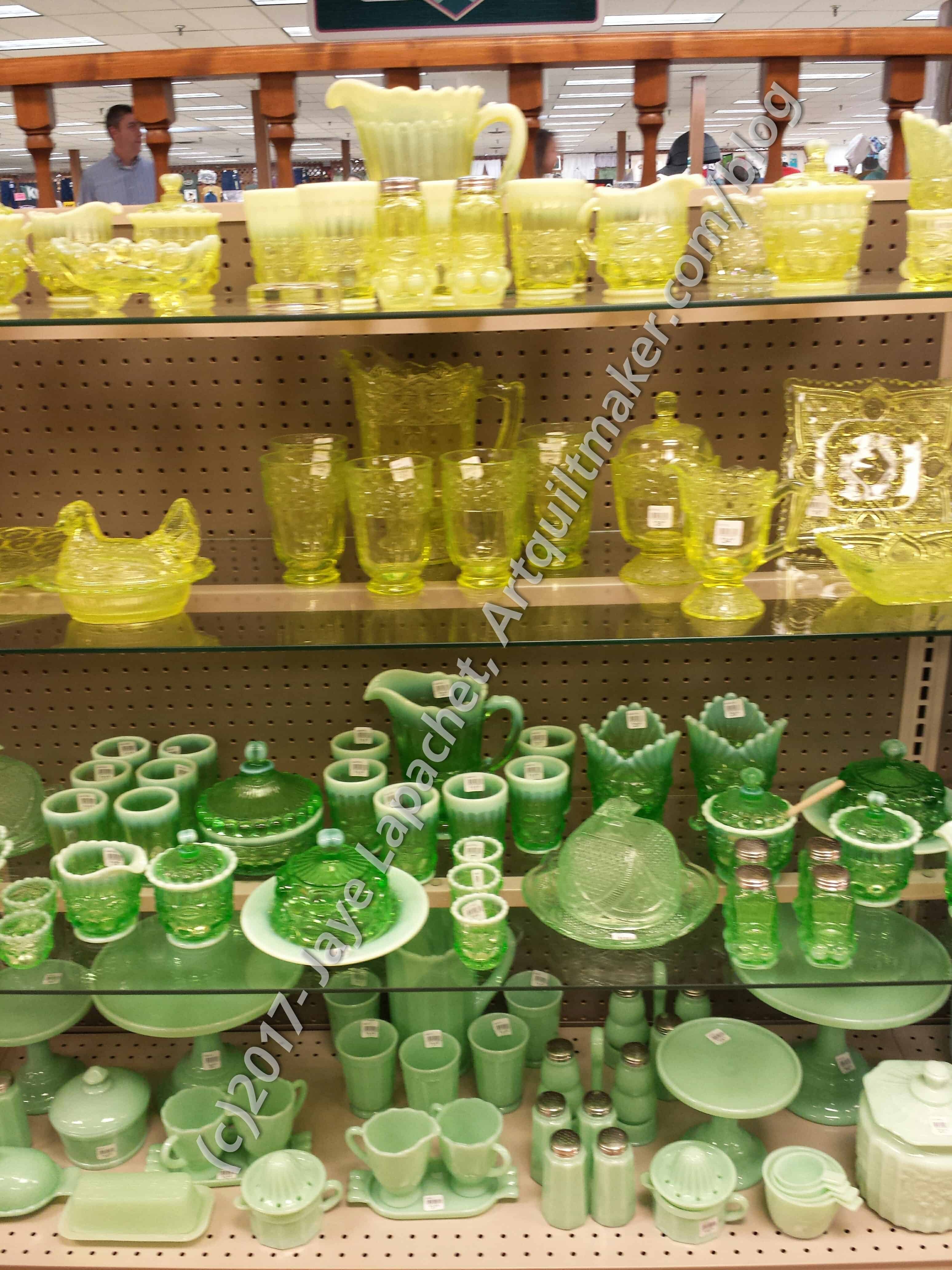
I decided that I would do a few more palettes with the photo from last week. I realized that I wasn’t quite done with it yet.
We are skipping the default image since it will be the same as last week’s. Go look at it if you want to see how neutral it was.
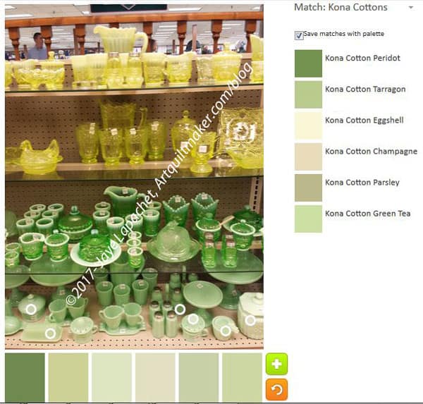
I wanted, first to explore the lighter section of the bottom shelf and see what light greens Kona came up with. There is an interesting selection. Champagne is included and it looks very green to me in the bottom palette. I think the lighter colors, in general, look like succulent colors.
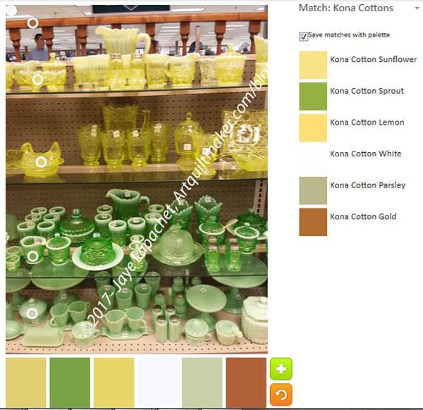
I really wanted to combine all the colors and see what I could come up with. I had no plan for selecting sections fairly and equally, so I just lined up the bubbles in a row and came up with a very different palette.
There is a certain look that all the colors have except for the Kona Parsley. This ‘look’ seems to make them go together in kind of a 1970s avocado and gold sort of way. Still there is a warmth about the palette. I wouldn’t make a quilt with it, but I can see it as being a successful palette for someone.
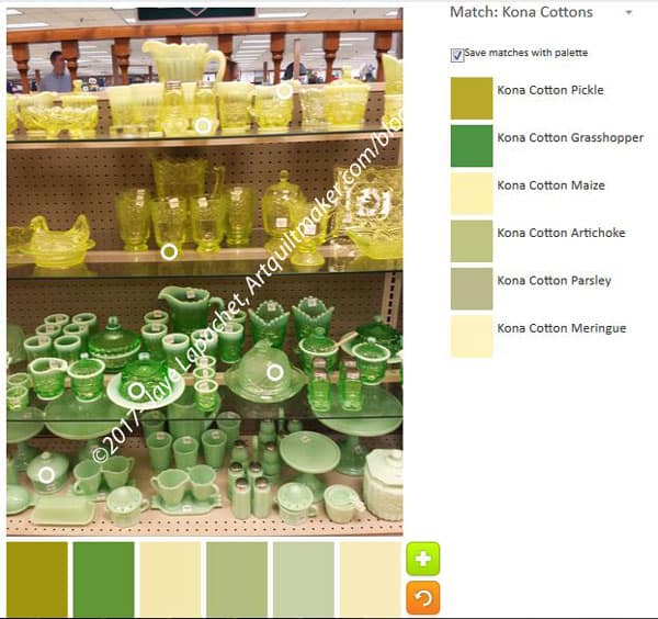
I was a little more careful with my final selections (yes, I think I might be done with this photo and the palette possibilities) and came up with one last palette.
The palette doesn’t have any real yellows although I did put three circles on the yellow shelves. I wonder if the green is reflecting or somehow influencing how the camera sees the yellow?
If green and yellow were neutrals, I would say this would be another neutral palette. It isn’t neutral as the greens are clearly defined, if still in the succulent area.
Go try the palette builder tool and take a look at Anne’s quilts while you are there.