
This is from the Republic of Tea’s Tea 101 email series. I love the image!
Commentary about works in progress, design & creativity
This is from the Republic of Tea’s Tea 101 email series. I love the image!
Don’t hate me. 😉
I have scent on the mind, because I am reading the Perfect Scent: A Year inside the Perfume Industry in Paris and New York by Chandler Burr. This is not my kind of book and there are things I don’t like about it, but it has scent, the sounds around scent, the words of scent on my mind. It will be a challenge, darlings. 😉
Definition: 1, to cause distaste or disgust by supplying with too much of something originally pleasant, especially something rich or sweet; surfeit. 2. initially pleasurable or sweet but wearying in excess. 3. overly ingratiating or sentimental.
sickly
Apparently ‘cloying’ in home brew is not a good thing.
saccharine
syrupy
cloying sentiment
From the Urban Dictionary: The deathbed scenes in the novels of Dickens are famously cloying: as Oscar Wilde said, “One would need a heart of stone to read the death of Little Nell without laughing.”
It was word of the day in the New York Times on Sep 21, 2011. Who knew there was such a thing as the New York Times Word of the Day? I may have to start reading the New York Times!
Post the direct URL (link) where your drawing, doodle, artwork is posted (e.g. your blog, Flickr) in the comments area of this post. I would really like to keep all the artwork together and provide a way for others to see your work and/or your blog.
We are also talking about this on Twitter. Use the hashtag #CPP
The Creative Prompt Project, also, has a Flickr group, which you can join to post your responses. I created this spot so those of you without blogs and websites would have a place to post your responses.
From the Wine Spectator Website: Dear Dr. Vinny,
I’ve recently started to expand my wine horizons by including sweet and/or dessert wines. I’ve noticed many reviews of sweet wines mention the word “cloying.” It seems some of the best sweet wines are described as “sweet but not cloying”. Can you tell me how I will know if something is “cloying” my palate?
—Tom, Denver
Dear Tom,
You’re correct that “cloying” is most often a negative term, referring to an excessively sweet wine that is lacking acidity. If you’re not certain what cloying feels like, take a tablespoon of honey and swallow it. It’s very sweet, but it’s so sweet it feels like it might get stuck in your throat. The best dessert wines will balance any sweet, sugary or honey notes with a body and acidity that make the wine glide over your palate and linger without being sickly sweet.

The blood oranges in this response came out purple. I am not sure why, but they are clearly a kind of purple. I know the center is at least partially purple, but the outside is orange and I did not show that at all. I could do this response over, but I probably won’t.
If you have not done a response, you can be inspired by the original prompt.
What did you think when you saw the prompt?
I hope you have done a response. If you have, please post the direct URL (link) where your drawing, doodle, artwork is posted (e.g. your blog, Flickr) to the comments area of this post. I would really like to keep all the artwork together and provide a way for others to see your work and/or your blog.
We are also talking about the Creative Prompt Project on Twitter. Use the hashtag #CPP

I am behind, but I have been doing responses. I had so much to say about quiltmaking that I haven’t been posting the responses.
I hope you have done a response. If not, you can see the original prompt to be inspired. If you have, please post the direct URL (link) where your drawing, doodle, artwork is posted (e.g. your blog, Flickr) to the comments area of this post. I would really like to keep all the artwork together and provide a way for others to see your work and/or your blog.
We are also talking about the Creative Prompt Project on Twitter. Use the hashtag #CPP
Last weekend was the CQFA meeting. I mentioned this project briefly when I talked about Attack of the Hexies.
Caroline taught a workshop using Susan Carlson’s techniques from her Serendipity Quilts book.
To start we got an email with prep instructions and when I finally got a minute (work really gets in the way of my quiltmaking!) I started getting the materials I would need together. One of the items was Drawing of simple object, ( Think little kid’s coloring book.)
I have one coloring book left from when I was a kid and couldn’t find it. I did find my old stained and leaded glass pattern books. Those drawings are simple enough and I perused them. Two stuck out for me. One was in the book and one was a drawing, probably a tracing of an image from another book, I had done that was stuck in the book. No attribution on the second one, nothing. If you have an Ed Sibbett, Jr book with the image below, please send me the citation. I do want to attribute it properly.
I decided to do them both, one at a time, but both. I have been lamenting, in my head, the fact that I haven’t been doing much art quiltmaking lately, which seems kind of lame, considering the name of this blog. I tell myself that all of my other quilts are ‘color work’, but I might be fooling myself. I do work a lot on color, but….
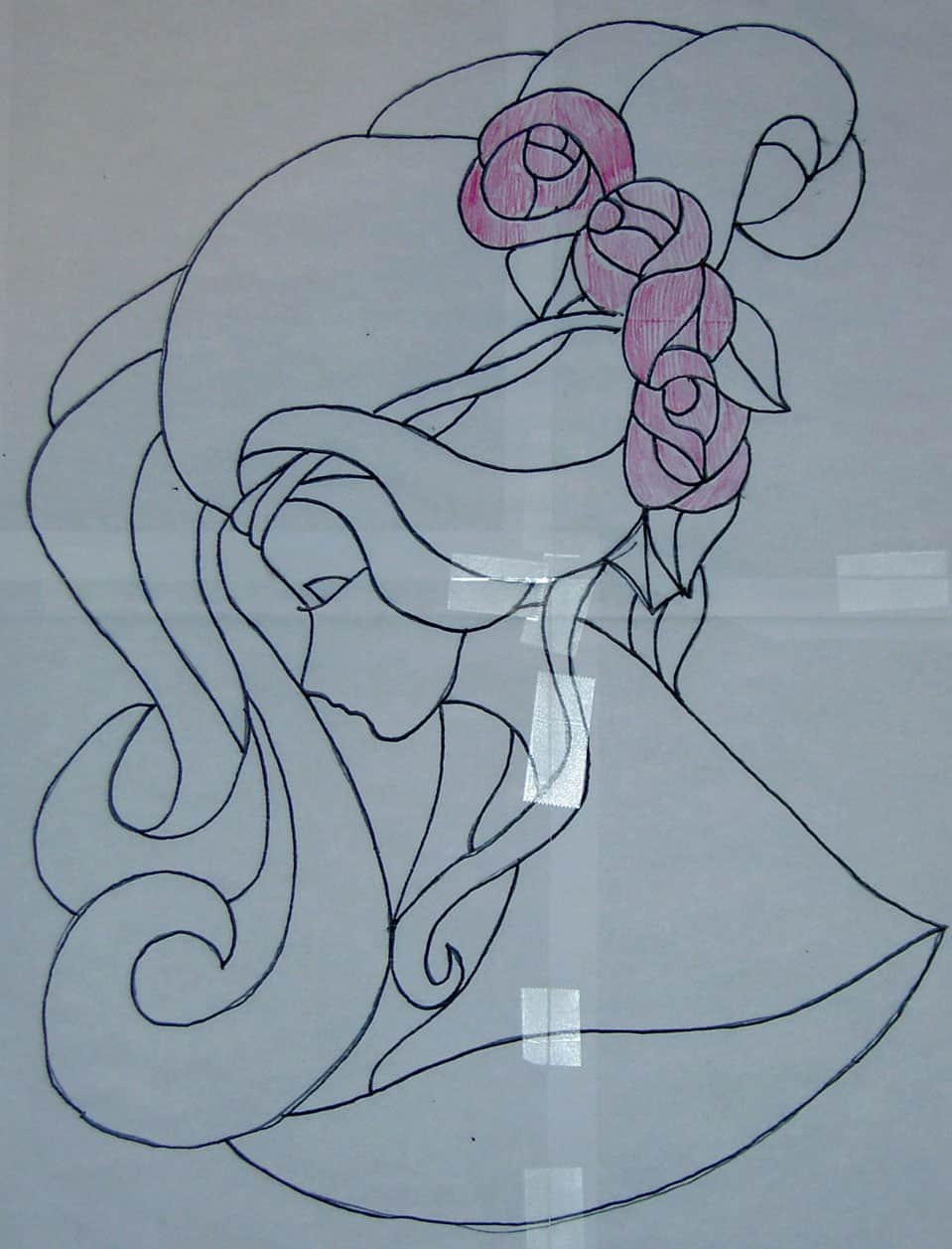
This image shows the first piece I will work on. the idea is to use scraps to make up the image. Everyone was working on it at the meeting and I was ‘in process.’
I will use pink for the hair and blue for the roses. I will probably use one piece of fabric for the face. It will not be green, but other than that I don’t know what color it will be. I might do the eyelash in embroidery.
According to Caroline, our workshop leader, the first step was to transfer the image to fabric. My actual first step was to enlarge the image. The original was smaller than 6×6 and I wanted to do something a bit larger. It is now in the 20×16″ range. It was a painful process, but I finally figured out how to do it and went ahead to the transfer-to-fabric stage.
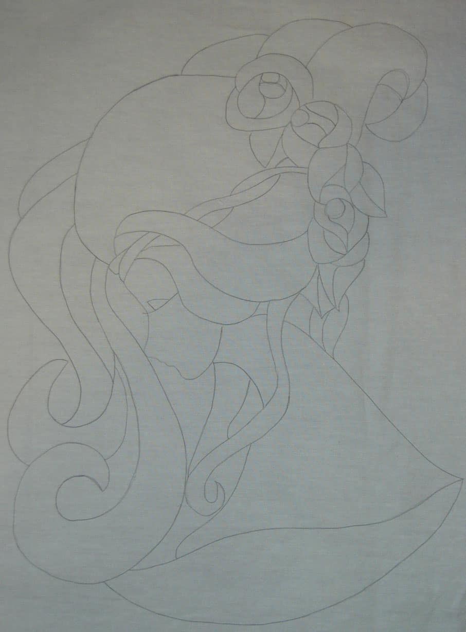
I used a piece of the linen colorway of an Art Gallery solid. I still had some left even after using bunches on the Flower Sugar Hexagon (Attack of the Hexies) quilt top. I simply traced over the printout with a Sewline pencil. It worked like a charm when I was able to keep the fabric in the right place over the printout.
My next task is to remind myself of the rules of light and dark: “if I put a light in a front piece of hair, will it look closer or farther?” and then I will get to it. I have the scraps already chosen and am eager to get to work.
I suppose I could check more thoroughly to see if I have Susan Carlson’s book, too.
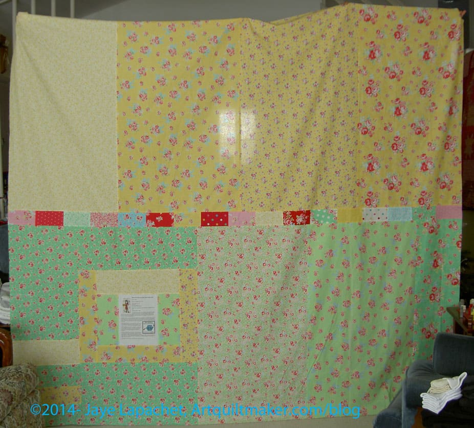
Periodically, I will find something interesting that is old and post it under the Vintage Tuesday tag. In this case, I am showing you an old quilt of mine. It can’t really be called vintage as it is only 24 years old, but you get the idea.
There are a few things that you should immediately see in this piece. They are:
Here is the story:
This isn’t my first quilt, but I believe it was the first quilt I actually finished (the Sampler took me awhile, because of the hand quilting). It was finished in 1990.
I did in response to a challenge posed by one of the members of the quilt group of which I was a member at the time. We were all on board and one of the other members went to pick the fabric. It is all machine pieced-NOT paper pieced- and machine quilted as well.
Do you like that binding? I put the binding on by machine and then sewed all those miters down by hand.
It was really a challenge to hang.
Yes, yesterday I finished the last details I needed to do to prepare the top for quilting. The tasks required were:
Saturday was a busy day, because I attended the CQFA meeting. I stayed after the meeting to sew with Sonja, Angela and Rhonda. It is good for me to hang with others and talk sewing. I am tending to work alone lately and am trying to get out of that rut.
During the sewing time, I worked on finishing some buttonhole stitching on one of the stockings and making progress on applying the sleeve to the Original Bullseye top. When I returned my mind was buzzing with an idea using the technique that Caroline taught based on Susan Carlson’s book, Serendipity Quilts. I worked on getting the design to the size that I wanted. That was about all I had energy for before I needed to go to bed. In the process, I ruined the cropping tool on Photoshop Elements. I know there is something I clicked, but I don’t know what it was and will have to take some time to find it and undo it. Ergh! All this is to say: 1) I didn’t work on the Attack of the Hexies on Saturday and 2) I have an idea for a new, small art piece, so stay tuned.
Yesterday morning, I had big plans to get up early, go to the gym, take a shower and get going on Attack of the Hexies by 10am. Famous last words! I didn’t get up until nearly 9 and I felt creaky. I have been dealing with a cold. While I am on the downslope of it, I am stilling fighting it off. I didn’t sleep well a few nights in a row and am trying to make up for that lack of sleep. I cut myself some slack.
After writing in my journal for awhile, I went upstairs and started sewing. I had to add a bit of fabric to one half of the back before I could sew the whole piece together. I did that and had to trim the whole back so that the piece was essentially square.
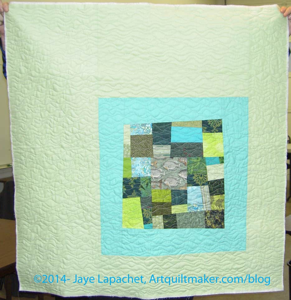
The line of bricks on the horizontal in the center of the back used to be hexagons, but I cut the leftover hexies up into rectangles and used them to add a little interest. The rest of the back is leftover yardage from the Flower Sugar line of fabric. I still have at least 5 yards of yardage left from that line. Not sure what I will do with it, but it will go into the stash and will show up again. There are two pieces that I really like.
Next, I made the binding. I used one of the pinky-reds from the line to provide a frame for the entire piece. I also made it a straight of grain binding. A lot of the border is on the bias because of the way I placed the hexagons as I added them to the piece. Basically, I didn’t pay attention to the grain line. I should have, but didn’t. I don’t do straight of grain bindings very often, because they tend to get kinks and near-folds in them as I hand stitch them on to the quilt. I like the ‘give’ that bias bindings have. It makes them very easy to apply by hand.
In this case, I want the edge to be stable. I don’t want it to get out of whack when it is quilted, thus, a straight of grain binding. We’ll see how it goes.

Finally, and I don’t know why I did this last, I trimmed the border. It wasn’t straightforward, but I had to trim half of each hexagon one by one. I used the lines on the Clearview Ruler I discussed in the Hexagons Follow-up post to keep the who piece as straight as possible.
It wasn’t straightforward, because of the bias, so I just did it slowly and as carefully as I could. The piece will not be as straight as the Quilt Police would want, but they never made this quilt and I am happy with it. As you can see from the photo above, the border looks a little odd, but I like how it looks different.
The piece is now ready for quilting. I’ll take it to Colleen for quilting as soon as I can. I look forward to getting this completely done.
Hexagon Related Posts:
Little Bluebell’s Cutting Instructions
May 21, 2011 – Hooked on Hexagons
June 1, 2011 – Hexagons Follow-up
June 7, 2011 – Attack of the Hexies
June 9, 2011 – Hexagons tutorial
October 20, 2011- Hexagons Return
November 13, 2012- Blue Chair Blog Hexagon Sewing tutorial
June 28, 2013- Hexagon Clarification
September 5, 2013 – Hexies Return
January 5, 2014 – Attack of Hexies Returns
January 8, 2014 – Attack of the Hexies Border
We’re back!!!!
Well, it has been awhile since Sandy and I were able to get together, but we are back in the saddle. We worked on a new Design Series episode last week. You should be able to hear all about Emphasis/Focal Point today!
You can find the other episodes and companion blog posts by searching the Design Series tag.
_______________________________________________________
Emphasis/Focal Point is a principle of design.
Emphasis/Focal Point is related to Size/Scale
I have dominance listed separately in my outline for this series of podcasts, but we cannot really talk about Emphasis and Focal Point without talking about dominance, so consider this episode related to the upcoming episode on Dominance.
Definitions:

Using Emphasis/Focal Points:
Notes:

There can be more than one focal point. Sometimes secondary points of emphasis are present that have less attention value than the focal point. These are called accents.” “…the designer must be careful. Several focal points of equal emphasis can turn the design into a three-ring circus in which the viewer does not know where to look first.” (Pentak & Lauer, pg.46)
Exercise:
Type “focal point” examples into Google or your favorite search engine and look at the images. As you look at the images, try and figure out what the focal point is.
Resources:
Art + Quilt
Design Basics by Pentak & Lauer
The Elements and Principles of Design, http://nwrain.net/~tersiisky/design/emphasis.html
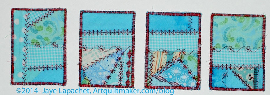
ATCs are small bits of art that can be traded.
ATCs are 2.5″x3.5″ – the size of baseball or other trading cards. They are made using discarded bits and are not limited to being made from fabric. Paper artists make them from paper and other materials are suitable as well.
As you read this, CQFA is meeting (or will be if you are reading this at 6am ._. ) and part of the meeting is trading ATCs. It is fun to see what other people have made and I love it when a lot of people participate. I am always sad when I can’t one of each example of the other members’ cards.
I had a mosaic pieced fabric in turquoise already made and decided that I would use it since it was a start. I stitched out some of the stitches on the loaner machine over the seams and called it good. The flower on the right hand card is my favorite of the few decorative stitches on this machine.
Post the direct URL (link) where your drawing, doodle, artwork is posted (e.g. your blog, Flickr) in the comments area of this post. I would really like to keep all the artwork together and provide a way for others to see your work and/or your blog.
We are also talking about this on Twitter. Use the hashtag #CPP
The Creative Prompt Project, also, has a Flickr group, which you can join to post your responses. I created this spot so those of you without blogs and websites would have a place to post your responses.
Definition: “Teal is a low-saturated color, a bluish-green to dark medium, similar to medium blue-green and dark cyan. It can be created by mixing green with blue into a white base, or deepened as needed with a little bit of black or gray color.[3] The complementary color of teal is coral.[3] It is also one of the initial group of 16 HTML/CSS web colors formulated in 1987.
The first recorded use of Teal as a color name in English was in 1917.[4]” (Wikipedia)
Its name is derived from the Middle English tele, a word akin to the Dutch taling and the Middle Low German telink.[5] As a color, its name is believed to have been taken from the small freshwater Common Teal, a member of the duck family whose eyes are surrounded by this color.[5]
In the TEAL project, Belcher teamed up with Co-Principal Investigators Peter Dourmashkin and David Litster to reformat the teaching of freshman physics at MIT. Technology-enabled active learning is a teaching format that merges lectures, simulations, and hands-on desktop experiments to create a rich collaborative learning experience.
Blue-winged teal (bird)
Teaching Excellence in Adult Literacy

Recently a new brick and mortar store opened in a nearby town. I heard about it at a recent BAMQG meeting, but I wasn’t able to visit until last week when SIL and I escaped the family for a couple of hours. I would have really liked to visit a few stores, but this was the only one we were able to visit. It was definitely worth it.

The shop is filled with light and has a variety of fabrics, patterns and notions. The owner was friendly and, clearly, thrilled to see us.

I thought the inventory was a little sparse, but I know that many new businesses need time to build up their inventory – the old dance of selling allowing the owner to buy more.
Needless to say, I was able to find a few things to satisfy my desire to buy some new fabric. They have a discount on pre-cut fabric. They had a number of FQs, 1/2 yards and yards already cut. I am not sure what the discount was, but any discount is welcome.
In addition to Mettler thread, they also had a rack of Aurifil small spools.
There was a nice selection of batiks and lots of tone-on-tones. There was a little of everything, I think.
You know what else? They use Square for payment, which is awesome! I don’t like it because it is hip and cool, I like it because it is straightforward and easy to use. There is no complexity for the staff and no issues with taking credit cards, etc.
The parking was pretty easy, even on a Saturday afternoon in the middle of Winter Break. The shop is easy to find. We went past and had to do a blocky, which was a little tricky because the neighborhood surrounding the shopping area has a lot of twisty streets. We had to drive a few blocks up before we could head back down the correct street.
The owner said that they have had a web presence for a decade. I wasn’t aware of that site, so I went looking just to see more than their hours and indeed they do sell online. I think it is smart to start a business online before committing to a brick and mortar presence.
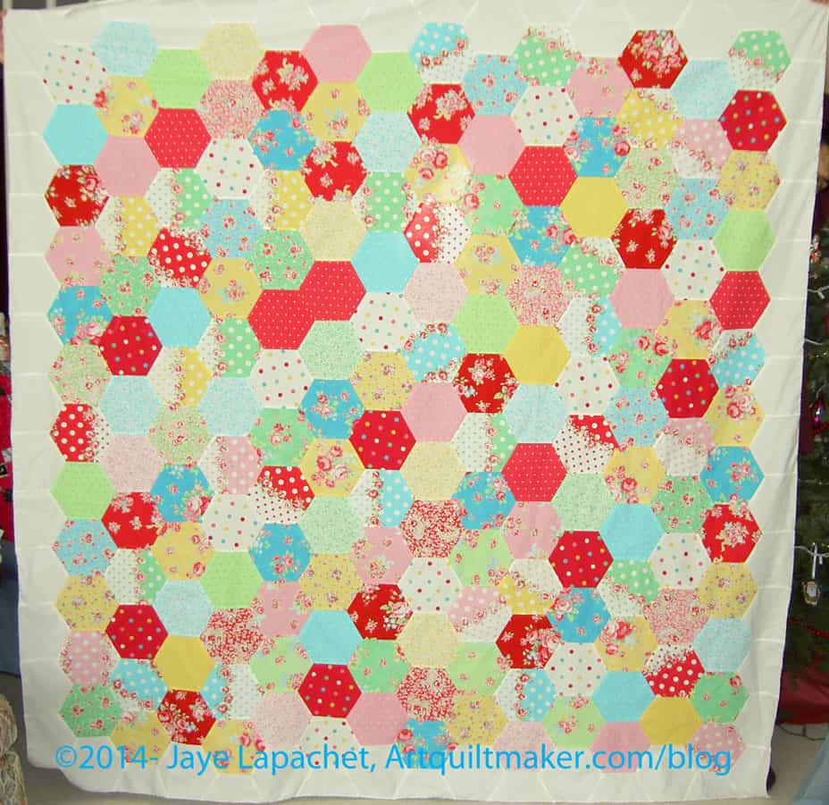
As I mentioned, all of a sudden, I am working fast and furiously on the Attack of the Hexies (Flower Sugar Hexagon). I spent all weekend trying, in vain, as it turned out, to finish the top, back and binding of Attack of the Hexies.
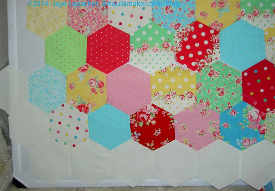
As I have said, Y seams are not hard, but they do take time. I decided to put a border on the piece and I needed to do it using hexagons. I don’t know another way to piece fabric into a hexagon piece without using hexagons. I could have cut off the hexagons on the edge, but I have always disliked that look for my own quilts and didn’t want to do that for this piece.
I also didn’t want to buy new fabric. Fortunately, I had enough of the Art Gallery solid Linen to use for the border. I didn’t even use all that I had, though my stock is significantly diminished.
The border is on the piece. I intend to trim it so the edges are square and still need to do that. I am all for wonky borders (Case in point: the Zig Zaggy Quilt), but not in this piece. I want the border to be square and subtle so that the center looks like it is floating on the border.
I am partway through the back as well. I lounged around for a long time on Sunday and didn’t have enough time to finish it. I had big pieces left over, so I didn’t have to piece a lot of small pieces together.
Almost there!

I know it is January 2014, but I am not quite ready to pack in the cutting for FOTY 2013. I’ll start arranging and piecing it later this month, with any luck.
I wanted to include these fabrics, because some of them are from projects in December. I also added a few from Attack of the Hexies and may add a few more, if I have any left.
I also have washed a few fabrics that I thought I would use for pillowcases, but it didn’t happen. I’d like to add those in as well.
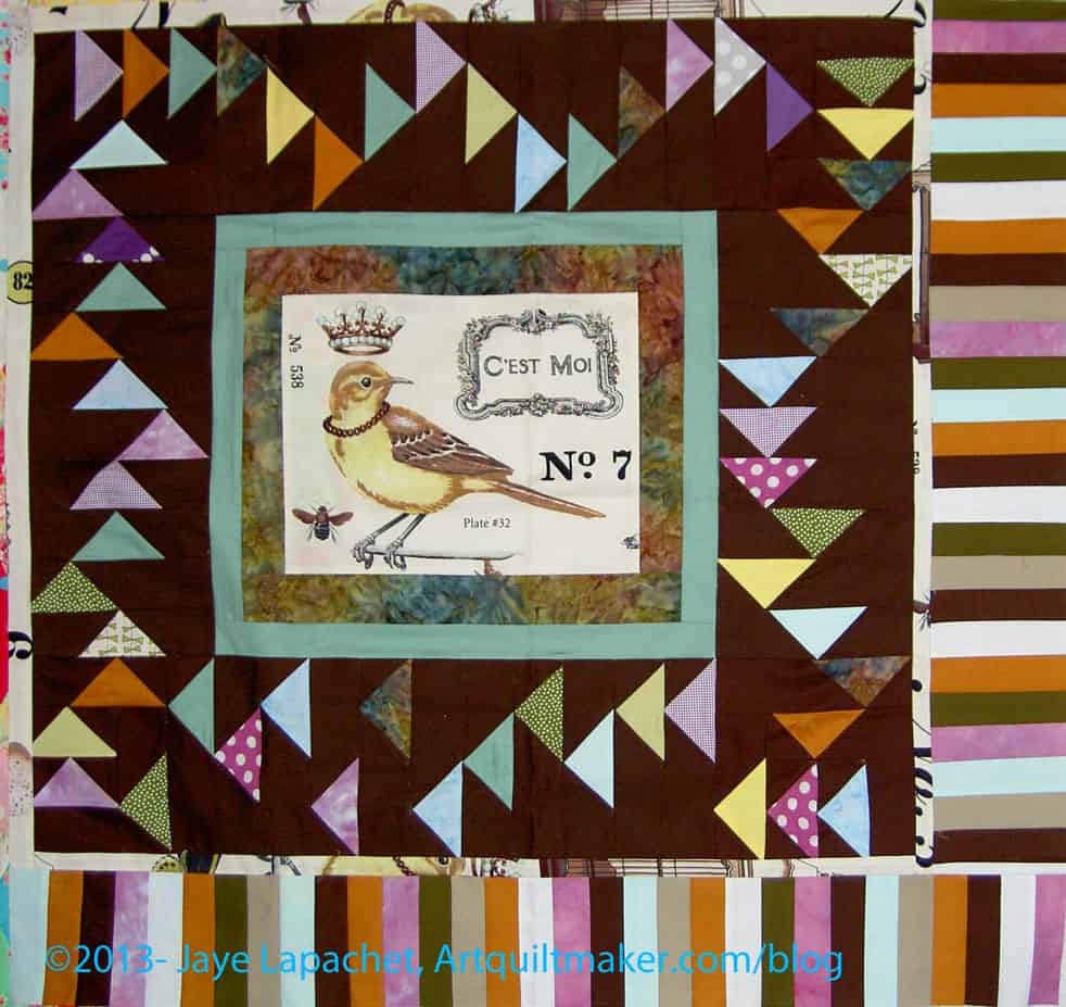
I spent some time with Kelly’s Round Robin over the past week. I finished my portion on January 1 and was pleased to be able to move on to the Attack of the Hexies.
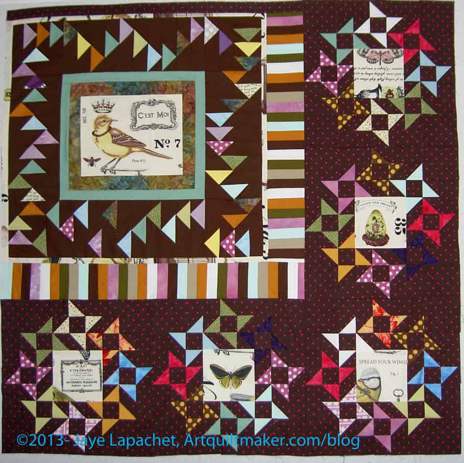
I saw Camille Roskelley’s Round and Round quilt and liked the basic block so much that I wanted to make it. The version from Around the Blocks blog really inspired me. I love the way the triangles seem to flutter or twirl on the background. The basic component is a Friendship Star, a block that I always thought had potential, but never quite liked. Now I know that making it smaller and combining it with others like it was the ticket. Camille Roskelley is a genius.
I didn’t think the block was the right size for the piece, but I decided the piece could use something bold. I resized the block and worked on the whole piece in EQ7. I could only get an idea of the outcome. The piece has special fabric and I didn’t feel like scanning and uploading it. From what I could see, I thought it would work.
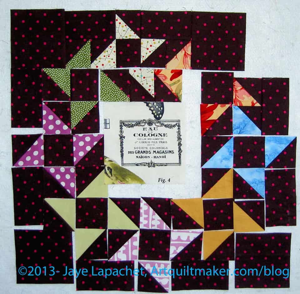
The block has 85 pieces. I reworked the piecing as well as resizing it, because some of the pieces didn’t need to be small squares. Also, I didn’t want, for example, to piece 4 squares together to make a larger square.
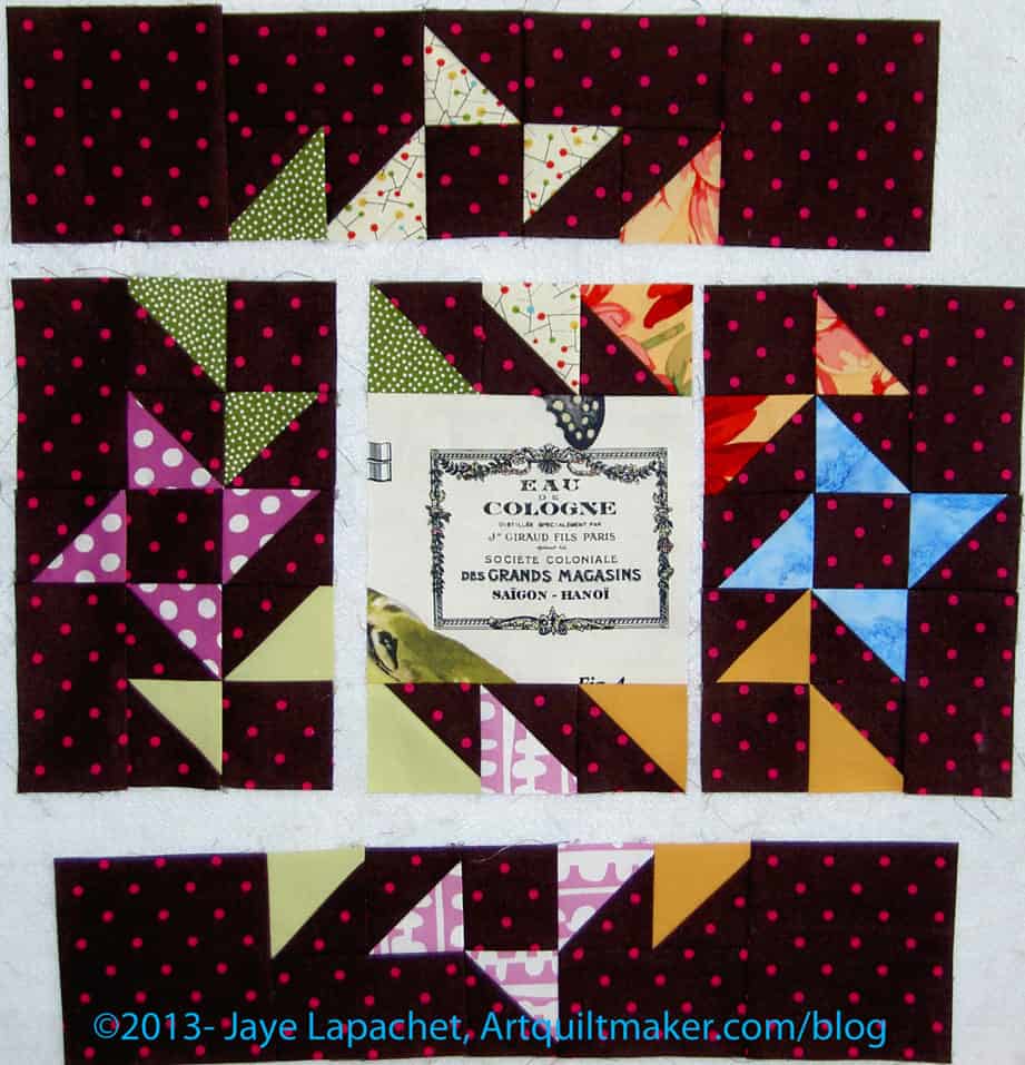
This made the final piecing of the block a little different than just piecing the block together in rows. I was able to chunk it. Once I was able to see how to chunk the piece, the piecing was no problem. I used the Triangle Technique to make all of the triangle squares (half square triangles).
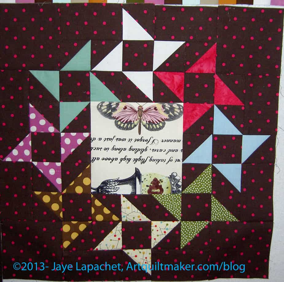
SIL suggested that I fussy cut the special fabric and use that for the center rectangle in order to echo the original focal point of the piece. I thought that was a good idea and fussy cut different portions of the special fabric for the centers.
I think it came out well and I hope that Kelly is happy with my work. I was really pleased with the block. I can’t make it to the meeting in January, so I sent it off to Kelly.
Related Round Robin Posts
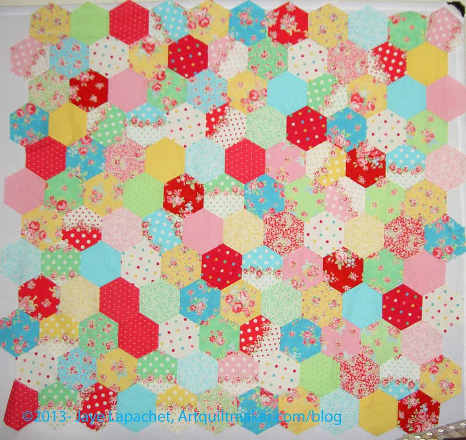
For months I didn’t work on the Hexies project, then on the first I just dove in and added rows. I am not sure why except that it didn’t require cutting. The hexagons were there, the piece was there and I needed something to sew.
I got my head around the Y seams and did it. I didn’t want to sew one hexagon on at a time and I had a row started, so I finished the row and worked on sewing the whole row on at a time. It was a lot of stopping and starting, but I just did it. I developed a system and kept at it.
Things I have to figure out:
I plan to just work on it until I am done with the top.
Hexagon Related Posts:
Little Bluebell’s Cutting Instructions
May 21, 2011 – Hooked on Hexagons
June 1, 2011 – Hexagons Follow-up
June 7, 2011 – Attack of the Hexies
June 9, 2011 – Hexagons tutorial
October 20, 2011- Hexagons Return
November 13, 2012- Blue Chair Blog Hexagon Sewing tutorial
June 28, 2013- Hexagon Clarification
September 5, 2013 – Hexies Return