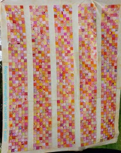
This is a cool quilt top made by my friend TFQ. I love this design. It has inspired me to cut 2″ blue, green and violet squares. I have a long way to go, but it is a start.
I love the way TFQ has chosen the pinks, yellows, oranges, etc for this piece. She said that she chose fabrics that read pink, yellow, orange, etc. They are similar in temperature, and sometimes in vlaue, but because of the different hues, there is interest in the piece as well. There is that quality of making the viewer want to come closer.
Some of the fabrics had white in them and TFQ was careful to not let the white creep in too much. This is to mitigate the holes that can be caused by too much white. White isn’t bad, but it wasn’t TFQ’s choice for the look of this piece. White can create a hole if it isn’t distributed well. The concept goes back to something Sandy and I have discussed in the Design Series: what is your intent as an artist and designer?
TFQ’s top is named Pink Lemonade. I may name mine Blue Lemonade. That will be the working title for now and we will see.
Gorgeous! I love seeing different design choices for scrappy quilts. This one reminds me of stained glass window inserts in doors for some reason. (Kind of like this.)
I love that! Might be fun to do that with the red and purple scraps that didn’t work for Pink Lemonade…
Oohh! Red and purple would be awesome!
Pretty! How about Blueberry Lemonade? 🙂 I Love Blueberry Simply Lemonade. It is so yummy!
Good idea! I’ll ask you what you think when I have pieced the top. 😉
Lovely! Can’t wait to see the one you make.
Stay tuned! It might be awhile!
Great quilt top and name. I agree with Amy regarding Blueberry Lemonade. 🙂
Two votes! That means something. I’ll let you know.
I love this quilt! These are totally my colors, She did a fantastic job picking out the fabrics and putting them together!