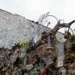
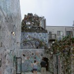
Recently I went to Phoenix for a work conference. It was a very different Phoenix than I had seen before. I saw a lot of art while I was there and not all of it was in museums.
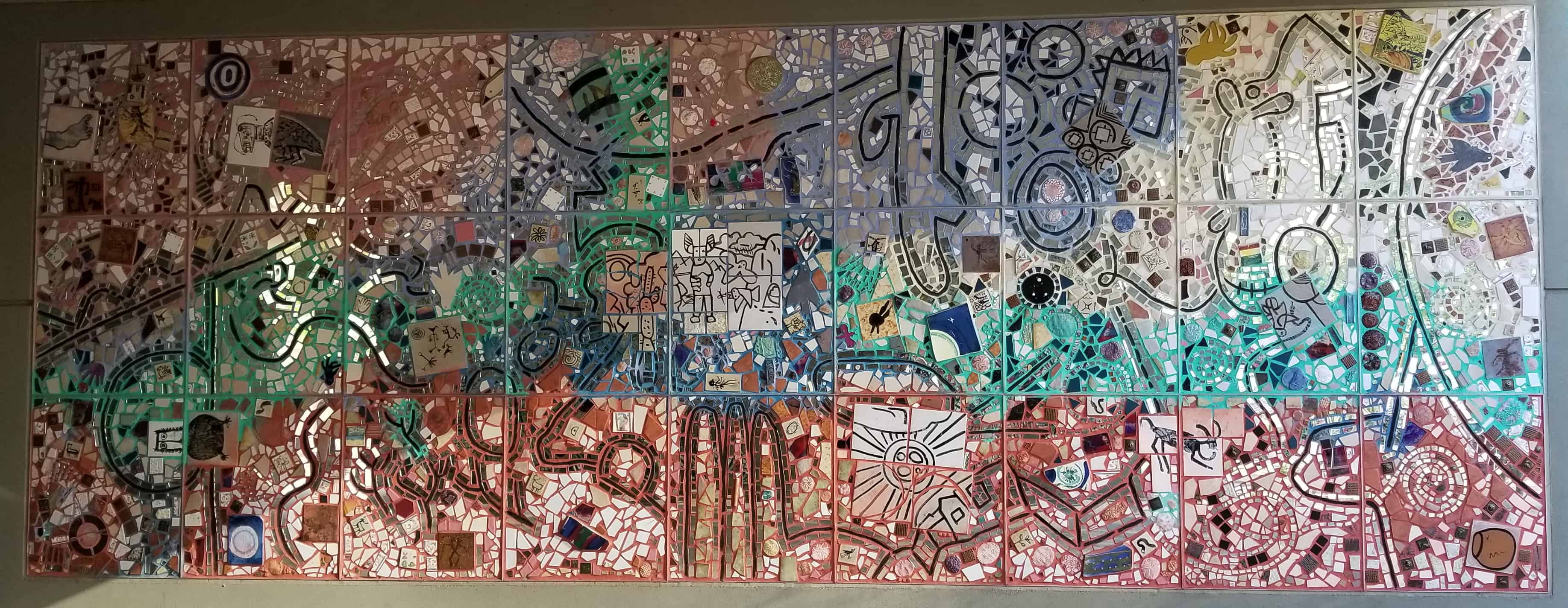
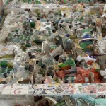
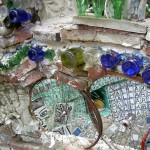
The Earth Dreaming – full
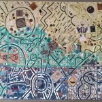
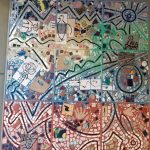
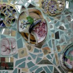
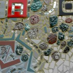
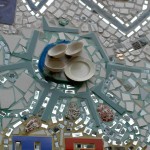
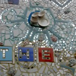
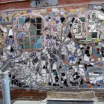
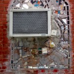
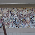
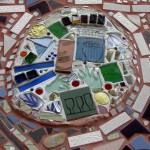
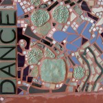
Outside the convention center were a a few pieces that I really enjoyed. The set of pieces were mosaics called The Earth Dreaming by Isaiah Zager. The pieces were made in 2008.
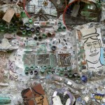
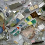
The Earth Dreaming – detail
The Earth Dreaming – detail
I like the mosaic aspect of the pieces. There is a spidery element and also the circles.
It is very nice to see art when I walk down the street.
Monday was a day of outings. Friend Julie came up on Sunday night to stay. She, DH and I headed off to the SFMOMA at the crack of dawn (ok, 9:30, but it was a holiday) for our appointment to see the Diebenkorn/Matisse exhibit that was closing that day.
We had a 10:30 appointment to get into the exhibit and arrived at the museum before the galleries opened. We had about 20 minutes to look at the other galleries on the 4th floor before our entrance time. One of the artists at which I looked was Ellsworth Kelly.
Kelly has a long history with the SFMOMA. The Fishers (founders of the Gap) bought many of his works and donated (or loaned) them to the museum. The SFMOMA has also bought pieces of his.
I have a checkered history with Kelly. A number of his works I have seen in the past were “color fields,” a canvas of one color. I am sure critics and art historians have a lot of positive things to say about such work, but I have never liked them. No matter how famous the artist I see these types of work as works they made phoning it in. This view comes from a very limited knowledge.
Spectrum I, 1953 by Ellsworth Kelly
There were different works on the walls by Kelly this time. There were two that I particularly liked. One was Spectrum I from 1953.
As you can see, Kelly gradates the color from yellow to yellow. The information said that the yellow is the same on both sides. It doesn’t look like it because of hte influence of the green on one side and the light orange on the other. I also like the series of violets in the middles -an indigo with a touch of violet, a violet and a red violet. The canvas looks like it bows in the middle, which is an added bonus.
Spectrum Colors Arranged by Chance, 1951-53 by Ellsworth Kelly
Second, was a piece called Spectrum Colors Arranged by Chance, 1951-53. He did not phone this one in and I don’t think that blue tape was available at the time (though I really have no idea) to help keep the lines straight. DH found it hard to look at, but I found it inspiring.
You might have noticed that June is nearly upon us and I have not sewn FOTY 2016 together yet. I wasn’t feeling the love. After seeing “Spectrum Colors” I feel a renewed sense of purpose. I am seriously thinking of putting charcoal (not black) in between the colors, but doing it like he has done so there is some interaction between the colors. He uses solids and not all of my fabrics are solids. Still, I think using a solid charcoal or even the cool grey of which I bought about 1000 yards might make an interesting piece.
There are some issues:
Another quilt with a gazillion pieces. Sigh. What has gotten into me.
The squares I cut are 3″. Doubling the number I have might lead to a quilt sized large enough to cover my house. I could cut the squares and might do that. I’ll have to try out a bit and see.
I don’t want to completely depart from the color gradation idea, so I might gradate the colors within the design field even though a solid might be in between some of the colors.
This is why it is good to go to art museums or see exhibits outside of your field. You never know when you will get inspired by an artist or piece of art.
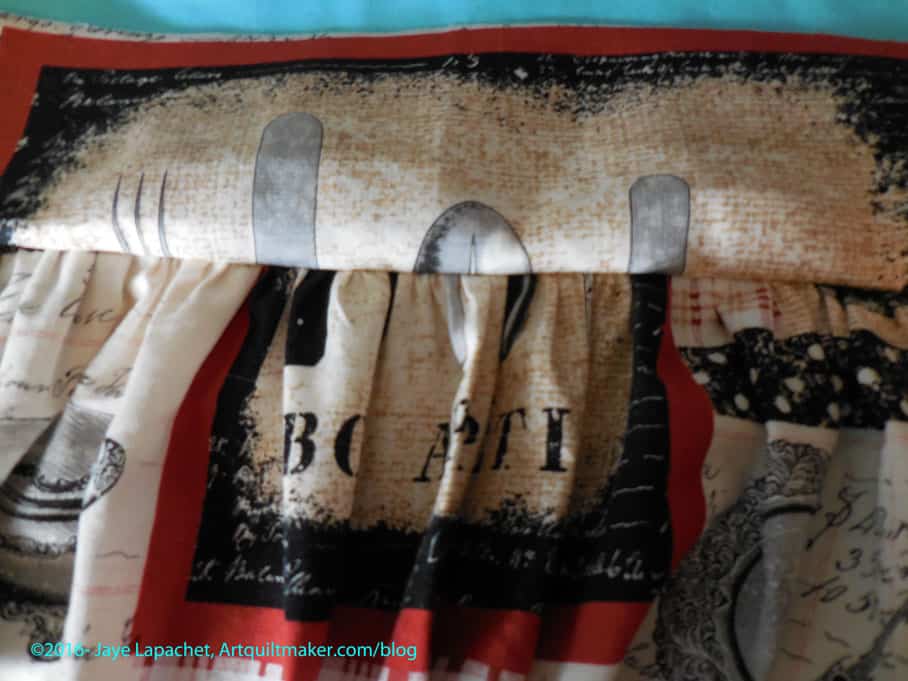
Sometime ago, Kelly supervised my work when I cut out the aprons. This apron is different from the Church Lady apron I finished.
The pattern, which has gathers, is from McCall’s and is called Fashion Accessories “The Retro Collection” (#2811). I don’t remember when I bought it, but it has been around my workroom for awhile. I think I might have bought it when I made my first apron in a garment sewing class back in the dark ages. I am pretty sure I definitely bought it before 2010. Too bad patterns don’t have some kind of date on them. Maybe they do and I didn’t see it. Fortunately, for you, it is still available. The link above is an affiliate link.
Mom was over and since I needed supervision for sewing this pattern, we started it. Altogether, the apron took about 3 hours to make. As usual, I sewed other things in between, like the pillowcases, so it took me more time, but not longer.
Gathering the apron skirt
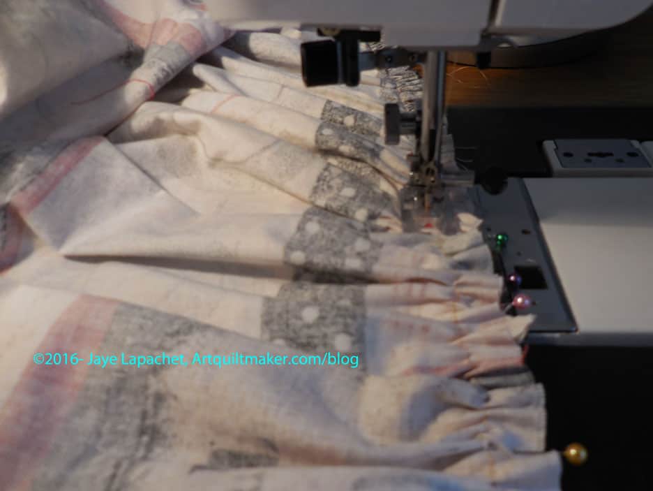
My dressmaker (for the Political Wifery dresses) has forbidden me from wearing gathers, so I was slightly horrified when I realized that this pattern had gathers. I also have never sewn gathers. My mom suggested we do pleats instead, which we started. Mom had to leave at this stage so we decided that since it was an apron and I would probably just wear it around the house, there wouldn’t be anyone to criticize the elegant styling. 😉 She helped me start and then gave me firm instructions. I think I did ok. Each time I got into trouble I texted her photos of my status and the relevant part of the directions, then we got on the phone and she told me what to do. What did we do before these technologies became available?
Arranging the gathers was fine, but sewing over them was very strange. It was nearly impossible to keep everything lined up properly. I think I did ok, but it was slightly terrifying. I was afraid I would do something wrong.
Waistband covering gathers
Mom helped me figure out the waistband, which is very clever once I understood the terminology.
All in all, I am pleased with my effort. I’ll never be a really competent garment maker, but I can hold my own with some projects. Stay tuned for the final!
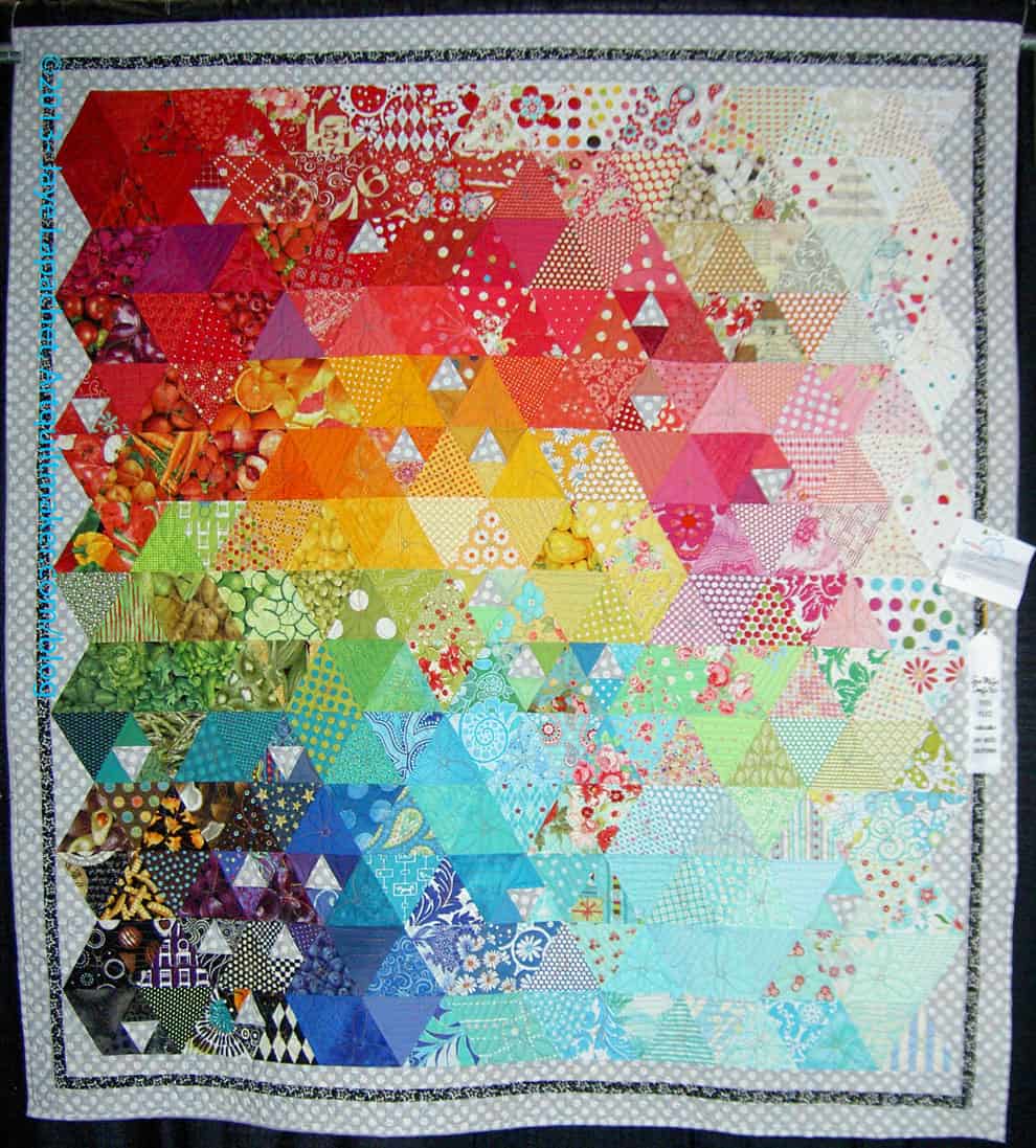
I decided to enter the Blogger’s Quilt Festival put on by Amy’s Creative Side since, for once, I have a really great picture of a quilt that fits the criteria.
Russian Rubix was finished this year.
Materials
100% cotton fabric
100% cotton thread
Techniques
Machine pieced
Longarm quilted
Russian Rubix
Details:
Year: 2013-2015
Size: 85”x85.5”
Fabric: various
Quilted By:
Colleen Granger
Details
I saw this pattern at Always Quilting when I was visiting there with Susan, the History Quilter. After some back and forth via email, we decided to both make the quilts. I used a selection of fabrics I chose carefully, which I subsequently used for two other projects. I wanted to make the pattern, by April Rosenthal, my own, so I changed it up a little bit by dropping some of the octagons in the center and adding an octagon border. The octagons were a bit of a challenge, but I got into a routine and they went together with no problem.
As you know I have a sincere but underdeveloped interest in making books. I have had a new one on my mind for awhile.
3 Postcards
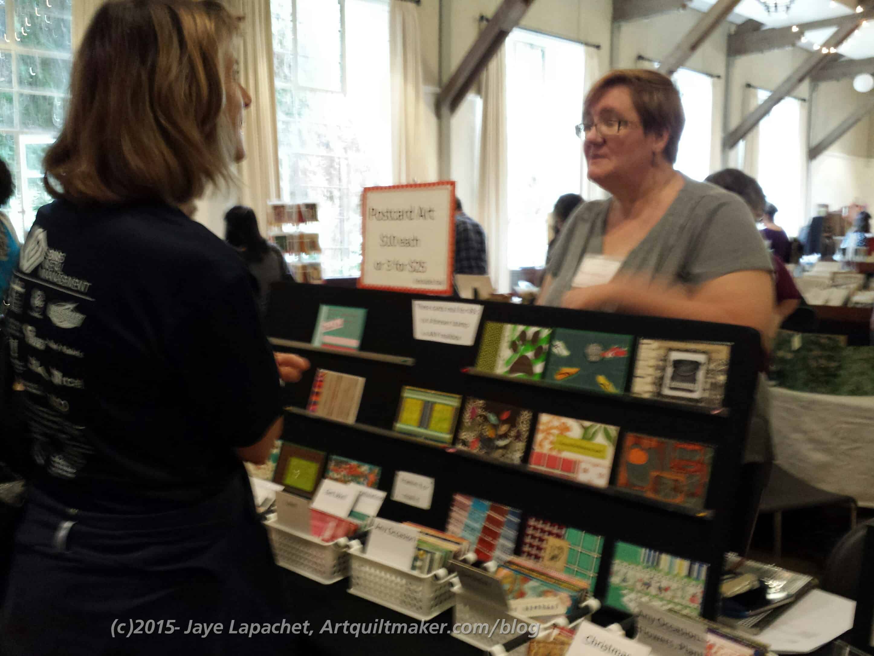
It was this plus Maureen’s booth, and the fact that Nancy would go as well that sent me to the Book Arts Jam last Saturday.
I had never been before and I found it to be a really interesting experience. I was expecting a PIQF but with books experience.
It was not like that at all. The show was much, much smaller and the people there were, mostly, selling their book art rather than selling supplies to make books. There were a lot of interesting shaped books and interesting sculptures made from books. I also saw some interesting supplies (mull was one) used to make books and related objects.
The location was in Palo Alto at a community center and, in true Palo Alto fashion, the room was gorgeous.
Maureen’s booth at Book Arts Jam 2015
Maureen was there selling her postcards and doing fairly well. She had a simple to set up, but very effective for display, booth. She had cards displayed on the black slant board and then she had cards in the little baskets. Those in the basket were arranged by event, occasion and holiday. Very clever! She said that she had sold almost all the Hallowe’en cards before we got there (around 1:30pm).
I thought it was an interesting experience. I kind of wish there had been some kind of exhibit of vendor’s art with more explanation. I was glad I went, because I had my eyes opened and my creative energy inspired. I was also glad to support Maureen.
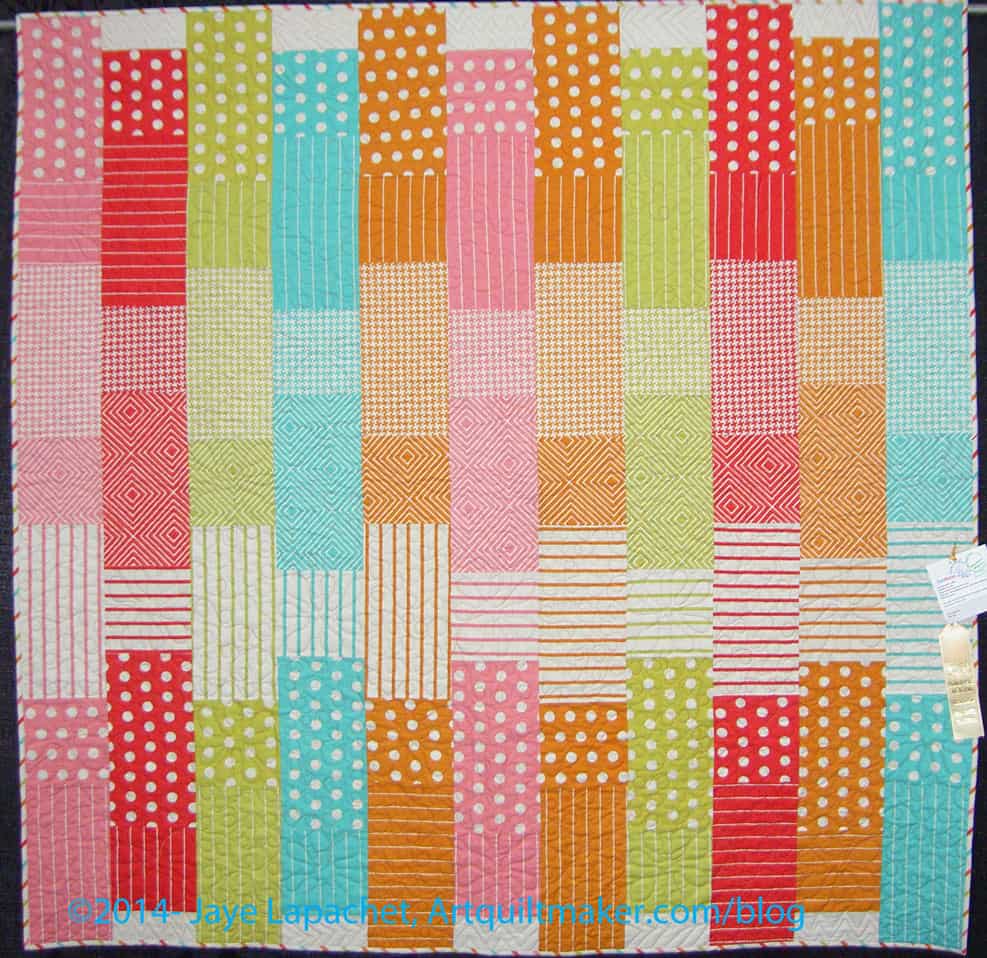
I am happy that Fresh Fruit is a winner, but also irritated. As I told you, it is a pattern e.g. not an original design, like the Whole Cloth Quilt. I used the same fabric as the designer used int he magazine picture. There was very little that was original in that quilt, unlike the Whole Cloth Quilt, which was completely original.
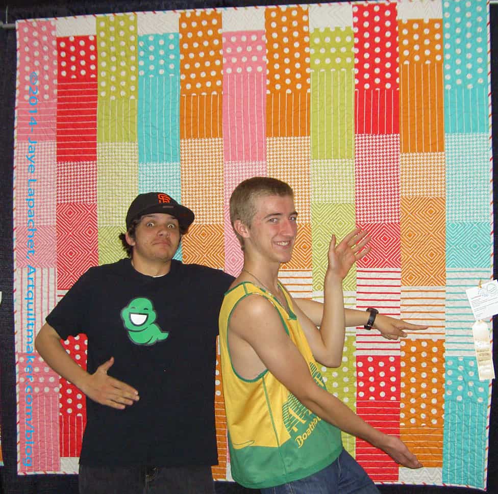
Silly Boys: Fresh Fruit: San Mateo County Fair 2014
As they did last year, I had the boys make a fuss over my quilt, mostly because they are so hilarious.
Keeping with my mini-theme of doing things out of the ordinary I went to an exhibit of part of the most recent Fiberarts International on Saturday with Maureen, Nancy & Dolores. We also had lunch.
The exhibit was at the San Jose Museum of Quilts & Textiles. The exhibit is on now through January 19, 2014. It is worth going to see. Not quilts, but inspiring in some ways.
I think I mentioned that I joined after a long hiatus of not being a member and one of the benefits was that I got into the exhibit for free. I went there ‘light’, meaning I took no sketchbook, no magazine in case people were late, no book, no camera. Getting in free kind of felt ‘light’ to me, too.
Lung of the City
I almost didn’t go. Going meant not sewing, but then I decided that my machine would still be there when I got back. I think I needed to hang out with some sane people and Maureen, Nancy & Dolores were just what the doctor ordered. It turned out to be good, because there was a piece that I loved.
Lung of the City
The piece was by a Hungarian woman and called Lung of the City. I don’t really like the name, because the word lung evokes pink fleshy bits that should not see the light of day.
This piece was named, because it had to do with the city in which the artist lives and how the parks act as lungs for the city. I am guessing she means cleaning the air that is polluted by exhaust and industrial output.
Lung of the City
The photos do not show the airiness and light that you could see through the piece. The piece was made up of three panels that must have been 10 feet tall. They were delicate, but must have been heavy as well, because they didn’t blow around as we walked by.
One of the things I noticed about many of the pieces was the layering. The one shown in the many photos, Lung of the City by Eszter Bornemisza, was three panels hung one in front of the other. It was made from a grid of thread and newspaper. This was a wonderful piece, partially because of the delicacy and partially because of the way the piece used shadows as part of the work. The photos above do not do the piece justice.
This piece really made me think. Not boring kind of thinking about art, but more about me making art quilts. The piece made me think about maps and place and community and my place and other people’s places. This piece with the foundation of watching Sarah’s video has made me think about art quilts again. I want to use her technique; I just haven’t found for what yet.
I don’t want to replicate what Bornemisza has made, but I want it to inspire me to do something different.
With the beginnings of the above conversation swimming around in my head, I went into the next gallery and saw what is, perhaps, a transition to a piece inspired by Bornemisza’s piece.
Untitled by Rachel Meginnes
A long time ago I made several (3? 4?) woven quilts. I was happy with them at the time and though there could be more in the series, but there was something that wasn’t quite satisfying about them and, as time when on and I learned more, thought more, I, frankly, moved on.
Those woven pieces, however never quite left my mind and Saturday they were back at the forefront, dusted off, rejuvenated, new life breathed into them.
Untitled by Rachel Meginnes
I saw this piece, which is also layered, and it reminded me of those woven pieces. It gave me a new idea for one of those woven pieces. I haven’t thought it all the way through, but I never thought the other woven pieces all the way through, so perhaps that is a good thing? I jut have a clear a few things off my to do list, which I did a bit of yesterday and pick some fabric and then we’ll see.
I love attending county fairs. I make it a point to attend my local county fair every year*. I also work hard to enter something. It’s not like I have a shortage of *ahem* quilts to enter. Also, if you have ever entered a quilt show, entering the county fair is a breeze. It is also really, really cheap, unless you are entering your quilts in the art section.
This year was no exception, though it was a very close call for me. The fair was changed from August to June a few years ago and is usually held the week of one of the major Library conferences I like to attend. As a result, I almost didn’t get to attend AND I almost bailed at the last minute. I was enjoying hanging around the house in my pajamas.
I like the Fair, and most all county fairs, because it shows what is going on in the community. It is a place for regular people to show off what they are making or growing or tending in the privacy of their own home. It shows off what the local organizations are doing. And there are the bizarre vendors (and not so bizarre, too).
I am sad, because my local Fair gets smaller and smaller and more and more expensive to attend. Here is a breakdown of costs:
That is a lot of fabric! I didn’t pay that much however, because the Young Man and I both entered exhibits we each got two free entrance tickets. We also got two parking passes, but I only used one since I can only drive one car at a time. My nephew paid for all but $5 of his carnival wristband. Our cost for the day was $71. I did take two teenaged boys and had to feed them. Still a lot for a day at the fair and out of the reach of many families with a few kids. It is definitely worth the money to enter exhibits. Even if I don’t win, I get $54 worth of entrance and parking right off the bat.
2013 Fair Ribbons
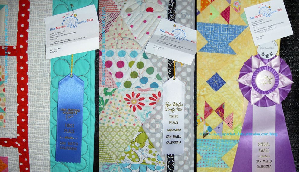
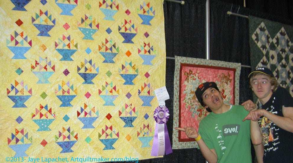
Last year I won a ribbon and was pretty excited about that, but this year I won 4 ribbons! Yes, 4!!!! I couldn’t believe it. I was thrilled when I saw the first one on the A-B-C Challenge quilt I did with BAMQG. I was ecstatic when I saw another ribbon on the Petrillo bag and practically jumping out of my skin when I saw the big, fancy ribbon on Cheerful Baskets. Then I saw the last ribbon on FOTY 2011. I forgot I entered that quilt and couldn’t believe it got a ribbon. Thrilled doesn’t even begin to explain how I am feeling right now. Thisis not a feeling I could ever imagine dealing with nor did I ever imagine I would win a ribbon. I have won two ribbons in the past, an Honorable Mention and a Judge’s choice, but not in the same year, at the same show.
Silly boys with Cheerful Baskets
I know some of you are thinking “Sheesh, it isn’t Houston, what is she getting worked up about?” I know this is a little show with a few hundred quilts and not Houston. I am still excited.
FOTY 2011 with 3rd Place Ribbon
After looking at my quilts, I went back and started looking at all the quilts in a very orderly and calm manner. A couple of the local guilds use the county fair as their guild shows. This saves money and enhances the quilt exhibit at the county fair. There are separate designations and categories of winners for those guilds only. I believe the judging is separate as well.
A-B-C Challenge with 1st Place Ribbon
There were a lot of nice quilts at the show. I enjoy seeing all the different quilts of all different levels. I took my own advice and looked for something in each quilt that I liked. It wasn’t hard as the quilts were so good. There really was some interesting about almost every quilt I saw there.
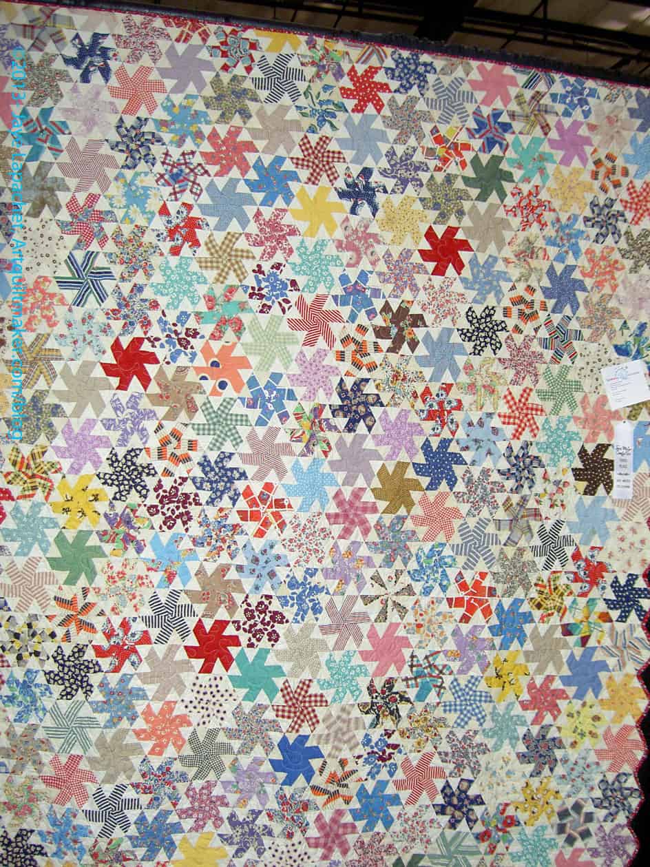
Julie Mcauliffe
The above quilt is by a local longarmer. She also has a hand in organizing the Fair’s quilt show. I liked this one for a few reasons. First, it is very similar to the EPP piece on which I am working. Second, it looks like the Spin Wheel project for which I am hunting and gathering.
Julie Mcauliffe detail
It also has great vintage fabric. The quilt was huge, thus the weird picture.
Sarah Martin Chocolate Challenge
Sarah Martin Chocolate Challenge
The above quilt is part of a SFQG challenge called “Chocolate”. I like this one a lot. There were a number of different renditions of the imagery of chocolate. I didn’t see any raspberries. I think that there is a lot of opportunity for creativity in a challenge about chocolate.
Kevin Martin
The above quilt is such a fantastic layout. One of the reasons I like it is the way the nine patches go out into the border. I also like it because the crosses are not cut off; they are complete.
Kevin Martin-detail
It is easy to see from this layout how part of the nine patches really are a border. The parts of the nine patch and the blue create the illusion of the nine patches going into the border.
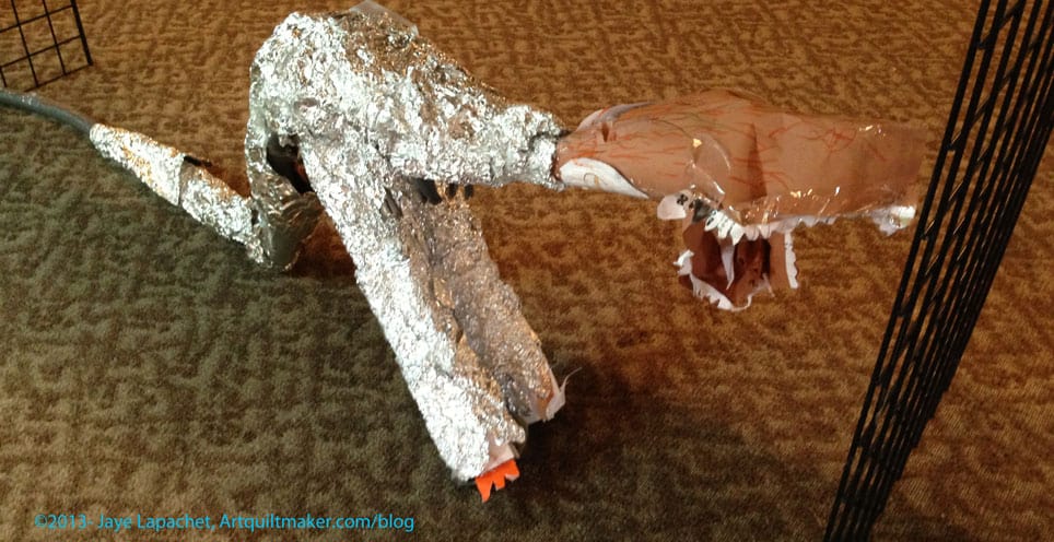
Tin foil dinosaur
One of my favorite parts of the fair is the building that houses the kid exhibits. Entering that building is an explosion of colors, movement and exuberance. Everything is a little wonky, but all of the art has such life. If you have no quiltmaking mojo left, the Kids Building is where you need to go. Where else can you see a tin foil dinosaur?
*2012 visit is chronicled as is 2009. I didn’t go back farther, but you can search in the search box, if you want.
One of my blocks for the QuiltCon challenge made on to today’s blog post: http://themodernquiltguild.com/2012/09/06/quiltcon-block-challenge-graphic-squares-rectangles-boxes/
I wrote about my blocks a few weeks ago and how sad I felt that mine seemed boring compared to some of the others entered by BAMQGers. It makes me happy that one of my blocks was featured. I am also happy that this blog was linked. Perhaps people will stop by and stay awhile!
I knew and meant to tell you earlier, but was really busy. Thanks to Adrianne of Little Bluebell for the reminder!
The last bit of my trip that I really wanted to talk about were the grates and grilles and other metal work. The Art Institute has collected pieces, parts and sections of buildings around Chicago that were being renovated or torn down. As you may have noticed from some of my inspiration photos, I have always enjoyed architectural details. Making a building beautiful (as opposed to striking or memorable) seems to be the greatest gift an architect can give a city.
I never really thought much about grates and grilles until I was standing in the second floor stairwell/lobby area of the AIC. For those of you who know the place, it is outside the Impressionist gallery. There, the curators have displayed a variety of pieces, many of which are metal. I know I have seen them as I have walked by buildings and there have even been a few times when I have ridden in one of those elevators where you have to close the door, but I didn’t really think about them as a source of inspiration until I saw them hanging on the wall. It is interesting how a museum will do that to me.
The Fisher Building Elevator Grille, above, is only the upper portion. I don’t think they had (or maybe I just didn’t photograph) the lower portion. I do think the round part looks like some kind of serpent. Not so great for quilty inspiration, but I could go with the general shape and proportion. What really grabbed me was the background. Those lines and curls would make great background on a quilt.
Manhattan Building Elevator Grille, 1889-91
This is a really elaborate elevator grille. Sometimes I wonder if the artisans or designers felt like they got one chance and went all out. Do you every do that?
I like the spirals in the middle, but in general I think this piece is top heavy. Stand on your head, look at the picture and tell me what you would think of it if the bottom were the top.
I think the spirals would be good quilting designs. I like the way there are different sizes of spirals and they go in different directions.
Manhattan Building Elevator Grille, 1889-91 detail
The close-up shows even more detail within the spirals and you can see the heavy part on top very well. I think it would be a good idea for me to take some kind of architectural history class so I would know what the official names of the various shapes are called. Dohickey isn’t very descriptive or precise.
The other thing about this detail is that it shows one thing I try to do in my quilts: the viewer gets a reward by getting close up. See the little dots and divets in the spirals? Do you see the wing shape in the largest spiral?
Window Keystone, 1872
I don’t know what a window keystone is, but the design would make an interesting piecing challenge. The way the piece is made makes the design seem like there is no ‘block’. I think this would probably be a similar piecing issue to the Spiky Stars piece I designed and created a number of years ago.
Window keystone, 1872, detail
I also like the slight curve of the motifs. I wonder if this is one of those motifs that could be sewed using straight lines, but would look curved? I don’t think so, but I also haven’t put much thought into it since I took the photos. Looking at the detail makes me see real curves in the piecing. I also like the interlocking knot look of some parts of the design. I think I would like a job where I designed useful items that would add to the beauty of everyday surroundings.
Schiller Building Block of Stringcourse
I am kind of partial to ovals, though I haven’t done anything with them in quiltmaking yet. These are really interesting pieces, partially because I have no idea what they were used for it and it fascinates me to think about these being added to a building because they were beautiful.
I really thought there were beautiful buildings in Chicago and it made me lament the dearth of classic (IMO) creativity in building today. Of course, things are a lot more expensive and these types of details may be prohibitively expensive, but I think their lack also makes us poorer.
These pieces would definitely make for interesting quilting designs and some complicated, but interesting piecing challenges.
As I said in my previous post, the quilts were really great.
I like the name of this quilt -Cockscomb, Rose Tree & Pineapple. The words evoke an English garden for me.
I think the quilt, in general, evokes a slightly wild garden. I have to say that I see the Pineapple as more implied than a true rendition of one. I won’t quibble too much, though.
Star Variation Quilt, 1831
I am partial to 8 pointed stars, so this quilt really attracted my attention. This quilt is attributed to Margaret Blean, 1811-1887. The best design aspect of this quilt is the border around each of the blocks. That little border really makes the stars stand out. There could be too much with the border, but the plain blocks really give the blocks space to shine.
Star Variation Quilt, 1831 detail
In looking closely at the blocks, I can see that the border adds a couple of extra diamonds to the block, which, I know, makes some quiltmakers sweat. As I said in the distant past sewing slowly and using the Jinny Beyer Perfect Piecer ruler to help with the inset seams really makes them doable. By the way, Jinny Beyer has a video and a guide to using the Perfect Piecer, which you can look at before you buy. I have been using the Perfect Piecer for awhile and learned a new trick watching the video.
Once you have done a few inset seams a few more make little to no difference. 😉
In the detail photo, the quilting is clearly visible, which looks looser than other quilting in the exhibit.
I would be doing the quilt a disservice, if I neglected to mention the fabric. There are a lot of nice plaids and I like the blue grey colors as well. The other thing I noticed was that the quilt is made from browns/earth tones/neutrals. Not always my favorites, but I like them in this quilt. Of course, I wonder how the quilt would look in brights with hot pink or lime green as a background.
Whole Cloth Quilt, 1819
I had whole cloth quilts on my mind after attending the July BAMQG meeting. Ruth spoke eloquently about the latest challenge – a whole cloth challenge. When I heard about it, I immediately said NO WAY, but I couldn’t get the idea out of my head. Visiting the Art Institute fed the inspiration fire. Don’t Ask.
This is a beautiful example of a whole cloth quilt by Ursula Whittlesey, 1796-1875. Think about Ursula for a moment. She was born just after the Revolutionary War, saw the War of 1812 and the Civil War as well as untold US expansion. And I was at a museum looking at her quilt. Just thinking about that makes my mouth drop open. I wish these women kept journals. If you don’t keep a journal, even just to chronicle your creativity, start. Start NOW.
Whole cloth quilt, 1819, detail
I thought the border of the whole cloth piece was nice. It is not an edge border, but a center border, like the mat of a framed picture. It is elaborate, but also simple with the repetition of the flowers and the wreath-like leaves. Of course, I had to take a photo of the corner. As I have mentioned, corners can be tricky, so I be sure and take note of them so I don’t have to make something crazy up myself. Looking at the corner detail made me notice the pineapple in the corner. I believe that pineapples symbolize hospitality. I carefully took photos and notes and did sketches, thinking that it might work as inspiration for a piece of my own sometime.
Whole cloth quilt, 1819, detail
One thing I like about the frame is that the flowers are simple. Of course, If I tried to machine quilt them, they would be complicated enough, but they are not complicated flowers. They are simple daisies (I guess).
Also the wreath-like leaves are complicated in front and simple behind, which probably made the quilting easier, but also make the front leaf stand out. If you look at the design one might think that the simple background part of the leaf could be attached to the flower. Who knows? It is fun to look at it and speculate.
Whole cloth quilt, 1819, detail
Finally, I have to go back to the pineapple. This is one of the best pineapple designs that I have seen. It is a bit stylized, but not a lot. A person can really tell what it is.
I also notice that it is its own design. The leaves are different from the wreath-like flower-leaf border, but it is connected to the cornucopia by the suggestion of abundance.
I guess the lesson is: go to a museum, get inspired there and pay homage to the woman who made these works and, probably, never thinking that their work would be in a museum.
As I said in my previous post about the Samplers, the textile exhibit was small. Despite being small the quilts on display were excellent. Perhaps not excellent in the that they were the best of the best, but excellent in that they were interesting. There were interesting choices of fabric, interesting corner treatments and interesting block variations. We all seem to go for perfect, especially when we run out of fabric and, yet, I find that antique quilts with an odd patch of fabric are more interesting. I often think “why would she choose that particular fabric?” and that thought leads me into a whole day dream about the woman that made the quilt.
The Star of Bethlehem was a stellar example of a quilt. The museum called it a bedcover. I wonder why? I’ll have to ask a curator friend and see if she knows.
Star of Bethlehem, 1830 detail
The colors are a really good combination. The red, green and yellow are a combination I used to use a lot when I drew and colored with felt pens. The viewer is rewarded with the fabrics when viewing close-up. They are interesting and add a lot of movement to the quilt
The borders are another excellent part of this. In reality, the whole quilt is about the borders. It is kind of a border round robin idea.
Star of Bethlehem, 1830 detail
The detail of this quilt is great. The photo (left) is a detail of the center. I love it that this quiltmaker sewed so many inset seams, not only in the center, but in the whole quilt. I would love to know the maker (or makers).
The other thing is that the points are really well done. I know that points matching is not the be-all-end-all, but when the points matching is well done, it is a joy to behold.
Again, in this detail, you can see the nice combination of the red, yellow and green. I think the tones of the colors are interesting. Not greyed, not bright. Not sure what I am seeing, but it is interesting.
Star of Bethlehem, 1830 corner
One thing I like to do is pay attention to the corners of borders. It is sometimes hard to know now to make a corner meet, especially if your piecing is a bit off. In this example the corner is a bit off where the two parts of the border meet, but the quiltmaker really did a nice job making that flower shape. I really like it. I also like that it is a bit off. It gives the quilt humanity, soul.
Keep in mind that I had to take photos of these quilts with no flash. Thus, the colors in the photo of the corner look more yellow than they were.
Pincushion & Burrs, 1830
I have never heard of this pattern with the name Pincushion and Burrs. It is also, according to the information card, called Square and Swallows, which sounds familiar, but not very much. I am pretty good with blocks, but I haven’t paid a lot of attention to quilt designs that have an all over name. Something to put on my bucket list, I guess.
I really like the border on this quilt, but the overall quilt is a great blue and white quilt. The little bird feet add movement and interest to this piece. I am not a huge fan of two color quilts; I don’t hate them, but I just think there is so much good fabric, why stick with just two? However, when I see a quilt like this, I think about making a two color quilt.
Pincushion & Burrs, 1830, detail
In addition to showing you the birds’ feet in this photo, you can also see the quilting. The quilting includes bunches of grapes, which are difficult in the best of circumstances. These are well done. The thing I like about this quilting is the double row of stitching that border the plain blocks. You may have to enlarge the photo to see them.
I also like the slight curves in the center of pieced blocks (applique’). I think this could be made, partially, like a Drunkard’s Path is made.
Pincushion & Burrs, 1830, corner
Again, here is a border corner. this is an interesting treatment-Flying Geese border and then a kind of Double Four Patch with Half Square Triangles. I like. It works, even if it isn’t perfect. It does look a bit like a butterfly.
The Opening Reception for the Scrap Art exhibit at the San Jose Museum of Quilts & Textiles was on Sunday August 21, 2011. My quilt, Fabric of the Year 2010 is included in the exhibit. I almost didn’t attend the opening reception. The drive is long and I am lazy about leaving my house on Sundays.
However, I kept publicizing the event on FB and Twitter, and when Deborah Corsini emailed me to say there would be an opportunity for the artists to speak about their pieces, I knew I had to go. I am glad I did. It was an exciting experience. I had lots of support from my DH and my quilt friends. They all said how great my quilt was and how great it looked.
Milling Around in the Gilliland Family Gallery
There were a lot of people at the opening. People in the know such as Maureen and Terri said this was one of the largest events they had seen in conjunction with an opening of a quilt show.
Listening to Roderick Kiracofe Talk
Lots of quilt glitterati, in addition to Terri Thayer, of course, were there including Lynn Koolish, Nancy Bavor (quilt appraiser), Marie Strait (president of the SJMQT Board) as well as my favorite CQFA glitterati. 😉
Rod Kiracofe, author, collector and former dealer was there. He had loaned several of the best examples of vintage scrap quilts tot he exhibit. Ms. Corsini had him speak about his quilts and he told a funny story about bidding on a variety of quilts including the the 9 patch (in the exhibit) against Julie Silber. I felt like I was in the shadow of greatness, because I have read his work and admired it for a long time. He wrote The American Quilt, a book I pored over when it came out. I bought it at Doubleday Books on Sutter Street back in the dark ages.
Nine Patch Variation
I didn’t recognize this quilt as a Nine Patch until Deborah Corsini pointed it out. I didn’t see the Nine Patch. No, I am not a moron, but I was quite distracted and not studying the quilts. Of course, once pointed out to me, I saw it. I love this quilt. It is dated ca. 1925-1950 and was found in Wingo, Kentucky. It is so lively and really different than most Nine Patches. It is an excellent example of why I love blocks: you can do something with a block, your neighbor can also do something and the two will not look the same.
Listening to Sande Stoneman
One thing I enjoyed was that collectors had loaned their quilts. Deborah Corsini acknowledged them equally with the artists. I never really thought about the importance of collectors, but as I listened to Deborah and some of the collectors talk I realized all the ways that collectors contribute to the art world. I thought of all the masterworks of all kinds of art that are loaned to museums (big duh moment, let me tell you!) and how the same must be true in the quilt world.
Ms. Stoneman, with backpack, talked about the quilt she had loaned,which was made by her grandmother. She talked about trying to match fabrics from the quilt in photos.
Ocean Waves from Afar
The Ocean Waves quilt was really stunning from afar. For being made around 1890, it was in stunning condition.
It and a few of the other quilts were made from fabric that was not to my taste up close, but all of the quilts were quite stunning from far away.
Of course, the scrap aspect was a factor.
Trip Around the World
The Trip around the World quilt was my favorite. The sashing/edge of each block was a soft yellow, slightly brighter than butter yellow, but not so jarring as sunshine yellow. I have been thinking of ways to use scraps as I cut triangles for FOTY 2011, over the past few weeks sans machine, and this quilt really spoke to me. The scraps I have would not be large enough for 2″ squares, but they might be large enough for 1.5″ or 1″ squares. The patches in this quilt are all the same in each round, but I might be successful if I used similar values and hues in this block pattern. I might make one block to just try it out.
Discussion about many pieces
The quilt next to the door in the back of the photo is the half square triangle quilt in the collection of Sande Stoneman, discussed above.
Everyone in the photo is looking at a Trip Around the World quilt with about 14,000 postage stamp sized pieces. It was a couple of quilts away from another quilt with 17,000 pieces. WOW!
14,000 Piece Trip Around the World
The quilt with 14,000 pieces also has a jagged edge (you know I like those!). It was made by Minnie Kesler Murray, a native of Boones Mill, Virginia. She and her husband lived in San Jose in the 1950s and 1960s. She called this quilt her masterpiece. Her granddaughter is the owner of the quilt and lent it to the museum for this show.
36 Patch with Chintz Border
I am really glad that not all of the quilts were made from thousands of tiny pieces. The 36 Patch with Chintz Border is another of my favorites and another that could be made from scraps in similar values.
Again, the background was more yellow than gold and really glowed. It is from the mid 1800s. The great great granddaughter of the maker was in attendance.
Crazy Block Quilt
The quilt with the red and black piano key border that Ms. Corsini is showing in the picture was made of tiny string pieced silk blocks. She said that the quilt had some condition issues (what old silk quilt doesn’t?), but that the contrast between the tiny blocks and the bright bold border was fabulous. I have to agree. It was scrappy and, perhaps, string pieced and some of the fabrics congregated in areas of the quilt to make flowing dark and light areas.
I am really liking the idea of a piano key border. I was thinking about it before for another quilt. Seeing it on this quilt made me like it even more. I liked the way the maker joined the corners, too. The colors don’t exactly meet, but they look good.
Ocean Waves & Scrap Top
You can really see Granny Burkitt’s Scrap Top (left of the Ocean Waves quilt) better — well, better than some of the other photos!
I was amazed at how large some of the vintage quilts were. I thought FOTY 2010 was a monster, but it is a baby quilt in sized compared to Granny Burkitt’s Scrap Top and the Ocean Waves quilt. Looking at both of them makes me want to start sewing light and dark half square triangles together. No, I don’t have an idea in mind, but if I come up with 1,000 half square triangles, I am sure I can do something with them!
String Diamonds
Charlotte Kruk spoke about her strapless evening dress, Sugar, which is made out of sugar packets she collected over the course of 2 years. You can see it in the String Diamonds picture right behind Rod Kiracofe. Charlotte had another jacket and skirt piece in the foyer. I really liked the shape of her wearable sculptures. Charlotte is the creator of “Traje de Luces,” “The Reign of the M&M”, a kind of toreador outfit I saw at PIQF some years ago.
Just after she spoke Roderick Kiracofe talked about his String Diamonds quilt (found in Alabama, made ca. 1930-1960). I felt a kinship with this quilt, having just made a diamond quilt. One of the interesting aspects of this quilt was the back. It was made from sugar sacks from Cuba! Not only was the Cuban angle surprising, but the location of that particular quilt near the evening dress (Sugar, 1998) was well planned and a pleasant surprise.
One of the things I liked about attending this event was somewhat less formal than just going to a museum. The artists and owners of the quilts were allowed to show the backs without white gloves.
String Diamonds
A few artists had more than one piece included in the exhibit and Barbara Wisnoski was one of them. She is a Canadian artist from Montreal. Barbara came all the way from Montreal to be at the show, which I thought was wonderful and made me glad I had made the hour drive down to the South Bay!
She makes pieces using strip piecing, but she will cut strips, sew them together, cut those strips apart over and over. The effect of this technique is a lot of little pieces, almost shredded looking. She strives for a landscape look – actually she said that she makes landscape quilts.
Ruth TabancayNo Two Alike, 2010
The quilt by Ruth Tabancay is made from Republic of Tea teabags, which she as well as friends and colleagues use and then save. The teabags in this piece are painted with gouache (lighter colors) and acrylic (darker colors) paint. She started painting the teabags so she could get the colors she wanted. The shapes are reminiscent of Grandmother’s Flower Garden. No Two Alike is inspired by the six-fold symmetry of snowflakes.
Evening Star, 2010, Karin Lusnak
I really love the Lone Star string quilt by Karin Lusnak. I have seen something like it, or perhaps this quilt, elsewhere and admired it.
The quilt is made entirely of string pieced diamonds, which are, in turn, made into larger diamonds. The photo does not do this quilt justice because it just glows and Lusnak has really captured the color of the sky when it turns from the blue of the day to purple-indigo of night. The aspect of this quilt that puzzles and amazes me is that she uses a variety of colors in each of the diamonds. The center diamonds that make up the Lone Star were not limited to gold tones. The same is true for the sky. I think this is an excellent example of the ‘weight’ of color. The artist has used more blues in each diamond for the sky even though other colors were included. This method adds a lot of interest.
Variation of the Snake Trail
I read an article recently about quilts with snakes in them. This quilt immediately jumped out at me as being from that vein.
I was fascinated by the green pieces and how they form a continuous line, except for some of the border pieces. In examining the making of this quilt, I think the maker would have had to be very open to serendipity or have made the blocks as she set the quilt.
I really never ceased to be amazed at how inspired I can be from looking at vintage and antique quilts. I would love to talk to their makers! Still, I look at these quilts and my mind starts spinning with new ideas. These quilts show, in a way, that the discussion of classifying quilts into traditional, art or modern is not easy. These vintage quilts are hanging on the wall. Does this make them art? Will they still be art when they are taken off the wall and put on the bed?
FOTY 2010 with JHL
Julie corralled me and got a picture of me with my quilt. I looked at my quilt on the wall and thought that it looked out of place, but I told the monkey voices in my head to STFU and listened to my quilt board of directors who told me how proud they were of me and how great the quilt looked. Adrianne told me that my quilt was next to a quilt by Jacquie of Tall Grass Prairie Studio.
I have to admit that I was slightly terrified when I saw my quilt on the wall, seriously hung in a gallery. I couldn’t really comprehend what was happening, which I know sounds really strange. I just had no idea what I was I was doing when I submitted the piece for the show. I knew what I was doing mechanically, but I didn’t realize the ramifications, which were that my quilt would be on the wall of a real gallery for two months. I am really thrilled to have a lot of people see my piece. REALLY. THRILLED.
FOTY 2010 with JHL's QBOD
Here are members of CQFA and what I like to call members of my personal quilt board of directors. All the members of my QBoD weren’t there, but these are people who talked to me about the layout, spurred me on and kept me going. I was really excited to have them there. From left to right: Jaye, Dolores, Terri, Maureen and Julie.
I know the photos are not top quality, but the lighting was really difficult to deal with. I hope you can, at least, get the flavor of the event.
If you haven’t seen the Red & White quilts at the NYC Park Armory and you are within commuting distance, go see them! Admission is free!!!! A couple of friends have gone to see them and have said that the exhibit is amazing. It is only there for a few more days. Make the time!
3/31/2011 Update: Here are some (there are many, many articles on this exhibit) news stories about this exhibit:
Financial Times: Infinite Variety: Three Centuries of Red and White Quilts, Park Avenue Armory, New York. By Simon Schama
NYCtheblog: Amazing Display of 651 Red and White Quilts by Paolo Mastrangelo
New York Times: Finally, Mrs. Rose (and the Public) Can See All Her Quilts by James Barron