QuiltCon Block Entries

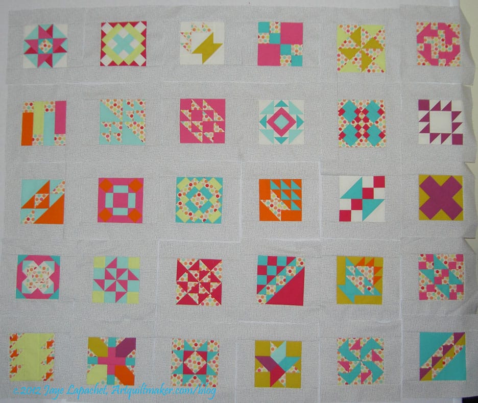
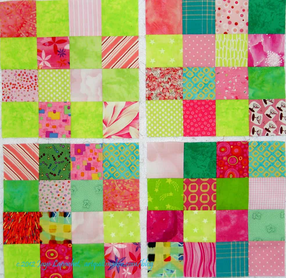
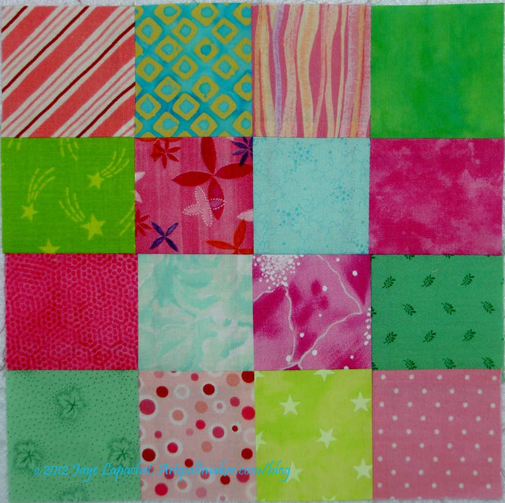
If you have not already sent off  your blocks for the QuiltCon block design challenge, it is too late. I sent mine in earlier and wanted to share what I created with you.

You can find the original directions at the QuiltCon/MQG blog.

QuiltCon Block Challenge FQs

I bought a set of fat quarters from Pink Chalk fabrics. I bought FQs from Pink chalk, because they were a bit cheaper than the other vendors (did not include the white) and I like the Pink Chalk customer service. It is ridiculous for me to try and save a few bucks. I buy enough fabric to insulate my house, but I have my moments of sanity.

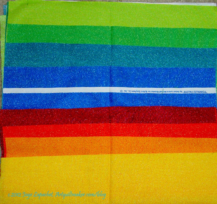
The colors, which were selected by Elizabeth Hartman of ohfransson fame, are:

  • Kona Cotton Cyan
  • Kona Cotton Azure
  • Kona Cotton Candy Green
  • Kona Cotton Lime
  • Kona Cotton Chartreuse
  • Kona Cotton Buttercup
  • Kona Cotton School Bus
  • Kona Cotton Tangerine
  • Kona Cotton Medium Grey
  • Kona Cotton Coal

I wasn’t very fond of the yellow. It is too wishy washy for me. The orange in the upper left hand corner shows up very red on my screen, but it is orange.

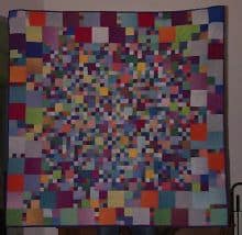
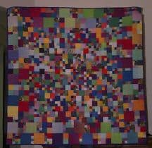
QuiltCon block entry #1

I thought some of my Block-a-Long blocks were pretty modern, so I entered some of those. The first one was a block I named Four Columns Squares (Block-a-Long #52). I did rearrange the columns a bit from my original post, because I wanted to take advantage of my perception that the modern quiltmakers like assymetrical quilts (blocks) as a general rule.

I found the 12.5×12.5 unfinished size to be unwieldy for me. Most of the blocks I make are much smaller. I didn’t have to make them 12.5″x12.5″. I could have made them 12.5″ by whatever width I wanted, but I didn’t do that.

I also thought it would be a good idea to make the same block in two different colorways. I also included a printout of how the block would look in a quilt.

QuiltCon block entry #2

I wanted to make several, but read the directions and found I could only make 3. At the time I found that out, I had already made two, so I thought I had to select the third carefully. Instead what I did was send in the two as the same pattern in two different colorways. Clever, eh?

Well, it won’t be very clever, if I get disqualified.

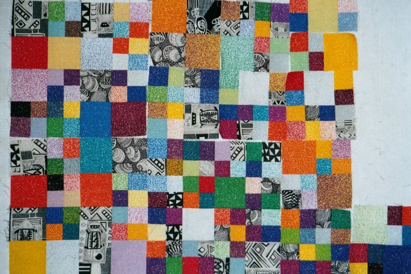
I was thinking about the rules saying that blocks could be any width. I kind of wanted to try a different width than 12×12 finished, so I reduced one of the Block-a-Long blocks by not making all the pieces. I think it looks very similar to the block I used for FOTY 2009.

QuiltCon Block entry #3

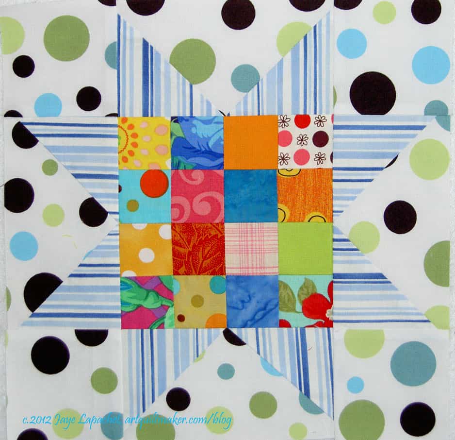
If you remember, that is a block I found in a book by Bill Kerr and Weeks Ringle. Not sure which one anymore. 2009 was pretty long ago, especially in the number of quilts I have finished.

I am pretty pleased with this one. I added one print, as you can see just to add a bit of interest.

I found that a fat quarter pack ends up being a lot of fabric. If I count up, what I bought was 2.5 yards of fabric. That is a lot of fabric and I really didn’t want it hanging around, so I made more blocks.

3 is the limit, you say? Yes, you are correct, but what I did was count QuiltCon entry block #1 and #2 as the same block in different colorways. I sent them off as such and then finally got around to making more blocks towards the end of June. I didn’t post this back then, because I didn’t want anyone copying my work. Shocking, I know, but it happens.

QuiltCon Block Entry #4

This one is more asymmetrical, but is not wonky in the Gwen Marston style. I just couldn’t do it.

I was glad to get this out of my hair. I don’t expect anything, but hope the judges will choose one of my blocks. If not, they will go to a good cause.

Stay tuned for more about the BAMQG block challenge that I worked on as well.

Art Institute of Chicago Quilts

Star of Bethlehem, 1830

These quilts were part of the Fabric of a New Nation, 1776-1840 exhibit at the Art Institute of Chicago.

As I said in my previous post about the Samplers, the textile exhibit was small. Despite being small the quilts on display were excellent. Perhaps not excellent in the that they were the best of the best, but excellent in that they were interesting. There were interesting choices of fabric, interesting corner treatments and interesting block variations. We all seem to go for perfect, especially when we run out of fabric and, yet, I find that antique quilts with an odd patch of fabric are more interesting. I often think “why would she choose that particular fabric?” and that thought leads me into a whole day dream about the woman that made the quilt.

The Star of Bethlehem was a stellar example of a quilt. The museum called it a bedcover. I wonder why? I’ll have to ask a curator friend and see if she knows.

Star of Bethlehem, 1830 detail

The colors are a really good combination. The red, green and yellow are a combination I used to use a lot when I drew and colored with felt pens. The viewer is rewarded with the fabrics when viewing close-up. They are interesting and add a lot of movement to the quilt

The borders are another excellent part of this. In reality, the whole quilt is about the borders. It is kind of a border round robin idea.

Star of Bethlehem, 1830 detail

The detail of this quilt is great. The photo (left) is a detail of the center. I love it that this quiltmaker sewed so many inset seams, not only in the center, but in the whole quilt. I would love to know the maker (or makers).

The other thing is that the points are really well done. I know that points matching is not the be-all-end-all, but when the points matching is well done, it is a joy to behold.

Again, in this detail, you can see the nice combination of the red, yellow and green. I think the tones of the colors are interesting. Not greyed, not bright. Not sure what I am seeing, but it is interesting.

Star of Bethlehem, 1830 corner

One thing I like to do is pay attention to the corners of borders. It is sometimes hard to know now to make a corner meet, especially if your piecing is a bit off. In this example the corner is a bit off where the two parts of the border meet, but the quiltmaker really did a nice job making that flower shape. I really like it. I also like that it is a bit off. It gives the quilt humanity, soul.

Keep in mind that I had to take photos of these quilts with no flash. Thus, the colors in the photo of the corner look more yellow than they were.

Pincushion & Burrs, 1830

I have never heard of this pattern with the name Pincushion and Burrs. It is also, according to the information card, called Square and Swallows, which sounds familiar, but not very much. I am pretty good with blocks, but I haven’t paid a lot of attention to quilt designs that have an all over name. Something to put on my bucket list, I guess.

I really like the border on this quilt, but the overall quilt is a great blue and white quilt. The little bird feet add movement and interest to this piece. I am not a huge fan of two color quilts; I don’t hate them, but I just think there is so much good fabric, why stick with just two? However, when I see a quilt like this, I think about making a two color quilt.

Pincushion & Burrs, 1830, detail

In addition to showing you the birds’ feet in this photo, you can also see the quilting. The quilting includes bunches of grapes, which are difficult in the best of circumstances. These are well done. The thing I like about this quilting is the double row of stitching that border the plain blocks. You may have to enlarge the photo to see them.

I also like the slight curves in the center of pieced blocks (applique’). I think this could be made, partially, like a Drunkard’s Path is made.

Pincushion & Burrs, 1830, corner

Again, here is a border corner. this is an interesting treatment-Flying Geese border and then a kind of Double Four Patch with Half Square Triangles. I like. It works, even if it isn’t perfect. It does look a bit like a butterfly.

Small, but nice exhibit in general. I enjoyed it.

Creative Prompt #169: Name

Domain name

Baby name

Family name

Nom de plume

legally change your name

National Association of Miniature Enthusiasts promoting the hobby.

Holy Names

Definition: A systematic name is a name given in a systematic way to one unique group, organism, object or chemical substance, out of a specific population or collection. Systematic names are usually part of a nomenclature.

A Horse with no Name

Chemical name

Code name

Name and shame

What’s in a Name?

Name That Tune (game show)

Name-Calling

sort by name

name tag

profile name

name attribute

In the Name of the Father

Getty Thesaurus of Geographic Names (TGN) is a structured vocabulary of geographic names for indexing art and architecture.

U.S. Board on Geographic Names, Domestic Names, Foreign Names, Antarctic Names, and Undersea Features.

Definition: A name is a word or term used for identification. Names can identify a class or category of things, or a single thing, either uniquely, or within a given context. A personal name identifies a specific unique and identifiable individual person, and may or may not include a middle name. The name of a specific entity is sometimes called a proper name (although that term has a philosophical meaning also) and is a proper noun. Other nouns are sometimes, more loosely, called names; an older term for them, now obsolete, is “general names“.

Hello! My Name is….

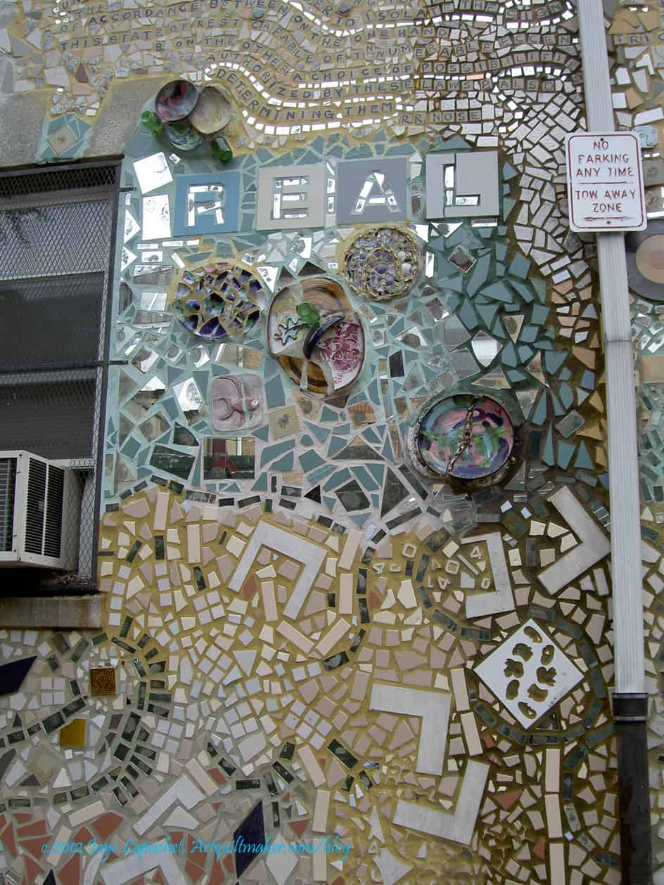
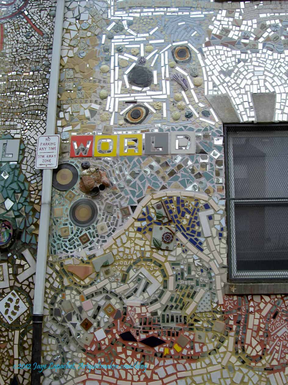
The Name of the Rose

business name availability

What’s in a name?

pen name

Make your response simple. It doesn’t need to be a masterpiece. Take 5 minutes. Just respond and create a creative habit.

Please post the direct URL (link) where your drawing, doodle, artwork is posted (e.g. your blog, Flickr) in the comments area of this post. I would really like to keep all the artwork together and provide a way for others to see your work and/or your blog, and how your work relates to the other responses.

The Creative Prompt Project has a Flickr group, which you can join to post your responses. Are you already a member? I created that spot so those of you without blogs or websites would have a place to post your responses. Please join and look at all of the great artwork that people have posted.

Sketching #164

imageThis drawing was ready weeks ago and I don’t know why I didn’t post it.

I don’t need my computer for a few days so I took it to be repaired….then I remembered I wanted to post tonight. Murphy’s Law, I suppose, bit I am making due. I may replace the photos in the future.

I used scarlet and a more turquoisey, but not quite, blue rathwr than the traditional colors. I like how this drawing came out.

Art Institute of Chicago Samplers

AIC Mourning Sampler

At the Art Institute of Chicago, while I was in Chicago, there was a very small exhibit of textiles called Fabric of a New Nation: American Needlework and Textiles, 1776–1840. It is in Galleries 57–59 from Thursday, July 12, 2012–Sunday, November 11, 2012.

The exhibit included some quilts and several examples of needlework. One type of needlework I like are samplers. I like them because they are so personal. They often include initials or names and dates. The ones I know best are cross stitch samplers. I have made a few, including one I posted here previously. The ones at the Art Institute were different. These were not cross stitch, but more emboridery/needlework samplers and they were mourning samplers.

AIC Mourning Sampler

At a certain point in time and space, I guess there was no way to remember people unless a woman stitched a mourning sampler. I felt odd staring at this sampler, it felt indecent for some reason. I couldn’t stop, though. The stitches shone, glittered in the harsh fluorescent light. The thread was silk and it was like a whole bunch of puzzle pieces clicked into place in my mind. The thread was gorgeous and it made me realize that I need to get some of this thread and try it out on one of my pieces.

I also liked this tree. I like the curves of the limbs and the shape of the leaves. The colors are very soothing, but I always wonder whether the colors have faded?

I enjoy looking at older textiles because I always get inspired. I see something that sparks a thought in my mind. I also like thinking about the women who made them. It always makes me sad when I read a tag next to a beautiful Sampler and it says ‘unknown.’ I am glad we have blogs, because we won’t be so anonymous in the future.

1791 Sampler by Lucy Potter

I thought the Sampler by Lucy Potter was very fine. It isn’t exactly my style, but the stitching was exquisite. I like the writing, but it is hard to see.

Nota bene: we were allowed to take photos as long as they were taken without the flash. That is why these photos are so dark.

Elizabeth Bogfholder Towel, 1831

The Bogfholder Towel is a cross stitch sampler. I like the simple shapes and bright colors of this sampler.

I have trees on the mind, too, so I was particularly interested in the way the artist stitched the trees.

Elizabeth Bogfholder Towel, 1831, detail

I know that thedetail of the towel isn’t exactly a tree, but I thought the motif had an interesting shape. It is, perhaps a candelabrum? The birds or griffins on the top intrigue and I wonder about the symbolism for all of these motifs.

I also think I could make a good argument that the smaller motifs on the left and right are stylized trees.

Stencilled bedcover
Stencilled bedcover

When I first saw this piece the exhibit was transitioning from needlework to quilts and I thought this was a quilt or an embroidered bed cover. It is a bed cover, but it is stenciled. The stenciling was very fine and detailed. I was amazed when I got up close to it, because I really couldn’t tell from even 3 feet away.

I had no idea that stenciling was done in the covered by this exhibit. I always think it is a good day when I learn something new.

Stenciled bedcover, detail

I think some of the motifs of the stenciling could be enlarged and used as applique’.

The description of the exhibit is “Featuring over 45 bedcovers, coverlets, needlework, printed handkerchiefs, and other household textiles from the permanent collection of the Department of Textiles, this exhibition explores the evolution of an American textile tradition as home creation, cottage industry, and commercial production developed between the years 1776 and 1840. While some needlework and textiles during this period were born out of necessity, others evoke refinement and sophistication, reflecting the overall growth, ingenuity, and prosperity of a new nation.

Traditionally textiles, whether made in the home or commercially, were considered prized possessions, but their value was not merely monetary; they often held special significance for the makers and their descendants. Many such textiles bear the maker’s name, and as treasured heirlooms were passed from one generation to the next serving as family record.

The sewing of textiles was also vital to the maintenance of a household. This important female skill not only provided the necessities of clothing and bedding but also a socially acceptable activity for women. The sewn and embroidered textiles in this exhibition represent the work of schoolgirls and women who had the means and time to pursue the needle arts. The works’ highly skilled execution and complex designs are evidence of the artistic and personal expression they provided.

A bridge from home to commercial production can be seen in the exhibition’s woven coverlets. Coverlet weavers in homes and separate workshops formed a cottage industry that would eventually grow into a full-scale commercial business by the mid-19th century. Printed textiles, on the other hand, were a product of the innovations and technological advancements of the Industrial Revolution, part of the commercial manufacturing industry that disseminated affordable textiles to a wider audience. With the mechanization of production and printing, textiles were able to keep pace with fashion and current events.

Whether sewn, woven, or printed, the textiles in this exhibition trace the development of an American textile tradition—one in which industrialization played a dominant role transforming raw materials into finished products but one that was also impacted by changes in the American home from creation out of necessity to a burgeoning consumer economy. Within these diverse textiles and their development, one can witness the innovation and progress of an early but thriving new United States.”

I was thrilled to see some textiles and hope that you enjoyed this review.

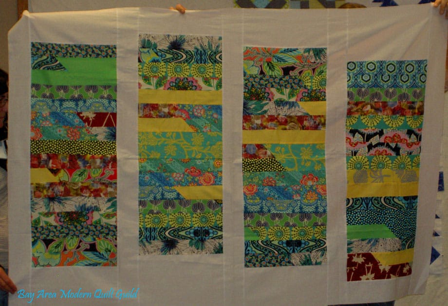
Yellow Donation Top

Yellow Donation Top with borders

What do you think?

The photo looks a little golder than it is. While there is a bit of gold in this top, the border fabric is definitely a bright yellow.

Many of these fabrics are from the Pat Bravo/Art Gallery Fabric scrap bag that I received. You can’t really see much of those fabrics, because of the problem I had with the sashing.

Yellow donation top back

I took the opportunity to use several of my golds for the back. I didn’t think I would use them for anything in the near future. I chose them in the hope that some small sick child will find comfort in those fabrics.

August BAMQG Meeting

I wasn’t able to make the meeting, so this will be a paltry post. Not sure what I will do for the BAMQG blog post. Hope someone comes through to help me out.

A-B-C Challenge

Underground Railroad

This Underground Railroad block has become one of my favorite blocks. I used it, differently colored, in the Stepping Stones quilt. After the Stepping Stones experience, I knew I had to add it to my collection of blocks for this challenge. As I have said many times, I love the way one slight change can make a block so extremely different. The coloration in the Stepping Stones quilt makes the fabulous overall pattern. The version to the left would have an Irish Chain kind of look if I put a bunch of similar blocks together.

Variable Star
Variable Star

I almost brought a W block, completely forgetting that V comes before W. In fairness, it isn’t completely my fault.I was relying on Around the Block and that book has no V blocks. It went straight from U to W, so I made a W block (yes, I am ahead, but you have to wait to see it). Then I realized what was happening and found the Variable Star in Around the block again. They use a template for the middle, rather than rotary cutting directions, because they want you to cut it on grain. I just cut it and was careful while sewing. I think it is probably off grain, but whatever. It is the middle of the block, so I am not worried.

Donation quilts

Yellow Donation Top - no borders
Yellow Donation Top – no borders

I love those Charity Girls. Have I said that? They are awesome. They REALLY make me want to make donation tops. Here is the yellow top I turned in this week. You have heard all about it in another post, so I am not going to say much more about it.

It is the top without borders. If you read the other post, you get the borders. I gave the top to Angela and she said that people really liked it. I am happy about that.

TFQ and I talked about other colors to use for these tops. I want to make an orange one and she suggested using another color besides black-on-white for the background. I think it is a good idea and thought of blue. That combo would really pop.

I am, however, on to the next top – another pink one. I have cut enough pink squares for almost the whole guild to each make a pink top. What was I thinking?

Workshop

Rhonda (organizer extraordinaire) did a great job on the improvisational piecing workshop. I have a spy who told me. I can’t wait to see the pictures.

I really like the BAMQG group. Some of the people are becoming my peeps! I was invited to join a small group, which is awesome! I am excited about that. More on that later.

More Sashing

The first picture in this recent post by Camille Roskelley (I just can’t stay away from her blog! If she posted 10 times a day I would be reading all the time and not going to work, cooking for my family or washing my hair) made my eyes pop out of my head. I know you have gone to look at the photo and are thinking “well, yeah, it is a polka dot, you love polka dots, Jaye, big whoop.” Why my eyes popped out of my head when I saw Camille’s work is because of sashing.

Huh? you think.

Zoe Pearns' Sweet NothingsYes, dear readers, sashing. Remember that I was puzzling over sashing options for the A-B-C Challenge earlier this week? The whole time I have been making these blocks I have been lamenting that Pat Bravo did not include a really good red in the line. I gnashed my teeth further because the Zoe Pearns dot has a wonderful red in it. I have lots of red and white dots. My idea may not work (make visual decisions visually!!!), but right at the moment I feel brilliant.

Big Dots
Big Dots

I love this big dot, but I don’t think it works with the A-B-C Challenge blocks.

The color is ok, though. It is hard to say, though, because the large dots interfere with the blocks. I think it might be from the Half Moon Street collection, but am not sure.

Small dots
Small dots

I think the smaller dots are better. This fabric is from the Sevenberry (?) collection. I am not sure, though. Not quite right. Why? I don’t know. I do have a large enough piece, though, so perhaps I will go with it just because of that. Bad reason to choose a sashing, though, I know.

Small dot #2
Small dot #2

Still, I liked the smaller dots, so I looked for another. A mini fabric avalanche (fabri-lanche?) gave me another idea.

I thought, perhaps, the problem was that I was trying out the fabrics with a straight set, so i got out a different red and tried the blocks on point. Some of the blocks, like the baskets, look ok, but most of the blocks just look weird. It is probably just that I have been looking at them in a straight set, but I don’t like the on point set.

Small dot #2 straight set

Here is the same fabric, but in a straight set. I like it, but the red is very strong.

A lot of what I like is the idea of the red. I like using a strong color for sashing and background. I also like the idea of bringing out that little red in the Zoe Pearns dots I mentioned above. It might be a dumb idea, because you can even tell. I can’t tell even when I standing with my nose next to the design wall.

Small dot #2 straight set - detail
Small dot #2 straight set – detail

More quilt drama. I am glad I am working on this now, because if I had 5 minutes one weekend to sew these blocks together and I was trying to do this, I know I would make a bad choice and have to live with it.

I thought you might like to see a close up of this fabric with the blocks on it. Of course, there are a lot of other factors that will affect the final outcome of this quilt: width of sashing, width of binding, arrangement of blocks (beyond straight or on point set), etc.

Grey squares
Grey squares

As much as I hate to say it, after all of the drama and hand wringing over red above, I think this grey is the winner. The blocks look really good. The grey is not too brown. The blocks stand out and do not blend into the background. All the colors look good. The grey is not as stark as a white.

The problem is that I have to get more. I found some on Quiltshops.com and PayPal wouldn’t let me pay. Even if I decide to go with the red, I can use this grey for something else.

Famous last words.


Creative Prompt #168: Imagine

BBC One: Imagine: The arts series edited and presented by Alan Yentob.

Imagine

Imagine a place
Where everything is calm and clear
Decisions between wrong and right are simple
And you`d never have a second thought
Imagine a place
Where everyone belongs with someone
A soul mate for a soul mate
Everyone is happy
Forget the heartache
Forget the pain
Breathe deeply in love
And never exhale
There would never be a moment of doubt
But this isn`t a fairy tale
This is real life
There is heartache and pain
And not everything is clear
People make mistakes
People make good choices
But in the end
There will always be something wrong
And maybe you`ll forget it
Maybe you won`t
There`s not always a soul mate
Not always someone to love
But it`s always nice
To imagine
Because you`re never too old
To create a block in your mind
And shut out reality
So, take a deep breath
And close your eyes
Imagine a place
Where their are happily ever afters
And dreams that can come true

Jessica Robert

Imagine is a newsletter for precollege students who want to take an active role in their own education.

Imagine Children’s Museum in Everett, Washington

Site intended for students age 14 and up, and for anyone interested in learning about our universe.

Imagine” is a song written and performed by English musician John Lennon. It was released as a single from his album Imagine in 1971.

Definition: (third-person singular simple present imagines, present participle imagining, simple past and past participle imagined)

  1. (transitive) To form a mental image of something; to envision or createsomething in one’s mind.
    Try to imagine a pink elephant.
  2. (transitive) To believein something created by one’s own mind.
    She imagined that the man wanted to kill her.
  3. (transitive) To assume.
    I imagine that he will need to rest after such a long flight.
  4. (transitive) To conjectureor guess.
    I cannot even imagine what you are up to!
  5. (intransitive) To use one’s imagination.
    Imagine that we were siblings
  6. (intransitive) To guessor conjecture.
    Let me imagine – it’s a ring!
    The board imagines the merger should increase profits about a quarter

Imagine: How Creativity Works, a 2012 book by Jonah Lehrer

Imagine Foods

Imagine… A Fantasy in the Sky, a fireworks show at the Disneyland Resort in California, U.S.

Ikarus Imagine, a German hang glider design

Imagine (AD&D magazine), an adventure-games magazine

Imagine (educational magazine), an educational periodical for 7th-12th graders


Imagine Publishing, a UK-based magazine publisher

Imagine, a 1970s comics magazine published by Star Reach

Imagine, official journal of the Socialist Party of Canada

Make your response simple. It doesn’t need to be a masterpiece. Take 5 minutes. Just respond and create a creative habit.

Please post the direct URL (link) where your drawing, doodle, artwork is posted (e.g. your blog, Flickr) in the comments area of this post. I would really like to keep all the artwork together and provide a way for others to see your work and/or your blog, and how your work relates to the other responses.

The Creative Prompt Project has a Flickr group, which you can join to post your responses. Are you already a member? I created that spot so those of you without blogs or websites would have a place to post your responses. Please join and look at all of the great artwork that people have posted.

Various & Sundry #10

The Short Version

What I am Reading: Ties that Bind by Marie Bostwick.  I gave up on reading (with my eyes) the Age of Innocence. I loaned my Kindle to a family member who is at home for the next two months. I bought it on audio and will start listening soon.  Creating Time: using creativity to reinvent the clock and reclaim your life by Marney Makridakis is still languishing.
Audiobook playing on my iPod: The Daughter of Time by Josephine Tey; just finished Shine Shine Shine, by Lydia Netzer.
Project on which I am Working: The Infinity blocks are put together, back is done and ready to go to the quilter. I am calmly making Swoon blocks and thinking about what comes next.

The Long Version

As you may have guessed from my recent habit of posting info about what I am reading and/or books to which I am listening, I love to read. I actually don’t care about the actual act of reading, but I love the stories. Audiobooks are perfect for me, because I get the story without having to sit or lay somewhere turning pages. I am not good at sitting around. I like getting sewing and reading done at the same time. 😉

Recently I saw a word cloud in the shape of the UK with the names of British, Irish, Scottish and Welsh literary personalities. This tickled my fancy. It is amazing to see how many great writers came from such a small geographic space. Something in the water, maybe? There is also a US version. Somehow it is not as impressive, but we Americans haven’t had as many years to write.

Housekeeping

I have the best readers (pat yourself on the back (or the head or the hand – whatever works). I have been getting so many great comments lately. I really appreciate everyone who has taken the time to comment. You make my day!

Around and About the Web

I saw a notice of a new collection of photos at the Library of Congress recently. I always like to test these photo sets using the word ‘quilt’ or ‘quilting.’ I retrieved a few images. If the 2d link doesn’t work choose the first link and put USF33 and quilt in the search box. the thing that I noticed about these quilt photos is that none, but one, have piecing on them. They also don’t look like whole cloth quilts. I am wondering if they basted the quilt upside down? Let me know what you think or know. If you take out the phrase USF33 and leave in quilt, you will get photos of all the quilts in the photograph collection at LoC. Yes, another web time waster, but inspirational!

From ResearchBuzz: “The New Museum has a new Web site with what sounds like intriguing archives: “The Digital Archive has a searchable database of over 4,000 artists, curators and organizations, plus around 8,000 written and visual records. …
Additionally, the site’s new Art Spaces Directory helps artsy travelers gain an insider’s knowledge of alternative art spaces in spots from Cameroon to Vietnam.”

Perhaps I am not done with diamonds after all. Two large-ish quilts (FOTY 2010, Renewed Jelly Roll Race) made with diamonds should be enough, but the project Be*Mused is working on looks very tempting.

Here is a really good circle tutorial.

Bonnie Hunt has a tutorial/chart on Square in a Square. Thanks to Pam at Hip to be a Square for pointing it out.

The fabulous Lisa Fulmer  helped Andrea Currie win the episode of Craft Wars that aired on Tuesday July 17 on TLC.  They have been interviewed about the experience on Fave Crafts. some of the Craft Wars episodes are available on iTunes for free. Check out the episode with Lisa and Andrea! Congrats, ladies. BTW, Lisa is currently adding select crafty clients to her Marketing A list. If you need help with Marketing, Lisa can be your best ally. contact her via the link above.

I love Be*mused’s work, so I have to show you this Trip around the World she made for her daughter. What I like about is the “if one fabric is good, 40 is better” sensibility. I also like it that she shows you what works and what she thinks doesn’t. I am also posting this for TFQ’s benefit, in case she didn’t see it.

The next bit is crankiness, pure and simple. I hope that you can all, gently, tell me that I am off base. Jackie from Tall Grass Prairie Studio talked about improvisational piecing in a recent blog post. She talks a lot in this post about wanting directions for improvisational piecing. She talks about the books she looked in. Not once does she mention Gwen Marston. Gwen Marston has step by step improvisational piecing (called Liberated Piecing, though) directions in a number of her books. Gwen Marston writes those instructions in such a way that they are the launching pad for the readers own work. Gwen Marston, however, does not have a robust web presence. Does that mean, in the modern quilt world, that she doesn’t exist? As a librarian, this makes me crazy. There was life before the Internet, you know. ERGH!!! Here is a brief take on the “everything is on the Internet” idea.

Penzu.com is an online diary or journal. I am an inveterate journal keeper. I have kept some kind of journal since I can remember. Penzu.com might work for those of you who don’t want to keep a paper journal. I like the idea of being able to add photos from Flickr. $20/year is very tempting for the pro account. I wonder if I would have the time. I do find that actually writing with my hand works well for me. I really don’t need more computer work either. Sigh. The video showing their concept is cute and worth 2 minutes of your time. More details are available on their products page.

Alex Anderson has an exhibit at the new (??) Accuquilt Gallery. Read the press release.

Shopping
Are you thinking about Christmas yet? Get going! August 1st marks the slow slide until Christmas and other gift giving holidays. You probably want or need to make some small gifts. Here is a new product from Hawthorne Threads that will make your life easier. In their latest newsletter, they write “NEW SCRAP PACKS! Here’s a great way to have a beautiful sampling of the highly coveted Flea Market Fancy by Denyse Schmidt at a great price! We’ve assembled our remnants into scrap packs like these seen above. For just $9.99 you’ll receive 2 yards worth of fabric by weight, ranging in size from just under 1/2 yd to 1/8 yd cuts. These remnant packs would be great for sunglasses cases, clutches, pillows, quilts, and more. If you’re hard pressed finding time to sew, these can provide some great material for a quickie project. These are limited release so once they’re gone, they’re gone!”

BlockBase from EQ is BACK!!! If you don’t have it, run out and get it. This is one of the best quiltmaking investments you will make EVER. Over 4300 block patterns that you can adjust and resize. BlockBase is a stand-alone program so you don’t need EQ to use it. This is not an update, so if you have BlockBase, you don’t need to buy it again.

Donations/Charity

Last Four
Last Four

As you know, I have been on a donation quilt bender. Not a bad bender to be on, if you have to go on a bender. 😉

I love that 16 patch block to which the Charity Girls introduced me. I saw a version on Camille Roskelley’s blog that shows how some different fabrics would look. I didn’t buy any of the Summersville fabric, but this quilt top is a great example how that block (hers looks a little larger-more squares, I think) and can be so versatile.