I thought I would have been able to choose a background from the previous post, but it wasn’t to be. It occurred to me to think about what I wanted. I do want the background to be a player. I don’t want it to just fade into the background, so to speak. I also don’t want it to overshadow the foreground fabrics.
So, I spent some time on Sunday pressing greys and trying different greys with my octagons. It meant that I didn’t sew, but it also meant that I was carefully and deliberately engaging in the process.
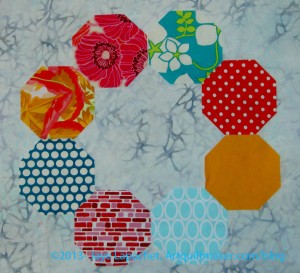
Above is a batik that I bought at The Granary. It has a bit of blue in it. I thought it wouldn’t work, but I do like it. It gives movement to the background. The dark grey bits remind me of swirling fog.

It isn’t directional, which is a bonus. The blue doesn’t show up very well in the photos.
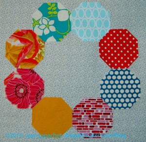
This background goes with the blue flower in the upper left of the photo above. It is from the same line. I may even have bought it at the same time. It is a true background, in the sense of it doesn’t add anything.
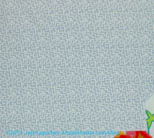
Again, has a directionality, but I wouldn’t say it is directional — or the directionality wouldn’t look weird if the pieces were cut different ways.
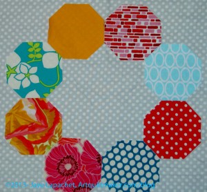
Dots are always a safe bet. This dot is the right size not to interfere with the other dots, even the red ones.
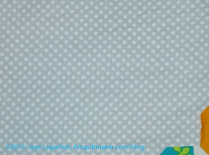
Not directional.
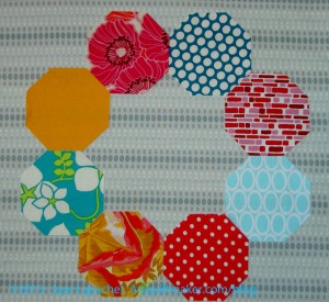
I am not sure why I bought the amount (2-3 yards) of this. I think I was expecting the color to be a little different. Since I was pressing greys anyway, I decided to press this, but I don’t think it is appropriate for the project.
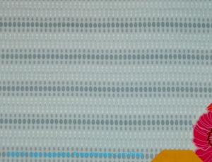
Very directional. I don’t want to worry about the way I cut so that the lines of dots lined up. I am not sure I would want to worry about that.
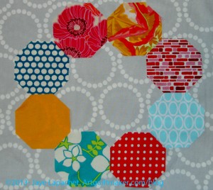
Lots of movement. If the pearl bracelets don’t interfere with the foreground, then the fabric adds a lot of movement. I would err on the side of this being too busy for the piece, which is a little busy anyway.
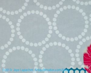
Not really directional. I only have a yard of this and would have to buy more.
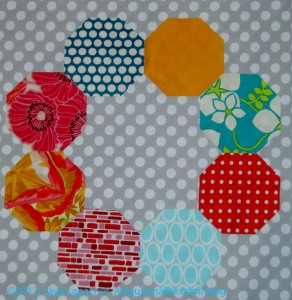
I have a boatload of this fabric, because it is a good background and I had the foresight to buy plenty.
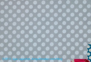
Not directional.
Between the the choices above and the previous choices, I think my favorites are below:


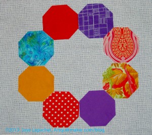
Of the three above, I think the batik is the most likely. I don’t have enough of the Happy Go Lucky, and can’t get anymore so that doesn’t seem to be a real option.
The grey dot is perfectly fine, but doesn’t really add anything to the piece. If I decide I don’t want to add the movement I discussed above, then that fabric would be a good option.
That leaves the batik.
My SIL commented that I only showed the light blue on one of the backgrounds. This time, I used the same octagons for all the different backgrounds. I did rearrange them, however.
Russian Rubix posts:
- Saturday October 5, 2013: Russian Rubix Backgrounds
- Saturday September 28, 2013: In a Clear Space You Can See Across the Room
- Wednesday September 11, 2013: Chosen Colors
- Thursday August 26, 2013: Russian Rubix Templates
- Susan: Tuesday August 20, 2013: History Quilter Podcast Episode 39
- Monday July, 22, 2013: Russian Rubix
Process is messy.
I am pretty sure that I also own some of the grey batik. I don’t think I used it in the wedding quilt because it was too grey. It may have gone into last year’s church quilt. But I know I have some.
It is a nice batik.
That blue batik looks really good. The juxtaposition of random pattern (if there is such a thing) is really good with the geometry of the octagons.
It is good to get a different POV. Thanks, Diane!
I vote for the batik as well