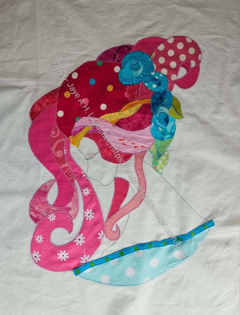
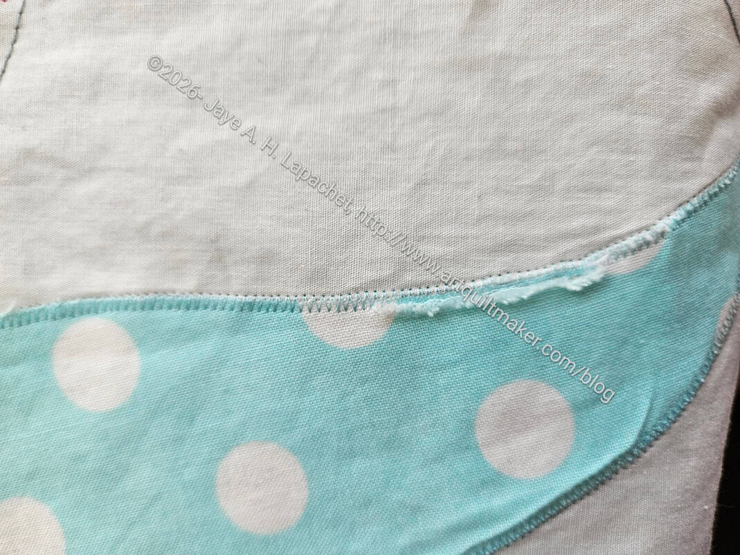
I was able to repair the tear on Serendipity Lady and move forward. Repair is a bit of an exaggeration as I just appliqued a piece of ribbon on the edge and called it done.
I was inspired after reading a novel about debutante balls. It made me think of the trim around those ballgown/ tea dress types of dresses. I am not sure of the era in which my lady resides, but I thought it was an appropriate way to fix the tear.
I am not going to be able to finish this piece before today’s UFO Challenge deadline. I really wasn’t inspired about the quilting and I don’t know my machine well enough to do the careful work I do know I want to do. I have kept up pretty well and am excited for the next project. I am not giving up on finishing Serendipity Lady. Today is just not that day.
I ripped all the paper off of Serendipity Lady, as mentioned. When I turned it over, I realized that the fabric had ripped or pulled away from the stitching and needed to be repaired.
Mostly, I looked at the tear for awhile, trying to decide the least difficult way to fix the problem. I didn’t really want to rip the whole thing out and do it over, though that was one option.
The other option was to trim the top edge. I was kind of excited about that option, because I think it could add to the look of the piece. The blue dot I used doesn’t provide a lot of contrast with the white of the skin. A trim could add some much needed contrast.
If I did it right, it would look like trim on a dress. I thought about rick-rack, though I don’t know if I have any. Mom does, but I have other options, too. I have a load of Renaissance ribbon. If I found the right ribbon, it might work with the fabric I used for the dress. I also thought about bias tape. I loved sewing the bias tape down for the Red Scribbles quilt.
I am not sure what other options there. I am going to test out a few of these and see what I come up with.
This is UFO challenge project #1 and I may not make the deadline, but at least I am working on the piece.
Remember the other day when I talked about finding blocks from the Handbag Sampler? In addition to those blocks, I found several other orphan blocks. I almost gave them all to the BAM Community Quilt project, but I couldn’t quite do it.
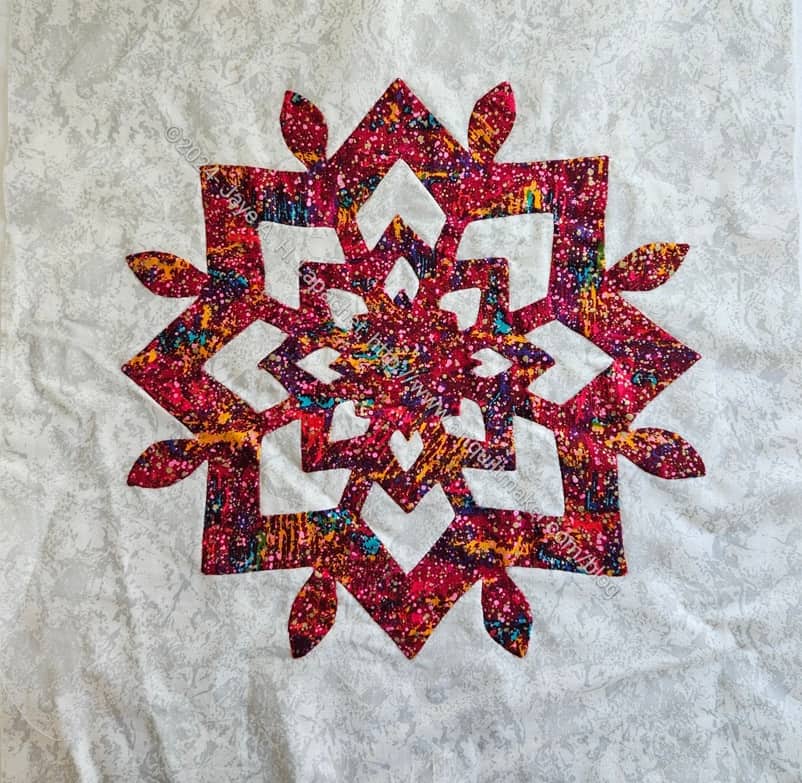
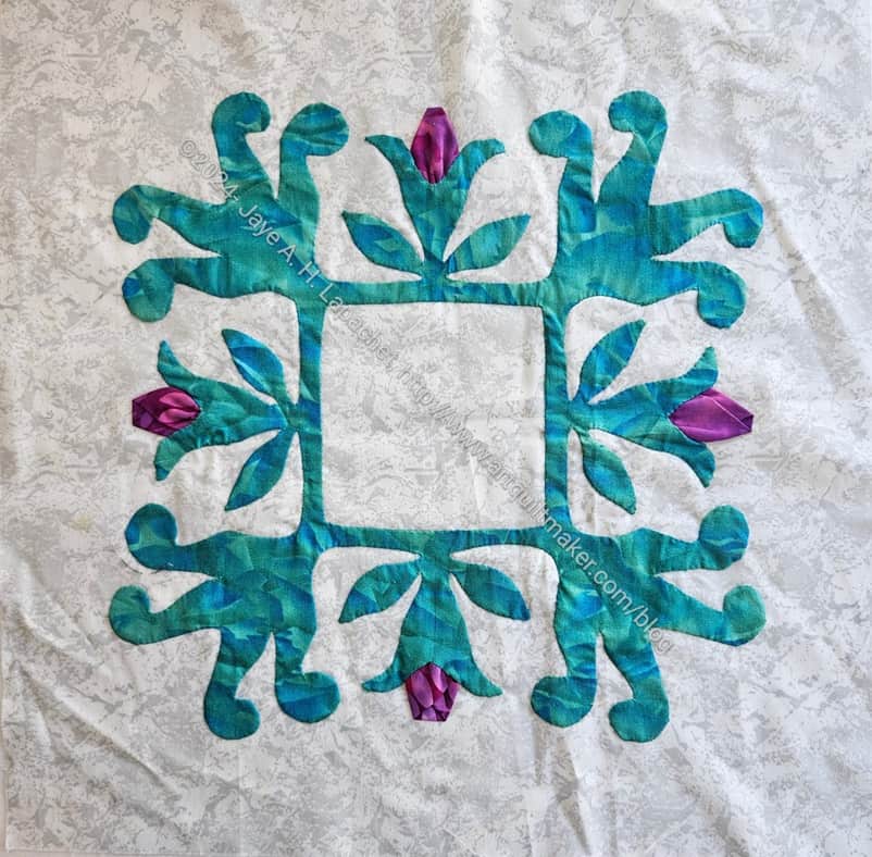
These are two Baltimore Album Quilt blocks I started in a class with the most famous BAQ quiltmaker, Elly Sienkiewicz. I took the class at Thimble Creek when they still had a shop in Walnut Creek back in the dark ages. It was maybe 1994 or so and I was excited to take a class from the person who started the craze and did the work to bring BAQ quilts to the fore.
Star of Hearts from Baltimore Beauties and Beyond v.1
The first block, which looks like a snowflake, is Star of Hearts from Baltimore Beauties and Beyond v.1 and I used needle turn applique.
It is made like you make paper snowflakes. This one was easier to make as there were fewer thin lines to deal with. It was good practice for dealing with sharp points, I remember. This pattern could easily be done with machine applique’, though that was not discussed as an option back in the day.
Fleur de Lis with Rosebuds III
This second BAQ block is pattern #13: Fleur de Lis with Rosebuds III (pg.34) from Baltimore Album Quilts: Historic Notes and Antique Patterns. I didn’t put the additional rosebuds in the corner. It was all I could do to finish this block as is.
I took the class with the intention of making a Baltimore Album Style quilt, but needle-turn applique’ and I didn’t get along. Perhaps if I tried it now, it would be better. Perhaps I didn’t choose the best patterns to try the technique? I don’t know. I never really did needle-turn after this.
I’ll write about the other lost and found blocks in a follow-up post.
**N. B. : Obviously, you should shop at local quilt shops and small businesses. However, if you are too busy or can’t find what you need there, I use Amazon affiliate links and may be paid for your purchase of an item when you click on an item’s link in my post. There is no additional cost to you for clicking or purchasing items I recommend. I appreciate your clicks and purchases as it helps support this blog.
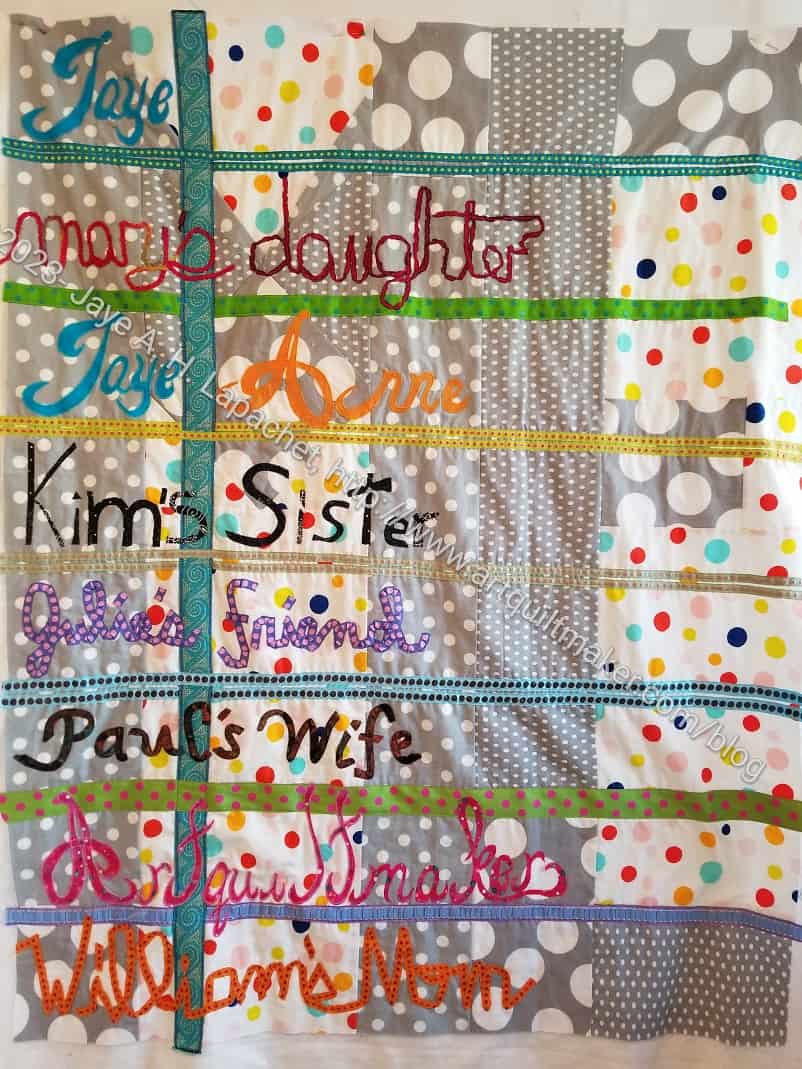
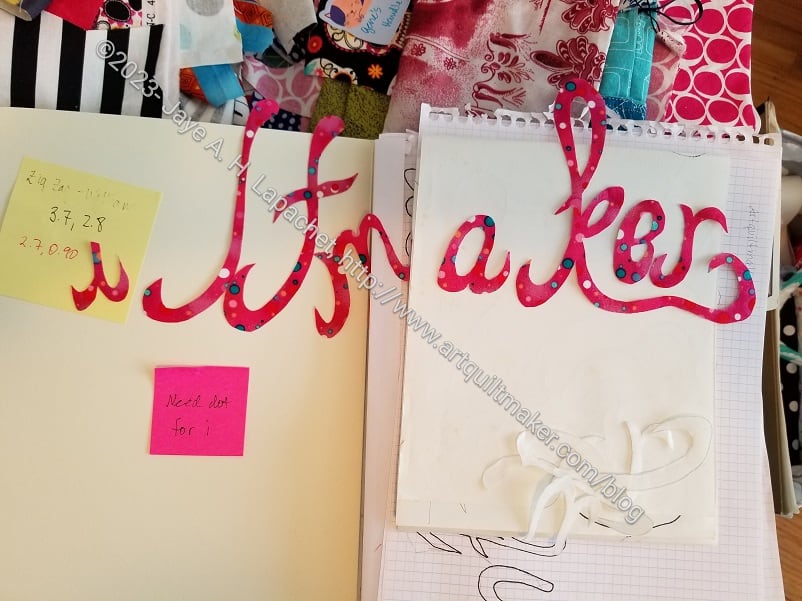
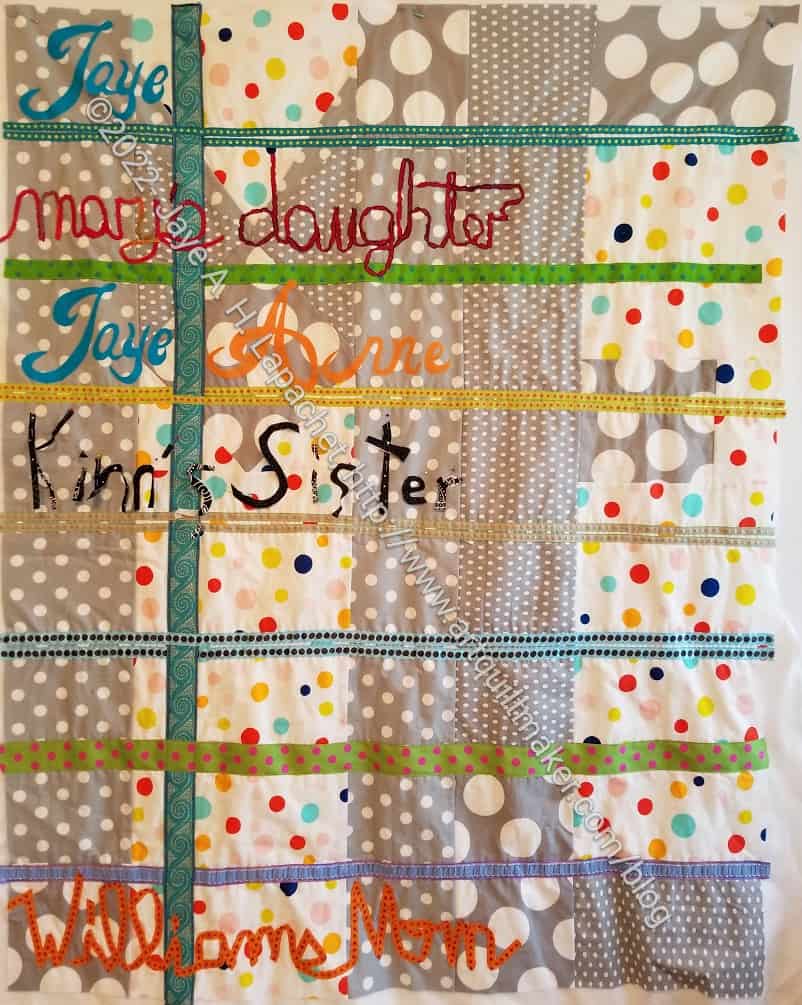
At Sew Day, I worked on creating the letters for Artquiltmaker. I thought this was a good task for Sew Day. I had a big table and could spread out all sorts of papers, tools and implements so I could work efficiently. It took me the better part of 3 hours (maybe 4) to get the words out, but I was able to get it done.
Who Am I? letters in process
The letters are not quite as good as I wanted. For one thing, the A is backwards. I don’t know how that happened. I have very high standards and I decided to be satisfied.
Friend Julie liked them and she is much less judgemental of my work than I am, but would tell me if I was off track.
Who Am I? letters placed
After I cut them all out, it took me a little while to place them.I wanted them at a certain angle, so I fiddled a bit to get them right.
Then I fused everything in place and they were ready to stitch.
Once they were placed and fused, I spent some time satin stitching them down. I didn’t stitch the entire word down. I needed to take a break and was hoping to finish a bag on which I am working.
I made more progress. I am seeing light at the end of this tunnel.
Do the little that I have done really feels like a lot of progress. Of course, it is taking me forever to do a little.
I am happy with what I have done and am already thinking about quilting options. Shocking! I know. Who knows why quilting is even entering my mind, though this is an art quilt and there are things I want to say with it that I think I will say with quilting. More accurately, Colleen will say with quilting. 🙂
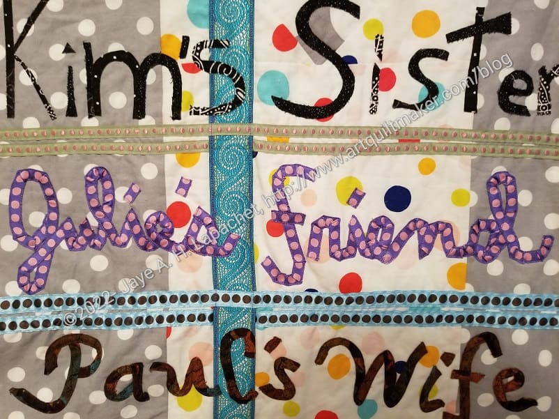
Who Am I? – January 2023 detail
I did the line that says ‘Julie’s Friend’, using some Tula Pink ribbon I had. I used a lot of pins to keep it in place until I could sew it down. I think it looks pretty good.
As I mentioned, I had planned to do the last three lines using bias tape, but ‘Paul’s Wife’ put me off that idea. It’s disappointing, because I do like bias tape, especially the stretchiness of it.
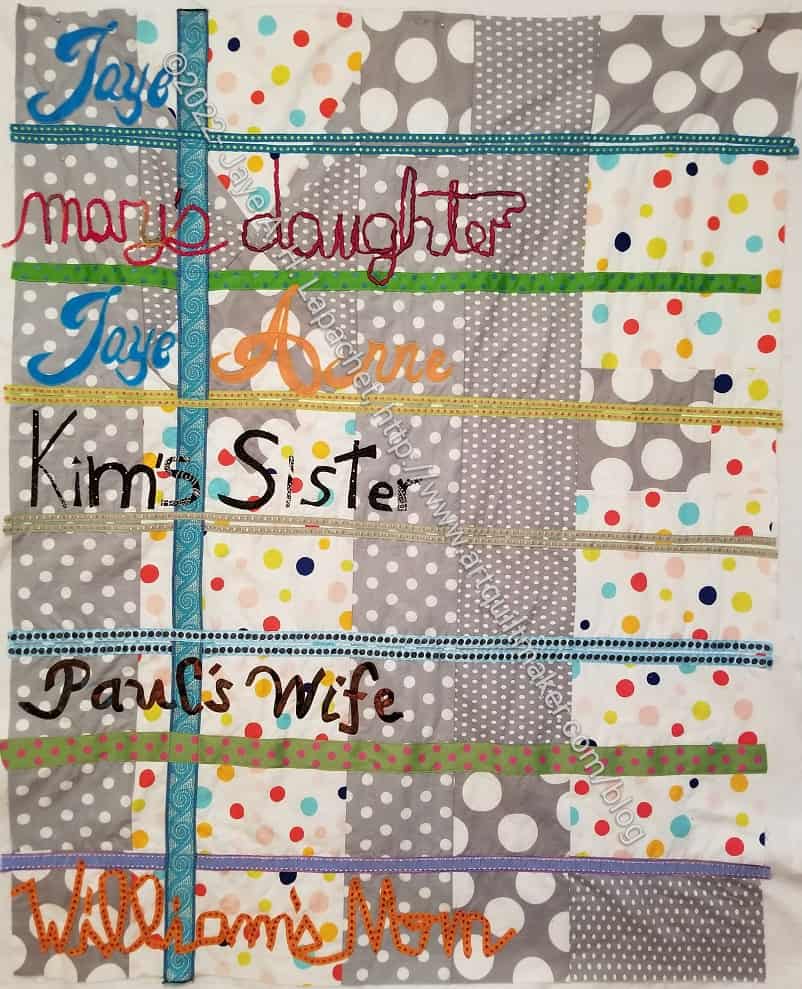
I continued to work on Who Am I? over the winter break. I wanted to finish it and just be done, but other projects and resting prevailed. Still, I was able to add another line of text to the piece.
I used bias tape to add Paul’s Wife to the piece. I had good luck using bias tape in the Red Scribbles quilt and also when I taught my students how to make bias tape and use it. Thus, I thought it would be easier than it was. I think the loops and swirls were smaller than my previous works. I used 1/4 inch bias tape, which is the smallest I could make. Still, I am happy with the result.
Two more rows to go!
As an added bonus, I used my new Daylight light table** for the first time. It is awesome.
**Obviously, you should shop at local quilt shops and small businesses. However, if you are too busy or can’t find what you need there, I use Amazon affiliate links and may be paid for your purchase of an item when you click on an item’s link in my post. There is no additional cost to you for clicking or purchasing items I recommend. I appreciate your clicks and purchases as it helps support this blog.
While this quilt has been on my mind, I only thought about it. I didn’t actually take it out and look at it until I finished Creamsicle.Now it is on the design wall and I am thinking harder about specifics.
I need to find the notes so I can be reminded of my ideas. It has also been 4 years since I even looked at this project.
I may have worked on it since the Rosalie Dace class, but I have no notes or blog posts unless they are well hidden and unindexed.
The Lobster table runner did not take very long to finish. I struggled with the piecing of the Sawtooth Stars for some reason, but eventually got them together and was able to finish the top. As you can see, I added a border to contain the blue.
The Lobster back finished
I also made a back and a binding and will take this piece to Colleen to quilt.
I cross this off my to do list with a great amount of glee.
I have had this project on my list for awhile. I show the original drawing in one post that also calls this piece part of a CQFA placemat challenge. I discussed working on it after I did some stitching. I showed it at a CQFA Art Walk. It seems that 2019 is the last time I worked on it.
The piece is small and I kept chiding myself for not just doing it. The muse, however, is a fickle mistress and she was not interested in this piece for a long time.
The Lobster with potential blocks
Finally, she allowed me a flash of inspiration and I ran with it. I have started piecing it into a table runner. I need more table runners for my buffet and I thought this would make a good one for summer. Also, I could admire my lobster more frequently.
I always like the Sawtooth Star block and thought it would work to make the table runner a little longer. I put some pinwheels inside the Sawtooth Star’s center just to make it a little more interesting.
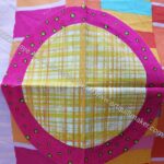
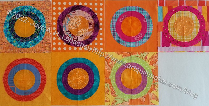
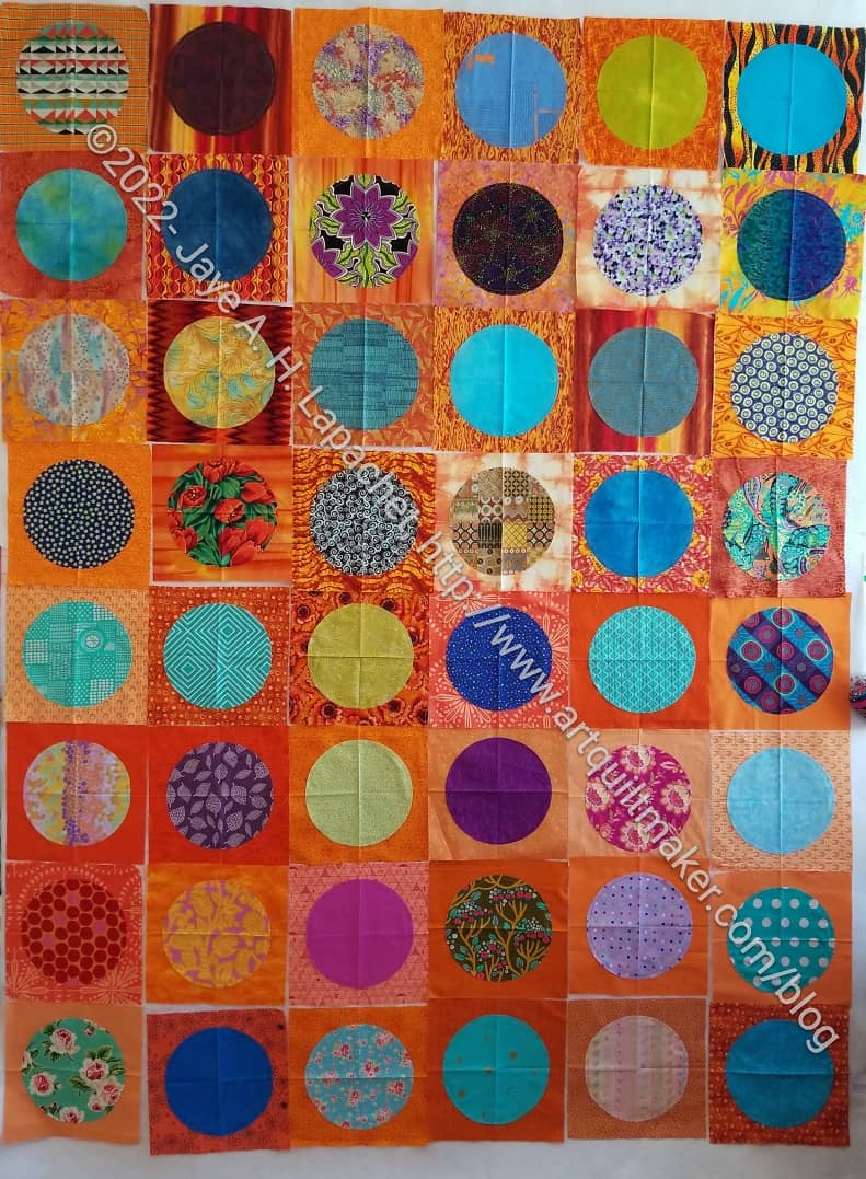
The blocks above were my favorites and I was anxious that they would be ‘ruined’ when I added the other circles.
Orange You Glad faves with 3 circles
The blocks definitely look different after the last orange circles were added. I am excited that they look even better. I still lament the covering up of some of the motifs (like the flowers in the pink and blue plaid circle), but overall, I think the blocks are enhanced by the additional, small circle.
After playing with the blocks a little, I am now ready to continue working on the bullseyes.
Then I looked through the bullseye blocks. Some caught my attention and I was sad to cover up the second fabrics with more circles. Still it had to be done.
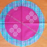
Pink & plaid circle
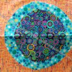
Blue excitement circle
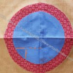
Blue on red map circle
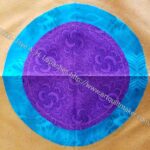
Turquoise & purple circle
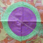
Green and violet circle
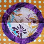
Purple fireworks circle
Pink and blue plaid circle
The blocks above are my favorites after looking through all of them. I know that will change when I sew the last circles on.
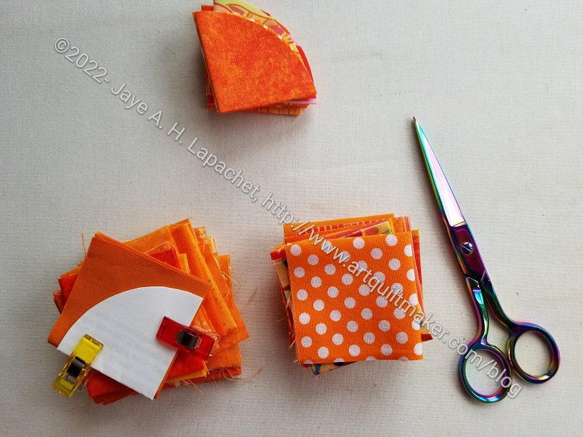
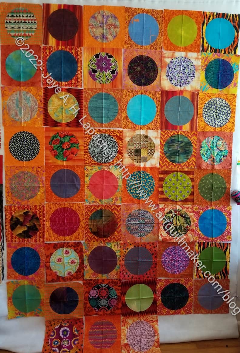
I dragged out the bag of bullseyes yesterday that had been languishing because of my travel and life. I wanted to look at them and match up the last circles, but instead I started appliqueing them to the blocks.
I did look at them all. Then, I did match up the small orange circles with the rest of the block, but I didn’t do as much looking and rearranging as I thought I would. I really just wanted to sew. I wasn’t lax, I was just faster than I thought I would be. I have never been much of an agonizer where it wasn’t necessary, especially with quiltmaking.
Orange You Glad example
I thought I would try and finish the top and back of this quilt and take it to Colleen as well, but then (head to desk and a big DUH) I realized that I need to wait for the parts of Julie and Adrienne’s blocks before I can go farther. Not a problem! I will use this quilt to make up the second batch of quilts I plan to take to Colleen in a few weeks. I am on another finishing mission.
Julie has a Picking favorites blog post on her blocks.
I am waiting for my backgrounds to be returned. Julie has them finished and I will get them when we meet for lunch.
I cut these squares as I was cutting the backgrounds. I have no idea if they will work after the other two have added their stamp to my backgrounds. However, they are a start.
I put the blocks I with Friend Julie’s backgrounds on the design wall so I could look at at them. I took them off, cut out the back and put the block on the ironing board to be pressed.
Half the blocks are Friend Julie‘s backgrounds and half are Adrienne’s. The top four rows are Adrienne’s backgrounds and Julie’s circles. The bottom four rows are Julie’s background and my circles.
Adrienne’s blocks with Julie’s circles
I decided to look at them together as I moved Julie’s off the design wall. It turned out that I needed to put Adrienne’s blocks on the design wall to select the fabrics for the second round of circles.
I only had cut about 10 squares to make circles for Adrienne’s blocks. I thought I had cut all I needed, but I am glad I didn’t. I ended up looking at each block to decide what it needed.
I spent Saturday getting down to Orange You Glad business. I had started the applique’, but needed to get it done as I wanted to send the package to Adrienne on Tuesday. I had some other packages to mail and wanted to make one trip.
These are Julie’s backgrounds and my fabrics for the circles. I am pleased with how they look.