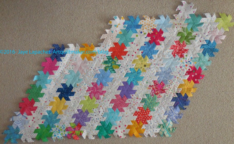
I know the last time I talked about this piece was back in February. I have sort of been working on it, though there have been long stretches where I have not worked on it. I got a little fed up because sewing big sections to the big main piece is really a pain and I didn’t want to do it. It made me think twice about La Passacaglia, but that is a tale for another day.
EPP April 2016
Finally, I put a new section on and it is looking good. A little boring and staid, but good.
I am going to try to put one or two stars on the main piece instead of larger secondary pieces. It means more handling of the large piece, but perhaps the duration of dealing with the main section will be less.
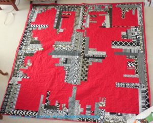
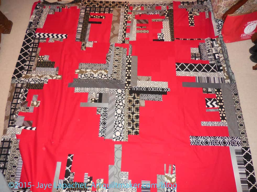
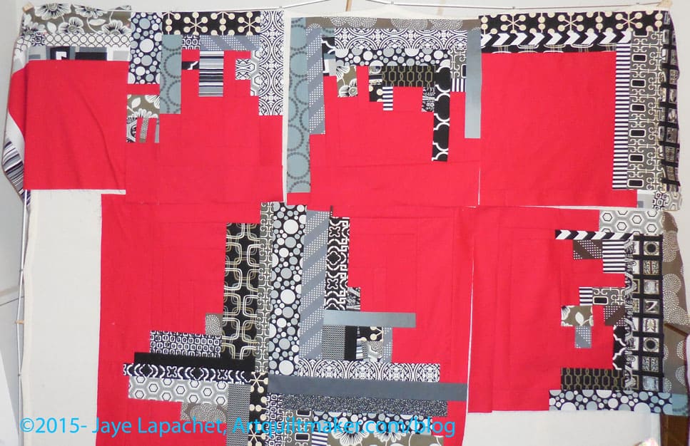
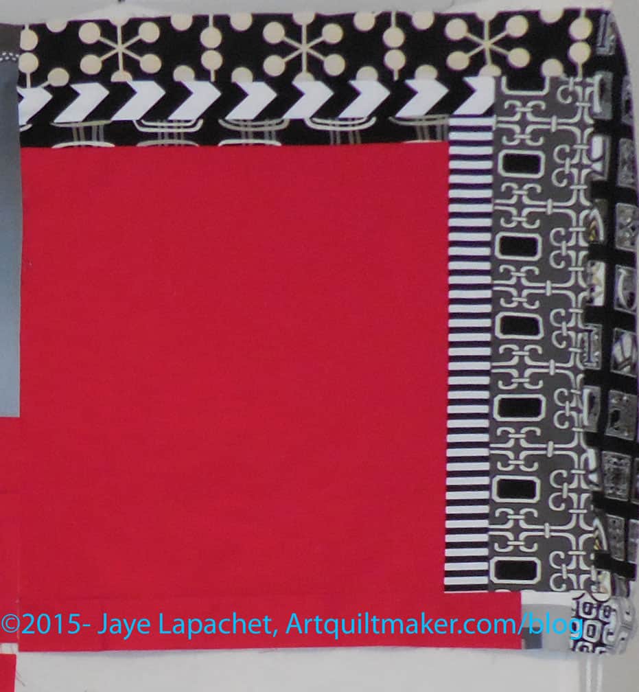
Along with Flowerburst, I also got back this quilt, which I wish I had called Cityscape. It really does look like a cityscape.
Cityscape- back from the quilter
I have sewn on the binding. I worked at sewing one whole side per evening so the binding process only took me about 8 hours. The quilt is 82″ x 84″ so quite a bit of work. I used a Kona solid for the back and the binding and it was a pain. The needle doesn’t slide through that fabric like I think it should. I MUST remember that.
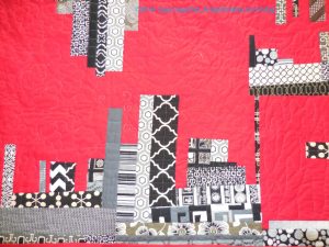
Cityscape – detail
The red is the background and I had Colleen think of it as a sky and put clouds in it. She did four different types of clouds in the four quadrants. I think of it as the four seasons.
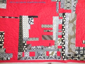
Cityscape – detail
The black and grey are more like buildings, so she did more geometric quilting in those areas.
I blew through the layout stage and am on to piecing.
Well, relatively anyway.
I gave myself a certain amount of time to do the layout. The time period was about two weeks and during that time, I didn’t take my cutting table or other in-process projects out of the fabric closet. I only allowed myself to work on other projects as leaders and enders and focused on getting this laid out.
This year’s piece was harder to arrange, because the fabrics I used were really different colors than each other. I am not sure why, because individually they don’t look different. The differences in each hue don’t really show up until you put two oranges or pinks next to each other and try and decide which has a lighter and which has a darker value. It is very strange. If I had thought of it I would have kept track of manufacturers and designers to see if I bought different ones this year than last year. I didn’t know that this would happen. It would have also meant that I would have had to keep track last year as well. More data would be needed.
The too-small design wall was a real problem this year, I think. I did not cut the patches down to accommodate the design wall as I did last year. I just crammed them all on the wall. That means that I found some places where I was short. You can see some white spaces on the bottom (near right hand corner). This problem showed up when some of the fabric was taken up by seam allowances and I was able to line patches up more evenly. I have to rummage through my leftover pieces and find some to fill in.
Most of the piece has been sewn into chunks. The chunks are not even because I had some rectangles arranged horizontally and some arranged vertically. With the squares it made for interesting piecing.
The difficulty was what it was and I got the feeling that it was done at some point and started sewing. I talked a little about the sewing when I posted about the Peacock. It is all about leaders and enders, because I only want two unsewn patches off the wall at a time to ensure the piece stays laid out the way I intended.
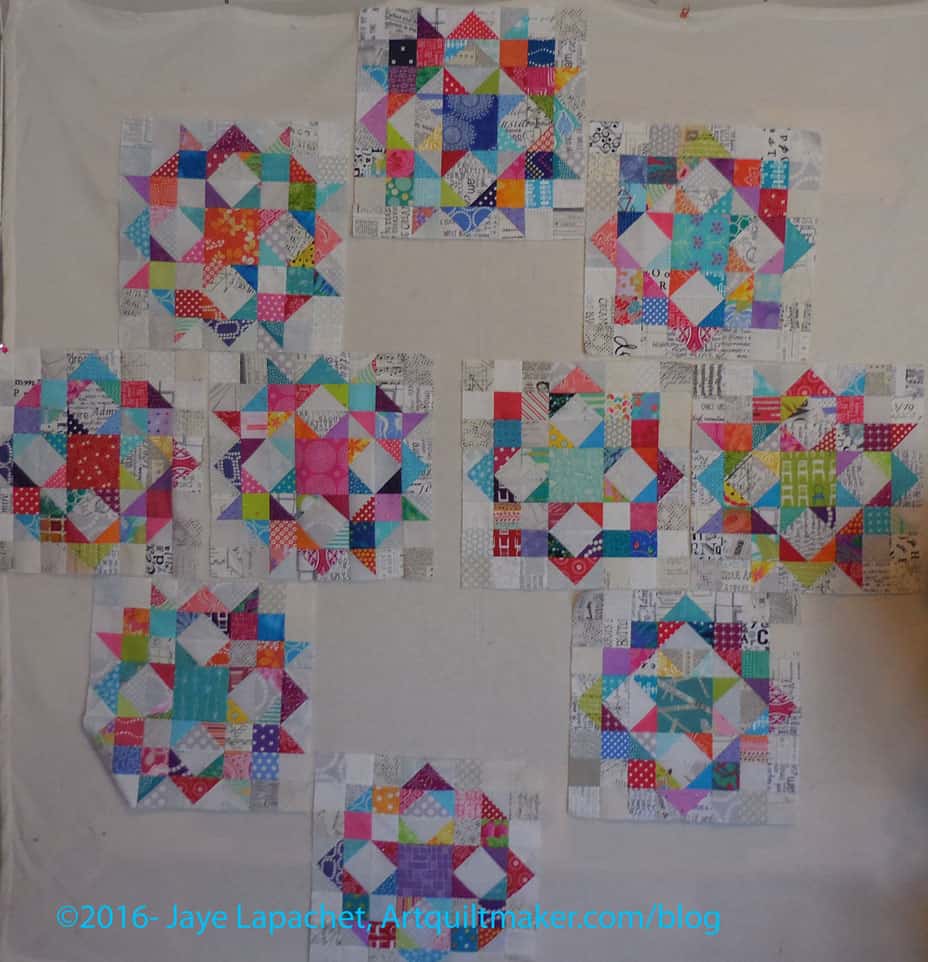
As I said the other day in the latest donation blocks post, laying out FOTY 2015 doesn’t make for a lot of tangible production. While I enjoyed making the donation blocks, I did need a little variety and the Stepping Stones parts were handy.
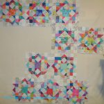
Four Stepping Stones blocks – April 2016
I enjoy these blocks and seeing the way they will be laid out makes me very happy. Turning each on a little bit makes a huge difference.
Even though I may need the squares for the layout of the Carpenter’s Wheel blocks, I have used some of the low volume prints for the white space in these blocks. I have plenty of fabric for the [mythical] Carpenter’s Wheel layout and can always cut more.
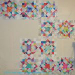
6 Stepping Stones blocks – April 2016
Making a few blocks always leads to making more and the six shown give an idea of what the quilt will look like and makes me want to make more.
Based on the layout I devised for my nephew’s Stepping Stones quilt, it looks like I will only need two more blocks and then border blocks for the width. I thought I measured 8 blocks across my bed, which doesn’t account for border blocks. I want to make the border blocks to finish the design. There are two blocks around the whole edge of the previous SS quilt and I could eliminate those if I thought the width was too big. Measuring next, I think.
I am really pleased with how the blocks look. Now to get FOTY 2015 off the wall so I can layout all the blocks I have and see what I am facing. After months of feeling meh about quiltmaking, I am finally excited about several projects! Yay!
In between other things going on here in the Artquiltmaker Workroom, I wrote the book review of Scraps Inc. As you may have read, I was lukewarm about the book in general, but everything can provide some inspiration.
Carpenter’s Wheel Layout #8
One quilt (from the related blog post) that I didn’t think should be included in the book** provided inspiration for the Carpenter’s Wheel layout, however. I don’t think I have quite enough blocks to make this layout work. I can’t really tell since the design wall isn’t large enough to give me a good sense and the proportions of this layout are off. I might try it on the living room floor since I can see it from the upstairs hallway.
Carpenter’s Wheel Layout #9
My SIL suggested a regular on-point 3-2-3 layout. I tried it. This might work without the bottom two blocks, but with those two blocks, it looks crowded and odd. If I do this layout, what will I do with the bottom two blocks?
I have more work to do on this piece, so stay tuned.
**Nota bene: There is nothing wrong with the quilt and it is very modern, but it uses very few scraps, thus I didn’t think it fit the definition implied by the book. YMMV.
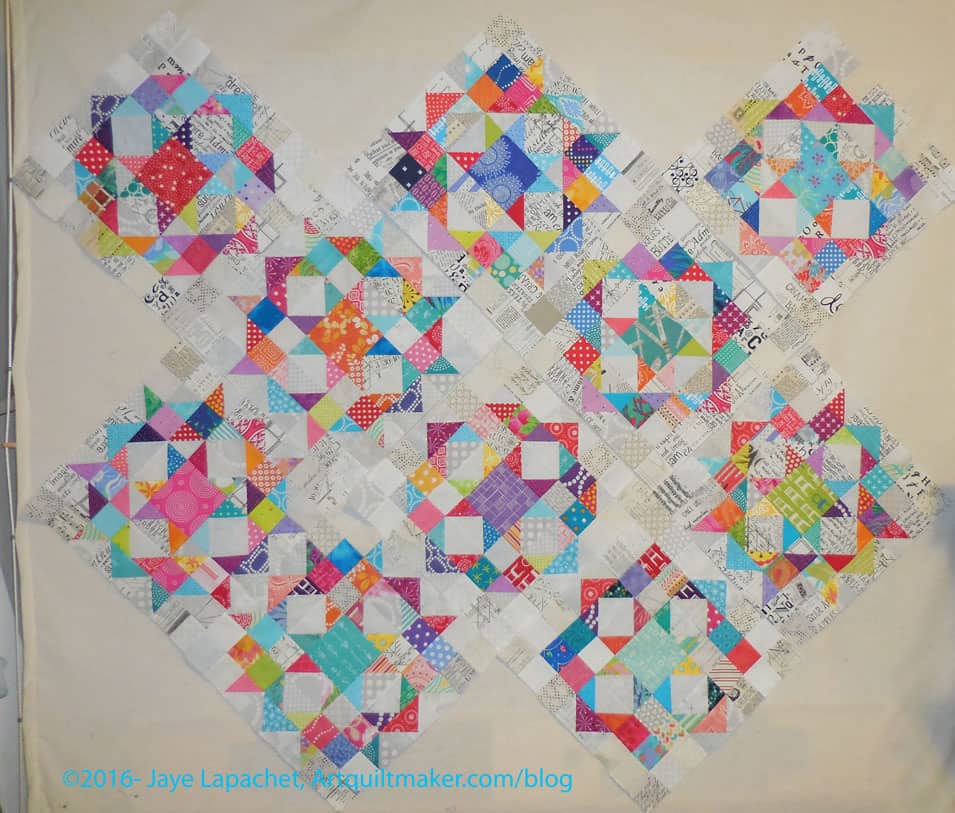
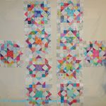
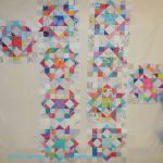
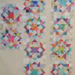
Before I allowed FOTY 2015 to take over my design wall, I did a little bit of layout design with the Carpenter’s Wheel blocks. I don’t want the layout to be a straight block layout. I am willing to piece a bunch of low volume alternate blocks if I need to (rote sewing- YAY!). I only have 10 blocks, which adds to the design challenge.
Color Group Donation Quilt
I was first thinking of designs that were similar to a donation quilt that Kathleen and I made. It was all Kathleen’s idea, but I happily went along. Donation quilts, as I have said about 12 million times, are good for trying out new ideas.
I wanted to stretch myself with these blocks. I like the linear effect of the donation quilt and wondered what I could do with the Carpenter’s Wheel blocks that would give the same effect?
Carpenter’s Wheel Layout #1
Carpenter’s Wheel Layout #2
Carpenter’s Wheel Layout #3
Carpenter’s Wheel Layout #4
Carpenter’s Wheel Layout #5
Carpenter’s Wheel Layout #6
Carpenter’s Wheel Layout #7
I tried out different linear type layouts. Of the above, #1, #6 and #7 are my favorites. I like the idea of giving these blocks some space and all of these layouts give the blocks space. That might not be the case with alternate blocks made up of low volume prints, however. I might be able to mitigate it by not including any patches that have a large concentration of black. We’ll see. I may need to do a test block.
#1 is a bit too symmetrical and I wonder if that layout is not stepping out of my comfort zone enough?
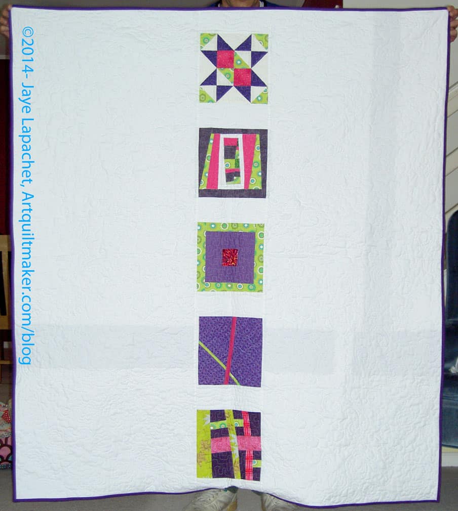
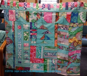
I got a brief glance at my Improv Round Robin piece before Ruth whisked it away to work on.
More of the Philip Jacobs print is showing up and that is creating some interesting results. I do think the piece needs more space, so I will add more solid or, perhaps, someone working on it will add more solid.
I made more progress on the Carpenter’s Wheel project over the weekend. I worked on this one in between working on the Cutting Corners donation top. I put in some newer fabrics and that makes me very happy. I am totally in love with that flower print I used for the center. It is by Studio E and that blue is fantastic! Especially since it is not turquoise. 😉
Now I have a dilemma. I now have 10 blocks. That is a very awkward number with which to lay out a quilt. I am going to look at the blocks and see if I can eek out two more unique layouts. If not, I may make two more of my favorites. I will also try to lay the blocks out in different ways to see if there is an interesting layout which will work for this piece.
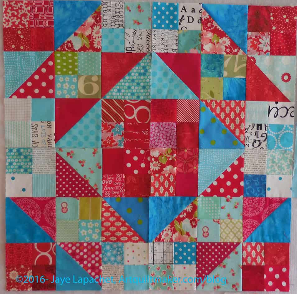
You might remember the review I wrote on Kathy Doughty’s Adding Layers book. After I wrote that review, I decided that I would make the Super Nova pattern included in the book. I wanted to make something fast and the pieces were big, so I thought it would be a quick top.
Bleah.
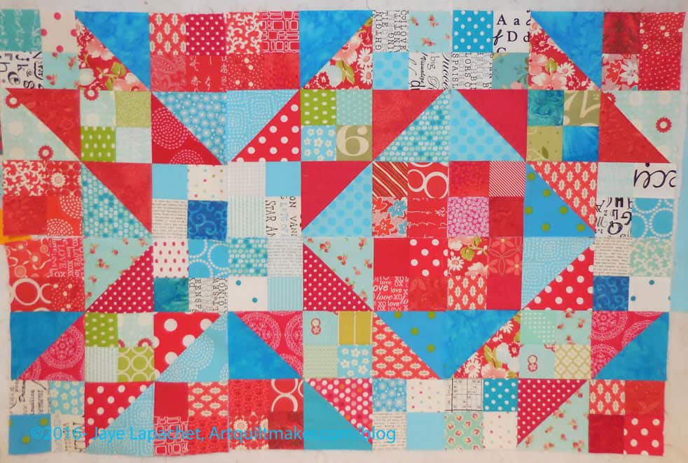
Flowerburst
I had to rip out almost every seam at least once. It was so frustrating. After a break because of travel and Quiltcon, my quilting muscle definitely needed a workout. I got back to it and finished the top yesterday.
The back is still to come, but I am glad I am back on the sewing bandwagon.
The other problem is that we can’t take photos of large quilts without the YM anymore and I make large quilts. That is what I do. This time we tried doing it with blue tape holding up one side and DH holding the other. It was ok, but without the Young Man, we really don’t have enough wingspan to photograph large quilts.
I made major progress on this piece during the weekend before Thanksgiving. I have had a lot to talk about, so posts are getting backed up. For someone who hasn’t had much of a chance to sew recently, I seem to have a lot of content!
Potential Red & Black Improv Back
I walked around my workroom trying to get comfortable with the blue and green backing. I really tried hard to like it. I tried to convince myself that another color scheme would provide a different look and make a good addition to the piece.
No dice.
I had already cut one piece into two and I still couldn’t like what I saw. The blues just didn’t work with the red and black and I couldn’t do it. I admitted to myself that I wanted to save the large piece of red solid for another project and that cleared the way for progress. I found a piece of American Made Brands red solid on sale and bought it. That kind of freed me up to use the large piece of Kona red for the back, which is what I did.
I spent a whole Sunday piecing the back. I wanted to finish and it took me a long time. I did. I just need to make the binding and then I can take it to Colleen’s to be quilted. I like the way the whole piece came out, but I am glad to get it off my design wall.
The thing is huge and I need to take a photo of both sides outside, but that will have to wait for one of my quilt hangers to return from college.
I was kind of shocked to realize that the last time I devoted a post to this project was back in September. I did mention it last week and meant to write a full post. I was out of town for most of the week for work and it never happened.
Red & Black Improv Top
On Saturday, I got back to the machine. I worked on this top, in between other projects. For the Improv top, I seem to be able to make progress on this project, but only while working simultaneously with other projects. For some reason this project does not inspire me to buckle down and work on it by itself.
I tried Improv again and it still doesn’t inspire me. I guess I like the technical precision of regular blocks. Does that make me boring? Perhaps.
Three blocks was the sum total of what I needed to finish to put this top together. The end was in sight! (Let’s not talk about back or binding at the moment). I finished one block completely on Saturday and made major progress on two more.
Sunday, I finished the blocks and then put all the blocks together into the top.
I started on the back, for which I am making different color choices just to give it a different feel. I am choosing some blues so that the back will have a different feel.
I spent almost the whole day last Saturday working on the Carpenter’s Wheel blocks and the Red and Black Improv quilt.
I was really struggling with the Improv quilt and it was taking up space on my design wall so I wanted to get it done and off. Done and off the wall meant making more blocks. Somehow making more blocks has lost their appeal.
3 Carpenter’s Wheels + a Stepping Stone
I decided as I worked on the Carpenter’s Wheel blocks that I would intersperse pieces and parts for the Improv quilt and make some progress at least. I am so pleased with the progress I made! And I had fun.
The Carpenter’s Wheels are very cheerful and that makes them fun to make. I sewed the second block together (top left) on Saturday and am enjoying looking at the two blocks together while the third block is in process.
Improv Quilt – Late October
I had started out on these blocks, but the Improv quilt was nagging at the back of my mind, so, as I said, I pulled out some black and red strips and started to work on an Improv block in between working on the second Carpenter’s Wheel block. When I finally pulled my nose away from the needle and assessed my day’s work, I found that I had completed a whole side of the quilt! I only have three blocks more to make to finish the top!
This quilt is a monster, which should surprise nobody, which makes it hard to photograph, but you should be able to see some of the work and the progress. There will be no border and sewing the blocks together should be a challenge, but not so much of a challenge that I can’t do it. The seams will be long, but over quickly, I think.
I was doing such good work that I was angry that I had to leave on Sunday for a work trip. I was looking forward to the work trip, but it just came at an inconvenient time and I was hoping I wouldn’t lose my momentum, especially with the Improv quilt.
The exercise wasn’t completely useless, because I got to look at the pieces for awhile. I really have a lot of warm colors in this piece. I like that it makes the quilt feel warm, but I wonder if I need more cools. Also, as Julie said at one point, the solids do look a bit like holes. I think I can mitigate that by having Colleen quilt in each one.
Also, in realizing I couldn’t put all the blocks up, I figure out that I needed to count the blocks and decide on the layout. Sounds stupid, I know, but I always think the piece will just come together. It would if I had an infinite design wall, but I don’t so I have to count.
I had a brilliant idea after deciding to count, but not wanting to count only to have to count again in a week because I forgot the number. I pinned the blocks together in groups of 10. Yay! or DUH! depending on how daft I feel at the moment.
Snowball blocks: 110
9Patch blocks: 111
Without really trying, I have a very similar amount for both types of blocks. Perhaps I counted before?
Now comes the math. I have to figure out how to lay out the blocks – basically starting with a nine patch or an octagon is mostly what I need to figure out.
The other thing I was wondering is if I need to put another row between each row.
Saturday and Sunday, when I wasn’t working on Michelle’s IRR piece, I was working on the Improv Quilt. I know both are Improv projects.
Improv Progress, September 2015
The last time I made any progress on this piece was over a month ago. That progress felt forced and unsatisfying even though I didn’t know it at the time. I had the piece up on my design, which meant I had to look at it and that frustrated me. Frustrated me, because I wasn’t happy with the work as well as frustrated because it was taking up my design wall. I need to learn to make smaller quilts.
This weekend’s progress felt good. It was fast and intuitive and right. The piece is starting to look like something I won’t hate looking at.
I am not sure the blocks will end up where they are placed now, but there is a good bet some will stay where they are.
Improv Corner Block
One thing that happened to jolt me ahead in the process was that I laid in bed one night, trying to get to sleep. I spent the time thinking about this piece and made a plan. I decided I would cut a big piece of red to use as a start to make some corner blocks.
I wasn’t completely on board with making ‘B’ blocks for the corners, so I made corner blocks, which are similar to the ‘A’ blocks. I did what I thought would look good. I can always make something different, right?
I like the corner block shown at left, but I wish I had varied the length of the neutral strips more. I did a bit, but not enough. It will be fine once the rest of the quilt is done and I am not going to worry about it right now. I do reserve the right to change it if the design needs it later.
New ‘B’ Blocks
I did sort of learn from this block and the first two ‘B’ blocks. I didn’t want all the ‘B’ blocks to be heavy, so I varied the length of the strips to give them less weight — or less perceived weight. I also made the centers a bit more interesting. I want people to be interested in looking at the piece.
I have about 7 more blocks to make on this monster. I have some slim hope I can finish it by next week and take it to be quilted. I am laughing, but you can stop. 😉 I know it is a pipe dream, but I would like to move this project along.
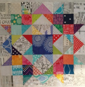
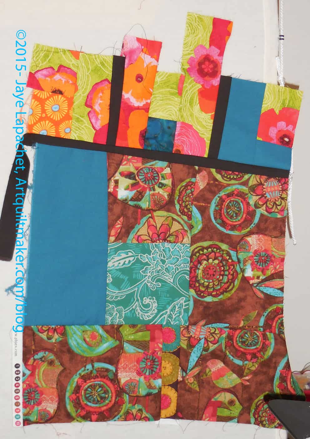
As mentioned the other day, the IRR is going well. I worked on Michelle’s piece on Saturday. It is, as also mentioned, a 20 minute exercise, so I worked on it early and got it finished.
Michelle’s IRR Start
I started with Michelle’s piece, by putting it on the wall and looking at it for a few days. That tactic would have worked better if I had taken a look at the fabrics she included. 😉
I decided, however, that I was going to work on it on Saturday and get it out of my hair.
I did loosen up a bit on Michelle’s. Even I can admit that mine was a bit more uptight than improv. I guess that is part of the process.
Once again, I have a shortage of design wall space. I really think I need a whole room with movable design walls all over it. OR I need to clear my mind of the jumble of projects in it. My mind is an insane mess right now.
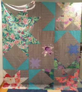
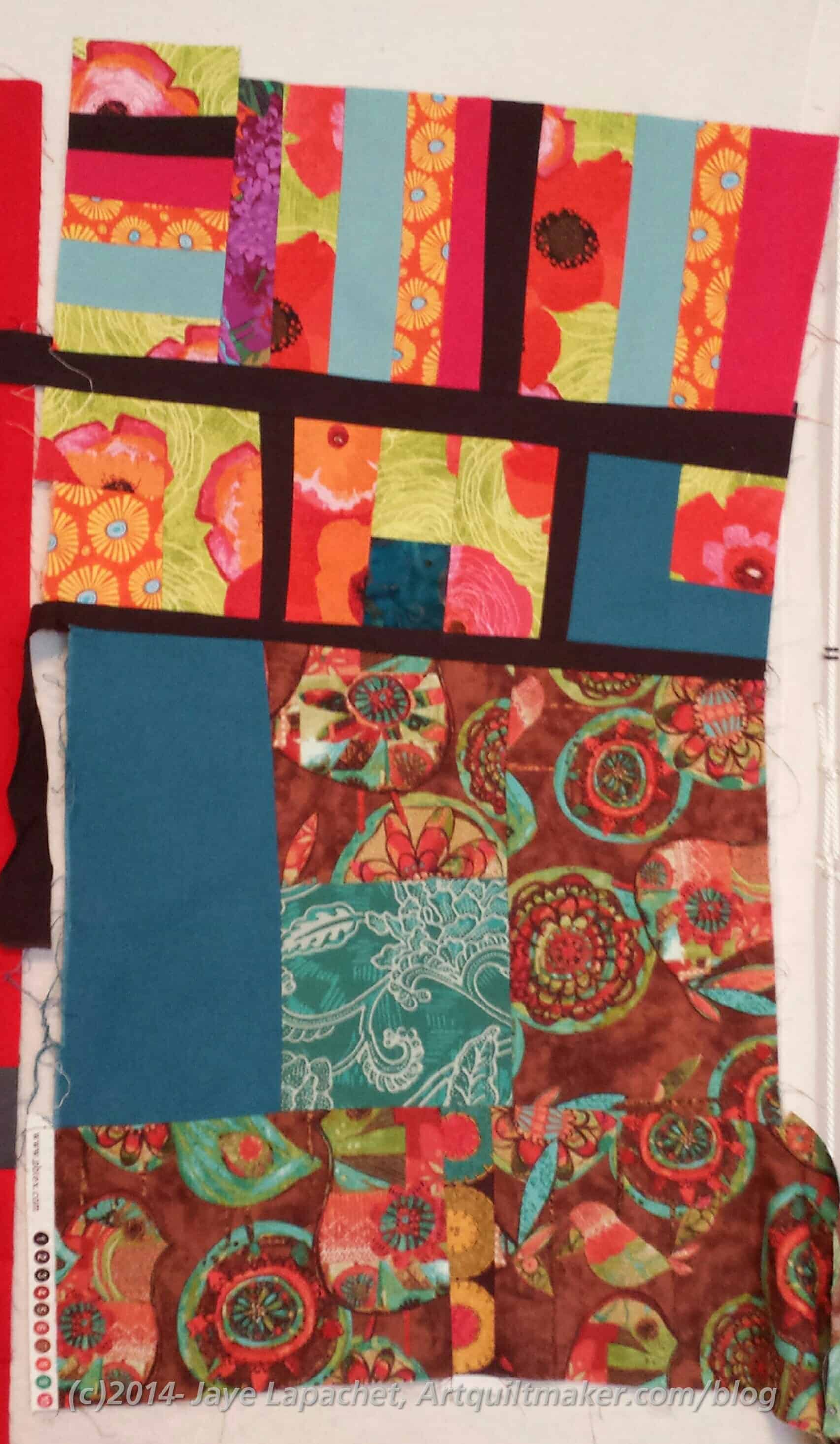
Michelle’s IRR with my contribution
I should have balanced the piece out by putting my contribution on the bottom, but I wanted to continue those dark solid lines. I really do like the strips of bright. the top of the piece is very happy.