Creative Prompt #179: Wheel

Ferris Wheel

Carousel

Definition: A wheel is a circular component that is intended to rotate on an axial bearing. The wheel is one of the main components of the wheel and axle which is one of the six simple machines. Wheels, in conjunction with axles, allow heavy objects to be moved easily facilitating movement or transportation while supporting a load, or performing labor in machines. Wheels are also used for other purposes, such as a ship’s wheel, steering wheel and flywheel.

Common examples are found in transport applications. A wheel greatly reduces friction by facilitating motion by rolling together with the use of axles. In order for wheels to rotate, a moment needs to be applied to the wheel about its axis, either by way of gravity, or by the application of another external force or torque.

Wheel of Fortune (TV show in the US)

Wheel rims

alloy wheels

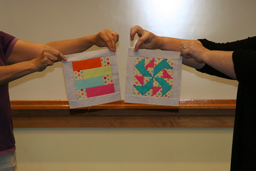
Wheel of Fortune quilt block

Wheel of Time (novels)

Riesenrad

hamster wheel

Patchwork Wheel (aka Cheyenne) quilt block

Buddhist Wheel of Life

spinning wheel

asleep at the wheel

bicycle wheel

Wagon Wheel quilt block

prayer wheel

Broken Wheel quilt block

Wheel of Fortune tarot card: The Wheel Of Fortune card, like other cards of the Major Arcana, varies widely in depiction between Tarot decks. Basically, this card has been modeled ever since the tarot’s inception in the 15th century after the medieval concept of Rota Fortunae, the wheel of the goddess Fortuna. Images generally show a six- or eight-spoked wheel, often attended or crested by an individual (sometimes human; sometimes a Sphinx-like half-human) attired in an Egyptian-style headdress. In some decks, such as the AG Müller, the wheel is also attended by an individual wearing a blindfold; and often there are people sitting or riding on the wheel whilst others are shown falling from it.

The wheel is not always shown inscribed with any lettering. Where this is the case, the letters T-A-R-O can often be found aligned against four of the spokes, which can also be interpreted as R-O-T-A, the Latin word meaning “wheel”. In some decks, such as the Waite, the wheel is also inscribed with additional alchemical symbols representing the four elements of Earth, Air, Fire and Water (which are also said to be represented throughout the Tarot by the four ‘suits’ of Pentacles or Discs, Swords, Wands and Cups respectively.[3] These emblems can also be seen on the Magician’s table in the Magician card (Card I)).

On the Waite card shown, though not necessarily on others, there are also four winged creatures in the corners of the card, representing the symbols of the four Evangelists (The Lion, the Ox, the Man and the Eagle). These four Evengelists are also represented the four fixed astrological signs: Leo, Taurus, Aquarius and Scorpio. In addition a representation of the god Anubis is seen rising with the wheel on the right side, while the snake-like Typhon descends on the left. On the wheel, alternating with the letters T-A-R-O are the Hebrew letters ?-?-?-?, usually transliterated as YHWH (Yahweh), the name of the God of Israel.

wheelchair

Seattle Great Wheel

color wheel

potter’s wheel

reinventing the wheel

ship’s wheel

flywheel

Millennium Eye

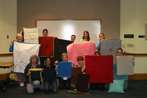
Take 5 minutes to do any kind of artistic response: poem, doodle, quilt, pastel, pencil. ANYTHING counts. No rules; just do it!

Post the direct URL (link) where your drawing, doodle, artwork is posted (e.g. your blog, Flickr) in the comments area of this post. I would really like to keep all the artwork together and provide a way for others to see your work and/or your blog.

The Creative Prompt Project, also, has a Flickr group, which you can join to  post your responses. I created this spot so those of you without blogs and websites would have a place to post your responses.

PIQF Part 2

PIQF+ Purchases
PIQF+ Purchases

As I mentioned, my purchases at PIQF were quite modest. I need another bag pattern like a need a hole in the head, but I do want to try another one from the Chubby charmer company. I want to see if all of their patterns are as good as the “Chubster.”

I really just liked the buttons. It occurred to me that this particular color scheme would go well with the Aqua-Red Sampler. I don’t know if I will put them there, but I’ll try it out and see. Adding buttons might not be good for teaching, but it might make me happy. Make visual decisions visually, right?

I decided to participate in the pincushion challenge swap with BAMQG as a result of buying the Fig Tree pattern. There were a few things that didn’t make sense, but once I got a personal lesson from Joanna Figueroa, I was good to go. I forgot to go back to another booth and buy some crushed walnuts, but I imagine I can find nice filling somewhere else.

I didn’t buy the Marmalade charm pack at the show. See the previous PIQF post where I talk about the ‘baked goods’ problem. We went to the Granary on our way home and I bought it there.

Maureen turned me on to The Granary and I like that shop. Their prices are retail prices, but not outrageous. They have a GORGEOUS color wall. If you need to match or coordinate fabric, go there! The owner was cutting for TFQ and she remembered me buying fabric recently, which impressed me as I have only been in there 2-3 times. Great customer service! They have a nice selection of rulers and more than your average selection of notions. It is definitely worth checking out.

Since I have so many bag patterns, I figured that the clips and D rings wouldn’t go unused. I liked the size, finish and packaging. When I made the Bird Watcher Messenger Bag, I had a devil of a time finding a set even remotely suitable.

Gifts
Gifts

The other lovely thing that happened was that I got to see Mrs. Kristen and her sister-cousin, Vicki. We met at the show and then we sat down for a snack together and made each other laugh. As I have said a zillion times, but cannot be said too much, Mrs. Kristen is one of the loveliest people I know. I am hoarding her for myself and refuse to introduce her to you. Sorry.

OK, to be honest, I am not that sorry. She brought me gifts. I didn’t ask for anything, but she brought me gifts. 😉 She is not only a lovely person, because she makes me laugh, but also because she brings me gifts. She is supportive and generally nice to be around, too. Aside from fabric (dots and Pointillist Palette fabric), she brought me some rhubarb. I make a special rhubarb pie at Thanksgiving and Christmas. I used to be able to get canned rhubarb here, but they don’t seem to sell it anymore. I buy fresh, when I can, in the summer and stew and freeze it, but more is always welcome. The pie is scarfed down. I think I might be strung up if I didn’t make it. She and TFQ liked each other (or appeared to like each other), which was an added bonus.

As I mentioned, work sucked on Monday and Tuesday, so I’ll see if my budget allows for some more retail therapy.

More Fun with Skirts

Skirt Patterns, annotated

You might remember I had high hopes of making a skirt. This past weekend was the weekend, because TFQ was here to walk me through the process. On Saturday, we pulled out the patterns, the fabric and got busy.

We cut out the pattern pieces, measured my waist (UGH!!) and TFQ read the directions for the Butterick pattern. We chatted, she read and then she told me that we needed 60″ wide fabric not the 45″ wide fabric I had. I flew upstairs to get the other yard I had, but it still wasn’t enough.

She reminded me that I had bought two skirt patterns, so I ran upstairs (our plan was to cut on the dining room table) and got the other pattern. Again, we chatted, she read and then she told me that I had bought the wrong size. Bleah.

Our options were to go get 60″ wide fabric, get a different sized pattern or bail. I had had enough of skirts for one day, so I bailed.

I had hoped to have a new skirt this week, but, alas, that was not to be. Don’t worry, I am not completely demoralized and I am not giving up. I’ll go get some 60″ wide fabric and the other pattern in a different size and we will try again.

Lessons learned:

  1. Measure before buying pattern
  2. Learn where the pattern tells the maker what size fabric to buy.

PIQF Part 1

My day yesterday left me rather cranky and irritable and if that comes through on this post, I won’t publish and will see if I can uncrankify it. Work has a way of sucking all the good feelings I get from a few well deserved days off right out of my system.

Anyway.

Renewed Jelly Roll Race on display

I took a day and a half off of work last week and went down to Santa Clara to the Pacific International Quilt Festival to visit the Renewed Jelly Roll Race, which was on display. TFQ and I usually go and she missed a year last year. We got ourselves organized again and were back in the saddle this year – sort of. Our trip was abbreviated a little because of family obligations for me. Despite having less time to view the quilts, I think we both agreed that we saw plenty.

I am concerned that once the 49ers stadium is built, the parking will no longer be free or there will be no available parking on game days. I look at these next few years as, possibly my last chance to go to the show. Yes, I am being melodramatic and borrowing trouble. I’ll get over myself.

The show was not as crowded as usual on Thursday and Friday, but I thought the preview was more crowded. I loved not having such large crowds on Thursday and Friday, because it was much easier to take photos. However I was concerned about what that meant for attendance numbers. Both days, I saw lots of white hair and not many strollers. I didn’t attend on Saturday or Sunday, so I’d like to know if you saw more younger quiltmakers on those days.

In terms of quilts, the show had the same look – lots of landscapes and portraits especially. I noticed lots of pattern quilts being shown, especially quilts made from patterns or classes by Judy Niemeyer. I still took a lot of photos.** I wonder about entering a quilt made from a pattern. What do you think about that? Should the quilt have been altered in some way or is it ok to enter a pattern quilt in a show that is an exact replica of the original?

The Best of Show winners were in the “more is better” philosophy. I apologize for being snarky, but I think design counts for something and since I heard a podcast on what judges look for, I have been disillusioned by Best of Show quilts. Still and all, there was lots at the show from which I was inspired. The stitching is still getting better and better and there was a lot of hand work to satisfy that craving.

The vendors were meh. I had put myself on a strict budget and it wasn’t difficult to keep to it. There were a few things I would have bought, but, in general, the offerings were old and expensive. I saw only a few vendors carrying Jelly Rolls, Layer Cakes and the like and the variety of choices was slim. One vendor told us it was very hard to receive the ‘baked goods’ that you actually order and that Moda does one run of them, sends what it can and does not reprint. I suppose I can understand not reprinting the “baked goods” as they have so many lines coming out each year. I, personally, cannot keep up with all the lines and have kind of given up on getting the newest latest and greatest.

I did see quite a few of the Tonga Treats and Bali Pops, which I thought was interesting and didn’t remember seeing last year. I really liked the colors from the Macaron line of fabrics by Hoffman, but didn’t buy any. I still might. Still, I wanted to see what was new and exciting in the quilt stuff  department and just didn’t get that fix satisfied. I bought a little fabric, some dotty buttons, a couple of swivel clips and D ring sets and a Tonga Treats pack for a project I have in mind.

The SD card went bad on my camera while I was at the show. Fortunately, I only had about an aisle and a half left. Unfortunately, it was the aisle with New Quilts of Northern California on it.  TFQ took photos of the last quilts, so you will have a complete set of the photos *we* liked. 😉

I bought a new SD card, but the camera can’t seem to read it. I like my camera and think it takes good photos. It will be hard to create interesting blog posts when I can’t take photos.  I’ll have to deal with that problem sooner rather than later.

Marbled Star by Judy Mathieson

There were quilts in the various special exhibits that I liked. There was an exhibit of quilts inspired by the floors at Bristol Cathedral, including a smaller version of her quilt, Cosmati Stars, by Judy Mathieson. This is an offshoot or further examination of an exhibit we saw a few years ago, also at PIQF, of mosaic floor tile inspired quilts by Christine Porter.

Improvements the Mancusos need to make:

  1. Replace black drapes behind quilts with white drapes. It will make the space seem lighter and larger as well make it easier to take pictures.
  2. Include a special exhibit of Modern quilts (perhaps the Modern Quilt Guild should organize it?) to draw in more of the Modern quiltmakers.
  3. Encourage vendors to bring new stuff.
  4. Consider moving the show back to the City in order to provide more options for public transportation, which would, in turn, increase attendance.
  5. Create a category for bags and other small accessories.

**I will be uploading all of the photos to my Flickr account, but it will take me some time. There is a link above, but you will need to return later to see them all.

Various & Sundry #14

Quilt World News

International Quilt Festival in Houston starts on November 1. If you are going, you’d better get organized. 😉

I think I mentioned that I signed up for Threadbias when SeamedUp went out of business. I only signed up. I tried to add a project, but I couldn’t upload the photos for some mysterious computer reason and I haven’t been back. I have nothing against Threadbias, I just feel like a jilted lover. I spent all that time with SeamedUp and now have nothing to show for it. I know it is a risk with free sites, but I will need some time.

All that being said, I don’t dislike Threadbias or anything. I am sure they are a fine crew and doing a fine job. Thus, I wanted to let you know about their Kickstarter campaign to design an online quilt design tool, which is described fully in their blog post. I have not decided whether or not I will contribute, because I am disappointed that they say nothing about EQ7. Why didn’t they call up EQ7 and say “dudes, let’s collaborate on a webtool”? Perhaps they did and were blown off?

I did watch part of the video and the features they have developed so far look pretty cool.  Still, I have invested a lot in EQ, so I have to think hard before switching. GenQ Interviews the ThreadBias team on their blog in a Q&A type format. Good info.

Speaking of EQ, follow along with Barbara Brackman’s new Grandmother’s Choice blog starting now. She has started a new blog about blocks. A free block each week. Find the block in BlockBase then build the quilt right in EQ7. The topical topic is: The Fight for Women’s Rights.

Weeks Ringle and Bill Kerr of FunQuilts, now Modern Quilt Studio, have a lot of fun news to share with you: classes, books, fabric. Go take a look at their blog post.

Tutorials and Help

Here is another way to make bias binding, if you are looking to try a new way or you have never done bias binding.

Around the Web

Little Bluebell also wrote about the Whole Cloth Quilt Challenge at BAMQG on her blog.

I liked this blog and the pieces shown on the blog. One of the blog posts has a great Swoon block. The blog post is good in general.

Check out Quilter in the Gap (Rhonda)’s giveaway: Dots and Chevrons!!! Don’t enter, just take a look. I want to win. You know I love dots. I have to make a project with all dots, I think.

Sketching #171

CPP Response #171: Perch

I cannot get this bird woman out of my mind. I have drawn her before and I am sure she will appear again. I think she represents more of an escape than wanting to fly. Here she is perched on the top of the building and ready to fly.

I was inspired by the idea of perching on the edge of a chair, but I didn’t want to draw someone perched on the edge of a chair. This idea came to me when I was looking through my sketchbook for the budgie photo and came across the response to prompt #119. I drew another woman ready to fly instead of the budgie. I think I like the feathers in this response better.

Take a look at the original prompt and draw, paint or sing something in response to it. I would love to see what you create.

Book Review: A Bounty of Bead & Wire Bracelets

A Bounty of Bead & Wire Bracelets: 50 Fun, Fast Jewelry ProjectsA Bounty of Bead & Wire Bracelets: 50 Fun, Fast Jewelry Projects by Nathalie Mornu

I don’t know if this set is a trilogy, but if you were waiting for the bracelet version of the Bead & Wire series, here it is. There are a wide variety of bracelets to entice different kinds of jewelry makers. Not only are the styles different, but the beads and materials all give the projects a variety of looks.

Some of my favorite pieces are Wire Links (pg.122), which, in a variety of blues combined with silver, has great colors. Paris is lovely memory bracelet, like a charm bracelet (pg.116), but made as a memory. The crystals make it a bit different and interesting.

The book starts out with lists and definitions of tools, including photos, a Key to Wire Gauges and depictions of clasps, bead caps, spacers and chain. Different techniques and skills are discussed and illustrated. The projects and patterns start immediately after these sections.

Many of the patterns have a “Designer’s Tip” which gives just a little bit of extra information, not just on the pattern, but to improve the reader’s skills. The lists of tools needed for each project are clearly spelled out and photos and diagrams are very clear.

The patterns come from a variety of designers, whose bios are all included in the back of the book. There is a very brief table of contents and no index.

The imagery provides great inspiration for everyone.

View all my reviews

Book Review: A Bounty of Bead & Wire Necklaces

A Bounty of Bead & Wire Necklaces: 50 Fun, Fast Jewelry ProjectsA Bounty of Bead & Wire Necklaces: 50 Fun, Fast Jewelry Projects by Nathalie Mornu

Nathalie Mornu has come up with this new take on beads and wire after previously sharing A Bounty of Bead & Wire Earrings. This is another book I received from Lark Crafts as a review copy in the last week or two.

When I read “bead & wire” I don’t think of the elegance that is included in this book. Many of these pieces could be worn to elegant events.

As in the previous work, there are a lot of great photos in this follow-up. The lighting especially enhances the photos. There are photos of the projects, such as Odyssey (pg.127), inspiration photos, clear photos of tools and processes as well as multiple, large images of each project. The reader is also able to clearly see the details of each piece, such as claps, the facets of beads and the patina of the metal. The photos really make this book.

Many of the projects are delicate and lovely and are enhanced by the models wearing them.

Jewelry makers would get something out of this book; other artists would enjoy the forms and shapes. Buy it at your bookstore or check it out at your local library.

View all my reviews

Sketching #170

Sometimes I paint myself, no pun intended, into a corner when I create these prompts and this was just such a prompt. After I posted it, I asked myself what I was thinking, because how could I recreate a painting that viewers would recognize. I still had nothing when i sat down to draw, but after creating a response to prompt #169, I flashed on this response.

CPP Response #170: Painting

The painting part could be better, but I was so relieved that I just put something down on paper.

This was a good lesson for me, because I often tell you to just take 5 minutes and I often spend more time on my responses.

The original prompt has some interesting words and terms. Take some time to create your own response in the media of your choice.

Creative Prompt #178: Star

Starlight, Star bright,
the first star I see tonight
which I may, wish I might
have the wish I wish tonight

STAR magazine

STAR Testing (Standardized Testing and Reporting)

Star Tribune (Minnesota)

Star power

Falling star

wish upon a star

EnergyStar

starfall

Stars and constellations

polygon

Definition: A star is a luminous cosmic body.

Star Comics, an imprint of Marvel Comics (1984-1988)

Minnesota Stars FC, an American soccer team in the NASL

Cuban Stars (West), a defunct Negro league baseball team

Shock Trauma Air Rescue Society, an air ambulance service

Star Wars

Movie star

Kansas City Star


Make your response simple. It doesn’t need to be a masterpiece. Take 5 minutes. Just respond and create a creative habit.

Please post the direct URL (link) where your drawing, doodle, artwork is posted (e.g. your blog, Flickr) in the comments area of this post. I would really like to keep all the artwork together and provide a way for others to see your work and/or your blog, and how your work relates to the other responses.

The Creative Prompt Project has a Flickr group, which you can join to post your responses. Are you already a member? I created that spot so those of you without blogs or websites would have a place to post your responses. Please join and look at all of the great artwork that people have posted.

Star Mountains, Papua New Guinea

Star Jones (born 1962), American co-host of the television show The View, lawyer, journalist and writer

“Star” (Bryan Adams song), 1996

A Star is Born (Kris Kristofferson)

Star, a novel by Danielle Steel

Pink & Green Donation Quilt

Pink & Green Donation top

If you are wondering WTF? then you are with me, because I keep looking at this quilt thinking “what was I thinking?”

This is NOT a horrible quilt. I am not embarrassed to give it to charity. It is not ugly. The workmanship is excellent. Not trying to be arrogant, but I do my best to make well made quilts. One of my biggest pet peeves, in case I didn’t mention it before, is bad workmanship. I could write a whole dissertation on THAT subject, but will spare you at the moment.

I have to admit, though, that it is not my best design work. The problem was I couldn’t figure out completely what was going on. I knew:

  • I should have been more selective about the shades and tones of the pinks and greens I picked.
  • I should have picked a 3rd color for the sashing and a 4th color for the cornerstones.
  • I knew something was wrong so I just put borders on with fabric that was large enough. I stopped worrying about the top being a great design. I actually like the batik border fabric a lot better after I cut it up.

Other than that, I was stumped. Then I listened to Sandy’s podcast on space with her guesthost: ME and think I figured out the problem.

An aside: I listen to all of the podcasts that Sandy and I record. I am cringing less and less. I want to hear what you hear. This episode on Space was a mind bender, even for me and I had been living and breathing the content for months.

Listening to the episode clarified the concept and I was able to figure out the problem with this quilt. In the episode I said that definition of space is “the area the design occupies”(for purposes of the design series) of space. I used the example of a 4’x3′ piece of fabric as space for a quilt. On that background or Picture plane or Space, the maker places his/her objects.

In the case of the donation quilt, the space, which is supposed to surround the objects (shapes in a piece), is confusing. If I had chosen all the same pink fabric, it would be clear that the pink was the background/space in the quilt. Same with the green. I didn’t do either. I just put a bunch of pink and green squares together and sewed for broke.

The donation quilts, such as the pink or the blue or the yellow, where I used the black on white background work a lot better, because it is clear to the viewer what fabric constitutes the space. Even though the black on white fabrics are different prints, it is still clear that those fabrics are the background/space.

I am ok with the quilt, especially now that I think I know the problem. The quilt will still keep a little missy warm. Live and learn.

Book Review: PUSH Print

PUSH Print: 30+ Artists Explore the Boundaries of PrintmakingPUSH Print: 30+ Artists Explore the Boundaries of Printmaking by Jamie Berger

My favorite image in this book is called Venice 2 by Tom Leighton of the UK. It shows St. Mark’s Square with a carousel in the middle of the plaza and famous buildings such as Notre Dame ringing the plaza. I love the juxtaposition and “wrongness” of the image even though it looks wonderful and perfect and as though it cannot possibly be wrong. Everything fits and it seems normal. There are tons of other images, as well as pieces of images, that I really REALLY like. Losing T.E.M.P.E.R.(detail, pg.34) satisfies that urge for gears that seems to manifest itself periodically in me. Dreamboat(pg.166) has really great waves. The curves are so symmetrical and perfect. I also like America the Beautiful(pg.169), a woodblock print that shows the topography of the United States in a cartoon kind of style. It makes the cities seem unimportant, which is a relief since they seem to dominate everything.

The last book I reviewed in this series was PUSH Jewelry. I still love this series, especially the edginess of the art that is included and the joy that is no patterns!

You’d think that all of the pieces in this book would be digitally manipulated, but there are pieces described as “woodblock, linoleum cut, hand-typeset lead and wood typography,” so something for everyone!

The types of images range from drawings to photographic imagery. Images are sparse and very complicated. There are dense drawings as well as lithographs, monoprints and silkscreens. The 30 (again!) artists in this book really push the boundaries of printmaking.

Yes, there are some images that I don’t like at all. They just aren’t my style, but I can see the line weight and the shading in them and appreciate those aspects.

There are brief bios at the back of the book either of the artists or their studio. The bios provide links to websites and information on whether the artist teaches, sells works or can be hired for other services. Artists come from all over the world and it makes me think of the differences in styles between countries and whether a similar book of artists from all one country would have the variety?

This book is full of more inspiration for you.

View all my reviews

BAMQG October Meeting

Saturday was the October meeting of the Bay Area Modern Quilt Guild. I know I am late getting this up, but I had to juggle posts around as I was sewing on Sunday instead of writing.

The meeting was fun as usual! The sad part is that I forgot my camera, so I don’t have any of my own photos. I could have taken them with my phone, but just didn’t. Adrianne, the current photographer got the photos up on Flickr pretty quickly, so you may see some.

There are a lot of upcoming events. If you are a member, you can participate in the FQ swap and the pincushion swap. I haven’t decided if I am going to participate in either. I am leaning towards the FQ swap. I want to look at patterns for pincushions as I haven’t made one and I don’t want to commit to something that will come out crappy.

It is also time for new officers. I don’t think anyone signed up, so I am nervous about what will happen. Adrianne will not continue as president. I can’t really blame her. After 2 years, she needs a break and guild needs some new blood. Adrianne has great ideas, but groups, organizations need new leaders to shake things up a bit periodically. I am not really presidential material, so didn’t sign up either. I am still doing the blog (would love to hear your comments over there, BTW!!!), but if you only have time for one comment, comment here at Artquiltmaker. 😉

Someone emailed me and wants to help out with the blog, so I am excited about that! I hope I am not taking candidates away from the leadership of the guild.

A-B-C Challenge

by Jaye

It was the end of the A-B-C Challenge block-making portion of the challenge. We asked people to finish their tops by December and the whole quilt by the beginning of May. Our goal is to enter them into the county fair as a group.

Rhonda was the only other one who showed blocks, the other participants were absent.

Whole Cloth Challenge

Aurifil Wholecloth Challenge

Here is the big reveal of all of the quilts. I wrote about my quilt earlier this week. I do have a detail that Adrianne took with her nice, fancy camera.
by Jaye (detail)

Charity
I was sad not to see the Charity Girls, Jennifer and Deborah at the meeting. They were both off having lives. I turned in the Froggy Cat Bed, but there weren’t any new cat bed kits to take, so I took some of the Patchwork Wheel block kits and am having some fun with them. I only took two kits, which seem to make a total of 4 blocks. The kits have pretty crazy fabric combinations! Perhaps I will move on from the checkerboard blocks I have been churning out and make some more of these blocks?

Checkerboard Charity Quilt

At the last possible moment, I also took a quilt that someone quilted to bind. I put the binding on it on Sunday by machine and am trying to decide if I will test sewing the back to the quilt by machine or if I will hand sew it. It is in the hand sewing area now (down by the couch), but I can always bring it up. I have some Aurifil monofilament to try out and this might be the perfect opportunity to try something new.

Sketching #169

CPP Response #169: Name

I do like the things in my drawings to look odd, incomplete from your angle or out of place. I like when the viewer is looking at the scene from an odd location.

I am still trying to fill in the whole street scene like a puzzle. This is a closer view of the sign for the shop.

Take a look at the original prompt and create your own response in any media that makes you happy.

Sketching #166

In honor of my mom, whose birthday is this week, I decided to post a Creative Prompt Response.

Finally!

I know.

CPP Response #166: Growth

It took me a long time to finish Growth, because the green stalk took forever to color in.

I wanted to make the stalk look like it was growing out of the sidewalk, but I think I ended up with a kind of space alien, scary looking response rather than something fun, if odd. Oh, well. Immerhin.

I have decided to do the prompts in order even when I get behind. It is getting too hard to figure out which prompts I have and haven’t done.

You can see the original prompt and create your own response! Please do. I would love to have you join in.