I finished Frolic! a long time ago, or what seems like a long time ago. Then, I entered it in the Fair. THEN I realized it didn’t have a sleeve! YIKES! I needed to make one fast in order to have enough time to sew the sleeve on. I often fight with sleeve making despite the great instructions in Free Expression** by Robbi Joy Eklow.
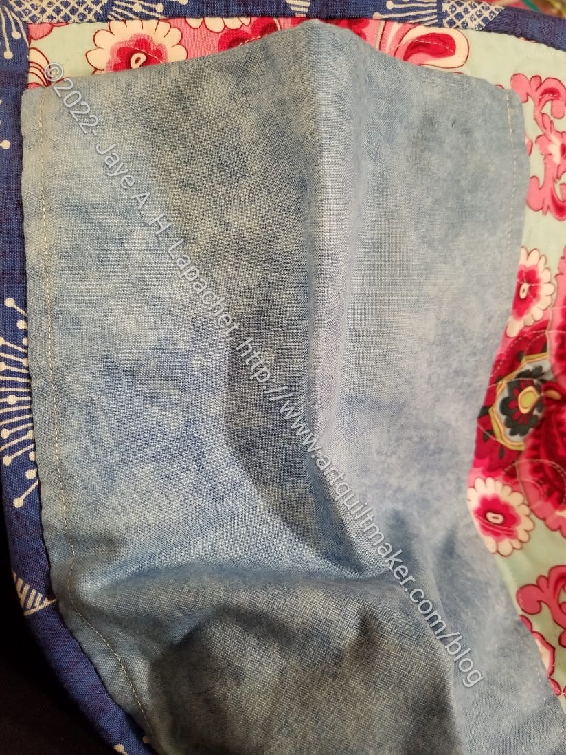
Frolic! Sleeve
I was able to make and sew the sleeve on in, what felt like, record time. It may only need a sleeve one time. I am happy that it is ready to go.
**Obviously, you should shop at local quilt shops. However, I use affiliate links and may be paid for your purchase of an item when you click on an item’s link in my post. There is no additional cost to you for clicking or purchasing items I recommend. I appreciate your clicks and purchases as it helps support this blog.
You can sew 2 or more borders together first then put them on your quilt top and miter them
Blends prints well
Lines up linear designs such as stripes
Add some pizzazz to a block that needs something extra, especially if you have to add coping strips
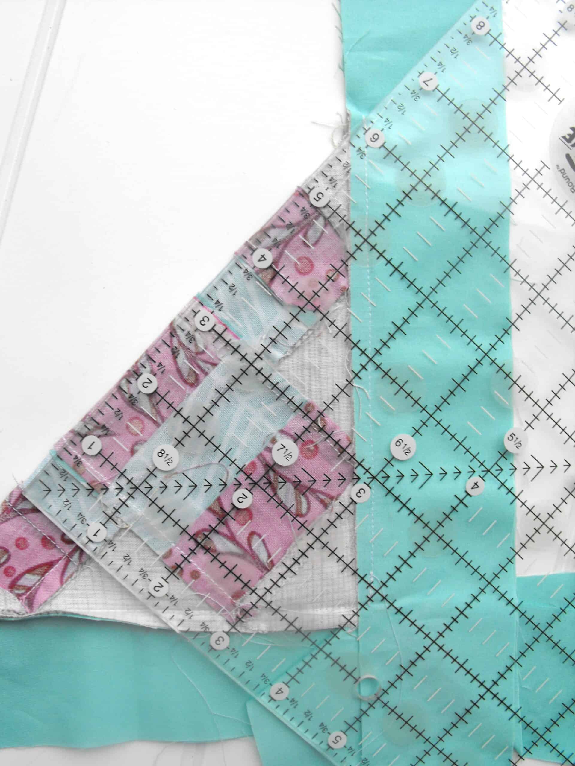
How to Miter:
Cut borders
Cut top and bottom border strips to the quilt top side lengths, plus an additional 2x the border width plus 1″. The 2x the border width gives you enough space to make the 45 degree angle. The extra 1″ is added for insurance. You can always add more “insurance”.
Formula: quilt top side lengths plus (2x the border width) plus 1“
Example: When the top of the quilt is 45”l and you want the side borders to be 5”w: 45 + (2×5”=10)=55”+ 1” =56
Sew the top border to the quilt top, starting and stopping ¼” away from the ends of the quilt, backstitching at each end.
Repeat for the other 3 borders. The corners will be flapping around.
Fold the quilt top in half diagonally, right sides together, creating a triangle.
Line up two adjacent borders; for example, the top border and the right-side border.
Fold quilt in half diagonally
Place the ruler along the 45-degree line.
Draw a line
When lined up, draw a line using a pencil and a ruler along that 45 degree angle and extend it over the borders.
Pin firmly in place.
Locate the stitch line you made when you sewed the border to the quilt top and begin sewing there.
Sew from the stitch line out toward the end of the border, directly on the pencil line.
Backstitch at the beginning and end
Sew and open to reduce bulk
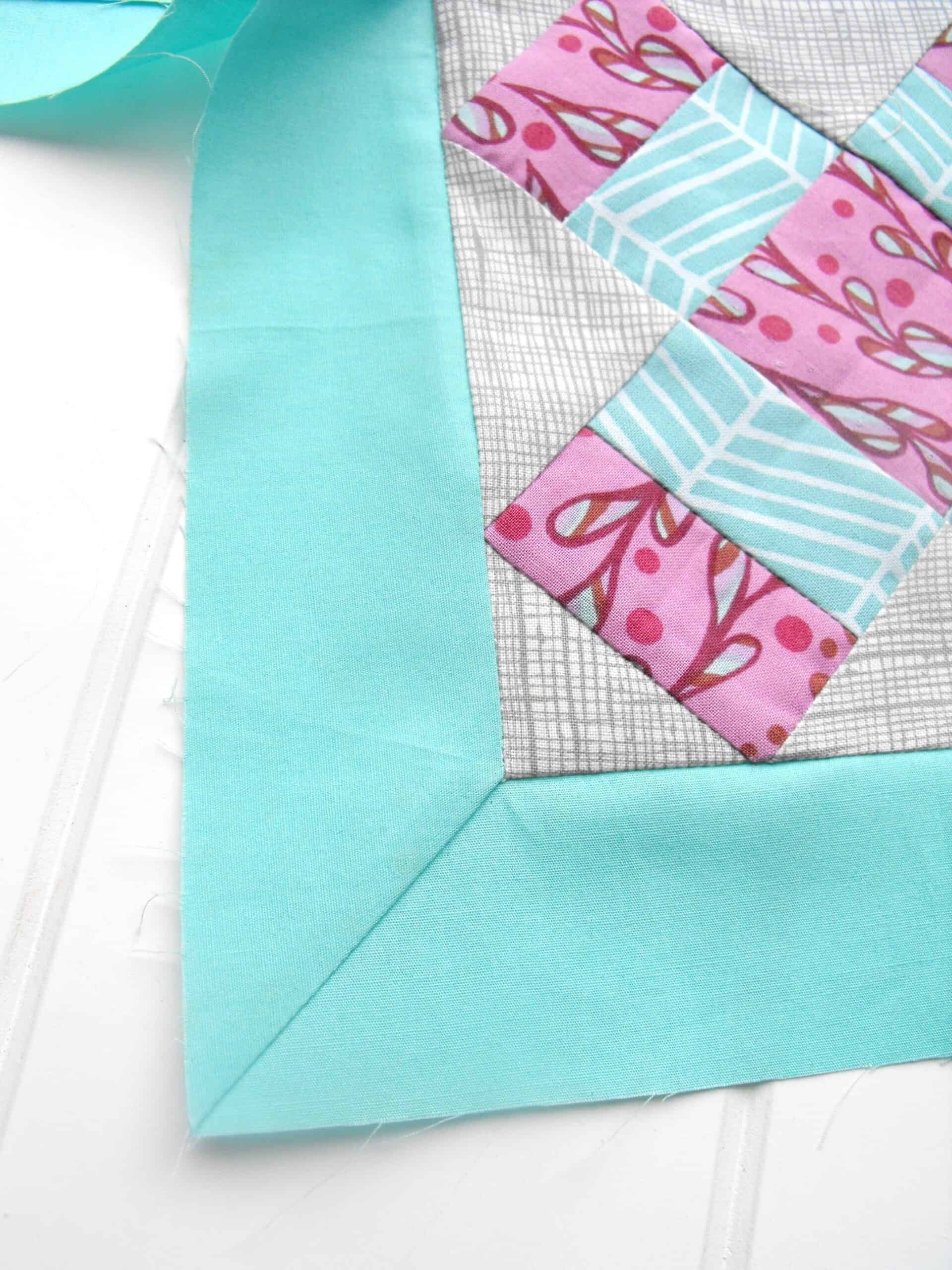
Open up the quilt top to check the miter. The corner where the three seams meet should lie flat when viewed from the front. There should be no tucks or gaps. The borders should also be square.
When the corner is perfect (or at a point that you’re happy with it!), refold the top to reveal that 45 degree stitching
Trim the seam (the extra border length) to 1/4″.
Press open to decrease the bulk of fabric at the seam corner.
Colleen sent these two quilts back to me last week. Both are gifts. I have to bind them, which is a problem since I have about 2,000 hours of handwork to do and not enough time to do it. My normal handwork time is taken up now with a 6,000 piece puzzle. I am working on the sky – no clouds, no airplanes – just flat blue sky. It is taking forever. I need to get them done in the next month, so perhaps at Craft Night? At least neither needs a sleeve.
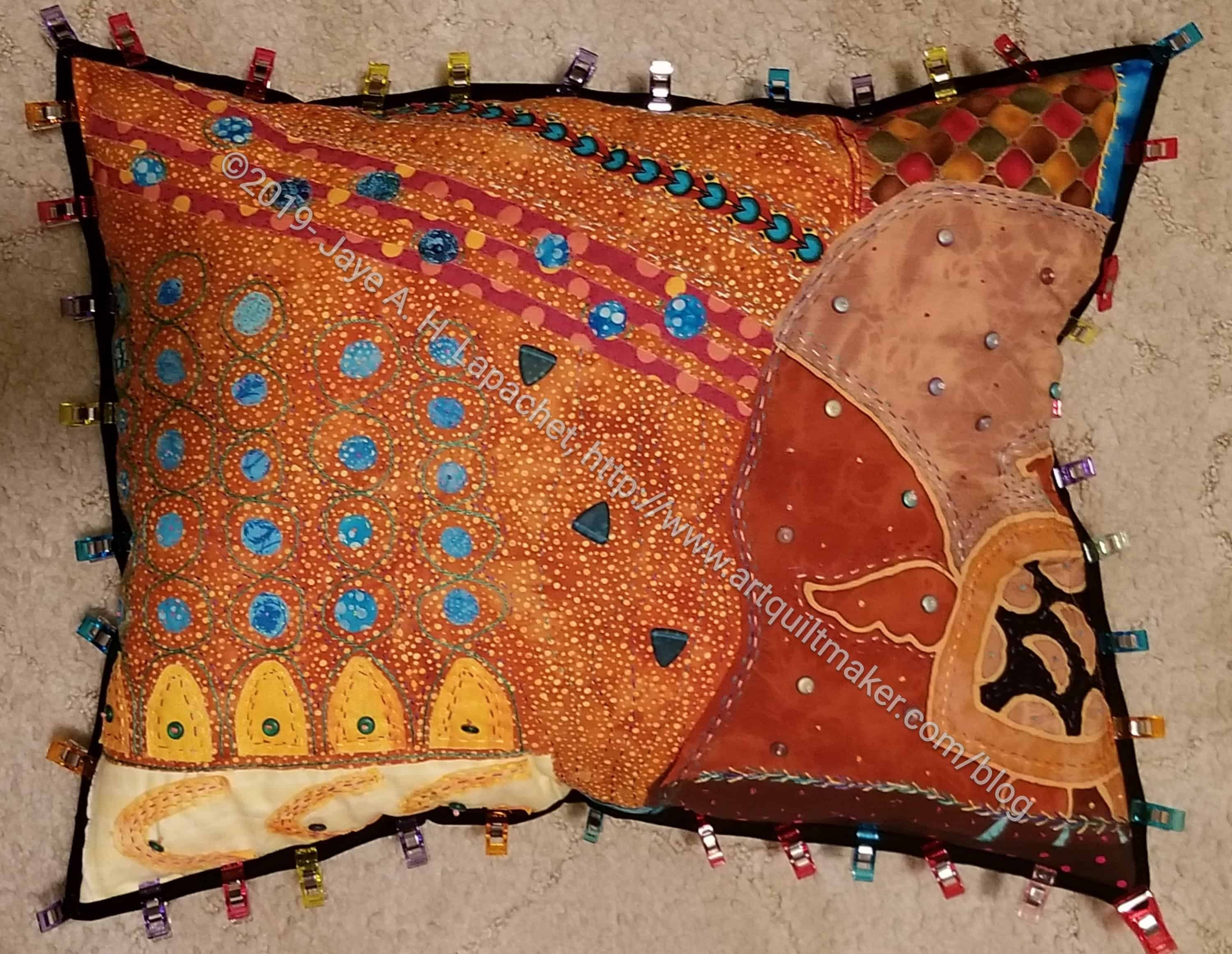
I wanted to finish Under the Sea by now, but I had to backtrack and do some repairs, so finishing will take longer.
I made the piece into a pillow. To do that I used up the polyfil I had leftover from the dolls I made for my little niece. I didn’t have enough, so I cleared out my batting scraps and used bits of batting for the rest of the stuffing. I would have preferred all polyfil, but as a lot of this project was from reclaimed materials, I thought the batting scraps were fitting.
Under the Sea back – Michael Miller print
I wanted to control where the stitching went, so I didn’t plan on sewing right sides together and turning the piece. I sewed wrong sides together, then left an opening I could use to fill the pillow.
The backing fabric is from the Michael Miller London Portfolio collection. This particular print is called Anjou Pour Vous. I don’t know why it would be called that if the collection is called London Portfolio, but I am sure the designer has a reason. I have a number of these prints and will have to use one for a backing.
I also wanted to put a black binding on. I did that to cover the raw edges, then machine sewed the back down. I ran into problems with the black thread catching some of the pillow top and also showing in the corners where it didn’t quite match up with the top binding. Again, I ripped and replaced the bobbin with Aurifil monofilament and restitched the binding so the mismatched binding front wouldn’t have a black line around the corners on the actual top.
Also the larger glass beads are coming off. For some reason, my French knots are not strong enough to hold them with the stress of handling. Again, I am using Aurifil monofilament to secure the beads and not disturb my overall design. The Aurifil monofilament is a hassle to use, so that is also a thankless task.
I will be so glad not to see this project on my to do list when I am finished. I know I will like it again, but right now I don’t.
I started binding the Sealife quilt-let the other day. I made a couple of bindings on a Saturday a week or so ago, so they were ready to go. After finishing off the Christmas mat, I got busy on the quilt-let.
It is going pretty well. I can’t remember the last time I bound a quilt that had flannel as its backing. I like it. The threads sink right into it. It is a little difficult to get the needle in, but not terribly so. Once that is accomplished the stitching goes easily.
I think I forgot to put a label on this one, so I will have to do some hand stitching. It’s been awhile.
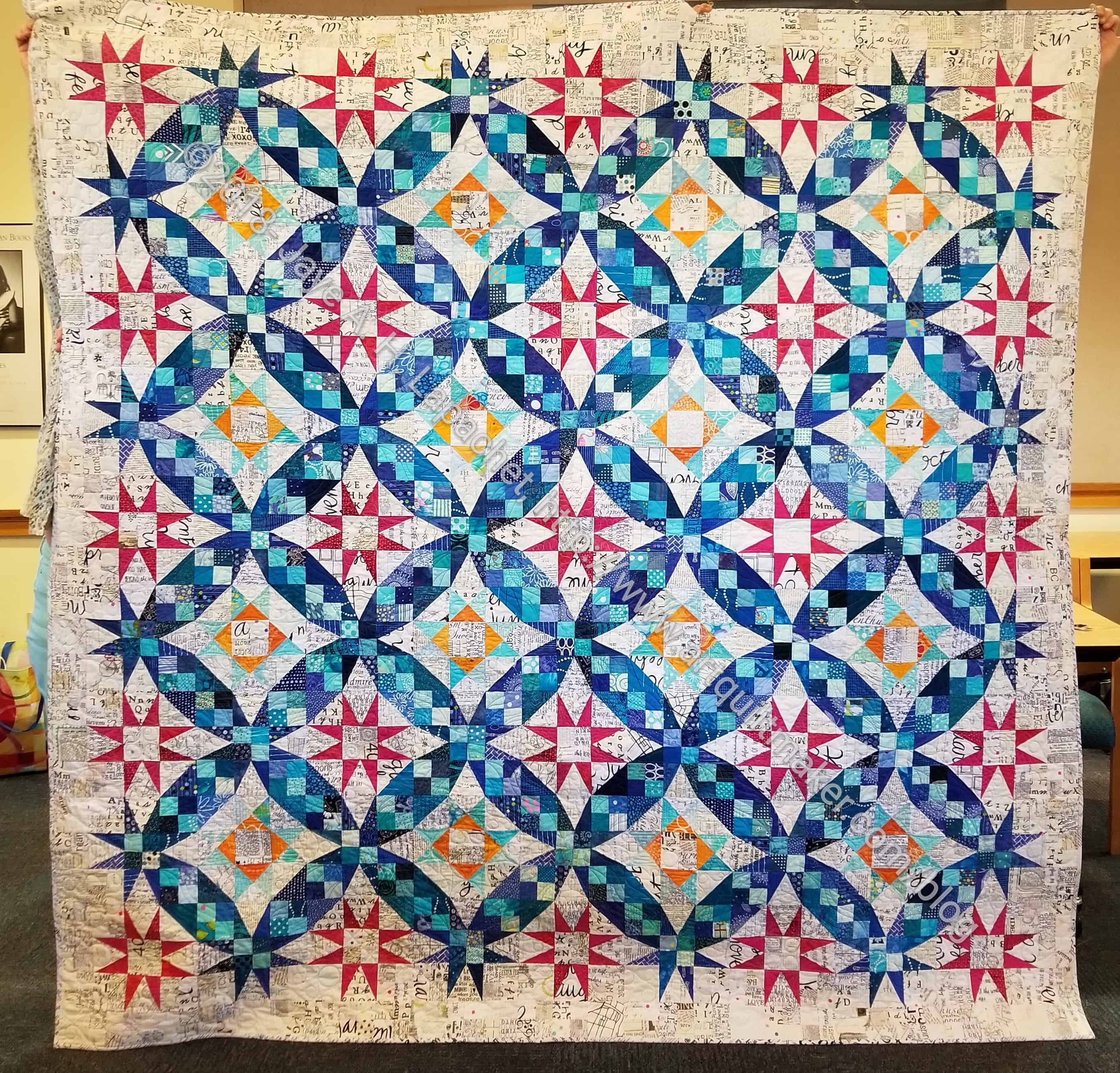
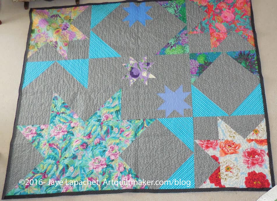
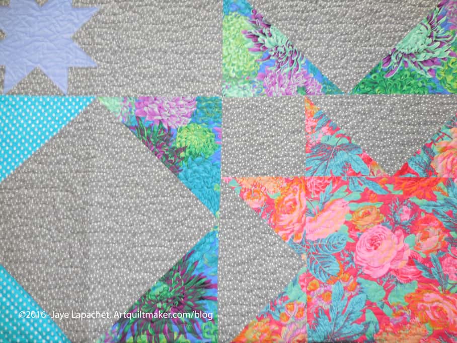
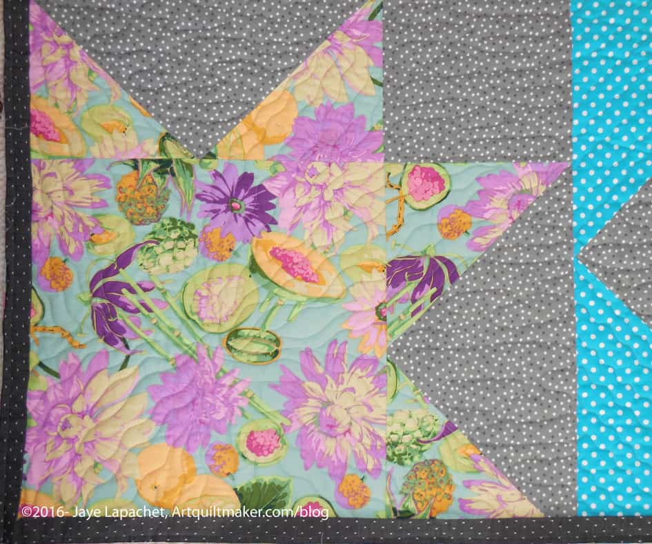
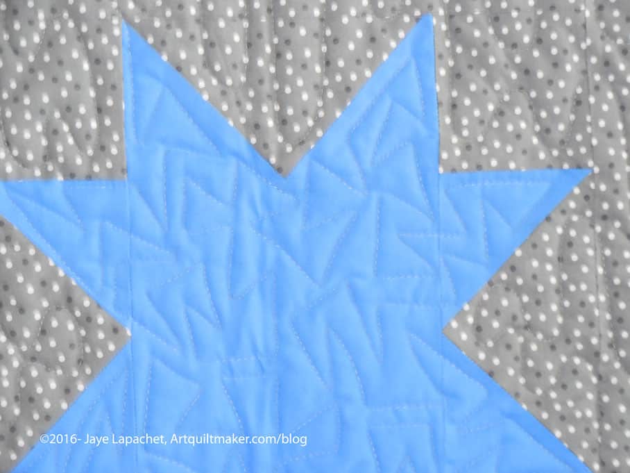
Yes, amazingly enough, I finally finished En Provence a week or so ago. I am so pleased with the finished product. I am sad that I will give it away, but it will go to a good home who will love it very well.
One thing I like about this pattern is that the edges are finished. By that I mean my hard sewn units are not cut off as you see in many quilts with weird edges. I like it that my stars have all of their points.
Also, I want to make another one. 😉 I am not sure when, but I do plan to make another one. If I select a color scheme I can start any time and use leaders and enders to get all of the units made. I haven’t done any sewing yet, as I haven’t selected a color scheme. I really like this color scheme, but want to do something different. How would it be if I reversed the darks and lights?
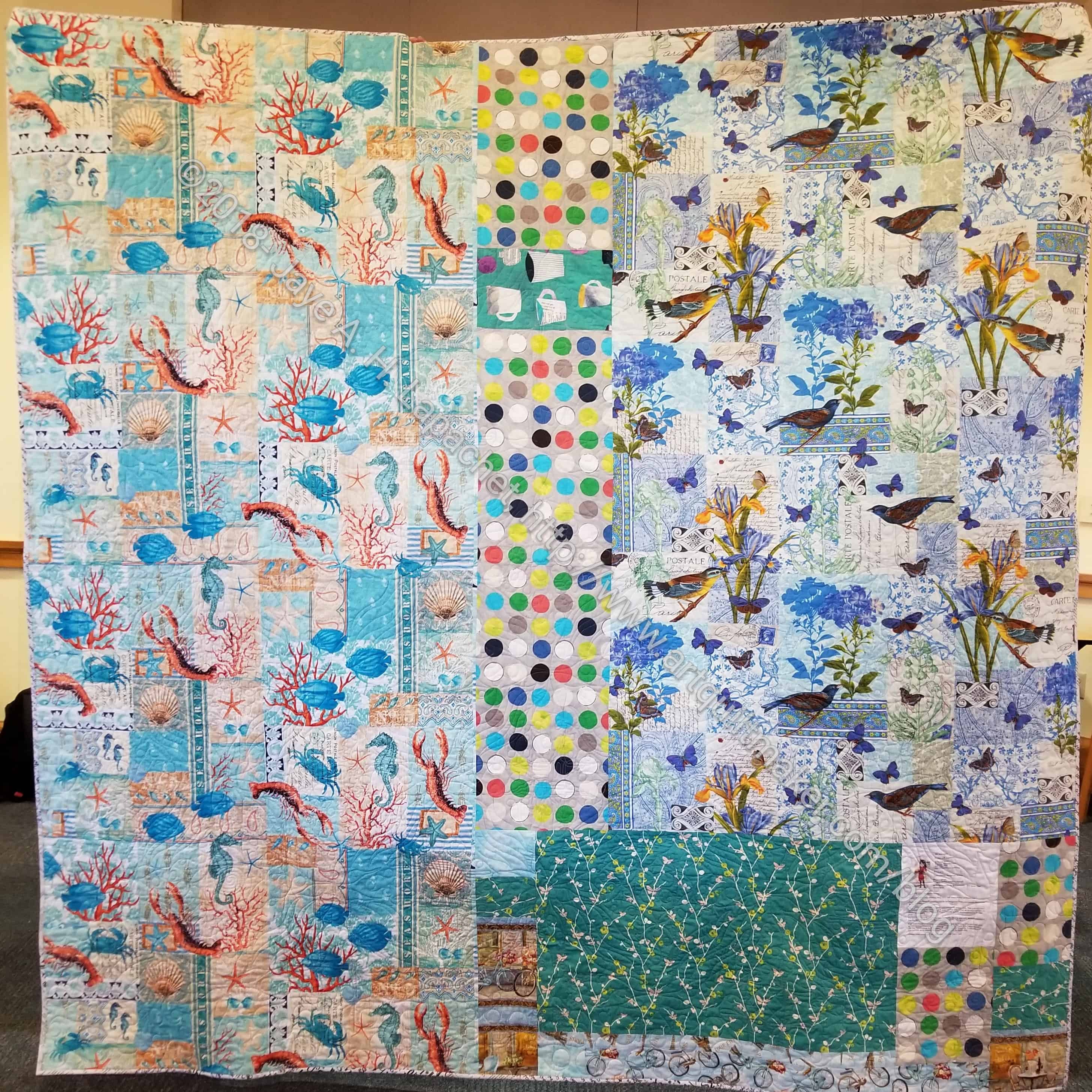
En Provence back
The back turned out to be very funny. Birds and lobsters? What was I thinking? It is definitely a good conversation starter, that is for sure.
I started this on January 10, 2017. You can see all the posts by clicking on the tag. 14ish months isn’t bad, especially when I know I took a long hiatus somewhere in the middle. Also, made most of this quilt using the leaders and enders technique.
After the Big Stitch class, I started thinking about the BAMaQG IRR project. This is one of the projects on the 26 Projects list that I had low hopes of getting done. Now I feel better about the project’s completion because I think that it would be a good venue for Big Stitch.
I talked with Julie about my idea at dinner the other night. I need to square it up, then make a back. My thought is that I will do some minimal machine quilting and then use Big Stitch to stitch the rest together. Alternatively, I will just Big Stitch the whole thing and skip the machine quilting. I’ll get it into the hoop a lot faster if I skip the machine quilting piece. I will have to baste, which is a trial any way you look at it. I could use a big hand project like this right about now, so stay tuned.
The last time I thought about this project was in June of 2016! I think it is good to attend a class and have it stay on your mind after the class ends.
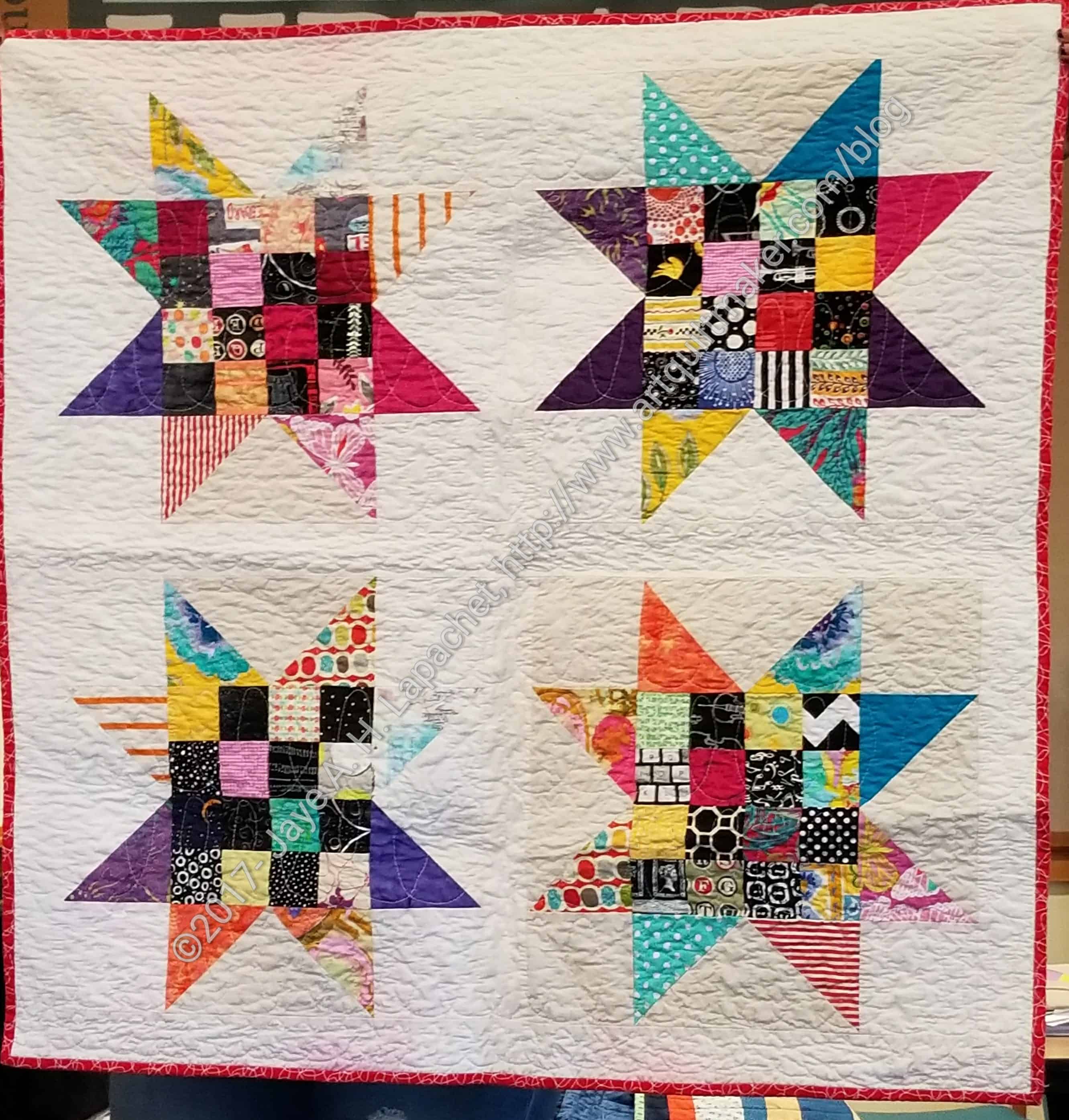
You might remember me talking about the first star donation top. I don’t always get to see the finished product, but last week at the BAM meeting, I got to see it finished.
Star Donation Quilt
Erin quilted it. She doesn’t make a lot of her own quilts, so she quilts a massive number of charity quilts.
The setting looks pretty boring compared to Stars #2 and Stars #3, but I had to make it in order to get to those two. Erin’s quilting makes it look a lot better!
I was thrilled to collaborate with Erin and look forward to seeing what she does next.
I finally finished Down the Drain on Friday night. Completely finished: quilting done, binding on, sleeve sewn down. Done.
First, as I mentioned, I finished the quilting. Of course I could have stopped any time, but was clearly on a mission. I kept quilting minutely almost every single open space.
I finished hand sewing the binding on earlier this week. Normally, the combination of tightly woven fabric (an AGF solid) and Aurifil make for slow going, but the combination worked great! My needle went through the fabric with no problem and I sewed the binding in only about 4 hours.
I stitched the sleeve down in only about 2 hours. The whole process of making this quilting was so relatively painless. The experience was not and continues not to be painless. The actual process of making the quilt went so smoothly. I guess it was meant to be.
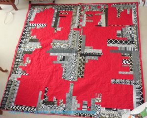
Along with Flowerburst, I also got back this quilt, which I wish I had called Cityscape. It really does look like a cityscape.
Cityscape- back from the quilter
I have sewn on the binding. I worked at sewing one whole side per evening so the binding process only took me about 8 hours. The quilt is 82″ x 84″ so quite a bit of work. I used a Kona solid for the back and the binding and it was a pain. The needle doesn’t slide through that fabric like I think it should. I MUST remember that.
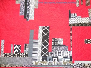
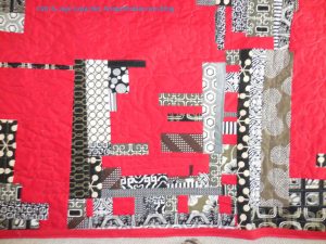
Cityscape – detail
The red is the background and I had Colleen think of it as a sky and put clouds in it. She did four different types of clouds in the four quadrants. I think of it as the four seasons.
Cityscape – detail
The black and grey are more like buildings, so she did more geometric quilting in those areas.
Flowerburst returned from the quilter about a week and a half ago. I have had so many other projects going on that I haven’t had time to post about it. I haven’t really worked on it either, so there hasn’t been much to say.
The photo is a little odd as I had to lay the quilt out on my living room floor and take the photo from the upstairs hallway (I have an open plan, mid-century modern house). When I get my other quilt hanger back from college and the quilt is bound, I’ll take another photo.
This was supposed to be a quick project and it was relatively. I didn’t like the directions, mostly because I had to conserve fabric, so I used different methods to cut the backgrounds, which meant I didn’t have as many leftovers as I would have if I had used KD’s methods. I understand the reasoning behind her cutting directions: she had to write directions for everyone not just for me, the person with the fabric shortage.
Flowerburst – detail
I like the way this quilt turned out. I liked using my big prints on the front for a change even though I will be gifting this quilt and won’t get to see those lovely prints very often.
I really like the idea of combining different sized blocks and think this, or a variation of this, pattern has potential for other layouts. I am thinking that a slightly larger block in the center with the smaller block would have worked as well. I think there could have been some transparency work as well, if I were willing to do a larger quilt.
Flowerburst – detail
A couple of the prints are Martha Negley prints, but they go so well with the Philip Jacobs prints.
The print on sea green with the flowers and melons is a favorite and was close to being a dress. I decided at the last minute that I couldn’t risk a melon ending up on a breast or buttock! I do love those flouncy lavender flowers, though. I also love the cantaloupe color combined with the sea green. I don’t remember seeing that combination before and will have to remember it in future.
Flowerburst – detail
Finally, Colleen did a great job on the quilting. I wanted her to highlight the stars and she did different designs in each one and they look great. I can’t wait to bind this and see what my niece thinks.
A week or so ago, I wrote my first Various & Sundry post for 2016. In a comment, BAMQG pal, Annemarie, asked about quilt labels. It occurred to me that I had been meaning to write about quilt labels for a long time and I hadn’t yet done it.
First, I think quilt labels are VERY important. They document the work of women who are not being paid to make things. While you may think that women and their work are valued, I think that we have a long way to go to have handwork (even by machine) valued as much as something such as, for example, a technology infrastructure or a new and successful app.
Second, I think quilt labels are important because they can tell the story of your quilt, if you want. Even if the story includes only:
maker
date
recipient
It is a small story, but a story nonetheless. It can be the starting link of a chain.
Label for Small Items
Third, for bags and small projects, I have a small label I print out in batches of about 20 on a page. It is not personalized to any particular project, but it lets people know who made the item. I even put these on ATCs. While simple and not unique, they can link a small item to my larger quilts. These would be perfect to make on Spoonflower and I might just do that.
Fourth, ALL quilts are important even the baby quilt you whipped up overnight for a baby who came early. The child will look at the label, wonder at and ask about it when s/he is old enough.
I did a little meditation on quilt backs a few years ago. Since I put my labels on the back, is relevant for this post. You may want to take a look.
What to Include
When I make a quilt label, I start with a Word document and save it to the folder on my computer (Google Drive or similar would work as well) that has all of the notes and images for the project. I include the following:
a picture of myself or my avatar
the name of the quilt
the size of the quilt (this is helpful when entering shows as I don’t have to measure the quilt every time)
details about materials and construction, such as if I have embellished the quilt or used special materials. I always put the content of the fabric and thread. Most of my quilts say 100% fabric and thread, but this is the place to put other content information, if relevant
my name, address and phone number
the name and address of my blog
Name and company of the quilter who quilted the quilt for me, starting with “Quilted by” or “Longarm quilted by”. Sometimes my name is in that spot. I feel it is important to differentiate the piecing from the quilting.
If this is a gift, I also include “Collection of Jane Doe”
If many people worked on the quilt, I include their names. This may help historians build connections between me and my guild mates in the future.
Sometimes I will include the pattern name.
If I got the pattern from a publication, I will include that and note changes that I made.
If the quilt was made for a show or exhibition or in response to a challenge, I put it on the label. Again, it helps make connections.
The story, process and inspiration for the the quilt. This is often the same, or similar, information I use on the quilt’s webpage. This information may include why I gave the quilt to this particular person. If I used special fabric or a particular line of fabric, I may include the information in this section. I also include why I made the quilt. It may have been specifically for a person. I may have started it in a class or wanted to try a technique or process
washing instructions, especially if the quilt will be a gift
Yes, the above is a LOT of information. My labels are frequently very large – taking up most of an 8.5″ x 11″ sheet. This is the information I would want to know if I came across a quilt in an antique store.
I often write up the label as I go along, so I only have to do some editing when I am ready for it.
How to Make a Quilt Label
There are as many ways to make a quilt label as there are to make a quilt. You can:
use my process and print on fabric
write with a permanent pen on a plain piece of fabric and sew on to your quilt
write directly on the quilt (watch for bleeding!!!!)
hand or machine embroider
applique’
use stitch lettering on your machine to write out label information directly on to the quilt.
Get sheets of labels already printed on fabric and fill them in with a permanent marker
Use Transfer Artist Paper
Write up your label in Word (or another word processing program), then trace on to fabric with a permanent pen
Create on Spoonflower
Buy personal, pre-cut woven labels (like the ones in your clothes) with your name, blog name, a short message, etc
Insert a triangle of fabric into the binding with your information written on it
embroider (watch for floss that bleeds)
I love the front of a quilt. Sadly, I am happy for the the fairies and magical animals to finish the rest for me. By the time I get to making the back, I want the quilt to be done. My method for making labels is relatively quick, in the grand scheme. Some tips:
print a test page on a piece of paper to check for color and clarity.
Make sure you ink cartridges are at your desired level
Sewing and More Information
My mom’s car was broken into and my niece’s quilt, which was coming to me to be bound was stolen. It had been made at a shower for her mom and many people had drawn, colored and written messages for my yet-to-be-born niece. The quilt was a wonderful scrapbook of heartfelt love and was never recovered. It is one of the saddest events in my quilty world.
I sew my quilt labels into the back of the quilt before the quilt is quilted. I do not applique’ labels onto the back after the piece is quilted. Yes, that means piecing the back. Yes, the quilting can make the words look weird, but I want people to know the maker and owner of the quilt. If the quilt is stolen, then the thief will have to destroy the quilt to remove the label. I think this is unlikely, but in a sick kind of way, I would rather have that then someone passing my work off as their own. If they don’t care, then perhaps every time they see the label, they will feel a little bit ashamed.
Confession Time
I have one quilt that is unlabeled and there are no photos of it. It isn’t a horrible quilt or anything and I do keep meaning to do it. I just don’t seem to get around to it. If I die before I do it, nobody will know anything about it, which is sad.
I really dislike making labels and quilt backs. I do it, because I truly, deep in my heart, believe it is important to document my work. If you don’t feel that labels are important, then you don’t have to make them. The above is not a call to arms, but information on how and why *I* label *my* quilts.
Resources:
This is a small sample of the myriad of information available. For more resources type “quilt labels” into Google and look at the massive amount of resources and images that are retrieved. Everyone has a different process. Find what works for you.
I was determined to make the Scrapitude back this past weekend. In order to do that I had to finish the label. I had some time on Friday night and used it to make the label and order some rotary blades.
Rotary blades, you ask? What do they have to do with making a back? There are some tasks that are not hard, but they can interrupt the flow of sewing if you have to stop and do them. I have been trying to identify these tasks and put them into slots of time that are not suitable to sewing.
Making labels, making bindings and ordering rotary cutter blades are three of those tasks, which I have identified so far. I figure that if I put them into these odd slots of time, I’ll get more sewing done. It’s a theory anyway.
I wasn’t up to sewing a lot of small pieces together, so I tried to find some larger pieces of yardage. I found the large piece of Philip Jacobs. I knew I had a large dot piece that I liked with it, so I found that as well and went from there. I always have to piece a bit around the label, but I found that bird and tree print, which was perfect, because I didn’t have to cut it up too much. The trees show up pretty well and I was pleased to see the butterfly. There is something nice about that print and this turned out to be the perfect use for it.
I made the binding last weekend, so this baby is ready to go to the quilter. Yippee!
I hope that, later this week, you will see another finish.
I went and got two quilts from Colleen last weekend while we were out car shopping in her neighborhood and both are ready for binding. I decided to sew the binding on the Original Bullseye first since that project has hung around much longer than the T-Shirt quilt. Also, I am planning to give the T-Shirt Quilt to the Young Man for Christmas. He hasn’t noticed it has returned, which means he isn’t clamoring for it, which means it will be a great gift.
Original Bullseye detail
Colleen did a really nice job on the quilting of this piece. It is flat as a pancake despite all of the bias edges of the circles.
T-shirt Quilt detail
Colleen sees a lot of quilts so I was very pleased when she, and her Mom, Elaine, complimented me on the border. That is a border that is a pain to make, but very effective. I discussed the making of it in a previous post.
I wanted to show the detail, because of the quilting. I told her to do something basically all over, but not to ignore the difference between the t-shirt ‘blocks’ and the sashing. I am pleased with what she did.