I don’t always chastise myself very vociferously for making a big mess in my workroom, because happy accidents happen with messes.
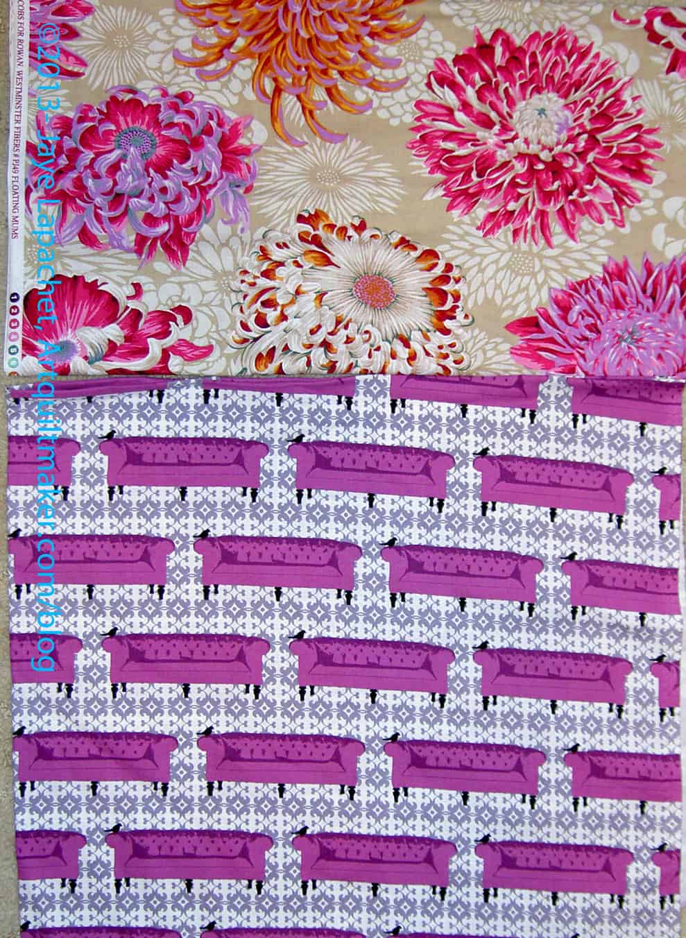
I found a new Philip Jacobs print at Roxanne’s in Carpenteria (you really MUST go there as soon as possible). The tan background isn’t really my color, but I love Phil and those mums are to drool for.
I was unpacking stuff from my trip and the Philip Jacobs flowers were flung onto my cutting table temporarily. They happened to land near this Lori Wisburn print from several years ago. It is from the Tufted Tweets line. I don’t know why it was in the pile, but it was a good thing it was, because I saw the two together and thought “hmmm, that could be the start of something”.
I dream of a beautiful garden. I find green things and flowers so attractive. Sadly, I don’t want to do the work required. Periodically, I get a bug in my ear and do some work on one part of my yard, feel great and then do nothing for months until the next bug gets in my ear.
Sigh.
One of the things I loved about the show was the non-quilt inspiration I got there. Everywhere I looked the employees had gone out of the way to make the gardens attractive to look at. Even the tables filled with flats of flowers and other plants looked wonderful. This place is no Home Depot; it appears that the owners and employees actually care about their work.
Garden art – Alden Lane Nursery
One part that I liked were the random sculptures. I don’t know if they would fit the ‘official’ definition of sculpture, but I thought the displays were sculpture.
I really liked the one on the side of a shed that looked like windows. I suppose a person could make something similar with 1x1s and some larger wood for the outside. It might look nice hanging on the back of my house in some pleasing arrangement. It would require some work, though, and I don’t know that I am up for it.
Part of what was so great was the weather. It was a beautiful day: sunny and not too hot. Not only did the wonderful weather make it pleasant to walk around, but it also made gorgeous shadows, which added to the look of the non-quilt ‘art’. (The shadows on the quilts was a little bit frustrating.)
Garden art – Alden Lane Nursery
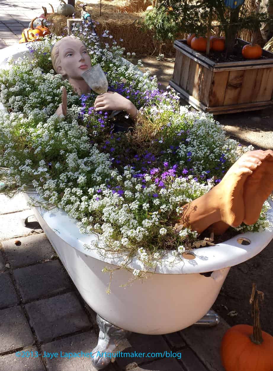
I am sure Alden Lane is serious about their plants, but they have a sense of humor, too, which was exhibited at the entrance.
It made me laugh. I am not sure I would put it in my yard, but given the right space, I wouldn’t count it out either. I love the humor and wonder if it says something about the owners? Perhaps a worker has a good sense of humor on which the owners capitalize? In either case, I think they should do more.
I might like a tub like that in my bathroom, though…
Garden art – Alden Lane Nursery
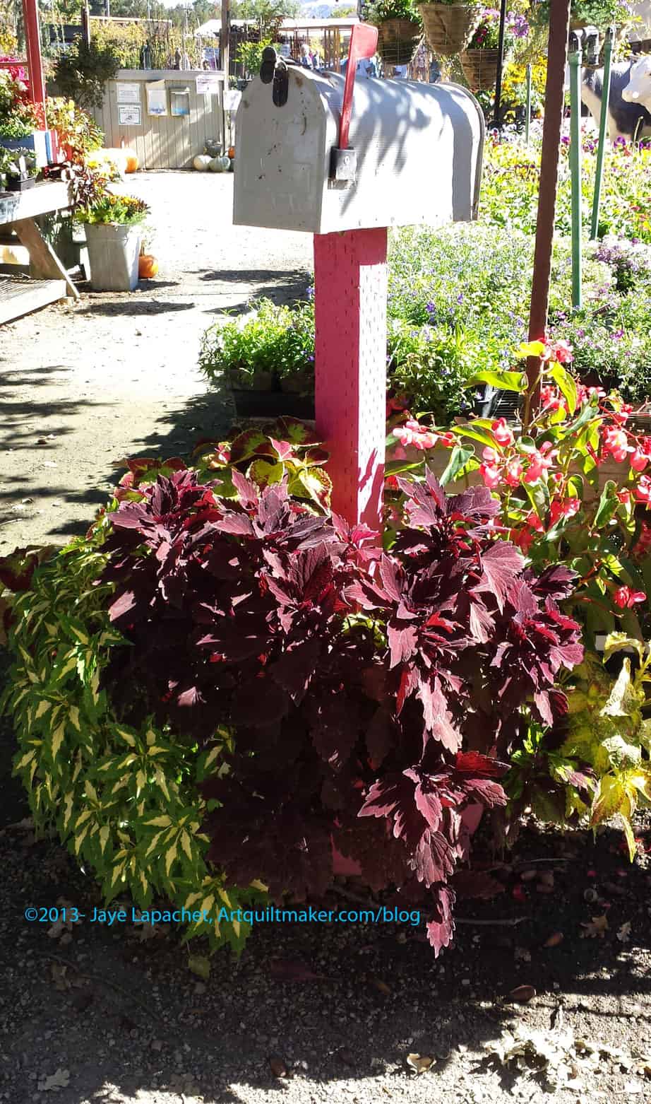
TFQ loves coleus. I saw this arrangement and thought of her.
It is a particularly appropriate arrangement, because we write letters back and forth. I can’t see her putting a mailbox like this in her yard, though.
I think TFQ was on my mind, because she was planning to visit that weekend and I thought it would be fun to go to the show together.
In looking at the color of the coleus and the color of the mailbox post, I wonder how the arrangement would look with a blue post? Red and green are opposites on the color wheel and the success of the look might hinge on that relationship. Still, it would be interesting to see a series of tableaus like this in different colors.
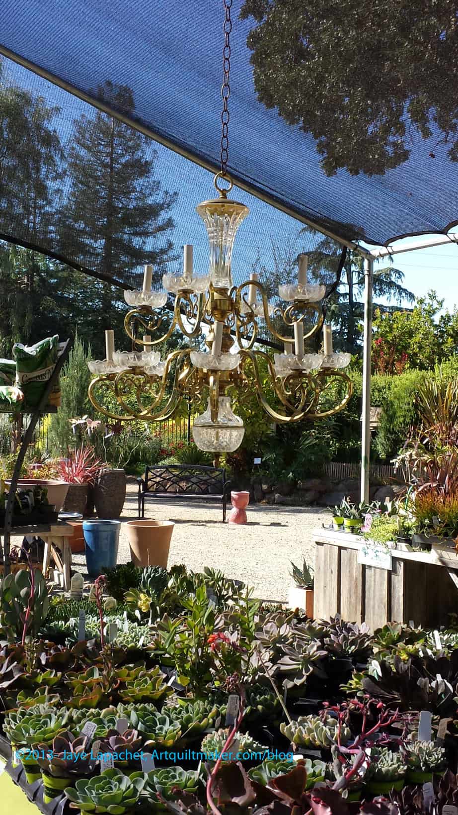
I think often of the type of outdoor rooms or living spaces that I see in glossy home and garden magazines. I know they wouldn’t really be practical for me because I would be able to use the “room,” maybe, four weeks out of the year. Still, a girl can dream.
Nice outdoor living! – Alden Lane Nursery
I do dream about them when see an arrangement that includes a chandelier outdoors. I can’t imagine that this one would work, but in my imaginary house set in an imaginary place that has the perfect climate, mine would work and cast a soft glow over my perfectly cooked kebabs.
Sigh.
Good thing dreams are free, right?
And from the Excellence in Marketing Department:
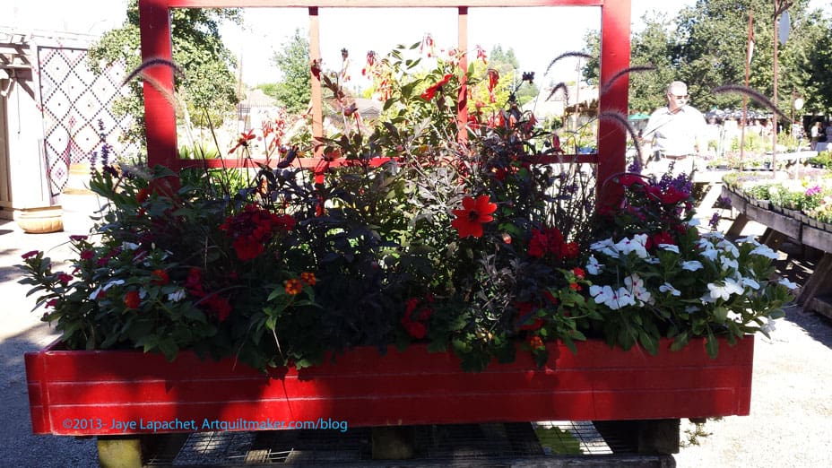
If I – the reasonable and authoritative side of me – didn’t know that my yard needs a lot of work before it will be at the stage where I can buy flowers to plant for a few weeks, I would have bought pots and pots of flowers simply because of displays like this red window box. Doesn’t it make you think that your life would be more beautiful if you had such a thing at your house?
There were two Featured Artists at the show: Sandy Klop and Susan Else. Sandy Klop is the designer of the American Jane patterns and fabrics lines. While I am not completely on board with her color choices, I don’t hate them either and her patterns are fabulous – not the easy stuff. You have to think about her patterns.
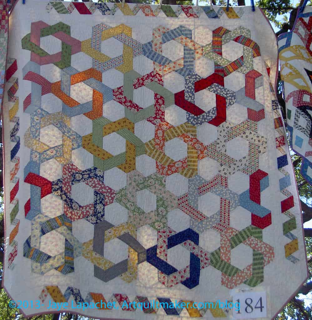
Pretzel Party, the interlocking beauty on the right is my favorite of her quilts, though there are many that I like.
She also has something or everyone: applique’, piecing, squares, hexagons, straight seams, partial seams. She also has different skill levels. Her designs, with the confines of piecing and applique, vary widely, too. She uses interesting borders, panels, and has a quilt depicting classic game boards- playable game boards! If a person cannot find something to make, I don’t think it is because of Sandy Klop’s lack of trying.
Sowing Seeds detail by Sandy Klop
Sandy’s quilts were everywhere. I estimated that she had 80 quilts on view. While her color palette is slighty dusky (e.g. she uses gold vs. yellow), I wouldn’t turn down most of her quilts if offered one. Her patterns are bold and bright and either are complex or look complex because of the fabrics.
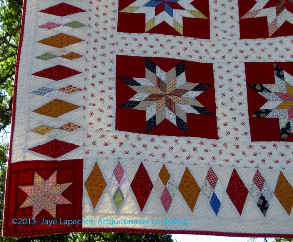
I loved the diamond border in the Sowing Seeds quilt. I like the combination of pieced and whole diamonds. I also like the way the pieced diamonds fade in and out. It adds interest and made me look at the quilt a bit longer.
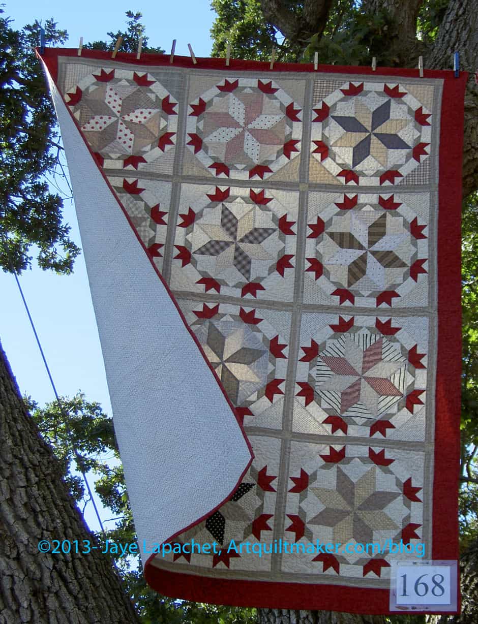
Starry Crown by Sandy Klop
The picture of the Starry Crown quilt shows the benefits and frustrations of an outdoor quilt show. The blue sky, the beauty of the tree bark and the greenery all make an outdoor quilt show pleasant.
The wind, however, did not make for easy picture taking. I finally just took the photo, because the wind was not going to die down even for a minute for me to take the photo. Also, I was really just interested in the piecing of the block and the interplay of fabrics Sandy used. Both of those are covered in this photo. This isn’t a quilt with a complicated border, so I think I could replicate the layout, if I wanted. The bonus is that the wind gives you a view of the back and front at the same time.
Susan Else piece
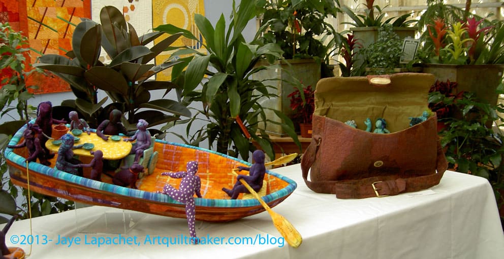
TFQ and I saw Susan Else at the Road to California show a few years ago. I really enjoy looking at her 3D pieces. I wouldn’t necessarily include figures in my own work, but i love looking at what Susan has made. She is very willing to talk with people, too. Her stories aren’t prominent in the show, but I had her tell Mrs. K and Vicki the story of her Lifeboat piece, because it rings so true with me.
Lifeboat by Susan Else
Susan explains that she, metaphorically, kept inviting people into the Lifeboat and serving them soup until her husband and daughter suggested that it might capsize. It is, for me when looking at the piece, a statement about women and how we try and take care of everyone.
Susan’s pieces are large, which is also appealing.
Susan Else’s Chess Set
Susan’s pieces are also hard not to touch. I really wanted to pick up a chess piece and feel it. Fortunately, Mrs. K asked so I didn’t have to surreptitiously stroke a queen or a rook! The people in Susan’s pieces really have a lot of life. I kept looking at them thinking about the giant chess set in the Sorcerer’s Stone and how all of those pieces moved. Susan’s chess pieces deserve to move!
Do people use the word magenta anymore? It doesn’t come up that often, but I really felt an Autumn-ish word was required. Since we are scraping the bottom of the barrel on words magenta was the closest I could get. Orange, Autumn and leaf have all been used. Even stem, branch and tree have been used. What’s a girl to do?
Definition: “Magenta (ma?gen?ta, /m??d??nt?/) is a purplish-red,[1] purplish-crimson,[2] or purplish-pink color.[3] It is a primary color in color printing which, combined with cyan, yellow and black in various combinations, can be used to create all other colors. The name comes from the dye magenta, originally called fuchsine, discovered in 1859, and renamed after the 1859 Battle of Magenta near Magenta, Italy where the French army defeated the Austrians and helped secure the unification of Italy.[4]” (Wikipedia)
The color magenta means universal harmony and emotional balance. It is spiritual yet practical, encouraging common sense and a balanced outlook on life. (Empower Yourself with Color Psychology.com)
Magenta -samples from Google
Magenta – The leader in Pro AV signal switching, extension and distribution over category cable and fiber.
Magenta Labs
Magenta – character from the Rocky Horror Picture Show
Magenta Theatre Company – Vancouver, Wash
skateboards
Magenta Boutique – Leavenworth’s newest fashion boutique specializing in the latest goodies for the fashionista at heart.
Hotel Magenta, Florence Italy
Magenta Agency is a social strategy and marketing agency based in Los Angeles California.
Magenta is Blue’s best friend from school who serves as a recurring character in Blue’s Clues.
Post the direct URL (link) where your drawing, doodle, artwork is posted (e.g. your blog, Flickr) in the comments area of this post. I would really like to keep all the artwork together and provide a way for others to see your work and/or your blog.
We are also talking about this on Twitter. Use the hashtag #CPP
The Creative Prompt Project, also, has a Flickr group, which you can join to post your responses. I created this spot so those of you without blogs and websites would have a place to post your responses.
The Quilting in the Garden at Alden Lane Nursery 2013 was held on September 28-29, 2013. It is held this weekend (last weekend??) every year. Alex Anderson comes every year and I saw that she taught classes this year as well. My understanding is that she had a hand in starting the show.
I have been to Livermore, which is miles and miles east of me, only a few times. Most recently I visited In Between Stitches, which is a great store with a great space, when my SIL was in town a few Christmases ago and we went on a shop tour.
I took the train and Mrs. K and her cousin, Vicki, picked me up from the station. It was nice to sit back and be driven around. They go every year to look at the quilts and shop for plants.
I was surprised when we got close to the nursery as it is right in the middle of a really nice suburban neighborhood. It was at the equivalent of the end of the end of my street. I thought it was an odd place for a nursery, but realized that the houses must have been built up around it.
Parking karma was with me (us) and we got a space on the premises. We didn’t have to park on the street and walk for miles. Yes, I know it is good for me, but ….
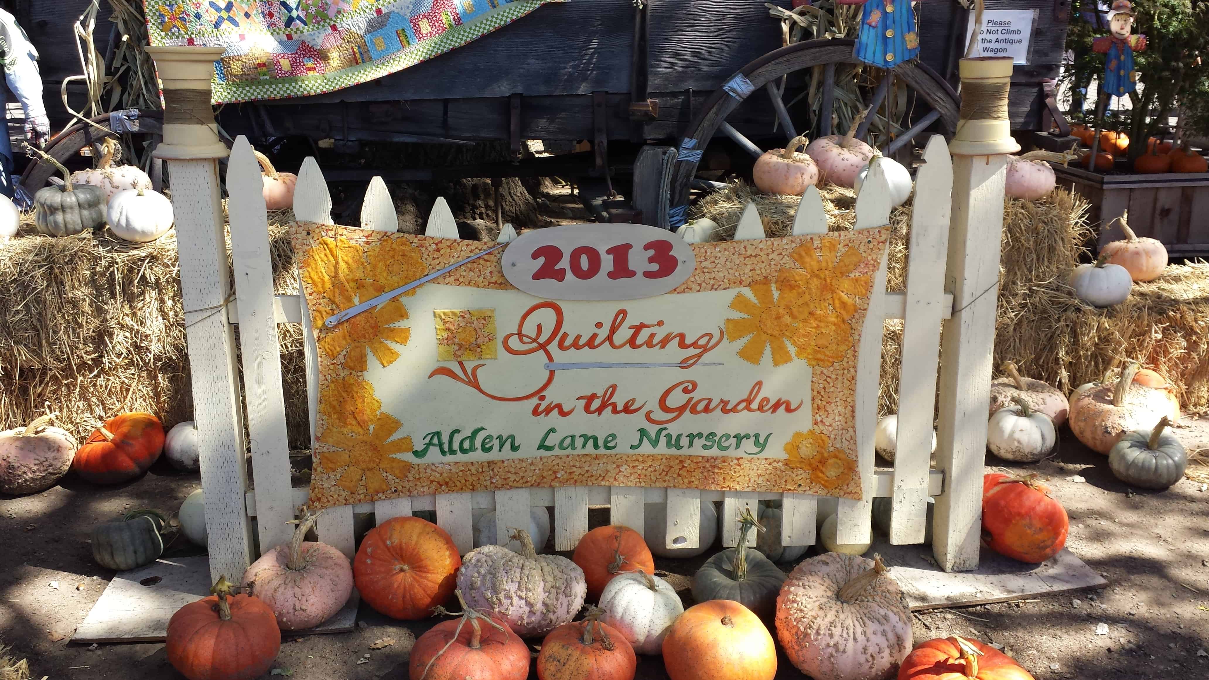
Quilting in the Garden at Alden Lane Nursery 2013Quilting in the Garden at Alden Lane Nursery 2013
Quilting in the Garden 2013
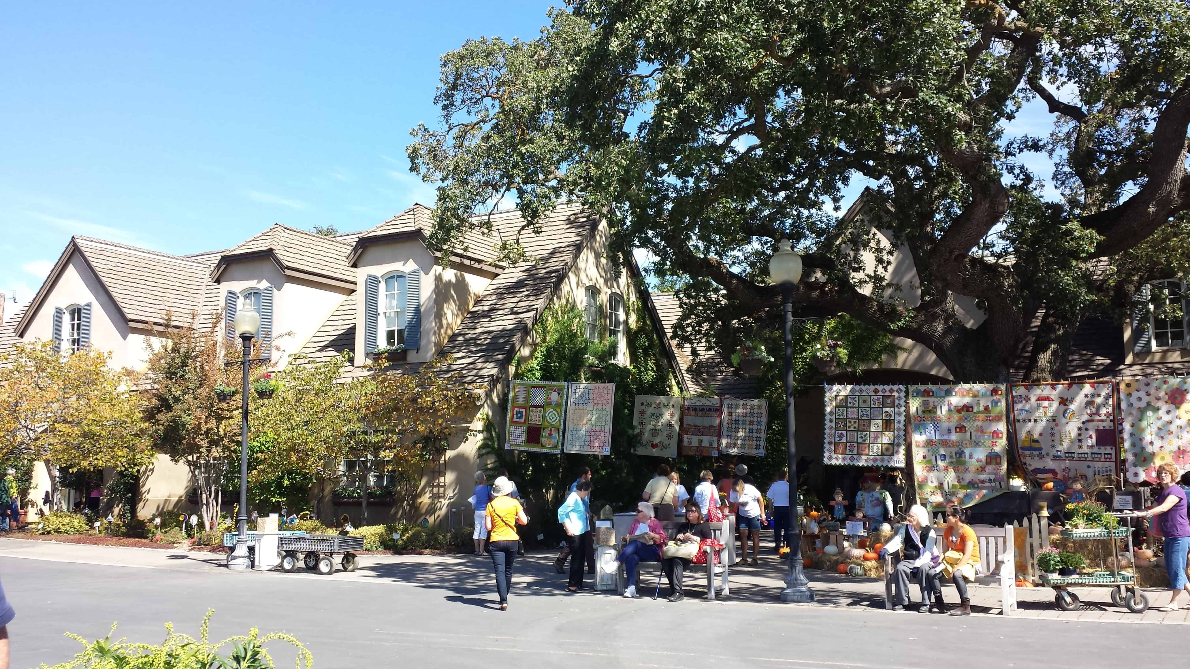
I got excited when I walked up. The whole front of the place displayed quilts. It was a feast for the eyes. It was beautiful.
Once we walked in, everywhere I looked I could see quilts. There were, mostly, outdoor spaces, but there were a few buildings that had quilts hung up along the walls. Where quilts were not, were other gorgeous displays of plants, pottery and other inspiration worthy displays. I took so many pictures! I have included, as you can see, a few here, but there is a whole Flickr Set for your enjoyment as well.
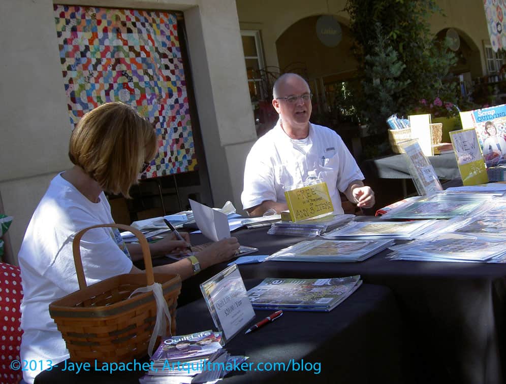
Alex & John Anderson
After entering the facility (no entrance fee!), the first thing I saw was a table where Alex Anderson and hubby, John, were sitting and chatting with people, selling their wares, including The Quilt Show DVDs, and signing books. I was glad to see them and don’t know what I was surprised, but I was a little surprised. She is a such a big star and I am sure she has better things to do than sit in the sun all day and answer the same question over and over. Still there Alex was and I have to say that I was impressed!
I did not stop to chat. The clear space through which I took the photo was the only one I saw the whole time.
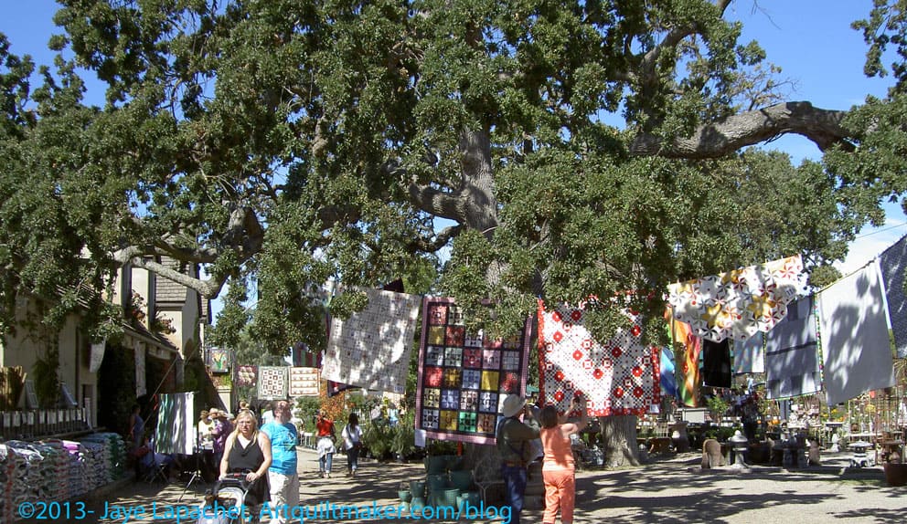
Quilts in Trees
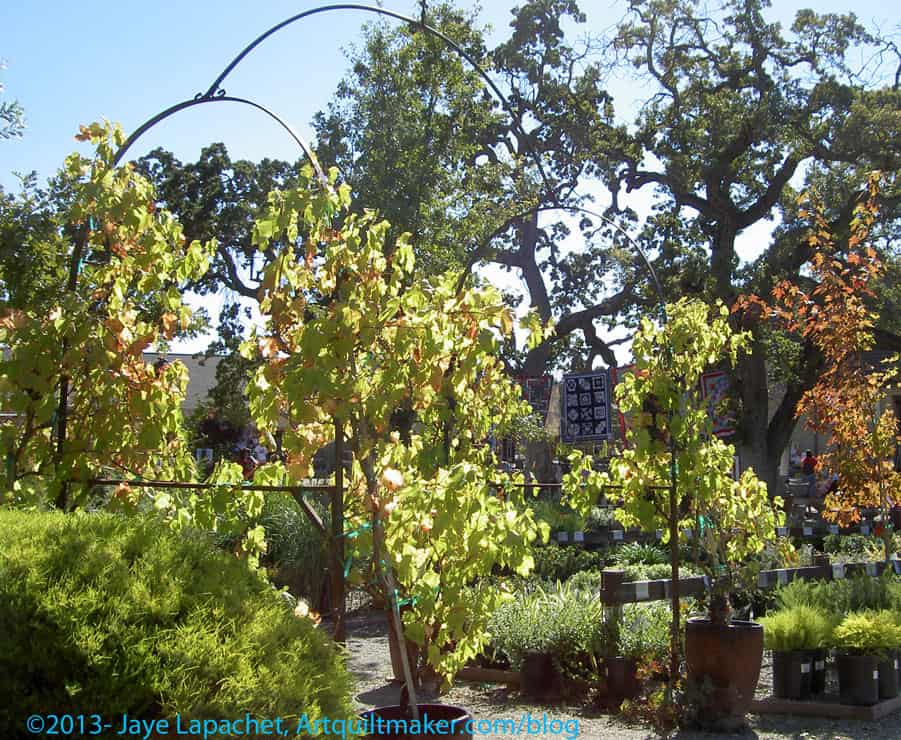
The nursery has giant, old oak trees on their land and the quilts were hung with clothesline and clothes pins from the trees.
The quilts look like they are low to the ground, but they weren’t, for the most part. The quilts were hung so that viewers could easily see the front and the back. Mrs. K really liked looking at the backs and we had fun discussing blocks, trying to figure out how to make the quilts, etc.
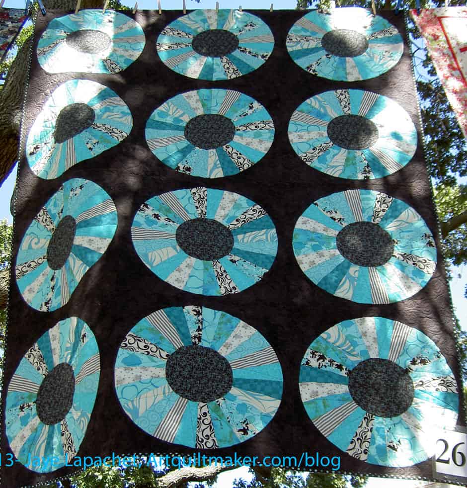
Sisters in Motion by Becky Perry
One of my favorite quilts was a turquoise Dresden Plate. I really liked the turquoise on chocolate and something about the ratios of turquoise to chocolate was very appealing.
I would have thought that all of that color, all of that complex piecing, all of the different fabrics would have been an overwhelming riot of color, but I have to say that the green of the other plants really softened the whole effect. The quilts were framed nicely by the trees and plants. Perhaps it was all of the dusty greens?
If I didn’t say, the day was gorgeous. There weren’t any clouds, but it wasn’t too hot. At one point I really needed to sit and there was a lovely patio near the pavilion with the featured artist and near the food vendor.
I was exhausted from a week away, but I am glad I went to the show and glad that Mrs. K kept nudging and encouraging and made it so easy for me to attend.
If you have thought of going to the show, but never made it, now you have a little more info to consider!
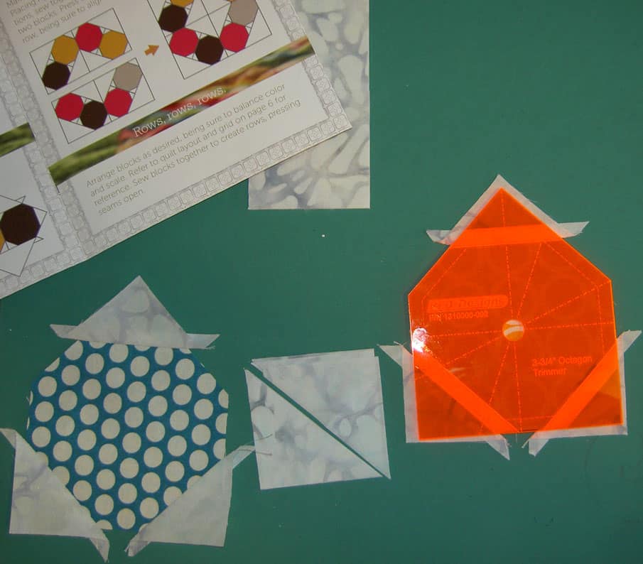
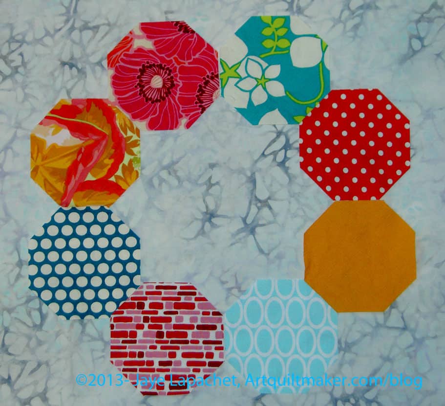
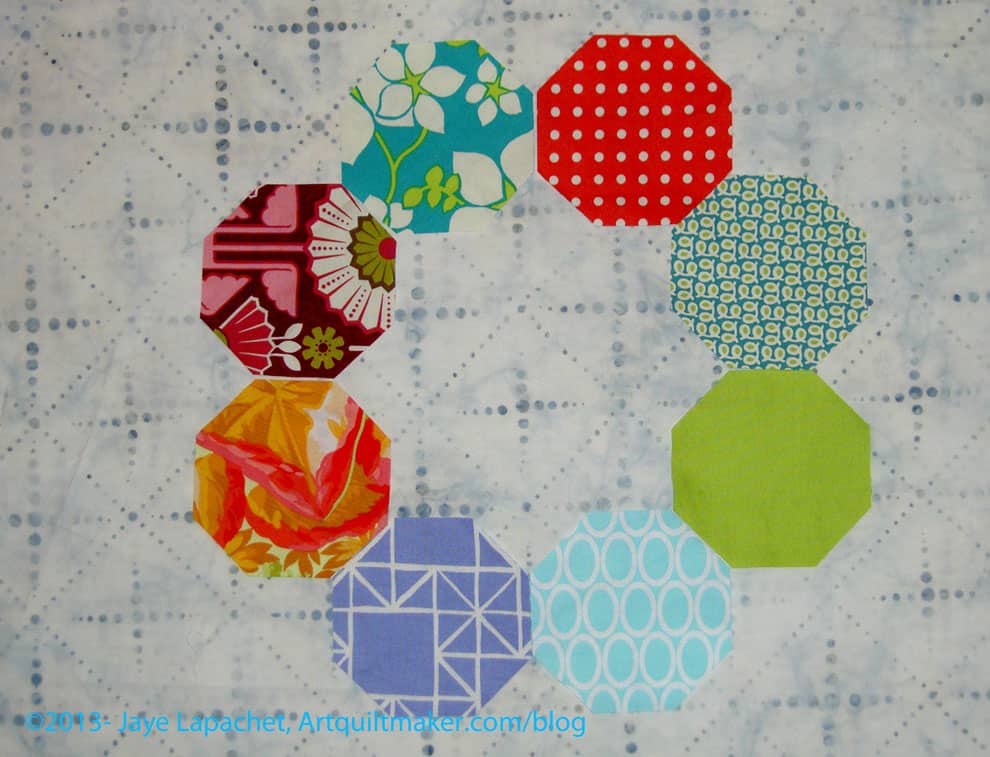
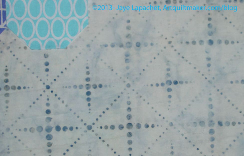
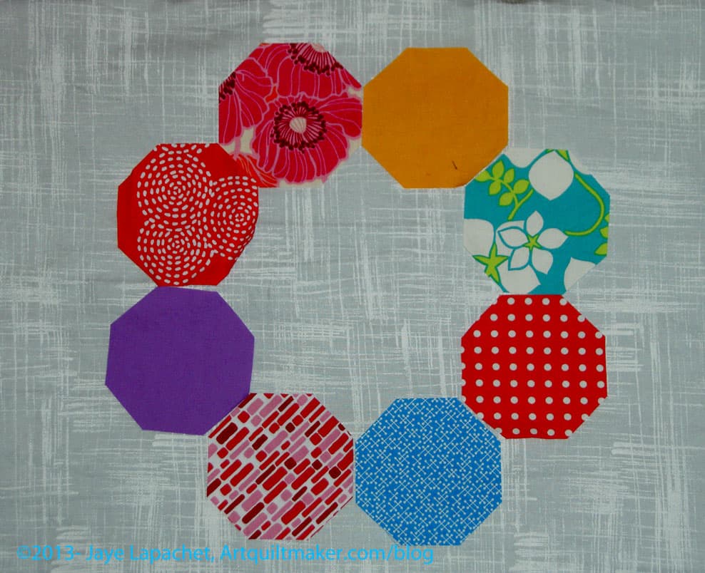
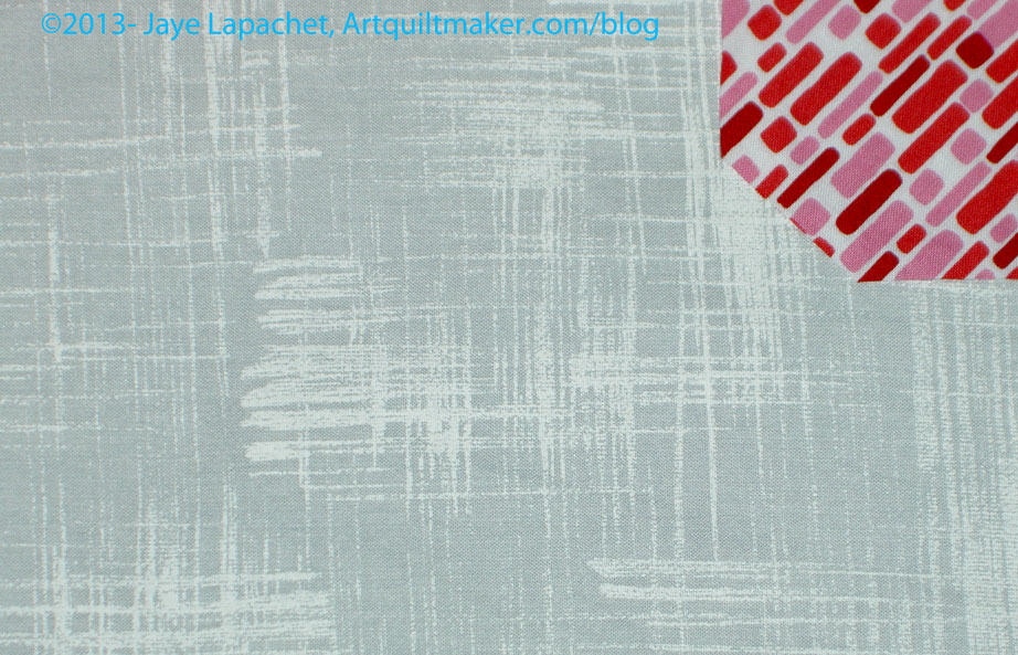
I had a feeling about the background drama and decided to make a couple of test blocks using my top two background fabrics.
Russian Rubix; Test Blocks
I am glad I did. A couple of observations:
the Russian Rubix blocks have a lot of seams
the seams seem to be in weird places, even though they make sense based on the design of the block
the fabrics I chose as potential background fabrics make the seams look very prominent.
In the photos, the backgrounds look like either would be fine. In real life the dots look better. The movement in the batik isn’t as good as I thought it would be.
These blocks are not difficult even though they look complex. The pattern is written so there is a lot of trimming. If you join in, definitely get the templates from Richard. It makes the cutting and trimming easy and painless.
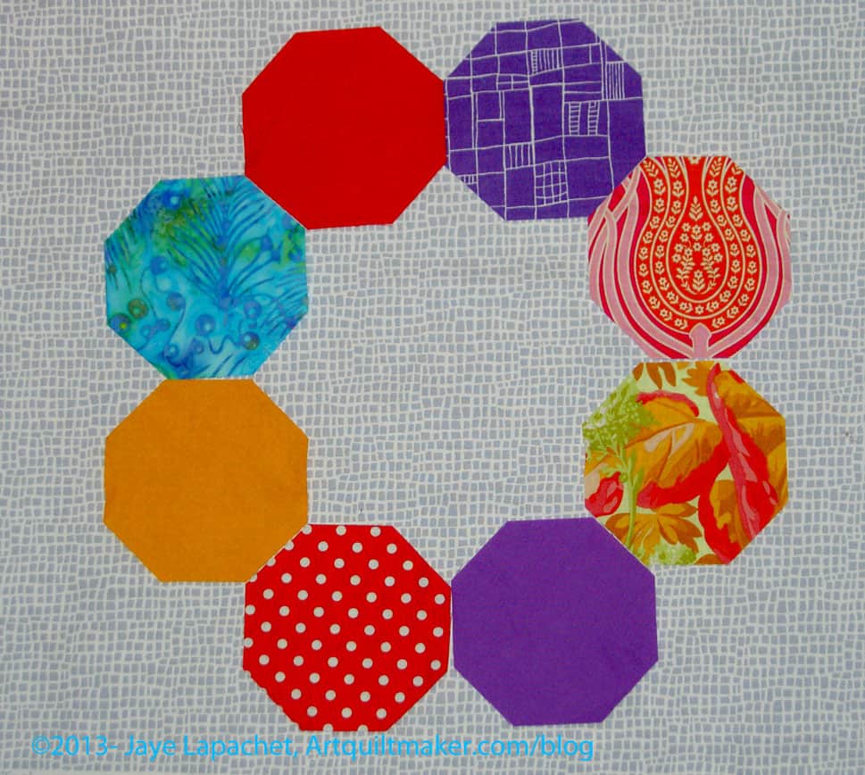
I thought I would have been able to choose a background from the previous post, but it wasn’t to be. It occurred to me to think about what I wanted. I do want the background to be a player. I don’t want it to just fade into the background, so to speak. I also don’t want it to overshadow the foreground fabrics.
So, I spent some time on Sunday pressing greys and trying different greys with my octagons. It meant that I didn’t sew, but it also meant that I was carefully and deliberately engaging in the process.
Grey Batik
Above is a batik that I bought at The Granary. It has a bit of blue in it. I thought it wouldn’t work, but I do like it. It gives movement to the background. The dark grey bits remind me of swirling fog.
Grey Batik
It isn’t directional, which is a bonus. The blue doesn’t show up very well in the photos.
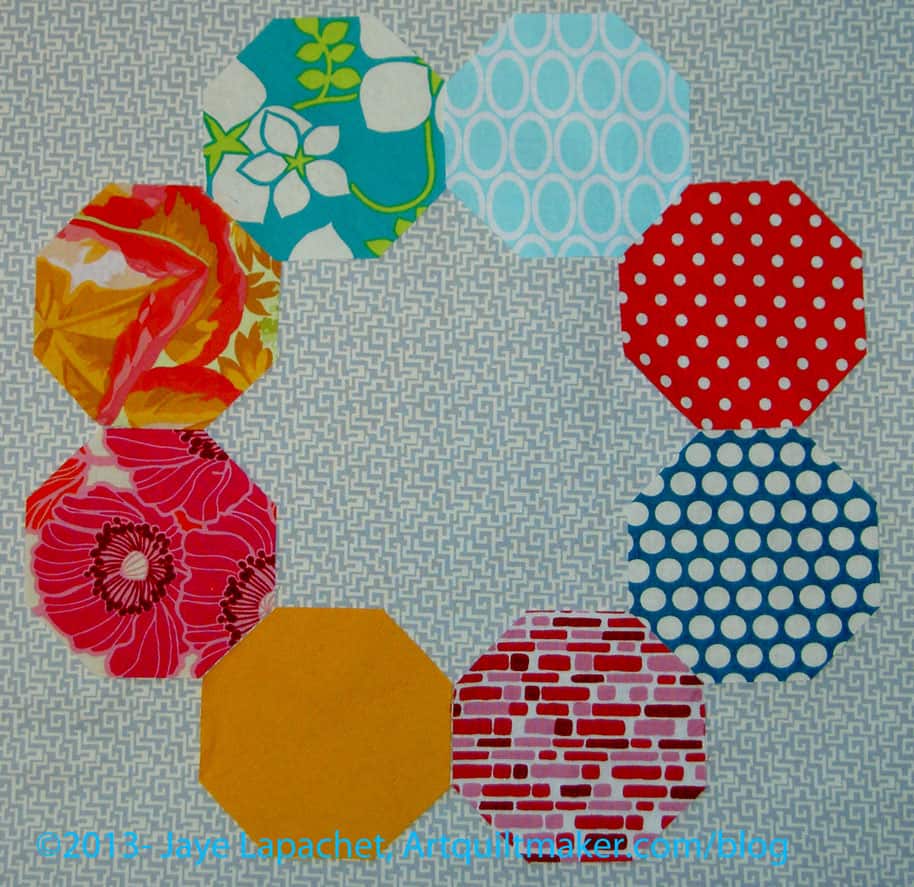
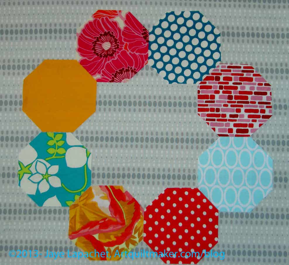
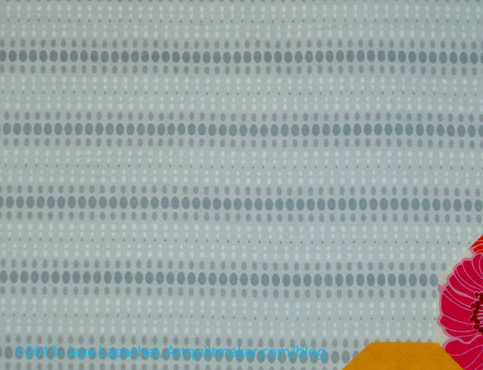
New Wave
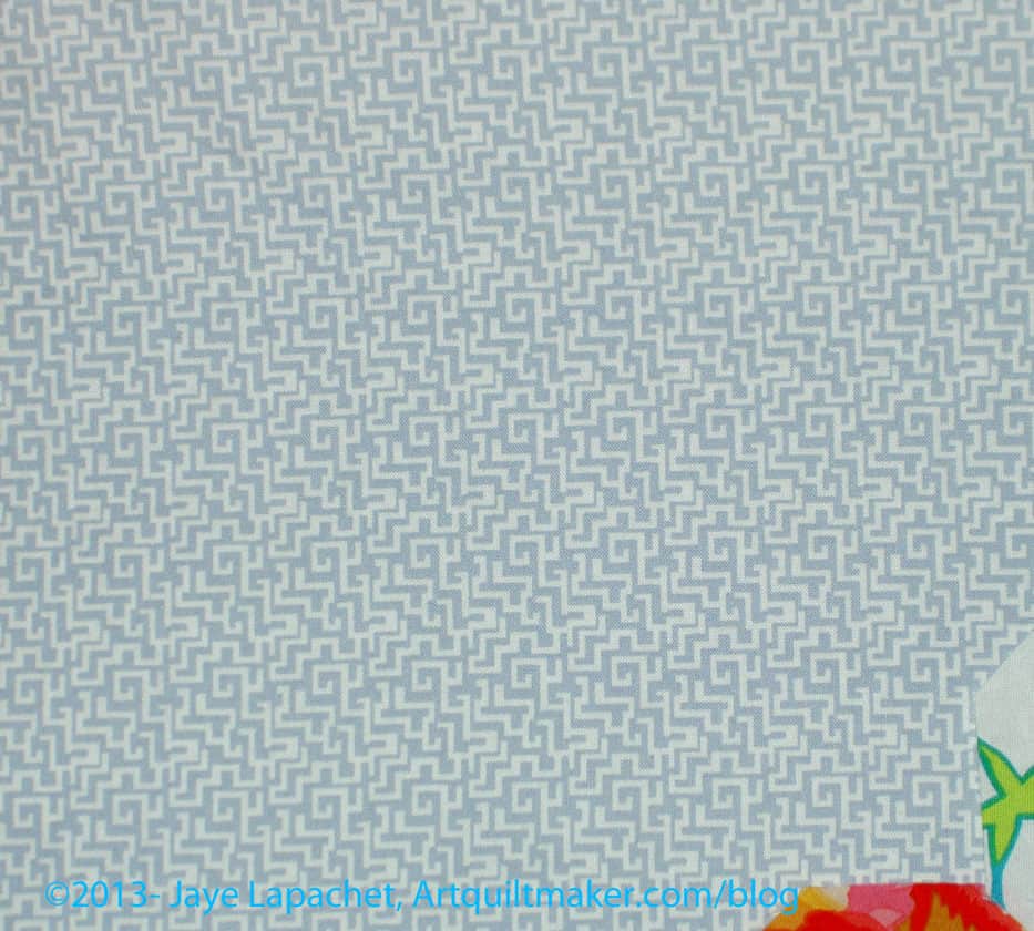
This background goes with the blue flower in the upper left of the photo above. It is from the same line. I may even have bought it at the same time. It is a true background, in the sense of it doesn’t add anything.
New Wave
Again, has a directionality, but I wouldn’t say it is directional — or the directionality wouldn’t look weird if the pieces were cut different ways.
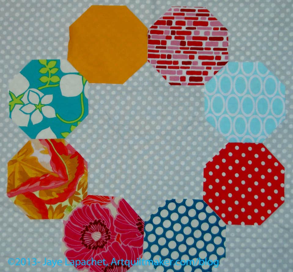
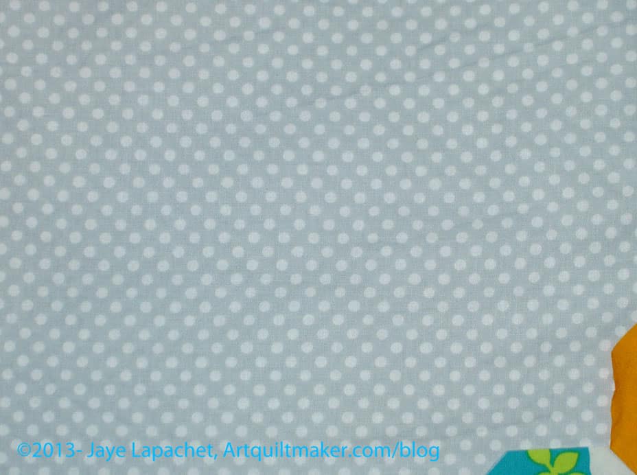
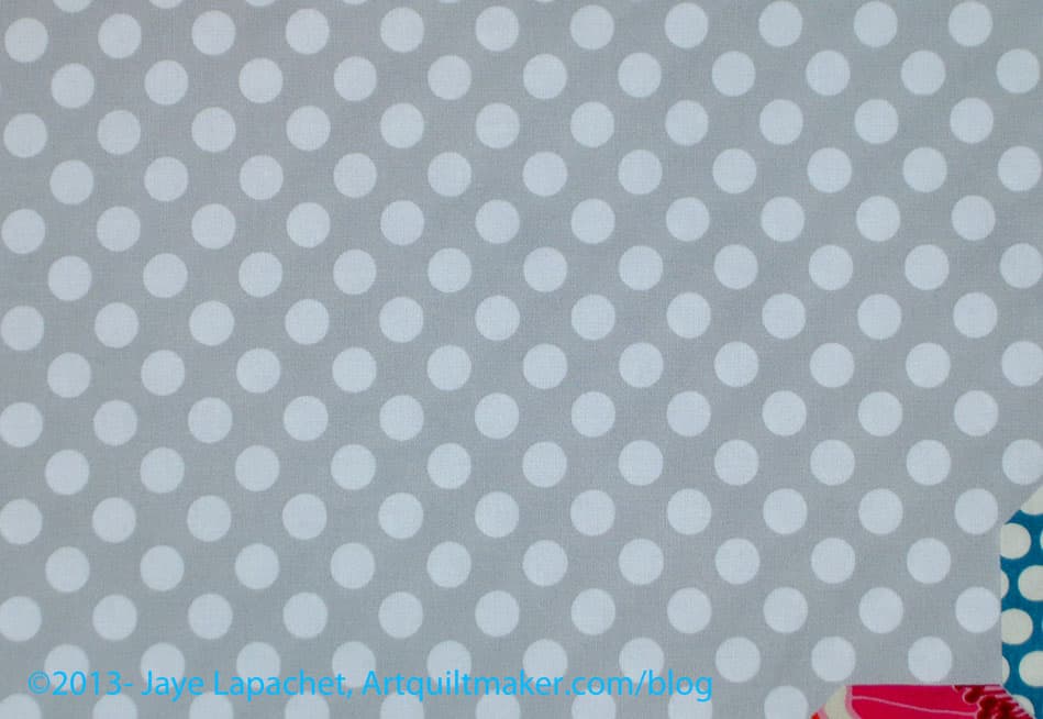
Grey Dot
Dots are always a safe bet. This dot is the right size not to interfere with the other dots, even the red ones.
Grey Dot detail
Not directional.
Angela Walter fabrics
I am not sure why I bought the amount (2-3 yards) of this. I think I was expecting the color to be a little different. Since I was pressing greys anyway, I decided to press this, but I don’t think it is appropriate for the project.
Angela Walter fabrics
Very directional. I don’t want to worry about the way I cut so that the lines of dots lined up. I am not sure I would want to worry about that.
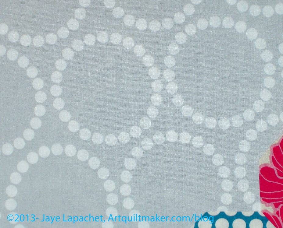
Pearl Bracelets Grey
Lots of movement. If the pearl bracelets don’t interfere with the foreground, then the fabric adds a lot of movement. I would err on the side of this being too busy for the piece, which is a little busy anyway.
Pearl Bracelets Grey detail
Not really directional. I only have a yard of this and would have to buy more.
Ta Dot Grey
I have a boatload of this fabric, because it is a good background and I had the foresight to buy plenty.
Ta Dot Grey detail
Not directional.
Between the the choices above and the previous choices, I think my favorites are below:
Grey BatikGrey DotP&B Happy Go Lucky Grey
Of the three above, I think the batik is the most likely. I don’t have enough of the Happy Go Lucky, and can’t get anymore so that doesn’t seem to be a real option.
The grey dot is perfectly fine, but doesn’t really add anything to the piece. If I decide I don’t want to add the movement I discussed above, then that fabric would be a good option.
That leaves the batik.
My SIL commented that I only showed the light blue on one of the backgrounds. This time, I used the same octagons for all the different backgrounds. I did rearrange them, however.
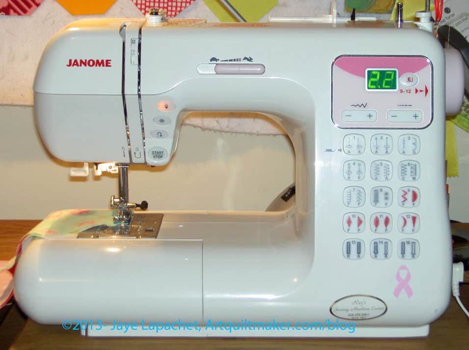
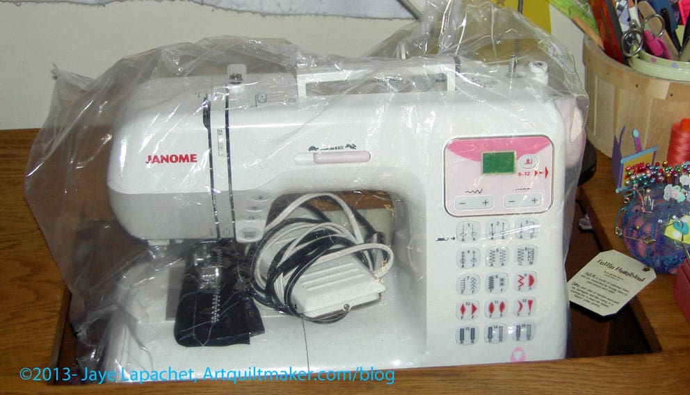
It is kind of funny how we come to feel about our tools. As I mentioned, I have a loaner machine. It is also a Janome, so my feet fit. It is a smaller model with a fewer number of stitches and no knee lift. I don’t know the model; there doesn’t seem to be a number or anything on it.
Loaner Janome
This is, generally, a nice machine. It sews quietly, the stitch is nice. It fits my 1/4″ foot, is easy to thread, has the needle up/down feature.
It isn’t my machine, though and it buzzes. It makes a loud-ish, electrical buzzing sound all the time. It sounds weird, but that might be part of why I felt out of sorts on Saturday. The machine was off most of the day on Sunday and I felt fine.
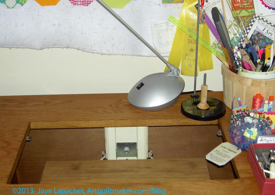
It also doesn’t fit well into my table, so I moved the pneumatic lift platform up to table top height and put the machine on top of it. I worried that my hands were going to hurt , but that didn’t happen.
Why You Should Care: It is always good to have information about different machines when you are going to buy a new one.
I spent the day Saturday doing laundry and working on four patches. I had really looked forward to a day in my workroom and, while I got that, I felt out of sorts. I am not sure why, but it just wasn’t the relaxing sew day I thought it would be. I sewed, but I didn’t enjoy it as much as normal.
112 Four Patches
Still, I made progress. I finished the 112 four patches that were part of the first sewing step in Charlotte’s Mystery quilt. I had started them last week or the week before, so about half of the halves were sewn. I needed to do the rest and I had to cut enough pieces to make them.I alternated cutting and sewing. It works better for me.
I have to figure out how and where to store these. I don’t have a good sense of when the next step will happen.
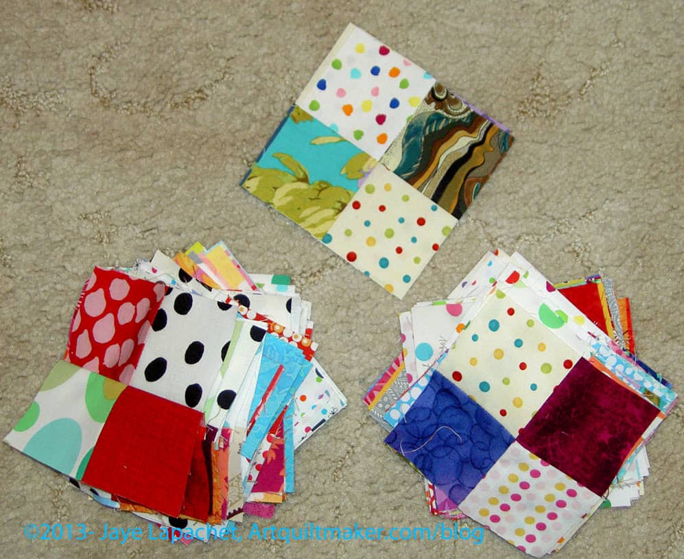
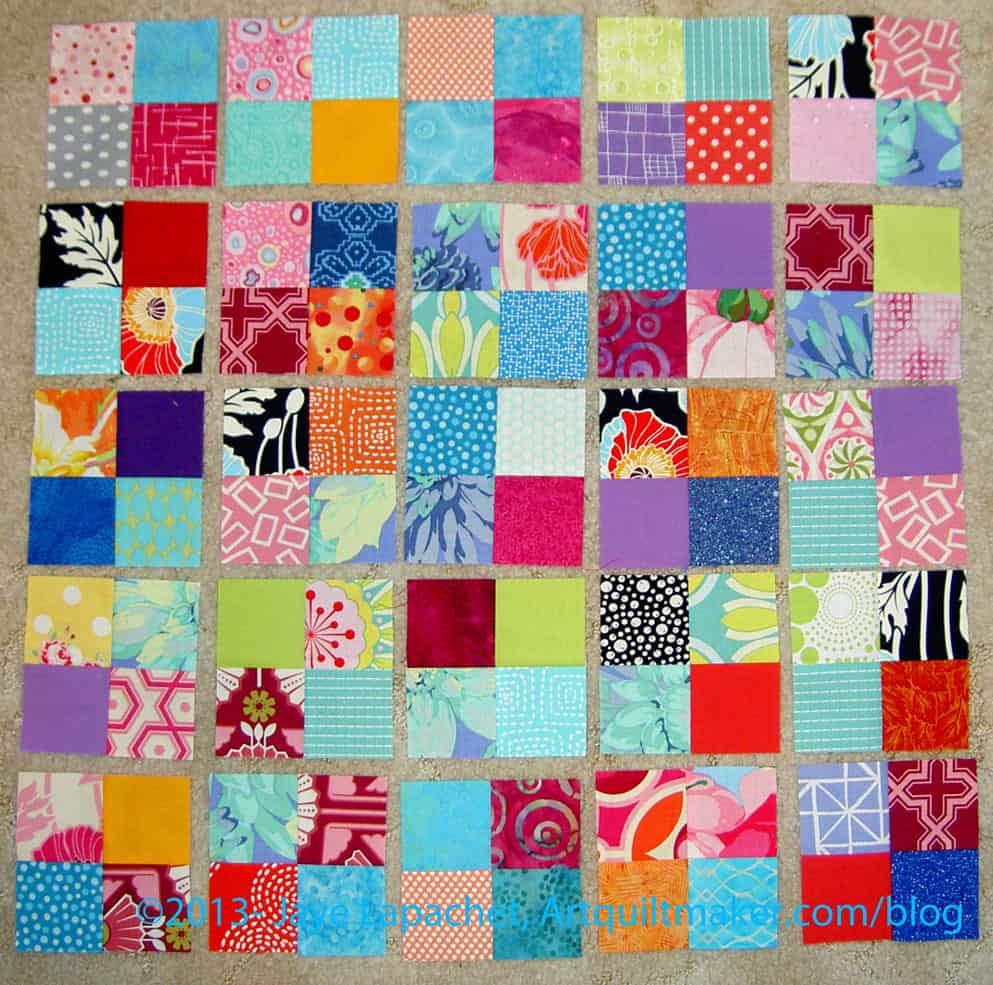
Example Four Patches
As you can see, my background fabric is dots. I figured I would use some of the dots I have been collecting sinc they are just sitting there waiting for a project. As I mentioned, I had to cut much of the background from yardage. I rummaged through my scrap bins as much as possible. Now, I am pretty much left with weird shapes and smaller than 2.5″ squares in many of the colors.
I have to say that part way through making the 4 patches, I was ready to make some larger blocks and see where I was going. I got a little sick of 4 patches, which is sad, because I really adore the simplicity of four patches. There is a lot one can make with a four patch as a base. I think part of what is going on is that I am not organized in my sewing room right now. I don’t have a good handle on the projects I have going. I know what they are, but I don’t have the steps in my head.
If you haven’t been following along, I went down to SoCal for a week and that trip, along with problems with my machine, kind of ruined my flow. I’ll get back into it; it is tough, though. Learn from me: sew or pet fabric every day.
Since I finished the 25 4 patches already as well, I think I am ready for the next step. I don’t see it posted on Sandy’s blog, so I guess I’ll get back to some cutting, of which there is plenty left to do.
Why Should You Care: You can see that it is possible to get work done even if your machine is out of commission and you have a loaner. You can also see that it is possible to create some organization, even in a scrappy quilt.
Once again, I am working on the background for the Russian Rubix. I know this seems like more drama than it is worth, but there are a couple of reasons, I am being picky:
White seems like an easy choice
Solid grey seems too boring and I don’t want to be depressed making it
I have to sew octagons together. I don’t want to sincerely dislike the background of a quilt that is difficult to piece
I don’t want the white in the foreground fabrics to bleed in the background and distort the look of the wreaths made up by the octagons.
I finally washed some greys and here are the choices I am contemplating:
Grey on White Batik
In no particular order, I am posting examples of the backgrounds I am considering. I like the movement of the grey on white batik. It does interfere with the light blue (bottom, center right).
Grey on White Batik detail
Above is the detail of the Grey on White Batik with only a little bit of other fabric for reference.
Painter’s Canvas from Magnolia Lane Collection by Laura Gunn for Michael Miller
This is my second favorite. It adds interest. It doesn’t interfere with the foreground fabrics. It isn’t boring.
Painter’s Canvas detail
I wish it weren’t so directional, though I think the directionality wouldn’t interfere with the design of the piecing. I could be wrong.
P&B Happy Go Lucky Grey
This my favorite. I love this grey. I have gone on and on about this grey and I am kind of angry that I didn’t realize I loved it when I had the chance to buy 1,000 yards. It is nowhere. I may call P&B and see if they have a bolt they will sell me.
I am worried I am just on the grey bandwagon and will sincerely dislike all of these quilts made with grey in 2 years.
Why Should you Care: you should care because of process. My thought process in the making of a quilt will give you some ideas of what to think about when you are making your next quilt. Maybe.
In reading Oliver Twist, the phrase ‘stow that gammon’ is uttered by the character of Mr. Sikes
Post the direct URL (link) where your drawing, doodle, artwork is posted (e.g. your blog, Flickr) in the comments area of this post. I would really like to keep all the artwork together and provide a way for others to see your work and/or your blog.
We are also talking about this on Twitter. Use the hashtag #CPP
The Creative Prompt Project, also, has a Flickr group, which you can join to post your responses. I created this spot so those of you without blogs and websites would have a place to post your responses.
The Sad Face is because of the ‘missing’ machine. Again.
I posted something similar on Twitter a few weeks ago. I wasn’t worried, because I was planning on being out of town and I could get the machine back relatively soon after I returned.
When I dropped the machine off, I clearly articulated that the machine was running by itself. In the imaginary universe a machine running by itself would be a good thing. You could line up a bunch of patches and go iron fabric while the machine sewed away. I am imagining household management a la Molly Weasley. Sadly, this is not the imaginary universe and, besides, I get a lot of pleasure out of feeding patches through the machine.
I always think it is important to tell the people working on my device or gadget what the problem is. I always thought they might want to know since I was asking them to fix it and they were taking my money for fixing the machine.
When I picked up the machine, the repair person was there and said that had told him about my machine running by itself. He gave me a new foot, assuring me that that would solve the problem. Famous last words, but you knew that was coming, right?
I got the machine home and it still ran by itself. I really thought I was losing my mind. I had a stressful week prior and thought that that may be contributing to my obvious insanity.
In reality, the intake person didn’t write any notes on my ticket, so the repair people just did a service on it. Service is great. The machine, you have to know, needed to be serviced in the worst way, but I don’t want the machine running by itself.
As you saw, the problem didn’t prevent me from sewing, but I couldn’t use the needle down function, because that had something to do with creating the problem. It also meant that I had to drive back to the shop, which is 50 miles from my house.
I had yesterday off work, so after a few fun things, I drove the machine down to the shop, then went out to lunch with friend Maureen. I called on Tuesday to tell them I wanted them to look at it right away so I could take it back home with me after lunch. As much as I enjoy having lunch with M, I’d really like to stay home and sew once in a while.
I called again late in the day. They said they couldn’t find anything wrong with it, so I went to pick it up feeling quite discouraged. The repair guy suggested I test the machine in the shop, so we set it up, he showed me how beautiful it was running and invited me to sew on it.
Immediately, I pressed the needle down button and it was like touching the ‘never stop’ switch. The repair guy’s mouth practically dropped open as he watched the machine run by itself. He looked at me and said that he had never seen the needle down sensor affect the running of the machine that way. He said he would have to call the company, so I would have to leave the machine again. Sigh.
Janome Loaner
He offered me a loaner, which I almost declined, but took at the last second. I don’t know what model this is, but it has a needle down function and uses the same feet as I have. I might just use my Jem. We’ll see if I can get along with this machine over the weekend. Who knows how long it will take to get my machine fixed and I hope it isn’t a $500 repair like it was when I had to have the screen replaced.
Why You Should Care: This is a reminder that you make sure the intake person writes down the specific problem. This is definitely a #firstworldproblem. I know that I am fortunate to have a machine, fortunate to have a backup and fortunate to have been offered a loaner. I am also fortunate not to have to take my machine by donkey to be repaired.
I succumbed to the Siren call of the mystery quilt. Just like Jason and the Argonauts or Odysseus or the sailors passing Die Lorelei, I couldn’t resist their call and am working on the Scrapitude Mystery Quilt.
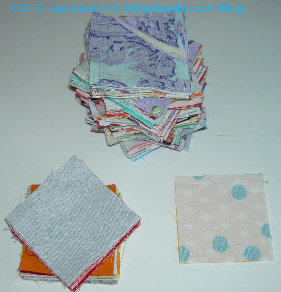
The Scrapitude Mystery Quilt was created by Sandy’s friend charlotte after the ladies in their guild begged. Sandy put out the [Siren] call and many of The Twilters joined in. I found an already cut batch of 2.5″ squares, so I joined as well. Lame reasoning, I have to say, because there are a whole bunch of other shapes I need to cut as well.
Scrapitude First 4 Patches
It turned out to be good, though, because I needed something easy where I could accomplish a lot in a short amount of time.
I only had about 3 hours to sew yesterday and was able to finish 25 four patches and make a huge dent in the 112 I still need to make.
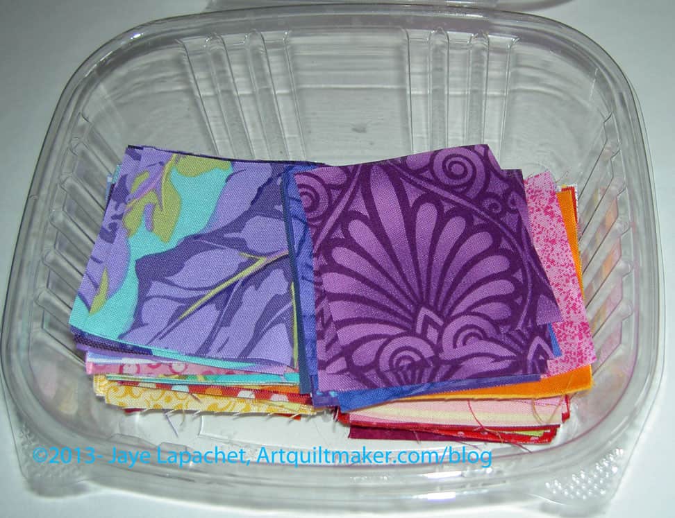
One of the first sewing directions was to make 25 four patches out of the foreground fabric (e.g. not the background). I found a container of 2.5 squares I had cut sometime ago and started out with those. I was able to make good progress and finish the first 25 pretty quickly.
2.5″ Squares
The next 112 would be a little harder and I knew that before even starting the sewing. Part of the difficulty was that I hadn’t, yet, picked a background. Fortunately there were enough dots with white backgrounds already cut to sell me on the idea of dots as a background. I toyed with the idea of blacks on whites, but went with the dots. There aren’t enough dots in my life ever. 😉
There were a lot of orange squares in the container, so, periodically, I rummaged through my scrap bins and cut some other colors. A lot of what I was cutting were greens. It is fun delving into my scrap bin. First, I use up scraps, which is always a bonus. Second, I enjoyed thinking about the fabrics through which I was rummaging and the original projects for which they were used. I found a lot of Philip Jacobs prints and joyfully cut those up to use.
112 4 Patches in Progress
Now I have about half of the 112 finished. I have had to use some yardage for the background, but I have plenty of dots, so it is ok.
Sandy has a tutorial on her blog on making 4-patches. Nonnie pointed out a very interesting 4-patch tutorial on the NZ blog, Bee in my Bonnet. I have not tried this tutorial and she doesn’t give sizes, so I don’t know how it works. It looks cool, though.
Why Should You Care: Perhaps you want to join in or use the directions for an activity for your guild?
Heat Rises by Richard Castle River’s Edge by Marie Bostwick Frozen Heat by Richard Castle Deadly Heat by Richard Castle The Murder Room by P.D. James
Yes, there is a lot of murder and mayhem going on in my reading life right now. The Heat books were all Kindle books, 2 of which I was able to borrow from the library. Since I haven’t been around much, the Kindle books are great for reading on the go. The last book is getting me back into the P.D. James/Adam Dagleish series. I am more interested in the character development of Dagleish than of the murder, really. Thus book is on audio. P.D. James writes mysteries that tend towards academic, but you get all the information and there are no loose ends, so I like them. I would have finished it during my trip last week, but Mom and I talk rather than listen to books.
Inspiration
Virginia, a CQFAer, sent an interesting thought: Pablo Picasso said: “The purpose of art is washing the dust of daily life off our souls”
Death Cab for Cutie Album Cover
Death Cab for Cutie is also providing some inspiration with their album cover for Narrow Stairs. The name of the album (do they call them that anymore?) looks like a selvedge. I wonder if they know? Is it a secret conspiracy to promote quilts? Thanks to Liesl Gibson of Oliver+S for pointing it out.
Fabric, Tools & Supplies
Look at these nice looking swivel clips! One of my frustrations with bag making is that the hardware isn’t that appealing. I was pleased to find this store so I can get some nice looking bag hardware.
Anna Maria Horner announced a new bag pattern recently. Some of the examples she shows are lush…a little over the top lush, but also a treat for hardworking women. The post also has some beautiful pictures and some of her life.
Iron Tote Pattern
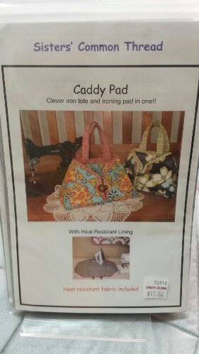
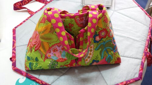
I might have mentioned that Friend Julie made an iron tote. I liked the idea so when I was on my way down to Super G’s house and happened to stop (ahem) in at Quiltin’ Cousins in Pismo Beach, I saw a pattern and, once Julie confirmed it wasn’t the one she used (she had trouble), I bought it. The pattern came with a piece of that insulated silver stuff. One of the things I liked about it was the fabric they used for the pattern. They used a Philip Jacobs-like fabric and Ta Dot dot for the straps and binding. Why didn’t I think of that?
I think I need to make one for myself. I don’t know that I will use it much, but I love the idea of a Philip Jacobs something that I can carry around.
Iron Tote Pattern Store Sample
I wanted to make it for my secret Santa at BAMQG, but that is not on her list, so, perhaps, I will have to make some for other friends. I have no comment, yet, on the pattern. I’ll let you know how it goes.
As a result, I don’t know what I’ll make for her. Perhaps a needle case? It seems so small, though it is on her list. I’ll think about it and come up with something to make it special.
On the Web
Thanks to Katie, we can now use the hashtag #qhc when we engage in quiltmaking. Researchers in Scotland have done a study on hobbies and speficially mention quiltmaking. The article in the Daily Mail online talks all about it.
I heard about a QuiltGuy retreat. Only guys? Do they go to quilt shops? Talk about their kids? There were some photos. Discuss amongst yourselves.
Awhile ago, I posted about my work on Chris’ start to the BAMQG Round Robin. Kathleen did a blog post recently about a start she worked on. I am posting a link so you can see more of the group’s work.
I love the quilting on the quilt on this post from Melody Johnson. There is something about the few rows of stitching in, what looks like, Perl Cotton that is simple and effective. I don’t visit Melody’s blog as much as I would like. Her colors are so fabulous.
If you want to be really impressed with some longarm quilting, check out this quilt, which was quilted by Kathy Perino. It looks like trapunto in some places. She does longarming if you need a quilt quilted….
Jill is always doing something interesting and now the ‘something interesting‘ is with wool and Perl Cotton. She even dyed some of the wool. I can’t wait to be retired. I should buy a lotto ticket.
Out and About
Thanks to Cathy Izzo at the City Quilter for these tips:
KATE STIASSNI OPENS AT THE ARTQUILT GALLERY·NYC Just opened in our gallery is Spaces in Between: Contemporary Textiles, 16 striking quilts by Kate Stiassni. This show will be up through October 19.
The Virginia Quilt Museum is having a fundraiser. Vicki Welsh turned me on to the antique looking, though newly made quilt. I can think of a few of you in whose houses this would look great. You can purchase chances through PayPal.
Luke Haynes et al will be showing quilts at the American Folk Art Museum in NYC call Alt Quilts. The show will be up from October 1, 2013 – January 5, 2014.I hope some of you are able to visit and will tell me all about it.
Purse Palooza 2013 started yesterday. Have you visited the Sew Sweetness blog to see the bag reviews?
Other
I was reading a blog post by Abby Glassenberg about having a successful craft blog (not getting into the art vs. craft of quiltmaking here or now!), which said that to have a successful blog, you should tell your readers why they should care about what you are writing. Sharing isn’t enough. I haven’t decided if I believe this yet, but I am going to try to figure out why you should care about what I am writing in each post. In the meantime, this post from the Creative Creativity blog is a good start when she says “you create what you consume.”
Why Should You Care: I write these Various & Sundry posts because I think it is good to expose you to things you might not normally see or read.
Sara of Sew Sweetness kindly asked me to participate in her Purse Palooza, as I have mentioned. Today is my day. Find my review on the Sew Sweetness blog TODAY! Go leave a comment so Sara knows how popular I am. 😉
A Day in the Park Backpack
I decided to, finally, make and review A Day in the Park Backpack Tote by Liesl Gibson. It is a few years old and I was relieved to see the pattern is still available at the Oliver+S website. I was pretty excited when I bought the pattern and I didn’t want you to get excited and then not be able to buy it. Also, it is about time I made it.
One of the reasons I bought the pattern in the first place is that I liked the verticality of this bag. Vertical bags are good for commuting as they don’t hit people when you walk up the stairs from the train. The size ended up being good-not so large that I would hurt my shoulder, but a nice size for commuting with a snack, a book, and a few odds and ends. Lunch wouldn’t fit unless it was bills in your wallet. 😉
First off, the look of this pattern reminded me of the Vogue and McCall’s patterns we buy to make clothes. I am not surprised as Liesl Gibson designs children’s clothes. I don’t think she has created many bags or small accessories.
The pattern is in a paper envelope with newsprint instructions. The pattern pieces are printed on tissue-type paper. I am always a little scared of the tissue paper patterns as I am afraid they will rip and be useless. I find it interesting how pattern expectations (plastic envelope with folded 8.5″ sheets inside) have changed since I bought this pattern.
Sara suggested a couple of ideas to get the review started. I don’t have any problem finding things to say, but I thought these were good ideas, so I will include them. Sara asked:
What fabric/supplies were needed to make the bag?
What did you think of the illustrations and instructions?
Did you make any modifications to the pattern?
What Difficulty Level did you think this pattern was at?
Fabric and Supplies
There is a complete fabric and supply list that includes 11 items. You will use all of them if you make the bag as directed. I didn’t find this to be a bag you can decide to make at 11pm on Saturday night and finish to take to brunch with friends on Sunday morning. There are some specialty hardware items that I don’t keep around. I made a special trip to Britex to purchase most of them and Britex is not open at 11pm on Saturday night. 😉 I am sure they are also available online.
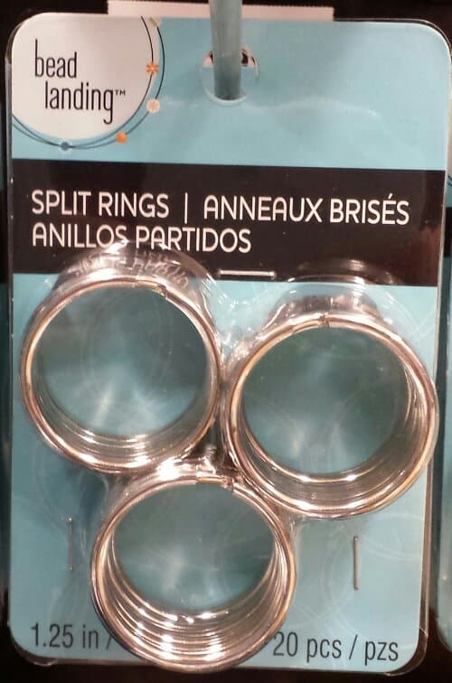
I found it difficult to find the O rings required for the pattern. I ended up buying two key rings that were on sale at Joann just in case. After visiting 3 stores and multiple online sites, I ended up using them. They were a little small so make sure you buy O rings on the large end of the spectrum described on the package instructions.
O Ring Option
I found this package in the beading aisle at Michael’s, which was another option. I didn’t really want to buy 20 O rings, though. I don’t plan on making 10 of these bags.
In the finishing process, DH was helping me with the rivets. I told him about the O ring problem and he suggested a hardware store. He said Home Depot and Lowe’s are more home improvement and don’t have much hardware, but a real old fashioned type hardware store where you can buy individual pieces of metal thingy-ma-bobs might be a good source. I’ll have to check it out. I have heard of other quiltmakers finding supplies at hardware stores, but I never think of it.
Additional Supplies I Used
Aurifil 2250, a red, for the top stitching.
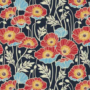
Free Spirit/Joel Dewberry Notting Hill Midnight Poppies (this is home dec weight)
Soft & Stable (instead of the canvas for the interfacing)
Good Morning by Me and My Sister for Moda (same fabric I used in the Star Sampler) for the lining
Pellon #100R Vinyl Fuse for the base
Shape Flex fusible interfacing
Saral paper to transfer markings from pattern to fabric. You might need two colors if you use a light and a dark. I wrote a post about Saral Paper that gives more information.
Directions
My first thought about the directions were that they were long and confusing. I always think that, though, because it is hard for me to read through the directions of something and understand what they mean until I start working through the steps. I am much better at figuring things out or being shown techniques BUT the former strategy doesn’t work for bags and the latter wasn’t available.
In the end, I thought there were a few things that could have been improved on the directions, but, in general, the directions were good.
There is a nice little chart that tells what to cut out of which fabric. In the chart, they list Primary Fabric, Contrast Fabric, Lining, Canvas. One immediate problem was that I didn’t know what pieces of the bag were going to be made out of which fabric. The section titled “Materials Needed” cleared that up a bit, but I was still unsure how the canvas (used for stabilizer) would be used until I read much further down the directions. I would have liked more of an explanation of the whys and wherefores of the fabric/supplies choices as well as a list of possible substitutes. For example, I would have liked to have known why the designer chose canvas rather than another kind of stabilizer. Look and feel? Weight? Availability? Cost?
It occurred to me that the pattern might not have been appropriate places for the whys I needed, so I went to Flickr and searched for “A Day in the Park” backpack. I found a Flickr group of these bags. You can get a good idea of the placement from the random photos and the photos in the group. I got a better idea of what pieces belonged in which fabrics. Hooray for Flickr! Nota bene: Please note that I said a better ideanot that I knew exactly. There was some variation in the way pieces and fabrics were referenced, or, at least, in the way I understood them to be referenced. I would like to see the different supplies referred to in the same way on all of the pieces, the chart, the supply list and the instructions.
I didn’t find much on the Oliver+S blog through web searches, but there was a post about why she created the pattern (sewing class). I did see that shops who are teaching classes could, at the time (don’t know about now), purchase packs of the hardware along with the pattern. While that would not have worked for me, I could have called to see if the packs were available for purchase by non-wholesale customers.
I also saw one forum post, which had some helpful information about making the straps. I didn’t explore to see if there were more posts.
Joel Dewberry Notting Hill Pristine Poppy (midnight)
Once I decided which fabric to use (Joel Dewberry Notting Hill Midnight Poppies, home dec weight), and after I washed it, I got started on the cutting. The cutting was a bit daunting, like the Petrillo Bag, simply because there are a lot of pieces involved. [Nota bene: when I cut out the second one, I cut the main fabric, then the lining and stabilizer fabrics that went with that main fabric piece and the cutting seemed less daunting.] I persevered and found the chart of how much of each fabric, etc. to cut to be very helpful. I was able to use it as a check to ensure I had enough of everything cut properly.
Making the Petrillo Bag was still fresh in my mind, so I decided use some of the supplies from that project. Since I didn’t have the canvas and don’t like floopy bags, I decided to use Soft & Stable instead of the canvas. I knew I was taking a risk. I usually like to make things as per the instructions the first time through, then start making changes if I make the bag again. I have enough bag making experience and I wasn’t doing anything completely crazy, so I decided it wouldn’t be completely crazy to use Soft & Stable.
The other thing I did was use iron-on vinyl for the base. I have been wanting to do it for the bottom of bags for awhile and this was a good opportunity. Pam did it first and gave me courage. The Base pieces on the A Day in the Park Backpack tote were small, so it was a good test. They came out pretty well, but, mid-process, the vinyl was stickier than I expected. I used Pellon #100R Vinyl Fuse. I used an applique pressing sheet on my ironing board and the vinyl release paper on the top. If I had been able to find my second applique’ pressing sheet, I would have used that on top. Nothing came off on my iron. Remember to cut the Base piece a little large, apply the vinyl, then trim the fabric with vinyl to the size of the pattern. This will avoid any issues with shrinkage.
I lined all of my lining pieces with Shape Flex fusible interfacing,to help prevent floop. Floop is bad on the lining also, because it means that the inside pockets aren’t strong enough to hold your stuff, and pens, etc can flip out of your bag. I felt that having iron-on interfacing would work fine and give the pieces some added body. It also saved me time and used a product I already had on hand.
I also didn’t want to baste all of the pieces I needed to cut. I used the WonderClips to help prevent the need to baste. They are too thick to sew over, but keep all the layers together with no problem.
I don’t think the main fabric really needed interfacing since I was using home dec weight fabric, but I put it on anyway. I haven’t used a lot of home dec fabric, so I was not 100% confident. As I said, there is very little out on the web about this pattern so I didn’t have a lot of information and experience to choose from when looking at what other people did. FreeSpirit and Joel Dewberry both replied to my question about washing the home dec fabric, which was GREAT!
Instructions
I thought the instructions were detailed enough. The way the pattern is written makes it clear that there is a certain level of knowledge expected. I would make several bags, including something as complicated as the Petrillo Bag before tackling this bag. In the blog post I referenced above, this pattern is designated as an advanced beginner pattern. I think that is optimistic. Not to discourage beginners, but there are a lot of steps, a lot of supplies, including a zipper, and sewing through many, many layers. I’ll defer to Liesl Gibson, but would categorize this pattern as Intermediate.
The instructions were a little hard to follow. I think they needed a bit more testing by random makers with a variety of intermediate to advanced experience. The more I got done, the easier it was to navigate through the pattern, but the designer should revise it for consistency with terminology and add some additional explanation, especially at the beginning.
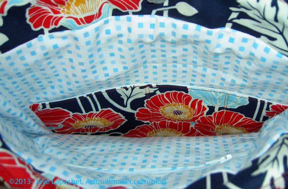
Inside A Day in the Park Backpack Tote
The instructions didn’t say how to put in a zipper (I don’t necessarily think they should), so make sure you know how to do that before starting the bag. Instead of making a zipper pocket, you could make two of the lining panels with the appliqued pocket. I do think that the directions for the appliqued pocket don’t tell the maker how to apply it in a nice way. The finishing isn’t very nice looking and I went around the pocket twice to make sure that it stayed on, if I put something heavy in it.
The fabric I used for the interior wouldn’t necessarily be my first choice again. I like it, but it frays. Definitely use a light colored fabric for the inside of your bags when making your own. A light colored lining makes it much easier to find things in the bottom of your bag. I am using a black on white for the second version.
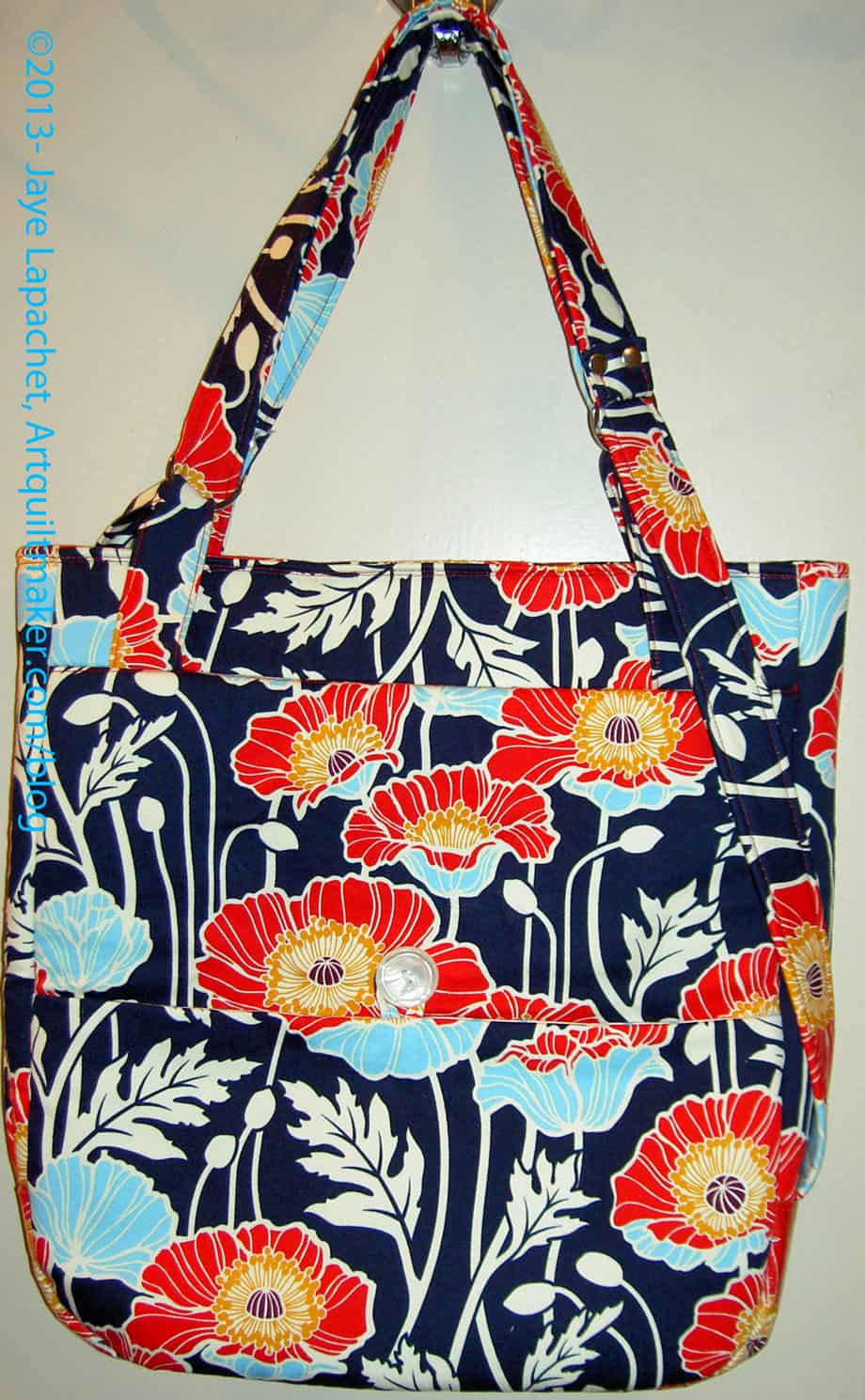
Finished A Day in the Park Backpack Tote
I am pleased with how the bag came out.
Things I Liked
No errors in the pattern
Shape of bag
The directions on how to make the zipper pocket. It came out really well
If I Made this Bag Again
I would try it with the canvas as the stabilizer
I would eliminate the facing and magnetic closure at the top and add a flap instead
I would add a larger pocket, such as a file folder pocket on the back
I would add a messenger bag type strap and not make the backpack straps
I would use a slightly larger seam allowance on the lining as cutting it per the instructions make it a bit large for the size of the outside of the bag. Alternatively, I could cut the pieces a little bit smaller
Leave a larger opening in the lining to turn the bag, especially if I used the Soft & Stable again. The Soft & Stable takes up more space and was kind of a problem to turn using the opening size indicated in the pattern
The lining bottom is made of two pieces sewed in the middle. I would try to cut one entire piece rather than two pieces. It is the lining, so who really cares, but I think it would look better and be one less step
Modifications to Materials
Iron-on interfacing (Shape Flex) instead of basting on interfacing
Soft & Stable instead of canvas
WonderClips instead of basting
I have already started a new version of this bag with the modifications described above. I am not very far along, so stay tuned.
Thanks to Sara for inviting me to join Purse Palooza. I really appreciated the opportunity to make a bag that had been on my list for awhile and write about it. Check out the other bags that will be shown in the next two weeks.