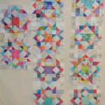
Fabric of the Year 2015 Layout Continues

FOTY 2015 - Layout 4/17/2016
FOTY 2015 – Layout 4/17/2016

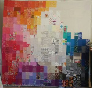
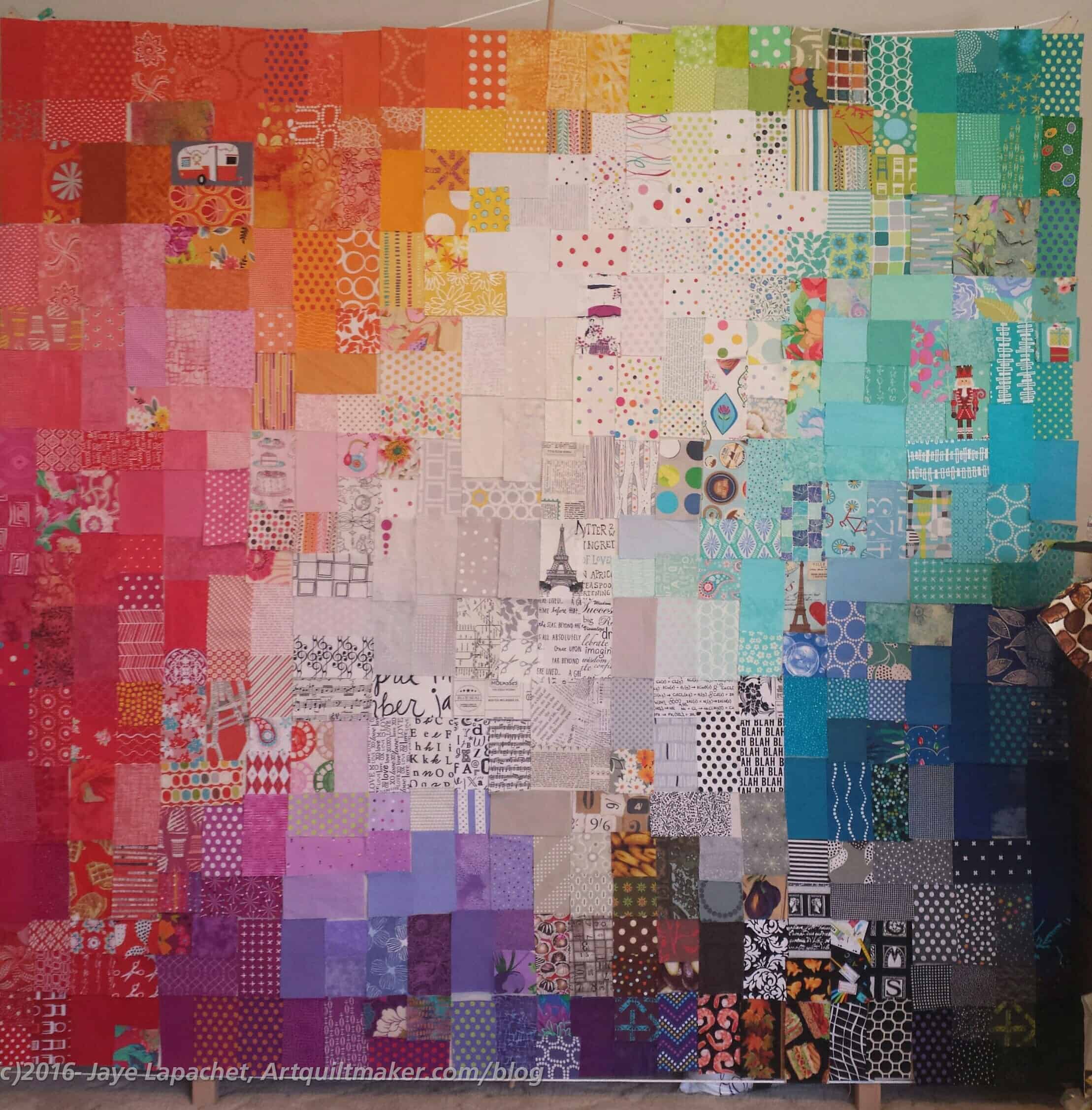
I achieved my goal of getting all of the patches onto the wall last Sunday. I was also able to start rearranging the patches into their final positions. To be honest I have about 5 patches that will not make it on to the front of the quilt. They will have to go on the back. Normally, I wouldn’t do that, and I don’t really like it, but I would have to cut about 22 additional patches in order to fit them into the quilt. I think putting 5 on the back is the lesser of two challenges. Also, the process is evolving and I am thinking of this as evolution.

As per usual, there are patches that are not in the right place. Moving the left side around gave me the advantage of putting that section into better, not perfect, but better, shape than it would be normally.

If you have ever tried to blend (gradate? Colorwash?) commercial fabrics into each, you will know it is not an easy task. It is a struggle and I am at the point where I wonder why I do it. Still, I see the value and will continue on.

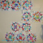
Carpenter’s Wheel Layouts #2

In between other things going on here in the Artquiltmaker Workroom, I wrote the book review of Scraps Inc. As you may have read, I was lukewarm about the book in general, but everything can provide some inspiration.

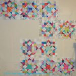
Carpenter's Wheel Layout #8
Carpenter’s Wheel Layout #8

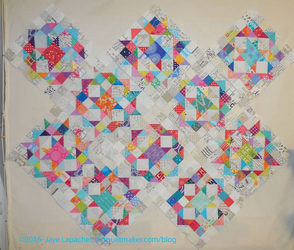
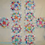
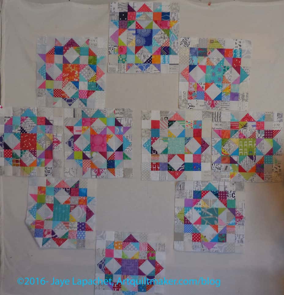
One quilt (from the related blog post) that I didn’t think should be included in the book** provided inspiration for the Carpenter’s Wheel layout, however. I don’t think I have quite enough blocks to make this layout work. I can’t really tell since the design wall isn’t large enough to give me a good sense and the proportions of this layout are off. I might try it on the living room floor since I can see it from the upstairs hallway.

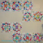
Carpenter's Wheel Layout #9
Carpenter’s Wheel Layout #9

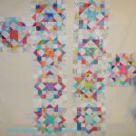
My SIL suggested a regular on-point 3-2-3 layout. I tried it. This might work without the bottom two blocks, but with those two blocks, it looks crowded and odd. If I do this layout, what will I do with the bottom two blocks?

I have more work to do on this piece, so stay tuned.


**Nota bene: There is nothing wrong with the quilt and it is very modern, but it uses very few scraps, thus I didn’t think it fit the definition implied by the book. YMMV.

Problem Children

In every version of the Fabric of the Year concept, there are problem fabrics. Every year I have crammed them into some place, usually a place that didn’t quite work. This year might be different.

FOTY 2015 - Problem Children
FOTY 2015 – Problem Children

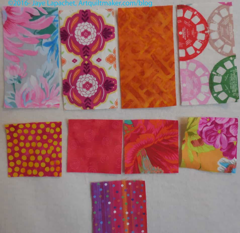
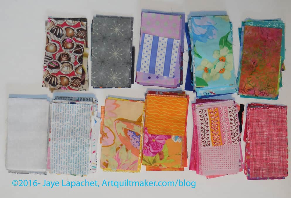
The problem children this year have varying degrees of problems. all of them should get into the quilt, to be faithful to my rulers. Some of them will get in to the quilt, perhaps all. I am not making myself any crazier than I already am this year.

You might look at these fabrics and think I am a wimp. In some cases, I might be. The Philip Jacobs print (2d row, 2d from right) will probably fit nicely between the reds and pinks. The pinky red next to it should, too, but it is just off enough to have no compatriots in either pink or red.

The top row’s fabrics are the real demons. What color is that gold (top row, 2d from right)? Yes it is gold, but is it more brown than yellow? ERGH!

The big prints and modern prints like the Cotton & Steel Viewmaster fabric are real problems. They do not lend themselves to being blended in with any other fabrics. I constantly move them from white to color and back.

I will put as many of them on the front as I can, but the rest will go on the back. I just cannot make myself crazy.

Creative Prompt #360: Diamond

An American retired professional wrestler, fitness instructor, motivational speaker and actor.

diamond in the rough

girl’s best friend

Hope Diamond

drill bit

Definition: “In mineralogy, diamond (/?da??m?nd/ or /?da?m?nd/; from the ancient Greek ?????? – adámas “unbreakable”) is a metastable allotrope of carbon, where the carbon atoms are arranged in a variation of the face-centered cubic crystal structure called a diamond lattice. Diamond is less stable than graphite, but the conversion rate from diamond to graphite is negligible at standard conditions. Diamond is renowned as a material with superlative physical qualities, most of which originate from the strong covalent bonding between its atoms. In particular, diamond has the highest hardness and thermal conductivity of any bulk material. Those properties determine the major industrial application of diamond in cutting and polishing tools and the scientific applications in diamond knives and diamond anvil cells.

Because of its extremely rigid lattice, it can be contaminated by very few types of impurities, such as boron and nitrogen. Small amounts of defects or impurities (about one per million of lattice atoms) color diamond blue (boron), yellow (nitrogen), brown (lattice defects), green (radiation exposure), purple, pink, orange or red. Diamond also has relatively high optical dispersion (ability to disperse light of different colors).

Most natural diamonds are formed at high temperature and pressure at depths of 140 to 190 kilometers (87 to 118 mi) in the Earth’s mantle. Carbon-containing minerals provide the carbon source, and the growth occurs over periods from 1 billion to 3.3 billion years (25% to 75% of the age of the Earth). Diamonds are brought close to the Earth’s surface through deep volcanic eruptions by a magma, which cools into igneous rocks known as kimberlites and lamproites. Diamonds can also be produced synthetically in a HPHT method which approximately simulates the conditions in the Earth’s mantle. An alternative, and completely different growth technique is chemical vapor deposition (CVD). Several non-diamond materials, which include cubic zirconia and silicon carbide and are often called diamond simulants, resemble diamond in appearance and many properties. Special gemological techniques have been developed to distinguish natural, synthetic diamonds and diamond simulants.” (Wikipedia)

Diamond offers a complete multimedia solution featuring AMD Radeon graphics cards, TV tuners, USB display adapters, video capture devices, sound cards, modems, etc

The term diamond is another word for a rhombus. The term is also used to denote a square tilted at a angle.

The conditions for diamond formation to happen in the lithospheric mantle occur at considerable depth corresponding to the aforementioned requirements of temperature and pressure.

Diamond is a resource from vanilla Minecraft. It is found underground on layers 1-16 as Diamond Ore, as well as in chests in dungeons or abandoned mineshafts. As rare and precious items, diamonds are used for many middle-to endgame items.

Neil Diamond

solitaire

Diamond Pistols

The Diamond Empire

blood diamonds

Simon Diamond was inducted in 1995; PCW (Pennsylvania Champion Wrestling) United States title winning a Steel Cage Battle Royal (December 27, 1996)

diamond mining

Diamond Age by Neal Stephenson

Diamond no Ace

HTC Touch Diamond2

Diamond City is a city appearing in the WarioWare series. Wario claims that it is “his city” that he has made into a “sparkling gem of a metropolis.” Here, Wario and his friends have parties, and most of them reside here. It isn’t clearly known where Diamond City is located.

Diamond Resorts International

Diamond Naturals dog food

A song recorded by Barbadian singer Rihanna for her seventh studio album, Unapologetic.

A fictional character, a superhero that appears in the NEW-GEN comic books

Diamond grape – A white grape which is a cross between the Concord and Iona grapes.


Definition: “A diamond (from the ancient Greek ?????? – adámas, meaning “unbreakable”, “proper”, or “unalterable”) is one of the best-known and most sought-after gemstones. Diamonds have been known to mankind and used as decorative items since ancient times; some of the earliest references can be traced to India.

The hardness of diamond and its high dispersion of light – giving the diamond its characteristic “fire” – make it useful for industrial applications and desirable as jewelry. Diamonds are such a highly traded commodity that multiple organizations have been created for grading and certifying them based on the four Cs, which are color, cut, clarity, and carat. Other characteristics, such as presence or lack of fluorescence, also affect the desirability and thus the value of a diamond used for jewelry.

Perhaps the most famous use of the diamond in jewelry is in engagement rings, which became popular in the early to mid 20th century due to an advertising campaign by the De Beers company, though diamond rings have been used to symbolize engagements since at least the 15th century. The diamond’s high value has also been the driving force behind dictators and revolutionary entities, especially in Africa, using slave and child labor to mine blood diamonds to fund conflicts. Though popularly believed to derive its value from its rarity, today, annual global rough diamond production is estimated to be about 130 million carats (26 tonnes),[1]” (Wikipedia)

Post the direct URL (link) where your drawing, doodle, artwork is posted (e.g. your blog, Flickr) in the comments area of this post. I would really like to keep all the artwork together and provide a way for others to see your work and get familiar with your blog or website.

The Creative Prompt Project, also, has a Flickr group, which you can join to  post your responses. I created this spot so those of you without blogs and websites would have a place to post your responses.

We are also talking about this on Twitter and Instagram. Use the hashtag #CPP
Fabric of the Year 2015 Continues

I worked a lot on the piece over the weekend as well as on and off during the week. these blog posts are a little behind my actual process, so you can follow me on Instagram (check the sidebar) for more up to the minute news.

Even though I was on the fence about this year’s edition, I am enjoying the process. This is the ultimate in scrap quilts, even if the scraps were cut from yardage specifically for the process. Perhaps, more accurately, it is the ultimate in charm quilts.

FOTY 2015 - First Pass
FOTY 2015 – First Pass

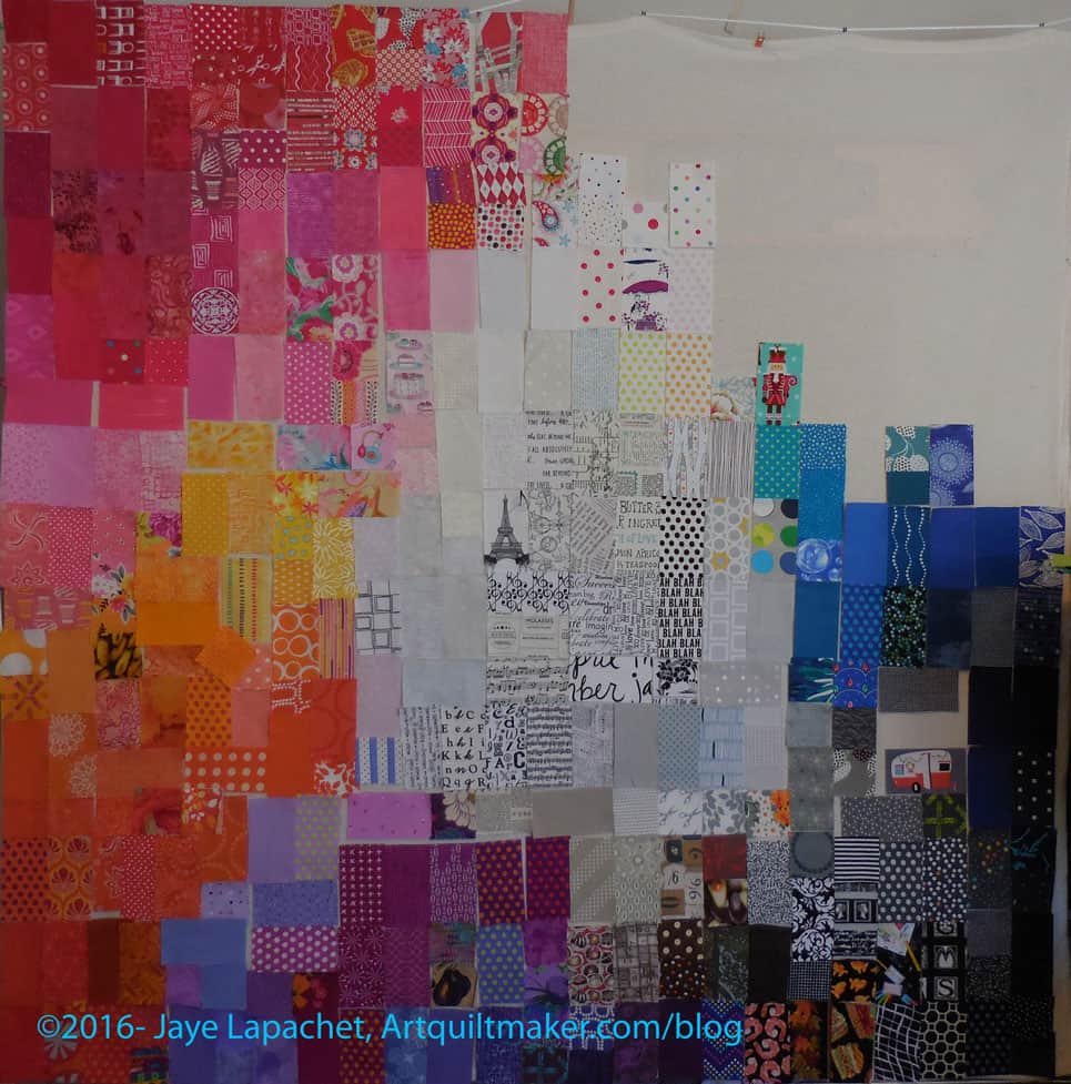
I thought my first pass was really good, but as I walked around and past the design wall, I realized that the transition from dark to orange wasn’t working. I looked at FOTY 2013 and saw that I had transitioned from dark to red. That meant moving all of the pieces on the left side and reversing their positions.

Sigh.

I am trying to enjoy the process, a constant battle because the next project is always newer, fresher, more fun. Moving a few hundred pieces was not my idea of a fun day. That dreaded “it will be fine” phrase popped into my head and I knew I had to just start taking pieces off and repositioning them.

FOTY 2015 - Off and Back On
FOTY 2015 – Off and Back On

This exercise actually turned out to be a good one. I was able to restack the color groups and think about them again. I looked at the pieces in each color group in relation to each patch. I used it as a way to further refine the layout while the patches were off the wall.

FOTY 2015 - After the Swap
FOTY 2015 – After the Swap

I think this was valuable, as the left side looks a lot better, not only because the red is at the bottom and lighter colors more towards the top, but because the placement of patches within each color family is better.

My next goal is to get all the patches on the wall.

Carpenter’s Wheel Layouts #1

Lots of design work going on in my workroom.

Before I allowed FOTY 2015 to take over my design wall, I did a little bit of layout design with the Carpenter’s Wheel blocks. I don’t want the layout to be a straight block layout. I am willing to piece a bunch of low volume alternate blocks if I need to (rote sewing- YAY!). I only have 10 blocks, which adds to the design challenge.

Color Group Donation Quilt

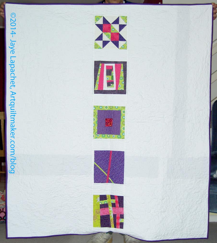
I was first thinking of designs that were similar to a donation quilt that Kathleen and I made. It was all Kathleen’s idea, but I happily went along. Donation quilts, as I have said about 12 million times, are good for trying out new ideas.

I wanted to stretch myself with these blocks. I like the linear effect of the donation quilt and wondered what I could do with the Carpenter’s Wheel blocks that would give the same effect?

I tried out different linear type layouts. Of the above, #1, #6 and #7 are my favorites. I like the idea of giving these blocks some space and all of these layouts give the blocks space. That might not be the case with alternate blocks made up of low volume prints, however. I might be able to mitigate it by not including any patches that have a large concentration of black. We’ll see. I may need to do a test block.

#1 is a bit too symmetrical and I wonder if that layout is not stepping out of my comfort zone enough?

Back to the design wall, I think.

Fabric of the Year 2015 Starts

I posted a beginning layout photo to Instagram and one reader (is that the right word for Instagrammers who follow your feed?) asked if I knew it was 2016. I politely explained that I was working with the patches from last year and hadn’t quite started 2016’s version yet. Unlike you, dear reader, s/he does not read the blog and doesn’t know how this project works. ?

I have to admit that I almost gave up on putting this one together. I just felt like I didn’t have it in me, which is why it is April and I am just laying out the pieces now.

There are a few reasons. My design wall is the primary one. It is too small and I have just complained about it in my IRL circles rather than doing anything about it. I AM going to do something about it soon. I have a plan and having a plan means that I can execute that plan.

Next reason is that the project is feeling a bit stale. I don’t think it really is, but it feels that way to me. Part of that feeling probably came from having three of the quilts rejected from QuiltCon. I keep telling myself that clearly the people who did not jury in my quilts cannot appreciate the work that goes into them.

Third, I have a lot of projects on my plate and that I want to make. Doing one that is similar to the seven others I have made seems futile.

However, it is an excellent mind puzzle and color exercise, so I am back in the saddle and I have given myself until April 26 to get the piece laid out.

Sorted color piles
Sorted color piles

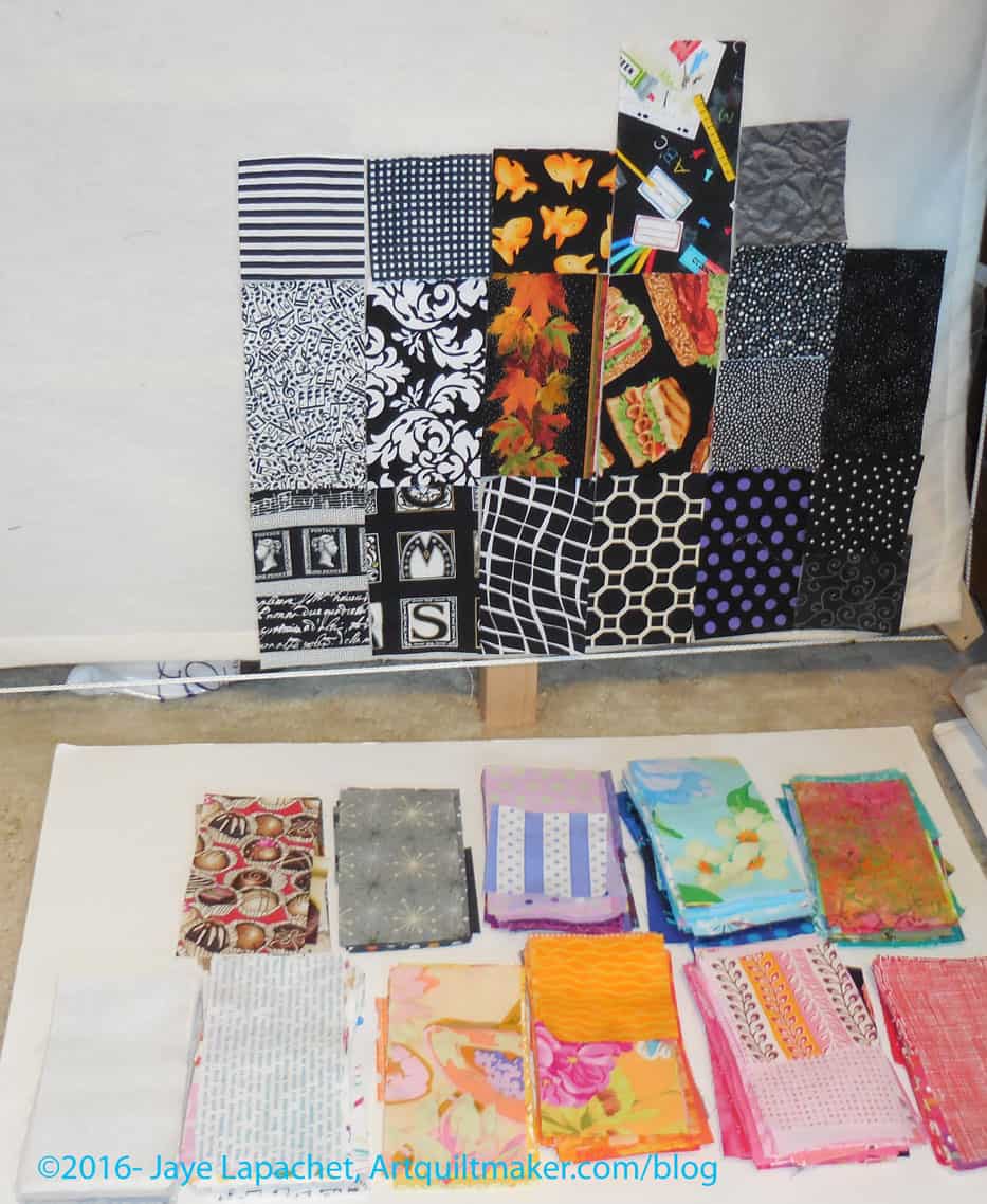
The first step is to sort all the pieces into general color piles: all the blues together, all the reds, etc. Normally I have several plastic boxes with patches, but this year, I used a large Recchiuti box and all were in one place. This step gives me an idea of how many patches in each color I have to work with.

The first challenge is to get all the pieces on the design wall. I can do some basic laying out before all of them are on the wall, but I can’t refine the placement without seeing the whole piece.

Starting the layout
Starting the layout

As of this writing, the patches are not all on the design wall. Since time is ticking, I need to work on getting that particular step done. It starts with putting a few patches in one color up and then the next. Making them all fit on this subpar design wall is the key. I am determined not to trim them all this year, like I did last year, even if I have to layer the pieces more than I would usually.

FOTY 2015 - First Pass
FOTY 2015 – First Pass

When I finished a good chunk of the layout, the above photo shows my first pass.


Midi Bag Class

Midi Bag in progress - full
Midi Bag in progress – full

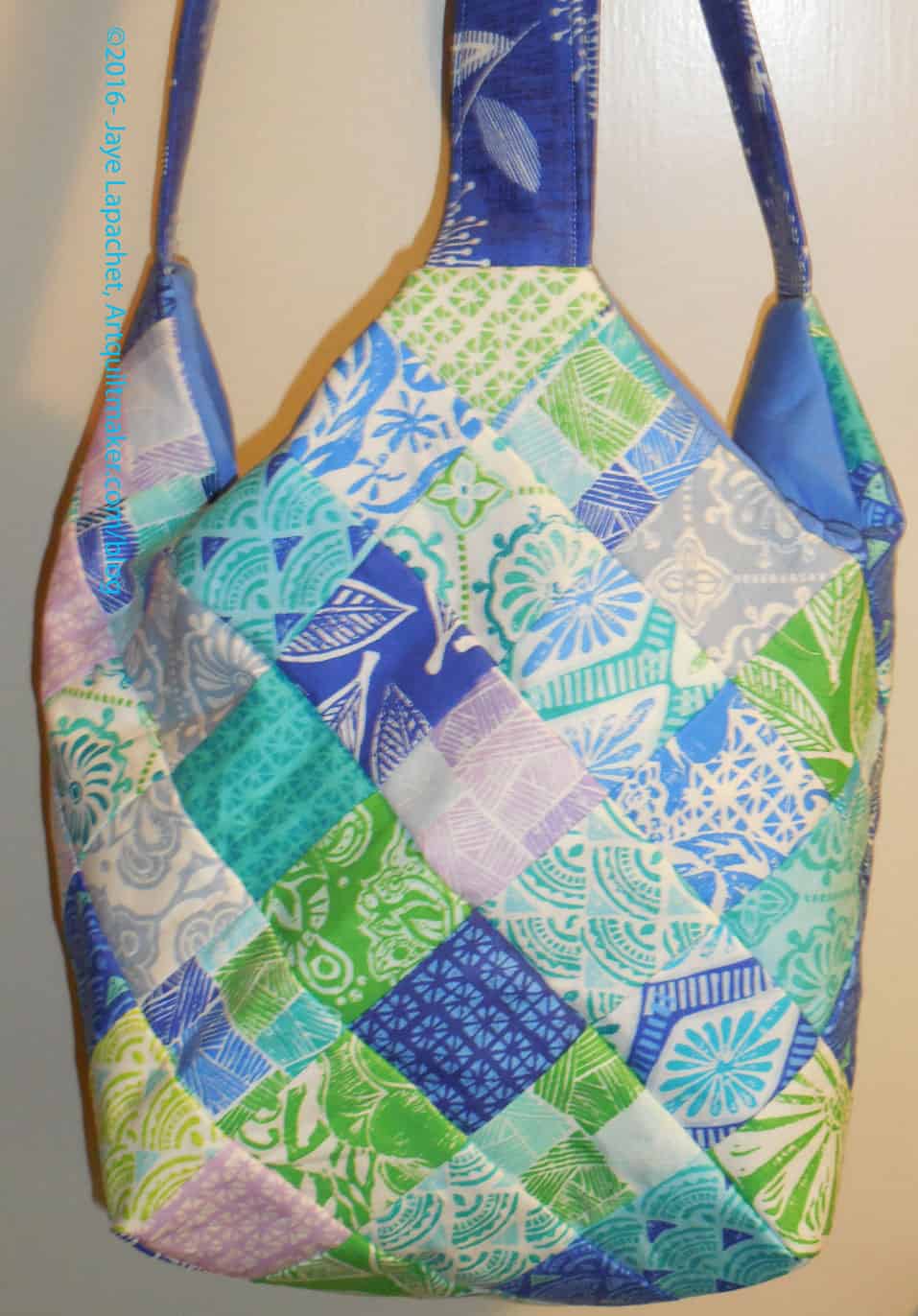
A week ago, I took a class at Scruffy Quilts to make the Midi Bag from QuiltSmart. I have had the pattern and the charm squares for awhile. Despite the short notice, it turned out that I was free so I signed up right away when Katrina sent out the class notice. I also wrangled Julie into taking the class with me.

One reason I wanted to take the class was to learn how to use the QuiltSmart fusible interfacing. I could not understand the directions on the pattern, thus the project had been languishing. It is very helpful for me to have someone walk me through the pattern the first time and this class was no exception.

Tips such as fabric placement is something you get in a class that you don’t get from a pattern.

Midi bag - detail
Midi bag – detail

I am pleased with the colors of the charm pack as I thought I would be. I used mostly the blues and the greens. I didn’t use as many of the lighter lavender squares, so those will show up in some donation quilts.

I am totally in love with the handle fabric and think I need to get more of it. The blue is not quite a navy, but is dark. I love it!

The bag is a little bit of a weird shape and I am not sure how I will use it, though I think it would be an excellent knitting bag. I have another sheet of the fusible interfacing (two come with the pattern, which is nice!) and I may add some kind of closure to the second one. I think having a closure would make it more useful. I think I would like to make the Mondo bag. It seems that size would better for a bag without a closure. I think it would be like having a shopping bag along rather than a purse.

I still have a few steps to do, but I got pretty far in the class. I laid out all of my charm squares and fused them. I was glad that I had charm squares and didn’t have to cut fabric. I made the lining and the handles and sewed the whole bag together. I could have made the handles at home, but was confused about how they wanted the handles made. I didn’t want to make them wrong and have to make them over. It turns out that there was nothing special about making them. I still have to poke out the corners, topstitch the top edge and sew the lining shut.

Learning how to use this interfacing makes me want the interfacing for the FOTY quilts. I am not sure how that would work since the sizes are different each year. Perhaps, if there was a general grid, I could overlap some of the seam lines when the patches didn’t quite match up with the lines? Oh well, if wishes were horses….

This is a pattern where you could use VinylFuse for the bottom squares. I didn’t, but may in the future. If you take this class, do with your 2.5″ squares already cut and your handles already made.

Finished: HMM Chubby Charmer

As I said last week, I was well on my way to finishing the Chubby Charmer (pattern name) made from Half Moon Modern fabrics. I finished it last Sunday. It took me about 6 hours total, including pressing the Vinylfuse to the squares I was using for the bottom.

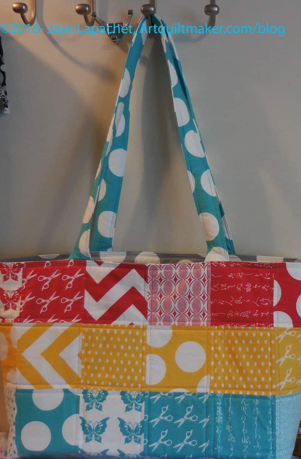
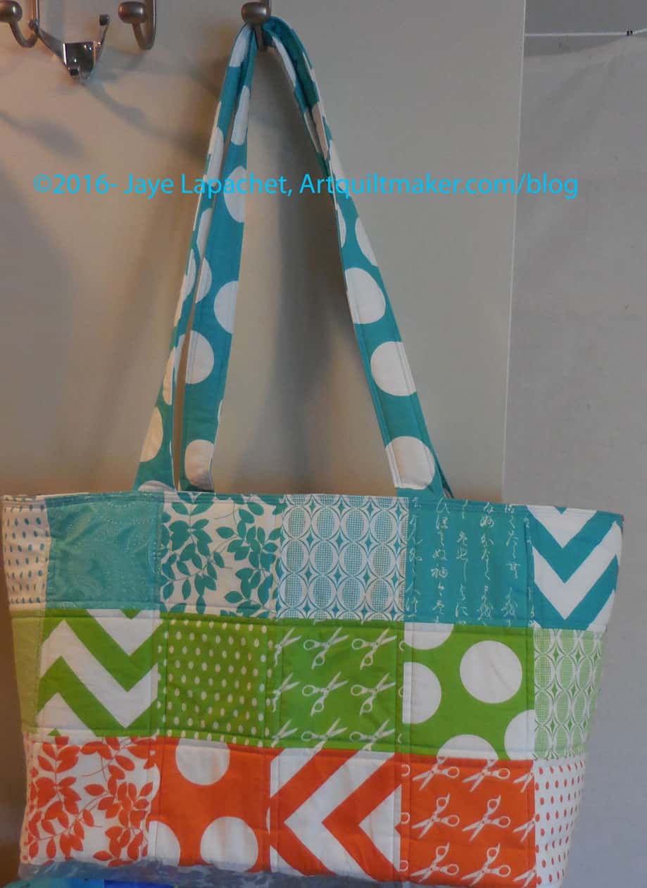
Half Moon Modern Chubby Charmer Finished

I did a couple of things differently this time.

I like bags with something on the bottom that can be cleaned without washing the whole bag. Some tote patterns use a “self-bottoming” technique to make the bottom of the bag, which is actually a really nice technique. You don’t have to insert anything. That technique does not lend itself to putting vinyl on the bottom of a bag since the bottom is made up from parts of the sides. If you don’t have a seam to create the bottom the VinylFuse will look bad and eventually peel.

The Chubby Charmer pattern uses this “self-bottoming” technique, but you can add VinylFuse to each square that will go on the bottom before sewing the charm squares together, thus enclosing the vinyl with seams.

You still have to be careful with the vinyl. You can’t rip out much as the holes stay in it. It is also messy and sticky. I used the paper backing as a pressing cloth. It worked ok most of the time, but I put the wrong side on one piece at one point and now have paper fused a bit to one of my squares. Fortunately, it is on the bottom. I could have ripped it out, but I decided to live with it.

Half Moon Modern Chubby Charmer Finished

I also made the handles twice the length of the handles in the pattern and on my other Chubby Charmers. This was an accident. You are supposed to cut and make one handle then cut it in half. I missed the one part and made two, thus this Chubby Charmer is more of shoulder bag, which is fine.

I also put Soft & Stable in the handles to make them really soft and comfortable to use. I also want to keep the handles from getting squished together permanently when I hold them.

The pattern calls for using Pellon Fusible Fleece. As I said with my first Chubby Charmer, the Fusible Fleece worked really well. This time, however, I wanted to make sure the bag stood up. I used Fusible Fleece on one side and Soft & Stable on the other size. Mission accomplished! The bag stands up. No floop!

I was a little disappointed with the Fusible Fleece, because it didn’t fuse very well. I know the fusibles can age, but it wasn’t old. I bought the product and then used it the same day. At least it wasn’t old from sitting around my house.

The other thing I did was use the walking foot to topstitch the top edge. I like more than a single line of topstitching and that area was so thick that I thought I would try the walking foot. It worked really well.

This is a great bag and it was a great use of the fabric. I already used it to go to the Midi Bag class (look for a post soon) and look forward to showing it off at the guilds soon.

Book Review: Scraps, Inc.

Scraps, Inc.: 15 Modern Quilts Made to KeepScraps, Inc.: 15 Modern Quilts Made to Keep by Editors at Lucky Spool

The best thing about this book is the photos. The colors are great; the photography is great. Other than that this is a project book with projects you have seen before done by ‘names’ in updated colors and fabrics.

First, I am going to talk about the projects and then will talk about the introductory pages at the end of the review.

The book has 15 projects by some of the most well known modern designers, including Camille Roskelley, April Rosenthal and Amy Smart. The artists begin each of the projects with a description. I liked it that some of them suggested alternate color options, though I didn’t see alternate color options shown in the book. There might be some examples on the individual quiltmakers’ websites. Each of the designers has a “Scrap Stash Tip” at the end of their chapter/project.

I thought the font was really good. Bold headlines are bold. The illustrations in the directions are also excellent. I haven’t made any of the projects, so I cannot comment on the technical quality of the project directions.

Many of the projects are based on traditional patterns: Bangles, Courthouse Steps, Favorite Things and Richmond, even if the names are different. I realize that everyone has different scraps, but a lot of these projects would not work for my scrap bins, because of the sizes required. Some of the projects require 4.5″ squares and I have very few scraps that size, so I would have to cut from yardage.

Amy Ellis’ My Favorite Things quilt project (pg. 24-35) is made up of all classic blocks. Her fabric usage would be considered modern, appearing to use a variety of background fabrics rather than just one. The setting is a rectangular medallion style, which is a little different than other classic settings. The complexity of this project is really nice.

Allison Harris’ Bangles quilt (pg.19-23) is made differently, but is the same pattern as the Jewel Box quilt pattern that was so popular several years ago. I guess everything old is new again? This quilt has a more stereotypical modern feel with its bright white background and no border.

The usage of many traditional block patterns and settings is a good way to draw in quiltmakers who don’t think the modern movement is for them.

My favorite quilt in this book, hands down, is Overcast by April Rosenthal (pg.5-58). I love this quilt and want to make it. I think it is reasonable use of scraps. In the introduction to the project, Ms. Rosenthal has some good advice. “Be sure to choose a grounding ‘background’ for your quilt. A strong solid here will help the rest your piecing stand out, and provide much-needed contrast to the fabrics with a white background and to the scrappy colored strips.” This pattern requires that colors don’t bleed into one another and the fact that the whites stand out give it a bright appearance that is also complex and interesting. I would have liked a couple of line drawn blocks with the lettered designations she uses for the piecing. The designer uses a glue basting method for piecing the curves, which she describes as being helpful for beginners, but may not be necessary as the maker progresses through the quilt. I thought this was a helpful tip and also acknowledges that sewists get better at skills as they progress through a project. I also like the way she assembles the curved units. She has the maker add on a strip made up of three squares rather than piecing a tighter curve. This allows for greater use of scraps and more success at small curves.

Unraveled (pg. 77-81) is an interesting pattern and it has that lozenge shape I have not yet explored. The blocks are rather big and I think I would like it better in a smaller size. It uses the flippy corners method to make the lozenges, thus I think could be resized relatively easily.

Kati Spencer’s quilt, Woven, (pg.89-83) intrigues me. It reminds me of a Jelly Roll Race quilt, but more planned. I like the different arrangement of strips and the coordinating of colors.

Most of the designers’ Scrap Stash Tips revolve around getting scraps organized immediately after finishing a project. Some cut into certain sizes a la Bonnie Hunter and others.

Templates at the back must be photocopied. I do not see a link to a downloadable version in the book.

Finally, we are back to the beginning where there are three pages of text, a welcome and some basic instructions on making HSTs and strip sets. There are templates at the end of the book. I was put off this book immediately in the first paragraph of the introduction, because the language used is deprecating to makers. “…with a love for every inch of the leftover fabrics…” implies a problem with obsessiveness. Later, the author writes “This has likely turned you into a scrap junkie.” While I understand that this was probably used in a tongue in cheek manner and that my own may have affected my understanding of the implications, ‘junkie’ is someone who has a drug problem. I really don’t think that loving fabric and making quilts should be equated with substance abuse. I also think we, as quiltmakers, should be supportive rather than judgmental about fabric purchasing or amounts of fabric each of us own.

Also in the welcome the author says “….colors we are loving right now, combined with innovative, on-trend designs…”. This begs the question of whether the project designs will be out of style when these on-trend scraps are out of fashion? What if you have scraps from 20 years ago? Are the designs not suitable for someone with a broadly reaching scrap bin?

I would, as usual, have liked to see more about the inspiration for each quilt. I think it gives readers ideas about where to get inspired on their own. As I have said, I think some of the projects are interesting. This book is definitely worth a look.

View all my reviews

Creative Prompt #359: Talisman

board game

A talisman was an item given by Duke Horacio in the old version of the Rune Mysteries quest. It looked like an air talisman but cannot be used as a runecrafting talisman.

1998 movie

Talisman – Magic Quest game

Authentic Kabbalah talismans by Rabbi Azulai for protection against evil eye, black magic, talismans for love, friendship, prosperity, luck and more.

book by Stephen King

Talisman Decorative handmade white ceramic tiles Talisman patterns arise from a conversation between hands and clay.

Talisman is an a cappella group at Stanford University that was founded in 1990 to sing music from the anti-Apartheid movement in South Africa as an act of solidarity.

TV Mini-series

Talisman Energy

Definition: “A talisman is an object which is believed to contain certain magical or sacramental properties which would provide good luck for the possessor or possibly offer protection from evil or harm.[1]

Amulets and talismans are often considered interchangeable despite their differences. For example, the amulet is an object with natural magical properties, as opposed to a talisman which must be charged with magical powers by a creator. It is this act of consecration or “charging” that gives the talisman its alleged magical powers. The talisman is always made for a definite reason whereas an amulet can be used for generic purposes such as averting evil or attracting good luck.[2]

According to the Hermetic Order of the Golden Dawn, a magical order active in the United Kingdom during the late-19th and early-20th centuries, a talisman is “a magical figure charged with the force which it is intended to represent. In the construction of a talisman, care should be taken to make it, as far as possible, so to represent the universal forces that it should be in exact harmony with those you wish to attract, and the more exact the symbolism, the easier it is to attract the force.”[3][unreliable source?]” (Wikipedia)

Post the direct URL (link) where your drawing, doodle, artwork is posted (e.g. your blog, Flickr) in the comments area of this post. I would really like to keep all the artwork together and provide a way for others to see your work and get familiar with your blog or website.

The Creative Prompt Project, also, has a Flickr group, which you can join to  post your responses. I created this spot so those of you without blogs and websites would have a place to post your responses.

We are also talking about this on Twitter and Instagram. Use the hashtag #CPP
Reno’s Premier Quiltmaking Event: Make it Modern

Make It Modern
Make It Modern

My friend Kathleen is organizing a great event in beautiful Reno: Make it Modern. This is the premier Reno event for modern quiltmakers. It is a great opportunity to work with a couple of QuiltCon 2016’s hottest designers.

What: Fun and fabulous days of creating, led by modern quilters Christina Cameli and Libs Elliott. Additional help, discussions, and general shenanigans each evening at the sewing salon, and a trunk show on Sunday morning.

Where: Peppermill Resort, Reno, Nevada

When: June 9-12, 2016

Who: Christina Cameli and Libs Elliot will be teaching

Why: Because it is fun to meet up with other like minded quiltmakers and have some fun sewing

How: easy access by car and plane

Find out more information and register on the Make It Modern Events website.

Various & Sundry 2016 #6

Classes

ByAnnie, the company that makes Soft & Stable, sent me a newsletter advertising their newest class, Sew Sturdy: The Ultimate Travel Bag, which is available on Craftsy. It looks like some other bags I have seen and I decided to buy it. I have to make the Sew Sweetness Rockstar bag first, but I decided I would make this bag as well. Buy the class on Craftsy and we can support each other.

Other Artists

Ms. Lottie has made a couple of art pieces. The pieces comprise a triptych and one thing I like about the pieces is that they have a clean, non-messy look.

Adinda Zoutman showed this crochet shawl on FB. I can’t believe how gorgeous it is!

Media

Pam recently posted an episode of the Stitch TV Show talking about thread. I was reminded of this when I began listening to an older, but new to me, episode of Annie Smith’s podcast. The topic is thread. Annie has a lot of good information on the different manufacturers, well known and not so well known as well as the properties of thread. Listen to episode #227.

Fabric, Tools & Supplies

Massdrop has a couple of great things that I think you will enjoy. First, they have the new folding mat by Olfa. I bought one for my quiltmaking Go bag. I use this bag to take to classes and retreats without having to raid my regular supplies. Next I saw the Martelli RoundAbout set in use at a class. The set ($40 off) includes a ironing surface, cutting mat and a piecing surface for use right at your class table or for smaller projects in your sewing room. Massdrop also has thread sets, batting, LOTS of fabric, including Eden by Tula Pink, as well as the electronics, fountain pens and gaming accessories. Use my code and will get a prize. 😉

Hawthorne Threads has a new companion line to their Celestial Stars called Stitch the Stars. There is an Indigo, Charcoal and other colors. It reminds me of Karen Lewis’ new line.

Articles & Information

Pat Sloan has a post on her site about how to use a Jelly Roll. It is always useful to see how others manage pre-cuts.

Check out OzzyPip’s interview with Daisy!

We have all discussed different brands of solids and their properties. I have recently been using 2.5″ squares cut from a Northcott solid. I didn’t even know Northcott made solids until QuiltCon, which gives us yet another choice. Right Sides Together wrote an article right on point. I am sure Frances will be thrilled! This is not a comprehensive article and she says right up front that YMMV. This is a GREAT start and we should add to the knowledge. She doesn’t talk about fraying (not every article can talk about everything!) beyond a brief mention. Fraying is huge for me. The author does include American Made Brand solids, which is great. I also liked it that she includes the number of colors in each line and whether or not there is a color card. She doesn’t mention the Northcott solids, but I believe those will come more into the quiltmaking consciousness as time goes on.

My sister is featured in this post :

Doing Good

You have seen the many donation quilts and blocks made from the 16 patch pattern. I saw a great quilt on Instagram. If I would plan better, I could make one of these. We can all dream.

Inspiration

Will you make a quilt from a floor design?

Julie Silber was at the EBHQ Show. I looked up her website in an effort to see if I could find one that I really liked. I couldn’t find it, but the others are really great, too.

La Passacaglia

I am still thinking about the La Passacaglia quilt. It is such an interesting concept that I can’t stop thinking about it. Here are few resources if you are also thinking about making it.

More New Donation Blocks

Mid-April Donation Blocks

I know I must be boring you to tears with these donation blocks. Still I have more.

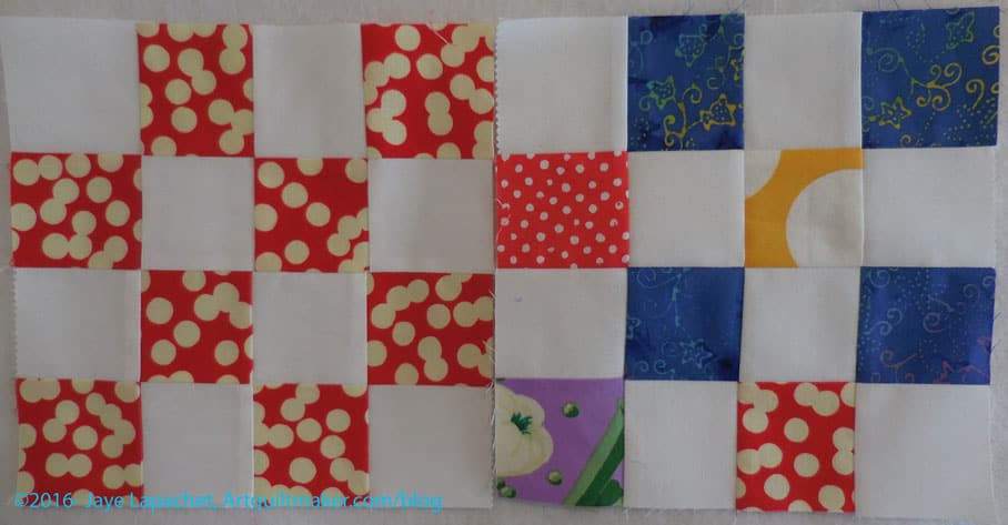
I think it is interesting to put the fabrics together in different ways. I also like the idea of using a bunch of the same fabrics and then combining those blocks with blocks in the same colors. For example, taking that red and white block, making other red and white blocks and combining them all into a top.

I made these two after I finished enough blocks for the Sugar & Spice Donation top.

I probably should work on the Octagon 9 Patch using leaders and enders for awhile, but I haven’t quite gotten to it.

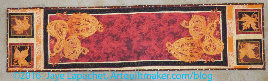
Thanksgiving Tablerunner

Thanksgiving Tablerunner

I finished the first tablerunner and was able to show it at the BAMQG meeting on Saturday. I am pleased with how it came out. I can’t wait to use it.

I did the (minimal) piecing and I did all the quilting. It was mostly straight line quilting or quilting with an applique’ foot. No free motion quilting on this one.

I didn’t put a label on this one, so I embroidered my name and the date and that will have to do.