
This is the flower on a succulent in my aunt’s yard. I didn’t know the flower shaped succulent had real flowers. The pretty colors are an added bonus.
Commentary about works in progress, design & creativity
This is the flower on a succulent in my aunt’s yard. I didn’t know the flower shaped succulent had real flowers. The pretty colors are an added bonus.
I was visiting Grama over the weekend and took a few minutes out of the constant care and cleaning to visit with Susan, have lunch and take a trip to the quilt shop in Northridge. I used to live near Northridge and the place looks so different now. I don’t know if my eyes have different standards for how streets should look or if the streets have really changed or if I never went to this area of Northridge. The area we drove in had lots of concrete, not much green, signs stacked on top of each other right near the sidewalk to announce the businesses in each strip mall. I guess I am not used to seeing the types of strip malls they have here. I don’t know.

Regardless, Susan came and got me (what a saint) so Mom and Grama could go to Grama’s lunch bunch. She also did all the research and found a pizza place that served GF pizza and a quilt store right down the street. Perfect!
The pizza place was called Pizza Rev and they had GREAT GF standards for handling the ingredients. The only thing I didn’t like was how loud the place was. However, Susan and I could hear each other and we couldn’t really hear the people around us, which was good. I would go there again in a heartbeat.
We chatted quite a bit at lunch. I am interested in Susan’s remodeling project. Of course, she had questions about Grama, we talked about our kids and, of course, quiltmaking!
Much too soon, we had to go to the quilt store. 😉 We could have talked for a long time.

Candy’s Quiltworks is a big shop. In the picture above, you can see that there is one of those rolling doors like auto garages have. The walls were cinder block, which is odd to a girl from earthquake country. I assume it is reinforced, but in an earthquake, I think I would run outside.
None of the above has anything to do with the shop. Candy’s has over 10,000 bolts of fabric, at least according to one of the clerks. I believe it. Their entire front wall and one side was filled with bolts of batiks. One entire side wall was tone on tone fabrics. The middle was filled with different lines of fabric, mostly together, as well as an aisle of blacks on whites and whites on blacks.
The quilts in the photo above are two of the sample quilts they had hanging. I thought there was a lot more space for samples, but perhaps they were in between hangings? The one with the white background looked like it could be a Jelly Roll quilt. I thought it looked like an updated log cabin version.

This is part of the Notions area. They focused on Creative Grids rulers (saw a Tumbler and a strip maker as well as others), but also had some specialty rulers from Eleanor Burns.
I didn’t see any Fons & Porter rulers, but they have a wide variety of the Marti Michell rotary template sets and rotary rulers such as the 60 degree triangle rulers. I also saw the Clear Angle ruler needed to cut the hexagons in that strip piecing method I used (originally on Little Bluebell’s blog) a few years ago for the Attack of the Hexies quilt.
This is also where they keep their sale fabrics – $5.99/yard. Can you believe how many bolts of sale fabrics they have? I didn’t really do more than glance at them, but it seemed like a lot of novelty prints.

The shop had these racks of books all over the store. I wasn’t in the market for any books today, so I only took a quick look at them. From what I saw, they were a little off the beaten path. It was an interesting mix of books and I think you would find some interesting titles. I think it would have been a little difficult to find a specific book.
There were a wide variety of panel projects hanging all over the store. In the photo with the books you can see some Halloween panels (the one with the pumpkin looks like it has a Halloween bunting as well), a gingerbread house panel. I saw panels from which you could make aprons and other small accessories.
These things are hard to display. I don’t see them in quilt shops up north, so I don’t know if they sell or not. I got one as part of a pack when I bought the fabric to make the Frosted Stars quilt. I thought it was fairly hideous, but I used it for the back anyway. This was a good way to display them as shoppers couldn’t avoid seeing them. The annoying thing was that we had to hold them out of the way for each other so we could see the fabric.
In another area, I saw Aurifil thread, mostly in neutrals. I saw a HUGE selection of DMC floss.

TFQ and I have been lamenting the lack of tone-on-tones now that solids have returned with force and bold modern prints are such the rage. I love solids, but sometimes you need a good tone-on-tone to add interest to your fabric selections.
Candy’s has you covered. This is a picture of HALF the wall of tone-on-tones. It looked like they had every tone, shade and hue of tone-on-tone imaginable there. I was very disappointed that I didn’t need to buy some tone-on-tones to fill in for a project.
Near different groups of fabrics, the staff has posted patterns and pamphlets with different ideas for quilts, bags and small accessories as well as baby projects.
You can see a little peek on the top of the bolt shelves of other stuff. The tops of the shelving were stuffed with different things: Jelly Rolls, patterns, kits for handbags (we saw some by Riley Blake that had everything you needed to go home and start sewing a gift.), fat quarter packs, though not a lot, and a multitude of other stuff that I can’t even remember.
")
I don’t think I have ever seen this many batiks in one place. It was an amazing number of batiks.
I don’t like those kind of shelves, normally, but in this case I think it worked well for two reasons: 1) the aisle was big enough to so I could get far enough back to see the different shades and tones; and 2) there were a lot of bolts of batik fabric.
I was kind of looking for a background for the Russian Rubix. I was thinking of a white with some grey on it. Shockingly, we didn’t find any of those colors. There didn’t seem to be any white batiks at all.

I really could have bought a piece of almost every one of these batiks. I am really noticing how they glow in projects near regular quilting cotton.
On top of the shelves, you can see more of the samples and projects.
I have never seen as many novelty fabrics in one place. They had as many junk food fabrics as a person could wish for. I saw some of the RJR food fabrics and was tempted for the other two food quilts I want to make, but refrained.
We saw a ton of baby fabric. Susan noticed the American Jane Punctuation fabric and several other lines from a few years ago. They might be worth calling if you are looking for something out of print.
There was a whole aisle of Asian fabrics.
We really had a short amount of time to visit this store, so I wasn’t able to look in detail at all of the fabric. It will definitely be worth another trip.
Actually I may not have seen this much fabric in one place in California ever. I have seen this much fabric in one place in Lancaster County Pennsylvania.

This is a shot from the restroom across the store to the opposite wall. The back door, where we entered would be to your left if you were in the store.
In the area to the left of that rounder of pink were all of their charm packs. there were piles of Jelly Rolls that were just the beginning of the Jelly Roll Extravaganza (not to leave out Anthropologie strips and Bali Pops) available at Candy’s.
They also had patterns galore in that rack and all over the store.
The store was a bit messy. I think it is hard when there is so much inventory. All in all, though, worth the trip. As I said, I would go there again.
Vital Statistics:
Candy’s Quiltworks
8549 Reseda Blvd
Northridge, California
(818) 349-7397
(between Napa and Chase)
There is no sign in front and the windows are tinted black. We went around and parked in back, but found out that there was a front door later.
Why Should You Care: you might have to travel to Northridge someday. This would be a great shop to visit if you need to get away from a conference or a little too much family for a few minutes.

A few days ago, I talked about my mom’s quilt. I decided that you would probably appreciate some detail shots.
This is one of the Blossom BOM blocks. Now, I always thought that BOM blocks were supposed to encourage people to quilt more. This block is a tough block. My mom has garment sewing experience and she had a tough time with this block. Look at the pieces – curves and that little block in the lower right hand corner. Not impossible, but also not a nine patch.
My mom is tough and created a strategy. After screwing up a few blocks and not having enough fabric for the BOM block, she started making a practice block with her own fabric and then used the BOM fabric for the non-practice block. The above blocks are the practice blocks.
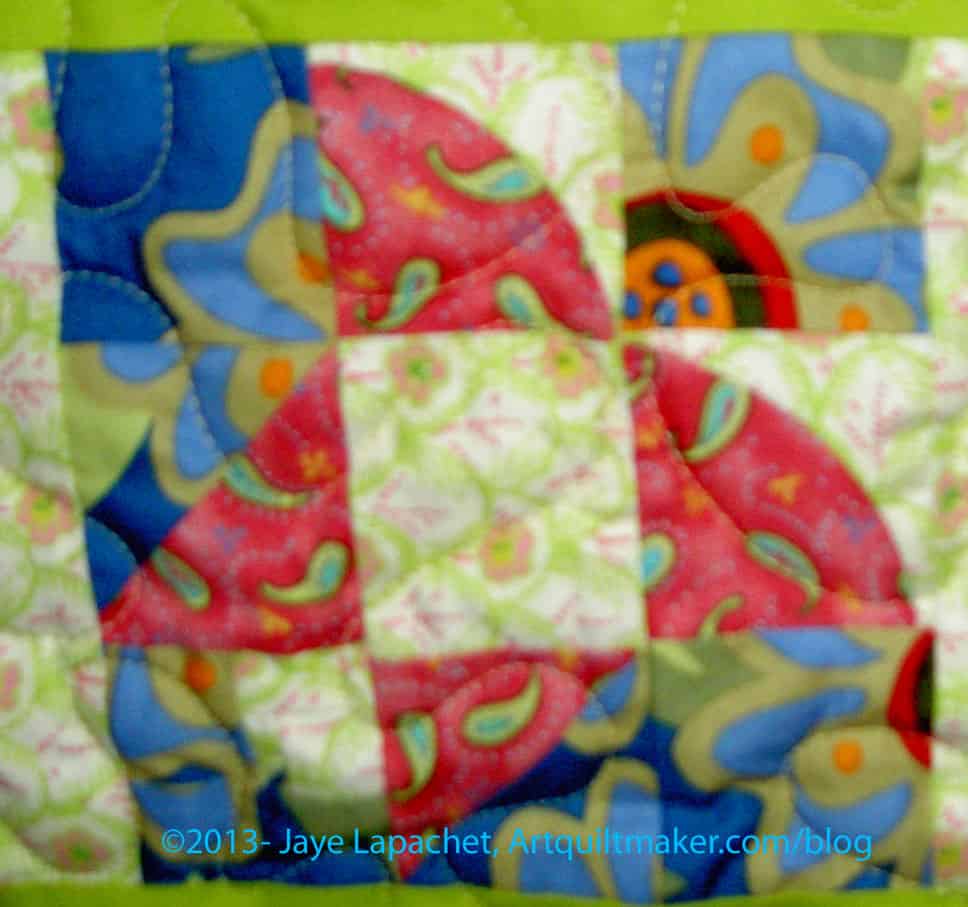
This is the same block, but made with a bolder selection of fabric. I believe that I gave my mom some of these fabrics. I feel like I make some bold choices in fabric selection, but my mom has me beat by a mile. I would not have thought to put the blue and the pink together.
I am glad that I took the time to look at these blocks.
They make me think. What would your interpretation of this block be? Even if you use fabric on paper with glue stick, what colors would you choose? What colors would take you out of your comfort zone?

The pinwheel block is a pretty standard pattern. It is actually a pattern that you can really make look like it is spinning if you place the fabric a certain way.
Again, though, mom has made it her own. The blue and the cabbage rose/bold flower print are an interesting combination.
I really think my mom and I see color in different ways. Again, I wouldn’t have chosen these fabrics together, but they work. It kind of reminds me of the quilt Bill Kerr showed that included David Butler and Jo Morton fabrics together.
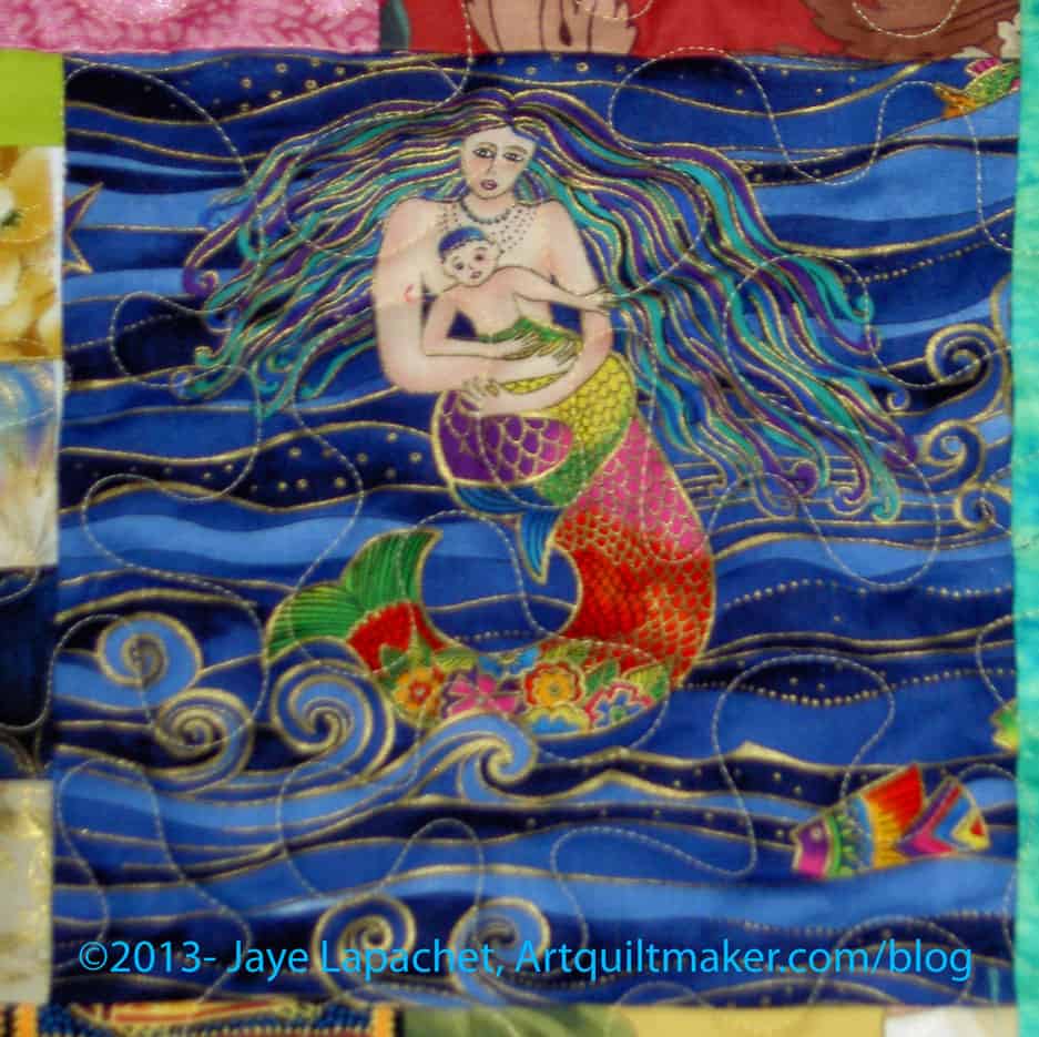
The mermaid block is some kind of panel. I have no idea what possessed her to add this to the quilt, but it works. Interesting.

The Morning Glory block really looks like a morning glory. You can see that the center cannot have been easy to piece. I know that isn’t applique’ and am pretty sure it isn’t paper pieced either.

The very bottom block reminds me of one of Gwen Marston’s filler blocks. I also, though I am reluctant to say it, think it has qualities of the Gee’s Bend blocks.
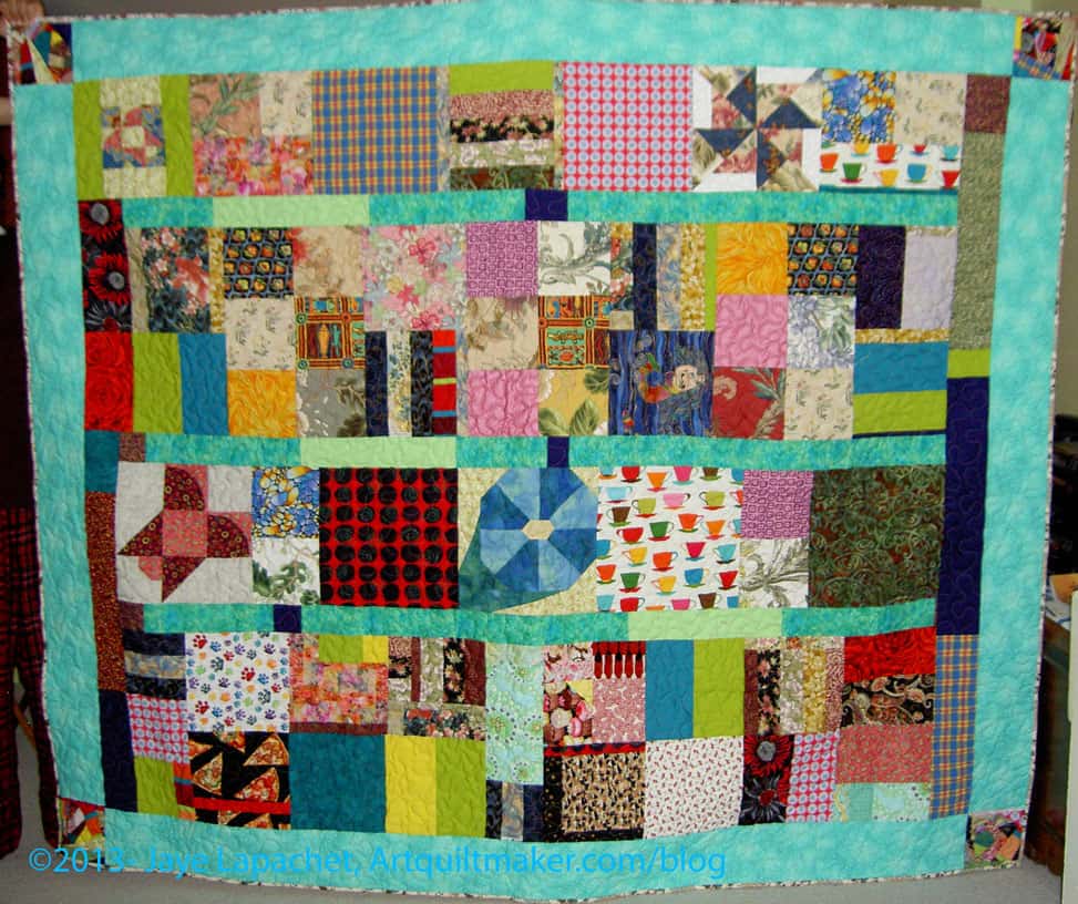
My mom just finished a quilt – well, a month or so ago.
She has a really unique style. If I had to put a name to it, I would call it Gwen Marston-esque, but that isn’t quite right.
Recently she finished a quilt shop’s block of the month program. It was the first she had ever done. This program was made up of flower blocks. I believe it was called Blossom.
Very few people would have set these blocks the way my mom did, but if you have seen any of her quilts, you know this is totally her style.
And it is isn’t boring. She has a great view of quiltmaking and always sees settings and design in a whole new way.
This will be a gift for my stepsister.
 Contemporary Jewelry in Perspective by Art Jewelry Forum
Thanks to Lark for sending me this book to review.
This is more like a scholarly book than most of the books I have reviewed for Lark. This book sets out to distinguish why contemporary jewelry is not like the jewelry found in the local shopping mall (pg.7). It is clear that contemporary jewelry artists struggle with the same problem that art quiltmakers have: art v. craft. The book delves into detail about what craft is and how jewelry making fits into fine starts traditions.
This is a serious books that looks at contemporary jewelry from all angles. Discussion about the journals of contemporary jewelry have a place. Photography of contemporary jewelry is explored. the tools, spaces and materials are all discussed in a scholarly and serious way.
The book is lavishly illustrated with photographs, which are works of art on their own.Many, many contemporary pieces are shown throughout the book.
The title, Contemporary Jewelry in Perspective, really describes what this book is about. No stone related to contemporary jewelry goes unturned. If you want a thorough grounding in contemporary jewelery, this is your book.

You are probably wondering why this is on yellow paper. Well, I am almost at the end of my drawing book and in the back they have “conveniently” placed different types of paper. There is a sheet of lined paper, there are some other sheets and this piece of yellow paper. I was drawing at Starbuck’s and the lighting wasn’t good, so I didn’t realize the paper was yellow until I had started. I actually realized that the pens weren’t dealing well with the paper before I noticed the color. Derrrr, as the Young Man would say.
I was thinking Touchdown for this response.
What did you think when you saw the prompt?
I hope you have done a response. If you have, please post the direct URL (link) where your drawing, doodle, artwork is posted (e.g. your blog, Flickr) to the comments area of this post. I would really like to keep all the artwork together and provide a way for others to see your work and/or your blog.
We are also talking about the Creative Prompt Project on Twitter. Use the hashtag #CPP
When I lived in Austria I first started seeing the washer in the kitchen. I thought it was weird.Now that I do a bunch of laundry every weekend, I think it would be very convenient. Of course, now, I don’t want to give up any counter space or cupboard space to a washer.
I am not as behind in drawing the responses as I am in posting them. I might post a few this week just to catch up a little bit.
I hope you have done a response. If you have, please post the direct URL (link) where your drawing, doodle, artwork is posted (e.g. your blog, Flickr) to the comments area of this post. I would really like to keep all the artwork together and provide a way for others to see your work and/or your blog.
We are also talking about the Creative Prompt Project on Twitter. Use the hashtag #CPP
There is also a Creative Prompt Project Flickr group, which you can join to post your own responses. I created this spot so those of you without blogs or websites would have a place to post your responses. Please join the fun!
A picture is worth a thousand words.
“Picture a Girl” – song Phi Mus sing at certain events, including notification ceremonies that some is getting engaged.
Seeing the Big Picture
Paramount Pictures
picture book
Picture window
digital photos
Motion Picture Association of America
The Picture Show (NPR)
moving picture
Academy of Motion Pictures, Arts and Sciences
picture perfect
Rocky Horror Picture Show
picture this…
The Last Picture Show
get the picture?
The Picture of Dorian Gray by Oscar Wilde
Star Trek: The Motion Picture
picture dictionary
Universal Pictures
Compliments of the Young Man “framed picture of a pickle on a plate”
HTML5 <picture> element -Responsive design techniques are a way for developers to adapt a site layout to a wide range of devices, from desktops to iPhones, and have it consistently look sharp and load quickly. And no responsive design solution is complete without an adequate technique for dealing with images.
images
school picture
picture gallery
This Week in Pictures
photo
hang a picture
formulate a picture
draw a picture
This Year in Pictures
Post the direct URL (link) where your drawing, doodle, artwork is posted (e.g. your blog, Flickr) in the comments area of this post. I would really like to keep all the artwork together and provide a way for others to see your work and/or your blog.
We are also talking about this on Twitter. Use the hashtag #CPP
The Creative Prompt Project, also, has a Flickr group, which you can join to post your responses. I created this spot so those of you without blogs and websites would have a place to post your responses.
Definition: “An image (from Latin: imago) is an artifact that depicts or records visual perception, for example a two-dimensional picture, that has a similar appearance to some subject – usually a physical object or a person, thus providing a depiction of it.” (Wikipedia)
I just noticed that I have only 7 projects on my WIPs list. I have really made progress, which is a good reminder that I need to focus my efforts on not filling up the list again. I don’t mind having a couple of projects going at once, but I don’t want projects that are stalled hanging around for years. I really don’t.
I talked this week about all the cutting that I did. All true. I don’t know why I cut for the Scrapitude mystery quilt, but I did. I didn’t cut all the pieces for each project, but I cut bunches of pieces for a variety of projects.
I made good progress on the cutting for the Russian Rubix and started talking about Easy Street.
Finished 2013 Projects:
Other non-quilt Projects finished
Still WIPs
Ready for Quilting
I took 5 quilts to the quilter last week: Infinity Blocks, which I had thought I would quilt myself, Fresh Fruit, FOTY 2013, Star Sampler, which nothing could induce me to quilt myself, and the Young Man’s t-shirt quilt. PROGRESS!
Please note that even if you combine the two lists above, I do not have 26 projects on this list anymore. I have made progress!!!
In the Finishing Process
Abandoned
Nothing so far for 2013
Hunting and Gathering
Last update for the 26 Projects List. Read it. There’s some interesting stuff there.
I thought you might want to take a look at the first list I made, the one with the 26 Projects. I started the list in October 2011. I have made progress. I plan to stop this post when I have no more projects from the original list to write about. I wonder when that will be?
*New – Project started after I started working on the 26 Projects list
Last November Bonnie Hunter’s Mystery Quilt was Easy Street. I liked the idea, but wasn’t that excited about the mystery part of the quilt. I kind of like to have an idea of what the quilt will look like.
Thanks to Pam and many others, I know, basically, what the piece looks like and I am still interested.
While I am not anywhere near cutting and sewing, I have been thinking about fabrics. I want to use grey for the background for some reason that I can’t fathom. To that end I have bought a few pieces of grey lately.
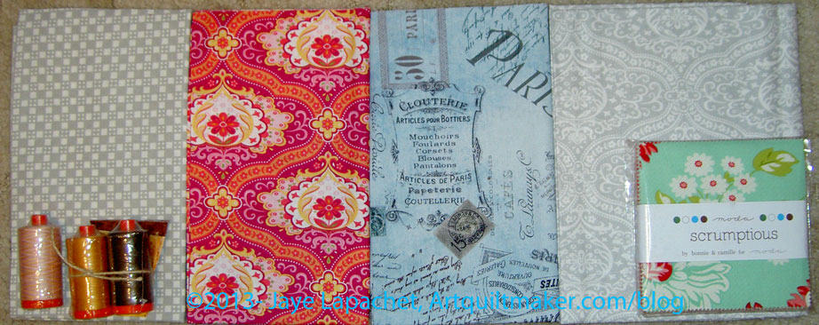
I have been disappointed in the greys I have purchased recently. They are too beige The perfect grey, which I may have mentioned, was the Happy Go Lucky grey by P&B Textiles, which I used to bring the block sup to size in the A-B-C Challenge (I definitely mentioned this). You can see the perfect grey on page 2 of the fabric card. All the Happy Go Lucky now is by Bonnie and Camille and definitely does not include the grey I want.
There is a lot of “starting new projects” in my head. I need to be mindful and judicious of ruining the progress I have made on my UFOs. I am also not ready to give up the small projects project.

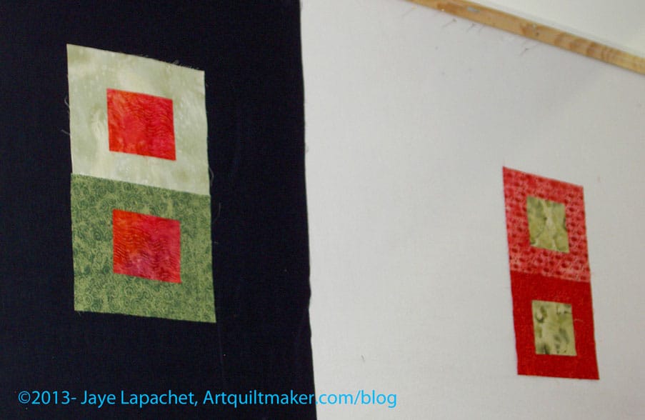
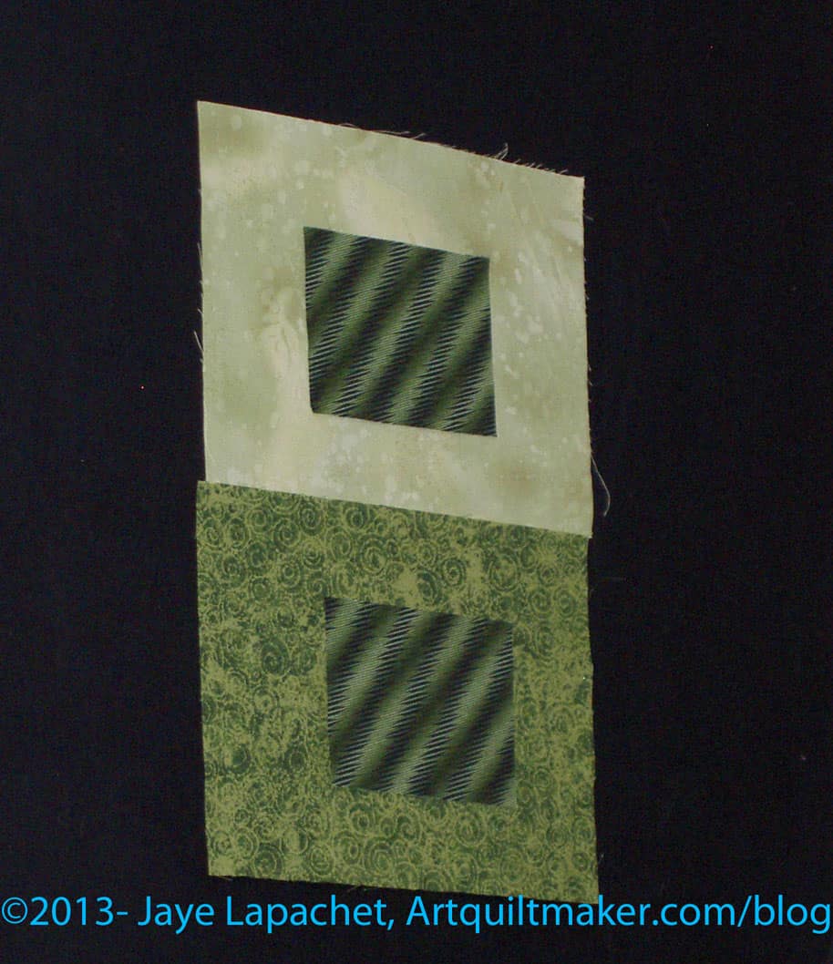
I spent a lot of time cutting over the weekend, which served a few purposes:
I really wanted to make progress on cutting for my Super Secret project and for the Russian Rubix. I just wanted to see what the fabrics would look like cut up.
It turns out I am using the same fabric for both projects. I like the combination so far. Probably not the same background and I will probably use the more colors (fabrics) for the Super Secret project than for the Russian Rubix, but the base colors and fabrics are the same.
Most of the fabrics on the right (above) are fabrics I am using for the two projects. The group shown is small, because the design wall is full of the RR octagons.
I cut octagons from all of the fabrics chosen so far, but there is a pile of them on my cutting table that won’t fit on the design wall. I need to move them to my portable design wall, but the Attack of the Hexies project is there and I am actually working on it a bit, so I don’t want to lose the momentum by taking it off. I’d really like to get that project out of my life. It was fun for awhile, but I am ready to be done with it. Working on it makes it more fun.
It really has been awhile since I filled up part of the design wall enough to post some squares for this project for you. Summer was busy; I wasn’t ironing. I don’t know what I was doing. Read the blog, then you’ll know.

I have been cutting a lot lately. I finished cutting out the bag that will be part of Purse Palooza blog hop. I am cutting out another Petrillo Bag and I cut a bunch of pieces I will talk about tomorrow. Regardless, I needed some finishes – or at least a finish.
This piece had been hanging around just needing a bit more work to get it finished. I really only spent an additional half hour on it to make it ready to use.
Ever since I had the idea to use the trimmings from quilts to make journal covers, I have been making different journal covers. At first, I was just sewing the pieces into the right sizes. Now I am trying to make the covers more interesting. I found that I didn’t like looking at them and that is not a good thing.
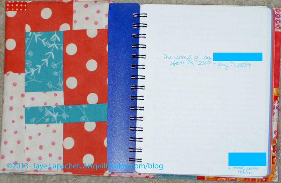
The trimmings are long and thin so by just sewing trimmings together I was ending up with a lot of horizontal design elements. I wasn’t liking those, so on later journal covers I cross cut the pieces and re-sewed them. You can see the sort of checkerboard I have going. Yes, it is more work, but it is also more interesting.
I am still fumbling with the lining. The batting is too fluffy even though it works on some journals (think that has to do with lucky placement) I think I need to try flannel next, but that requires buying some flannel just to put in the center of the journals and I haven’t wanted to spend the money. Part of my idea is using supplies on hand for these covers. I might also try no filling again and see if I still think it needs improvement.
I still have some bits for other journal covers on my sewing table. I’d like to get them off the table, which means I need to make more journal covers.
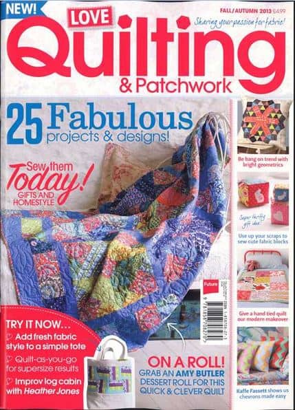
I picked up this magazine on a whim at Joann when I was there the other day NOT buying ShapeFlex (apparently they had has an interfacing sale and were cleaned out). I was attracted by the bright and cheerful colors. Yes, despite autumn coming on the quilt on the cover had no browns. Points scored!
Every page is designed with bright and cheerful colors. I think that in the US, it might be marketed as a modern magazine, but nowhere obvious in the content did anything scream modern.
There are patterns and most of them have an alternate colorway. The quilt you see on the cover has a 1930s alternate colorway, which is GREAT. It is so different than the fabrics shown that the 1930s fabrics really show the pattern to a different advantage.
In addition to quilt patterns, they offer block tutorials (in this issue, Tula Pink), interviews, and a tote bag pattern, which makes me hope for small accessories in future issues as well. There are a couple of pages showing new fabric lines, a shop review, technique tips and an article about a designer’s journey to Quilt Market. There was also a pattern on how to make apron pockets. Different, yes.
My favorite part of this magazine is the Triangle City pillow (block) pattern by Katy Jones. If you don’t know Katy Jones, she is the designer of the quilts that flow out of the I’m a Ginger Monkey blog. I like this pattern, because it is not made up of a 1,000 half square triangles and is a challenging project. The directions are several pages long, involve English Paper Piecing and assume that you can do this. You can. I am going to try it. It might kill me, but I am going to try it. Try it with me. Buy rotary templates from Katy.
The photography is colorful and interesting. The drawings are cheerful and fun. There is a god balance of color and white use on the layout of the pages.
Try it out. As encouragement, they have a special offer good until September 27, 2013:
Find an issue. I hope you will like as much as I do.
The CQFA Meeting was last Saturday and it was great. As you know, I haven’t been in awhile and I was so glad to see my art quilt pals.
Julie, Dolores and Maureen did a presentation on color. The presentation was called “Why Your Stash Needs to Be Bigger.” 😉 I am not going to rant today about the low cost of fabric compared to other stress reducing activities.
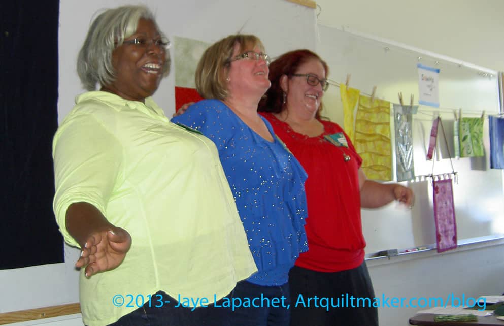
They covered the science of color, color in culture and some color exercises. I am trying to get Dolores to do a guest blog post, but I will post some of my notes for your edification. I was too fascinated by what she was saying to take really good notes.
Science of Color
Color is the reflection of ambient light on to an object. Dolores referred to the Archimedes Lab’s information on color. I just Googled and found some pages that I would like to explore later.
gamut is a term used for the range of color that can be reproduced.
Your monitor is set to use RGB colors and your printer is set to use CMYK colors, which why we sometimes have problems printing what is on our screen
No device can reproduce as many colors as our eyes can see.
simultaneous contrast – our eye evaluates the color in relation to what is next what we are looking at. This affects the sense of what color we see. It isn’t a function of the color, but of the perception of the color. Dolores told us that Van Gogh used this technique (?) a lot in his work. Our other senses experience this also. If you are in the hot tub, then jump into a pool, the pool seems colder than it really is. If you drink orange juice with your pancakes and maple syrup, the acidity of the juice in enhanced as is the sweetness of the syrup. Fabrics next to each other talk to each other.
Culture of Color
Maureen present culture to us and it was an eye opener how much color is involved in our culture in ways not related to actually using color such as writing with a purple pen or playing with fabric.
Language uses color in metaphors and for metaphors. This is called cognitive metaphor. Part of it is associating colors with emotions (not a comprehensive list; just some examples):
We have been trained to have associations with certain colors. Colors telegraph a certain message. I think this might have to do with my comments about cheerful quilts. I see certain quilts as cheerful when they have warm colors, usually. [I haven’t thought of this before, so it isn’t a fully formed thought. The idea just came together as I was writing this.]
Having emotional associations with certain colors means that we might want to look at the colors we are using in our work and ask ourselves if we are trying to telegraph a certain message through our work via color?
We also use color a lot in our language:
etc.
Victoria Finlay wrote a book on color called Color: A Natural History of the Palette. It is a dense book, but has a lot of interesting information.
There is also an iPad app you might want to try out called Josef Albers.
Exercise your Color Muscle
Julie reminded us that we all have our own color palette that is defined by our lives, experiences, art to which we have been exposed, etc. Julie showed us some exercises that started in a book called Playing with Color by Richard Mehl.
She used some of what Dolores and Maureen said for the exercises, such as picking a color from two that was in the center of another color.
One exercise (green on red) was an effort to find a color that looked the same when laid on two different fabrics in the same color family.
You’d think that this was easy, but it isn’t. There were a couple of issues to work with. 1) we are working with fabric. With paint, you can mix a bit of white in or a bit of grey. In fabric, it doesn’t work that way. 2) we were working with pattern. Julie set up the exercise and she doesn’t have many solids (remember the title of the presentation?), so she has to work with patterned fabric. Because of the contrast that often exists in a patterned fabric, it made the exercise harder. Yes, she found as many tone-on-tones as she could, but it was still a challenge. a good challenge, but a challenge. 3) we have a very limited amount of fabric handy, but even with your own stash, this would be a challenging exercise, because of the nature of fabric – it already has color. Yes, you can dye it or discharge it, but you still may not get what you expected out of the dye/discharge bath.
This was a great example for me of “fabrics talking to each other.” It was really, really interesting and amazing to see the same fabric paired with two different fabrics and how different they can look. The green on green examples show this really well. One makes my eyes vibrate a little. The top combination has the center square looking much darker than the bottom center square even though they are the same fabric.
It was very interesting and fun to work with the whole group. I enjoyed hearing others’ thoughts and how they saw the fabric.
Business
The group is working on a second show at SF Public Library. The organizing group is new, though I have offered to still act as the liaison with the library. The piece I am thinking of making is too big and will take too long. I also don’t think I have thought through the making of the whole piece yet. Not sure. I think I will consider entering Beach Town. More info about the first show can be found in earlier posts.
The Retreat was discussed. It will be at the end of January as per usual.

I was glad I didn’t do the color challenge. My idea was LAME compared to the gorgeousness that others brought. I am so lucky to be in this group. The CQFA people do fantastic work. I need to up my art quilt game. I might be a little discouraged, but the pieces were inspiring and made me think of my color strip in a different way. I am not out of the game. Late, yes, out: NO! The collage above was created using Ribbet.com.
We are having another challenge with shapes. Everyone cut shapes, our personal symbols or what we have been doodling, out of black paper and trade them. Now we have to take the symbols and do something with them.
Show and Tell
Show and Tell always make me want to work harder and more to get better.
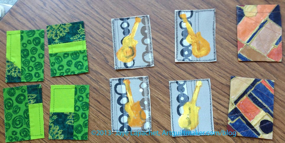
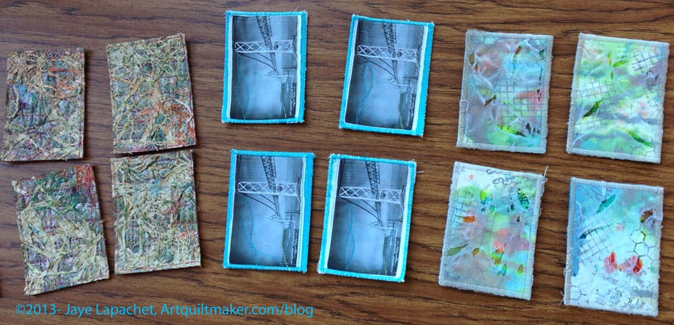
ATCs
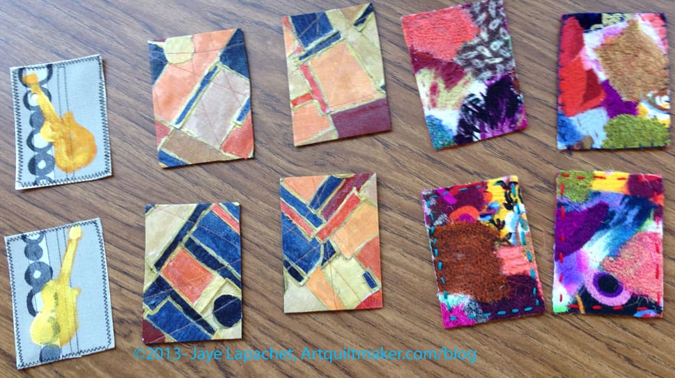
We swapped ATCs (photos sprinkled throughout this post) and there were a lot of swappers this time, which was nice. My bridge ATCs (Artists Trading Cards) were very popular, which was nice. I took some photos as I crossed the new bridge last Sunday and may use those as the basis for my November set. It is hard to take good photos from a moving car, so we will see.
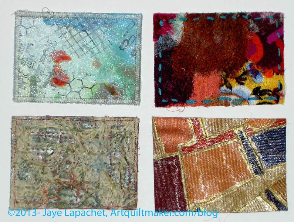
I picked a nice range of ATCs. I didn’t get one of each, because of all the swappers, but that is the nature of the beast. A couple people asked me for Bridge ATCs, so I might make some more of the historic bridge. We will see. I didn’t really enjoy the stitching I did on the photo. I felt like I had to do something in addition to just print a photo on fabric and edging it to the back to keep it together, but I wasn’t happy with the way the stitching came out. Not sure what to do.
Regardless, I need to get started on my ATCs for the next meeting. Not waiting until the last minute was fantastic.
Some of us stayed after and chatted and sewed. I started cutting out the next Petrillo Bag. Yes, I am making it with the changes I described in my previous post.
Thanks to Angela for the use of her photos of the ATCs.
I am thinking the drink and not the storm.
Hurricane High Gravity Lager, a malt liquor by Anheuser-Busch
Definition: “A tropical cyclone is a rapidly-rotating storm system characterized by a low-pressure center, strong winds, and a spiral arrangement of thunderstorms that produce heavy rain. Tropical cyclones typically form over large bodies of relatively warm water. They derive their energy from the evaporation of water from the ocean surface, which ultimately recondenses into clouds and rain when moist air rises and cools to saturation. This energy source differs from that of mid-latitude cyclonic storms, such as nor’easters and European windstorms, which are fueled primarily by horizontal temperature contrasts. The strong rotating winds of a tropical cyclone are a result of the (partial) conservation of angular momentum imparted by the Earth’s rotation as air flows inwards toward the axis of rotation. As a result, they rarely form within 5° of the equator.[1] Tropical cyclones are typically between 100 and 4,000 km (62 and 2,500 mi) in diameter.
The term “tropical” refers to the geographical origin of these systems, which usually form over the tropical oceans. The term “cyclone” refers to their cyclonic nature, with wind blowing counterclockwise in the Northern Hemisphere and clockwise in the Southern Hemisphere. The opposite direction of circulation is due to the Coriolis force. Depending on its location and strength, a tropical cyclone is referred to by names such as hurricane (/?h?r?ke?n/ or /?h?r?k?n/), typhoon /ta??fu?n/, tropical storm, cyclonic storm, tropical depression, and simply cyclone.
In addition to strong winds and rain, tropical cyclones are capable of generating high waves, damaging storm surge, and tornadoes. They typically weaken rapidly over land where they are cut off from their primary energy source. For this reason, coastal regions are particularly vulnerable to damage from a tropical cyclone as compared to inland regions. Heavy rains, however, can cause significant flooding inland, and storm surges can produce extensive coastal flooding up to 40 kilometres (25 mi) from the coastline. Though their effects on human populations are often devastating, tropical cyclones can relieve drought conditions. They also carry heat energy away from the tropics and transport it toward temperate latitudes, which may play an important role in modulating regional and global climate.” (Wikipedia)
Post the direct URL (link) where your drawing, doodle, artwork is posted (e.g. your blog, Flickr) in the comments area of this post. I would really like to keep all the artwork together and provide a way for others to see your work and/or your blog.
We are also talking about this on Twitter. Use the hashtag #CPP
The Creative Prompt Project, also, has a Flickr group, which you can join to post your responses. I created this spot so those of you without blogs and websites would have a place to post your responses.
See a lot more about hurricanes – all types — on Wikipedia